PRE2023 3 Group8
| Name | ID | Department |
|---|---|---|
| Geert Boer | 1894803 | Biomedical Engineering |
| Roel Domensino | 1758896 | Automotive Technology |
| Daan Kuijpers | 1892800 | Biomedical Engineering |
| Louise Rietra | 1859269 | Industrial Engineering |
| Chris Smeets | 1845403 | Biomedical Engineering |
| Thijn van Veggel | 1732358 | Psychology & Technology |
Introduction
Nowadays technological innovations have penetrated nearly every aspect of our lives, the realm of fitness remains a pivotal area that is broadened every year. With new research done and the variety of different exercise forms, there is a ton of information on this subject. In the app store, there are over 97,000 fitness and health apps providing all kinds of information. This can be viewed as overwhelming. How are we supposed to know which app to choose? And will this app live up to my expectations? Or will I be bored after using it for a week? This overload of information can cause a barrier for the population, because we simply do not know what to do with all the information provided. Not only the overwhelming amount of information is a barrier to work out, also the lack of motivation seems to be a contributing factor to the lack of physical activity among young adults. This lifestyle among young adults not only contributes to a variety of health issues but also impacts their overall productivity and quality of life.
Despite the awareness regarding the benefits of physical activity, a substantial portion of young adults remain disengaged from fitness activities. Furthermore, not only the lack of motivation can be discouraging, but also for beginners, the gym environment can seem like a daunting place where you feel judged by everyone around you. This intimidation factor, coupled with the absence of motivation towards fitness, often leaves individuals feeling overwhelmed and even less motivated.
As we recognized these challenges as a call to action, this project aims to motivate young adults who want to work out but are still reluctant to go to the gym. This is done by the fusion of fitness and gamification. Our mission is twofold: to address the issue of lack of physical activity amongst the youth and to inspire and empower individuals who have yet to embark on their fitness journey.
The decision to focus our efforts on developing a gamified fitness app is because games are considered to be fun and engaging. So, by using the principles of game design and applying them to fitness activities, the project aims to put a twist on the way individuals perceive and engage with exercise. Through interactive challenges, rewards systems, and immersive experiences, the app seeks to diffuse the fitness journey with elements of excitement, competition, and achievement, in order to create a fun and engaging app.
Furthermore, the choice to target young adults as a demographic specifically is rooted in not only the convenience of having similar aged people as a demographic, but also because young adults are in their prime years to shape future health behaviours (Bonnie et al., 2015). By forming positive exercise habits early on, we not only will prevent the health risks that will come with a lazy lifestyle, but also lays a foundation for a lifetime of well-being and vitality.
Moreover, the commitment to inclusivity and accessibility underscores the dedication to reaching individuals who may feel excluded from traditional fitness spaces by for example the overwhelming amount of information or the intimidation of the fitness community as mentioned above. By providing a digital platform that helps diverse fitness levels, preferences, and schedules, the app strives to create a welcoming and supportive community where every individual feels empowered to embark on their fitness journey at their own pace.
State of the art
When examining the landscape of fitness apps currently dominating the market, it's evident that they come in various forms, with distinctions between free and subscription-based models. Popular free apps like Nike Training Club, FitOn, and Adidas Training offer accessible workout options often using video or audio guidance to explain exercises. Additionally, these apps frequently incorporate features such as follow-along workouts with personal trainers and filtering systems based on difficulty, time, and workout type (KevTheTrainer, 2022). On the other hand, subscription-based apps like Muscle Booster, Peloton, Fitbot, and Aaptiv offer more specialized services, often providing premium content and personalized training experiences. Despite these variations, both free and subscription-based apps share a common goal of motivating users to engage in physical activities.
Now let's delve into the already existing gamification in fitness apps. Mack (2023) made a distinction between 5 different fitness apps that already use gamification, PlayFitt, Hops, Treeceps, Nerd fitness journey, and Fitness RPG. Looking at the details of the gamified apps we see that there are several apps that use a leaderboard in which you are compared to other players (Fitness RPG and PlayFitt), others make use of daily trackers to stimulate the forming of habits (PlayFitt, Hops, Nerd fitness journey, and Fitness RPG) and some give you the opportunity to customize the character (PlayFitt and Hops).
Another more recent study in 2019 analyzed 212352 health and fitness apps of these apps it was found that about 5018 could be considered gamified. However, a mere 344 were truly classified as behavior change apps. This is a shocking 0.16% of all ‘health’ apps. This study didn’t just look at fitness/exercise apps but also at apps to help stop smoking or to eat healthier. The 344 behavior change apps were then further analyzed to check their effectiveness. Two scales were used on the first scale the apps scored an average of 2.93 out of 5. And on a one point per criteria scale the highest scored was 17 out of 21 with an average of 7.8. This indicates that even though a lot of fitness apps exist they severely lack a strong foundation of behavior change theory (McKay et al., 2019). Our app could set itself apart by including some true behavior change theory. With especially crucial things like social support being only used by 3% of all apps (Edwards et al., 2016). According to an older study this can be attributed to the fact that app developers come from a variety of backgrounds. They often lack the Theory to base their apps upon. So if we want to improve on these apps we should use behavior change theory to expand on the existing foundations of the apps that are currently available.
This literature research mostly provided knowledge on the lack of behavior change theory in fitness apps. Combining the knowledge of what the apps seems to lack now, what the users want the app to contain (through surveys) and what behavior change theory says should work could create a more stimulating fitness app.
Technology acceptance Model
In recent years, the integration of gamification elements within fitness apps has revolutionized the way users perceive and engage with physical activities. Research in this domain has shed light on the intricate relationship between gamification, user perceptions, and behavioral outcomes, offering valuable insights into the design and effectiveness of these applications.
A seminal study investigated how users of fitness apps perceive their attitudes and motivations towards physical activities, and how gamification elements within these apps relate to their self-efficacy in performing such activities. Analyzing a vast dataset comprising 87,074 Fitbit user reviews and conducting subsequent surveys, the findings revealed that gamification elements such as self-monitoring, goal-setting, social support, and rewards significantly influenced users' participation in physical activities. Moreover, these elements were found to enhance users' self-efficacy, consequently boosting their motivation to engage in physical activities through the app.
Furthermore, the integration of the Technology Acceptance Model (TAM) into the analysis provided a deeper understanding of users' perceptions of fitness apps and technology adoption behavior. The TAM posits that users are more likely to accept and utilize a new technology when they perceive it as easy to use, useful, and reliable. In the context of fitness apps, the perceived ease of use, usefulness, and system reliability were found to significantly impact users' motivation and intention to engage in physical activities.
Methodologically, studies have emphasized rigorous data collection procedures, including analyzing user reviews and conducting surveys among diverse user groups. Statistical analyses, such as confirmatory factor analysis, have been employed to ensure the validity and reliability of the findings. Recommendations for future research include exploring user experience, demographic characteristics, and conducting experimental studies using longitudinal survey methods to gain deeper insights into the adoption and utilization of fitness apps.
In summary, the state-of-the-art research underscores the pivotal role of gamification in shaping user perceptions, motivations, and behaviors towards physical activities through fitness apps. By integrating gamification elements effectively and considering user perceptions and system attributes, developers can design more engaging and effective fitness apps to promote physical activity participation and improve overall health outcomes.
Theory
Theory
Theory was used to guide design choices together with user feedback. Here choices made are shown and theory-relevant choices are discussed.
| Choices | Literature | Questionnaire | Focus group |
| Use of gamification | X | X | X |
| Human character | X | ||
| Looks character | X | ||
| When notifications | X | X | |
| Kind of notifications | X | X | |
| Streak | X | ||
| Ranking among friends | X | X | |
| Competition and Cooperation | X | X | |
| Wheel | X | ||
| GUI/Colours app | X | X | X |
| Setup workout screen | X | X | |
| Having personal goals | X | X | |
| XP progression system | X | X | X |
| Chatting with friends | X | ||
| Having different kinds of cardio | X | ||
| App used to design our product | X |
Use of gamification
The very first choice made to increase exercising among young adults, was to make use of gamification in a fitness app. Gamification was considered and used given that “Motivation is demonstrated by an individual’s choice to engage in an activity and the intensity of effort or persistence in that activity. Current approaches concern two dominant clusters that play a role in determining player’s motivation: extrinsic and intrinsic motivation. Gamification combines these two motivations; on one hand using extrinsic rewards such as levels, points, badges to improve engagement while striving to raise feelings of achieving mastery, autonomy, sense of belonging” (Richter et al, 2014). This double working paired with young adults prevalence in gaming cemented the idea to use gamification to reach our goal.
XP progression system
As the name suggests, a progression system is a system where users are rewarded for exercising in the form of progression in a certain system. This can range from simply gaining points or leveling up to collecting fictional characters. In our case this is in the form of XP (experience points), as this was preferred according to the questionnaire. This system encourages users through extrinsic motivation with rewards, to improve engagement, while also raising feelings of achieving mastery, autonomy, sense of belonging as intrinsic motivation (Richter et al, 2014).
The most important decisions to be made are how difficult should this system be, how often should rewards be given and should punishments be used as well?
“People with high motivation to succeed prefer tasks of intermediate difficulty. However, if the motive to avoid failure is stronger people prefer either very simple or very difficult tasks” (Richter et al, 2014). As our app is used to succeed in exercising regularly, most users should possess a motivation to succeed instead of a motivation to not fail. As such we will implement tasks of intermediate difficulty based on users' previous data.
“Use (Randomly) an Intermittent Reward Timing (RIRT). This is the most powerful schedule for dopamine release and staying motivated. The casinos use it to take people’s money. It works 100% of the time. You can use RIRT to your advantage, to stay motivated in any pursuit. The key is to celebrate your wins, but do not celebrate every win” (Huberman, 2023). Sources suggest that the most efficient way of handing out rewards is by making the random and unpredictable. To implement this, a prize wheel with different bonusses is used. This prize wheel may be used after completing a certain amount of exercise schedules. Additionally by attaining a streak, which will be explained later, this prize wheel can be upgraded to possess better bonusses.
The normal exercise rewards are handed out when a user completes a set of exercises and when they complete a full schedule. Thus making a exercise count double if they complete the full schedule. Additionally extra multipliers are handed out for consistency and personal improvement. These rewards are always handed out instead of using RIRT as these are the cornerstone of the progression system.
“We compared the perceived effectiveness of Reward and Punishment quantitatively and found that Reward strategies can engage users and make behaviour fun, reinforce commitments to goals, reveal some consequences of bad behaviour, and their tendency to redirect behaviour intention and trivialise the consequences of bad behaviour. In contrast, Punishment strategies can be depressing, discouraging, and demoralising; therefore, elements of Punishment must be strategically implemented in the persuasive gamified systems, especially those targeted at health behaviours” (Orji et al., 2023). Given this risk of using punishments when targeting health behaviors, we decided that it would be better to not implement them as the risk of using them is not worth the possible positive effect they could have, especially since we don’t have a lot of experience on how to strategically implement them.
Competition and cooperation
This implementation is all about using cooperation and/or competition to inspire more motivation in the users. This can be done through teams, rankings, challenges between individuals, challenges between teams, communal goals and the like. According to sources the combination of cooperation and competition is most effective at motivation (Tauer & Harackiewicz, 2004). To ensure more certainty, we decided to inquire about this in the survey to ensure the correct choice is made. The results from the survey supported our decision to use both competition and cooperation, but suggested a stronger focus on competition and cooperation between friends. As such a team against team based system was implemented, where a team has the option to send a battle request to another team aside from the regular random matching. This way can opt to compete amongst themselves. Additionally the focus group suggested the implementation of a chat for the teams. This suggestion was adopted. Finally, to further boost competition between friends, the friends list is sorted based on weekly exercise points. These are handed out when one completes and exercise schedule and are reset every week.
Motivational messages/reminders
According to De Vries et al. (2017), personality and sex of a user are relevant for the effectiveness of messages with a certain tone. Generally, the most effective tone is positive and cooperative. Given the difference per user, we decided to obtain opinions from the users by including it in the survey and by allowing a user to choose between a few different tones which were preferred the most according to the survey. The positive and cooperative tone along with the funny tone was found to be the most preferred and are thus implemented, where the user can select in the settings which one of these types of messages they would like to receive.
Streak
A streak is a way of rewarding users for consistently doing something. According to Fook en Dastane (2021), consistency systems such as this are relatively effective at creating habits and as such are certainly something we would want to implement. In our case such a system will work weekly, where the user will get a progressively increasing multiplier to rewards, they get from doing exercises. It is not daily since many cannot exercise every day and it is not longer than weekly since exercise should be done regularly (Siddiqui et al., 2010). As the desired frequency of going to the gym differs per person, we decided to allow the user to choose how often one has to go each week to retain the streak. A more difficult to retain streak is made to be more rewarding than one which is easier to retain, to stimulate more frequent gym visits.
GUI
“A good GUI should present information that is contextual and consistent. It should avoid unnecessary detail and put as much information in as little words as possible to conserve screen space. It is better to utilize familiar data formats, if they exist (Jansen, 1998). Furthermore, a GUI should use colours to group information. Graphical boundaries are very effective in grouping items (Jansen, 1998). Other highlighting techniques are reverse video, brightness, underlining and flashing (Jansen, 1998). The information should be presented in a sequence in which the user needs it in. More important information should precede the lesser important information and general items should precede more specific items. Frequently used, needed information or commands should be in the most important location (Jansen, 1998). If there is no order, use alphabetical order. The GUI of our app was shaped in accordance with this detailed explanation. Changes were made based on feedback from the users.
Color
“Furthermore, the colours used in an app should not be more than 3, it should be as simplistic as possible (Kachan, 2021). Different colors generate specific human behavior. Social media apps usually use mostly bright and vibrant colors, while mind and body apps usually use more neutral colors. Here are some words with associated colors:
- Security and trust: Blue
- Speed: Red
- Cheapness: Orange and yellow
- High quality: Black (orange the least)
- High technology: Black, blue and gray
- Reliability: Blue
- Fun: Orange and yellow
You have to think about the impression that you want to give the users. If you want to give the expression it is an entertaining app, then use warm tones, but if you want to show it is a trade or e-commerce app, then use cooler tones like blue or a gray-scaled scheme, which is more reliable (Kachan, 2021). Given this information we decided to initially use blue as it provided trust and security that we needed as a ‘startup’ from a student group and because the first questionnaire showed that the users would prefer this color the most. The focus group gave a good suggestion of allowing people to change their color scheme in the settings. We decided to adopt this, while keeping the blue color as the default color. The optional colors to change to were orange, green and light yellow.
App used to design our App
Finally, we decided to choose Figma as our design tool for several reasons, all of which contribute to a smooth and effective design process for our app. First of all, Figma is user-friendly and easy to use. For newcomers like us, designing in Figma is very intuitive and accessible, allowing us to get started quickly.
One of the most convincing aspects of Figma is the ability to easily collaborate with others in real time. Whether our team is working remotely or sitting together on a screen design, Figma's real-time collaboration features allow us to work on the same project at the same time.
Moreover, Figma provides TU/e students with full access to their platform. This is especially valuable for us, as being students and having access to all of Figma's features and capabilities allows us to develop our designs professionally without limitations. We also received positive feedback from other students who had used Figma before.
All in all, Figma has proven to be the ideal choice for making our app design because of its user-friendliness, collaborative capabilities, student access and positive reputation among its users. With Figma as our design program, we can create a high-quality and effective design for our app.
Method
To reach the most desirable product for our users, we focused on obtaining and implementing feedback to shape our product, while using literature as support. As such, we started with literary research on motivation, habit formation, exercise, current fitness apps, gamification and app design. This research allowed us to form a general outline on what kind of features we possibly wanted to use in our app and on how the app would look. This general outline was used to create a questionnaire which provided feedback on whether possible features should be implemented or not, if so in what way and whether features were missing.
With a clear image of what features and thus kind of pages/screens should be in the app, an actual visualization and design of how these screens would look and flow from one another had to be made. As such, all members were tasked to create sketches for multiple different screens and a block diagram was made to illustrate the interactions between the screens. The multiple sketches for each screen were discussed to decide upon a clear outline for each screen. Each member was subsequently tasked to create a specific screen in detail according to the outline decided upon.
These detailed screens slightly adapted to conform to one style and were evaluated through a focus group to get new feedback. Most of this feedback was implemented to further enhance our product. To ensure that the feedback was implemented correctly, interviews with some of the members of the focus group were held to discuss our implementation of their feedback. Sadly, due to time constraints the new feedback from these interviews was not implemented.
Finally, to test our final design another questionnaire was sent out to get a read on user satisfaction and on how our product would compare against existing products.
Results
The results from the first survey were as follows:
number of survey participants: 113
Personal identification
39.8% female, 57.5% male, 2.7% other
Average age is 19.76, ranging from 17 to 24
94.7% is a Student
Current exercise situation
Average frequency of exercise is about 3 times a week (When considering “more than 5” as 6.5)
About 70% (69.9%) would like to exercise more
2/3 of all participants would like to do strength training, 44.1% would like to do Hypertrophy and 68,5% would like to do cardiovascular training.
61.9% is interested in using an app for exercise motivation
64.2% does not currently use a tracking/fitness app
App shape
Option 1(lightblue and gray) is the most popular (55.8%), others don’t get higher than 22.1%. Around 10% is displeased with all concepts.
Preferred tones are Funny (56.8%) and Considering (43.2%)
Multiplayer
Competing against other people is endorsed by 73.5%
Of those who want multiplayer:
94,4% would like to compete against friends
80,6% would like to compete against others
(note that the amount of people that replied varies, with n=90 and n=93 respectively, this is also not representative with the original 73.5%, showing that on average about 9 people answered against multiplayer, but still gave feedback on its creation)
Push notifications
About 70% (69.6%) would like to receive motivational push notifications
Only 38,4% would like to receive notifications about in game events or other-player progression.
Program creation
78,4% would like to make their own exercise program
88,4% would like to receive a program, based on their goals
On a scale from 1 to 5, the preferred customizability is 3.7 (2.7 if 0 to 4)
Tracking in between exercises is possible for 85.7%
On a scale from 1 to 5, the willingness to have predetermined exercise times is 2.25 (1.25 if 0 to 4)
The progression systems are ranked as follows:
- Character level up (53.2%)
- “wins” over other players (43.2%)
- Gaining currency/Exp (36.9%)
- Power levels (32.4%)
- Character gathering and leveling (29.7%)
The character creation systems are ranked as follows:
- Humans (57.7%)
- Animals (40.5%)
- Fantasy creatures (31.5%)
- Hybrids (15.3%)
The results of the first questionnaire helped with designing a rough sketch of the app.


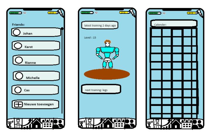


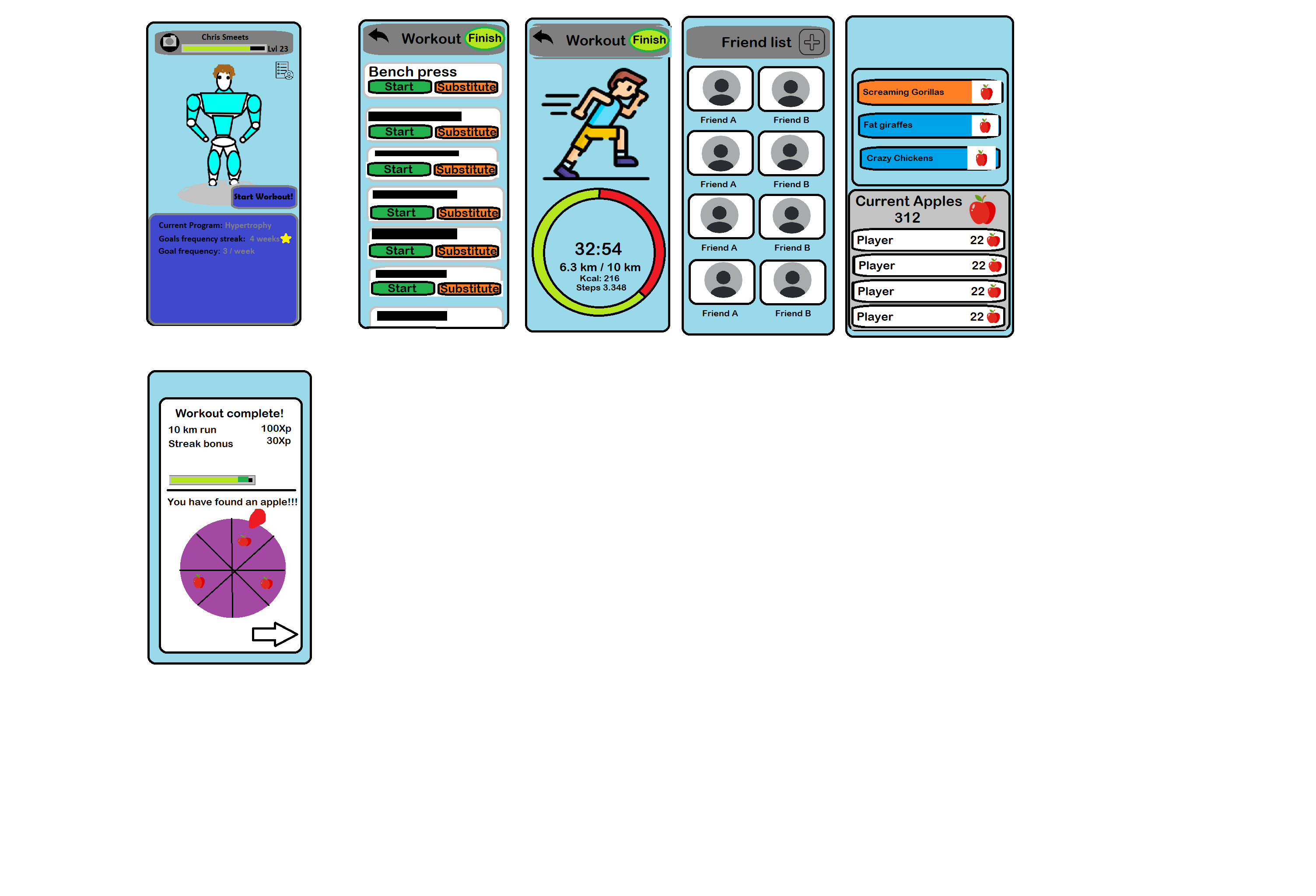
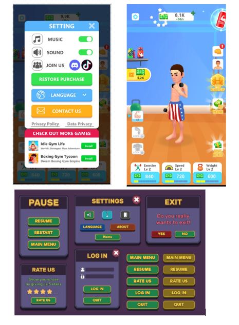
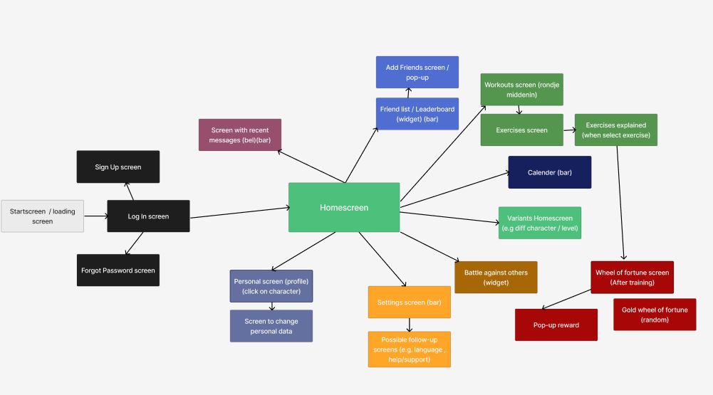
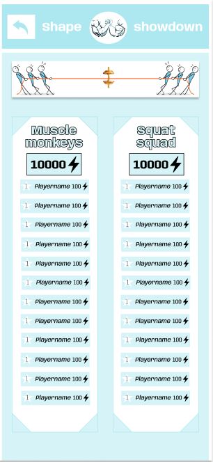
After the sketches were discussed, an app was developed with keeping in mind the preferences of the surveys and our own preferences. The following screens were developed:

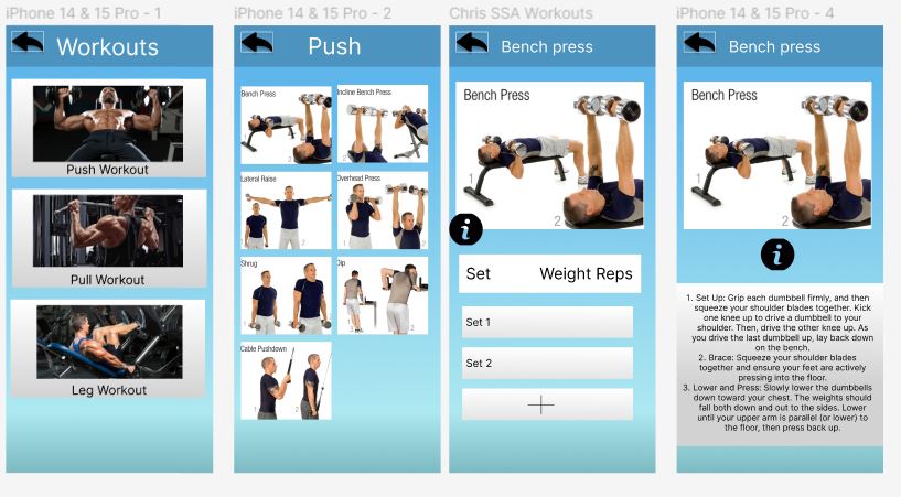
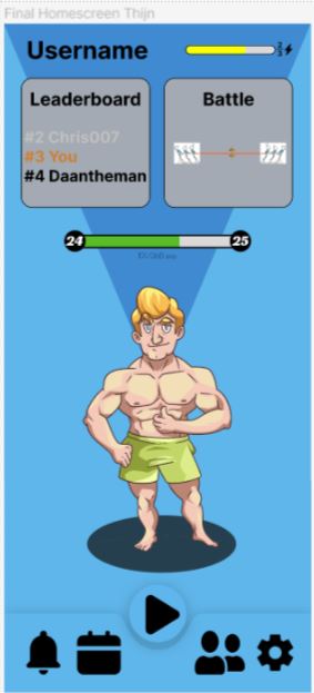
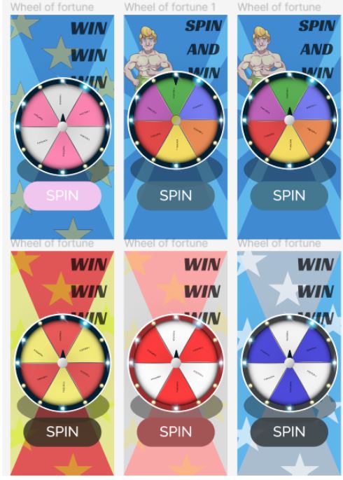

Since we worked on the screens separately, the designs were quite different from each other, especially the colors. So, after discussing the each other's designs we settled on a style that would best fit the app. Here are a few examples of the result:

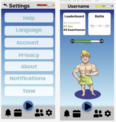
After this the feedback from the focus group was implemented. The feedback points were:
They were all unanimous about which colour scheme fits the app the best, namely the blue one. There was someone who pointed out that having the option to select different colours would be nice, on which the others agreed. They would also like the character to be less muscular, because that might be discouraging for someone who is not as fit. Additionally, they would like the possibility to select a female character as well and they want the character to show progression when they level up. The attendees liked our layout and thought the app was clear, but they would like to have more options when you go to the cardio workout, so not only running but also for example riding a bike or swimming. They would also like the option to fulfill personal goals and the ability to time workouts.
Both focus groups liked our app more than regular fitness apps, which is mainly due to the competition element in our app. They did notice that our calendar was a bit minimalistic and should be worked out better. Furthermore, both groups thought that our app would be less accessible for beginners. They suggested adding videos on how certain exercises work and adding more instructions about how to create workouts. They would like the app to save the reps they had done in the previous workout, so that you would not have to worry about this element. Additionally, someone mentioned that it would be nice to add certain exercises based on specific parts of the body.
The focus group attendees were a bit divided about the point system. They mostly agreed on getting points after the workout is completed. Consistency is imported, so if you make progressions, you should get more points. Someone also said that a more difficult workout should receive more points than an easier one.
There was one more thing on which everyone agreed, namely that you should not get notifications during a workout, because that would distract and be annoying. Someone mentioned that it would be nice to get a message when a record is broken but is not necessary. They like the streak, but do not want notifications about it. Everyone mentioned that it would be nice to be able to text friends and to chat within a team. It would be appreciated to get certain motivational notifications once a week.
This resulted in the creation or modification of the following screens:
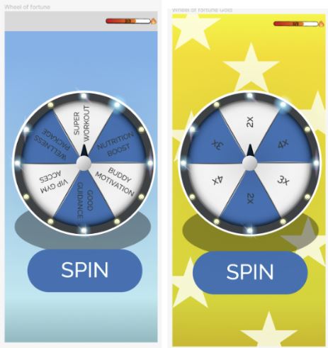
Rewards for spinning wheel:
SUPER WORKOUT: Your character earns double XP by completing a bonus workout session, leading to a significant boost in experience points.
NUTRITION BOOST: Your character wins a package of nutritious snacks and supplements, enhancing their overall fitness and providing a small XP boost for their next 3 gym sessions.
BUDDY MOTIVATION: Your character receives motivational support from a gym buddy, inspiring them to push harder during their next workout and earning them bonus XP for their next gym session together.
GOOD GUIDANCE: Your character receives personalized training advice from a virtual personal trainer, resulting in improved technique and increased XP gains for the next workout.
VIP GYM ACCESS: Your character gains access to an exclusive VIP section of the gym, complete with premium equipment and amenities, motivating them to return for their next workout and earn extra XP.
WELLNESS RETREAT PACKAGE: Your character wins a package to attend a wellness retreat focused on rejuvenation and self-care. This opportunity to relax and recharge in a serene environment inspires your character to prioritize their health and well-being, motivating them to return to the gym feeling refreshed and ready to tackle their next workout with renewed enthusiasm, resulting in enhanced XP gains as they continue to progress on their fitness journey.
The golden spinning wheel is just when you have reached a certain level, the points for the next workout will either be doubled, tripled, or quadrupled.
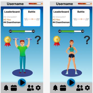
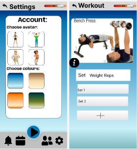


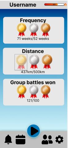
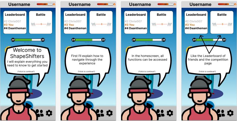


Once the feedback from the focus group was implemented in the app. It was time for a final survey and some interviews.
The results from the last survey were as follows:
Number of survey participants: 30
General
90 % has completed the first survey
26,7% Uses already a fitness app, 73,3% doesn’t so there could be potential for our app
Personal identification
50% female, 50% male
Average age is 20, ranging from 19 to 21
100% is a Student
Tutorial
The tutorial is clear for 86,6 %
Other comments 13,4 %:
- Background music or voice-over as tutorial
- Black arrows blend in with background
Competing against others
Everyone 100% would use the feature, only 1 person mentioned that they wouldn’t use the chat option (separate form chat question)
Push notifications
Would like to receive motivational push notifications 86,6%
Who wouldn’t 13,4%
Other comments: - Receiving messages that friends have been going to the gym, would be nice
Avatars / characters
Likes the avatars 70%
Comments for improvement (30%):
- Could be body shaming (look too perfect the characters) (make more realistic avatars)
- More diversity
- Show progression in the character (own progression)
- Too big changes in artstyle between the characters
- Character must be customisable
Home screen:
Home screen approval 96,7%
Other comment: - In leadership widget not only your own position but also the number 1 (leader)
Motivation for wheel:
Motivation is good enough to keep exercising 80%
Other 20% thinks not or didn’t understand the question right
Ranking friend list:
Find ranking among friends a good idea 89,9 %
No good idea or other comment:
- Making it optional for each user separately
- Can also be demotivating
Chat function:
Would use this chat feature 66,6%
Wouldn’t use it 33,4% (Most people just use alternative chat apps like WhatsApp)
Choose of app:
60% of the people who already uses a fitness app would prefer our app instead of their current app.
Grade for all-round motivation of app:

Discussion
App limitations:
During the app development we ran into a couple of problems with the features that were meant to be in the app. Thus, some of these features are only cosmetic in our design as having these truly work would require a functional app linked to a server with multiple users. Fully developing the app would also allow us to test how well the app works on the long term. In the limited time of this project it was impossible to fully develop the app. The team consisted of no one with prior knowledge of app development. This complicated the evaluation part of our app so a last feedback round consisting of interviews and a questionnaire had to do. Ideally the app would be evaluated through a trial in which a group of subjects would be split in three groups one group would use no app, another group would use a different state of the art gamified fitness app and the last group would use shapeshifters. Their fitness progress and motivation would be collected over at least a month and preferably longer.
Evaluation:
The last round of feedback gave an insight into how well the app functions and gives the ability to evaluate the app design. The feedback was collected through a questionnaire which had 30 responses and 4 interviews conducted with participants from the focus group.
Tutorial:
The tutorial is clear and explains every facet of the app. According to the feedback from the form ~90% said that the tutorial was well explained. The other 10% mentioned partly that even though it was clear the tutorial was too long and there is no way to opt out. The feedback from the interviews also relays this information all participants said that the tutorial was clear but just too long which meant that at the end they were distracted.
Competition:
With the competition being the main feature that sets shapeshifters apart from other apps this is an integral part of the evaluation. The result from the questionnaire showed that 29 out of 30 people were excited about this feature. The interviews also show that this is something that people think is a big motivator. One of the responses was that it resembles Duolingo where you have daily rankings and that the interviewee found that very motivating.
Ranking friend list:
The survey shows that 90% found this to be a great idea. The other 10% mentioned that it could also be demotivating for someone that just started. As some of your friends could have such a high score that you could never beat them. So this could perhaps be solved by a simple on and off switch that allows users to show the trophies of your friends or not.
Chat function:
This feature was implemented after the feedback from the focus group. The chat function allows chatting with friends and your teammates. This shows as the interviews showed that this was good that it was finally implemented. The questionnaire gave quite a mixed response with 2/3 of the responses saying they would use this function the other 1/3 said this was a redundant feature as they would just keep using other apps like WhatsApp for communication with friends.
Overall:
Reactions from the interviews were positive. The subjects said that they would use the app. With as only feedback that it is not as applicable to other sports. So someone who boxes will not have full use out of the app. The questionnaire showed that 60% of people who already use a fitness app would use Shapeshifters instead of the one they use now. Subjects were also asked to rate the app on how motivating they thought it would be on a scale of 1-10. The mode of these reactions is 7 and the mean is 7.3.
It would be nice to see the app fully developed and functional in the future. This could lead to a much butter analyzation of the app and whether it works.
References
Bonnie, R. J., Stroud, C., Breiner, H. (2015, 27 januari). Investing in The Health And Well-Being Of Young Adults - NCBI Bookshelf. https://www.ncbi.nlm.nih.gov/books/NBK284776/
Cowan, L., Van Wagenen, S. A., Brown, B. A., Hedin, R. J., Seino-Stephan, Y., Hall, P. C., & West, J. H. (2012). Apps of Steel: Are exercise apps providing consumers with realistic expectations? Health Education & Behavior, 40(2), 133–139. https://doi.org/10.1177/1090198112452126
De Vries, R., Truong, K. P., Zaga, C., Li, J., & Evers, V. (2017). A word of advice: how to tailor motivational text messages based on behavior change theory to personality and gender. Personal And Ubiquitous Computing, 21(4), 675–687. https://doi.org/10.1007/s00779-017-1025-1
Edwards, E., Lumsden, J., Rivas, C., Steed, L., Edwards, L., Thiyagarajan, A., Sohanpal, R., Caton, H., Griffiths, C., Munafò, M. R., Taylor, S. J. C., & Walton, R. (2016). Gamification for health promotion: systematic review of behaviour change techniques in smartphone apps. BMJ Open, 6(10), e012447. https://doi.org/10.1136/bmjopen-2016-012447
Egli, T. J., Bland, H. W., Melton, B. F., & Czech, D. R. (2011). Influence of Age, Sex, and Race on College Students’ Exercise Motivation of Physical Activity. Journal Of American College Health, 59(5), 399–406. https://doi.org/10.1080/07448481.2010.513074
Fook, A. C. W., & Dastane, O. (2021). Effectiveness of Loyalty Programs in Customer Retention: A Multiple Mediation Analysis. Jindal Journal of Business Research, 10(1), 7-32. https://journals.sagepub.com/doi/full/10.1177/22786821211000182
Hao, W., & Chuen-Tsai, S. (2011). Game reward systems: gaming experiences and social meanings. DiGRA. http://www.digra.org/digital-library/publications/game-reward-systems-gaming-experiences-and-social-meanings/
Huberman, A. (2022, 6 October). Tools to Manage Dopamine and Improve Motivation & Drive. https://www.hubermanlab.com/newsletter/tools-to-manage-dopamine-and-improve-motivation-and-drive
Jansen, B. J. (1998). The graphical user interface. SIGCHI Bulletin, 30(2), 22–26. https://doi.org/10.1145/279044.279051
Kachan, D. (2021, 10 december). Principles of Color Psychology in Mobile Application Design. Medium. https://medium.com/sketch-app-sources/principles-of-color-psychology-in-mobile-application-design-8d338144ffff
KevTheTrainer. (2022, 1 januari). 10 Best Fitness Apps for 2023 (Peloton, FitOn, Muscle Booster and More!) [Video]. YouTube. https://www.youtube.com/watch?v=irMJLcmSG5k
Liu, Y., & Avello, M. (2021). Status of the research in fitness apps: A bibliometric analysis. Telematics And Informatics, 57, 101506. https://doi.org/10.1016/j.tele.2020.101506
Mack, L. E. (2023, 24 mei). 5 apps that gamify your fitness routine. MUO. https://www.makeuseof.com/apps-gamify-fitness-routine/
McKay, F. H., Wright, A., Shill, J., Stephens, H., & Uccellini, M. (2019). Using Health and Well-Being Apps for Behavior Change: A Systematic search and Rating of apps. Jmir Mhealth and Uhealth, 7(7). https://doi.org/10.2196/119264
Nielsen, G. L., Wikman, J. M., Jensen, C. J., Schmidt, J. F., Gliemann, L., & Andersen, T. F. (2014). Health promotion: The impact of beliefs of health benefits, social relations and enjoyment on exercise continuation. Scandinavian Journal Of Medicine & Science in Sports, 24(S1), 66–75. https://doi.org/10.1111/sms.12275
Orji, R., Alslaity, A., & Chan, G. (2023). Towards understanding the mechanism through which reward and punishment motivate or demotivate behaviours. Behavior & Information Technology, 1– 25. https://www.tandfonline.com/doi/full/10.1080/0144929X.2023.2196582
Richter, G., Raban, D. R., & Rafaeli, S. (2014). Studying gamification: The effect of rewards and incentives on motivation. In Springer eBooks (pp. 21–46). https://link.springer.com/chapter/10.1007/978-3-319-10208-5_2
Schweinle, A., & Helming, L. M. (2011). Success and motivation among college students. Social Psychology Of Education, 14(4), 529–546. https://link.springer.com/article/10.1007/s11218-011-9157-z
Siddiqui, NI., Nessa, A., & Hossain, MA. (2010) Regular physical exercise: way to healthy life Mymensingh medical journal (pp. 154–158). https://europepmc.org/article/med/20046192
Snyder, K., Lee, J. M., Bjornsen, A., & Dinkel, D. (2017). What Gets Them Moving? College Students’ Motivation for Exercise: An Exploratory Study. Recreational Sports Journal, 41(2), 111-124. https://doi.org/10.1123/rsj.2017-0026
Suh, A., Wagner, C., & Liu, H. (2016). Enhancing User Engagement through Gamification. Journal Of Computer Information Systems, 58(3), 204–213. https://doi.org/10.1080/08874417.2016.1229143
Tauer, J. M., & Harackiewicz, J. M. (2004). The Effects of Cooperation and Competition on Intrinsic Motivation and Performance. Journal of Personality and Social Psychology, 86(6), 849–861. https://doi.org/10.1037/0022-3514.86.6.849
Wang, H., & Sun, C. T. (2011, September). Game reward systems: Gaming experiences and social meanings. In DiGRA conference (Vol. 114). https://citeseerx.ist.psu.edu/document?repid=rep1&type=pdf&doi=d850269a6e95214c6212c6402d06edb918f35db9
Planning:
| Monday
5 February |
Tuesday
6 February |
Wednesday
7 February |
Thursday
8 February |
Friday
9 February |
Saturday
10 February |
Sunday
11 February |
| Lecture & meeting | Send E-mail & meeting | |||||
| Monday
12 February |
Tuesday
13 February |
Wednesday
14 February |
Thursday
15 February |
Friday
16 February |
Saturday
17 February |
Sunday
18 February |
| Vacation | Vacation | Vacation | Vacation | Vacation | Update Wiki | |
| Monday
19 February |
Tuesday
20 February |
Wednesday
21 February |
Thursday
22 February |
Friday
23 February |
Saturday
24 February |
Sunday
25 February |
| Meeting | Meeting | Finish the questionnaire | Update Wiki | |||
| Monday
26 February |
Tuesday
27 February |
Wednesday
28 February |
Thursday
29 February |
Friday
1 March |
Saturday
2 March |
Sunday
3 March |
| Meeting | Meeting | Update Wiki | ||||
| Monday
4 March |
Tuesday
5 March |
Wednesday
6 March |
Thursday
7 March |
Friday
8 March |
Saturday
9 March |
Sunday
10 March |
| Meeting | Meeting | Finish motivation & Gui research | Update Wiki | |||
| Monday
11 March |
Tuesday
12 March |
Wednesday
13 March |
Thursday
14 March |
Friday
15 March |
Saturday
16 March |
Sunday
17 March |
| Meeting | Meeting | Finish exercise program | Update Wiki | |||
| Monday
18 March |
Tuesday
19 March |
Wednesday
20 March |
Thursday
21 March |
Friday
22 March |
Saturday
23 March |
Sunday
24 March |
| Meeting | App is finished & start last questionnaire | Meeting | Update Wiki | |||
| Monday
25 March |
Tuesday
26 March |
Wednesday
27 March |
Thursday
28 March |
Friday
29 March |
Saturday
30 March |
Sunday
31 March |
| Meeting | Meeting | Finished with final report | Update Wiki | |||
| Monday
1 April |
Tuesday
2 April |
Wednesday
3 April |
Thursday
4 April |
Friday
5 April |
Saturday
6 April |
Sunday
7 April |
| Free | Final presentation |
Log:
| Week 1 | Total hours | Tasks done (incl. hours per task) |
| Geert Boer | 7h | Lecture and meeting (3.5h), finding literature (1h), second meeting (1.5h), app research (1h) |
| Roel Domensino | 7h | Lecture and meeting (3.5h), finding literature (1h), second meeting (1.5h), research (1h) |
| Daan Kuijpers | 7h | Lecture and meeting (3.5h), finding literature (1h), second meeting (1.5h), exploring Figma (1h) |
| Louise Rietra | 7h | Lecture and meeting (3.5h), finding literature (1h), second meeting (1.5h), motivation (1h) |
| Chris Smeets | 7.5h | Lecture and meeting (3.5h) finding literature (1.5h), second meeting (1.5h), research workouts (1h) |
| Thijn van Veggel | 8h | Lecture and meeting (3.5h), finding literature (1.5h), second meeting (1.5h), GUI research (1.5h) |
| Week 2 | Total hours | Tasks done (incl. hours per task) |
| Geert Boer | 6.5h | Meetings (4h), state-of-the-art (2.5h) |
| Roel Domensino | 8.5h | Meetings (4h), research and conclusions motivation (2,5h),comprehensive report motivation (2h) |
| Daan Kuijpers | 9h | Meetings (4h), App development (4.5h), Uploading Wikipage (0.5h) |
| Louise Rietra | 6h | Meetings (4h), state-of-the-art (2h) |
| Chris Smeets | 7.5h | Meetings (4h), Character concept (1h), Data gathering and analysis (2.5) |
| Thijn van Veggel | 6h | Meetings (4h), App development and looking at example apps (2h) |
| Week 3 | Total hours | Tasks done (incl. hours per task) |
| Geert Boer | 10.5h | meetings (4h) , Design ideas app + Charachter concept(3h), designing the friend page and add friend page in figma (3,5h). |
| Roel Domensino | 8h | Meetings(4h),sketches/ideas app pages(1.5h), detailed competition page (2h), Uploading Wikipage (0.5h) |
| Daan Kuijpers | 10.5h | Meetings (4h), Design ideas app + Character concept (3h), Designing app further (3.5h) |
| Louise Rietra | 10h | meetings (4h), design ideas app + Character concept (3h), figuring out Figma and designing the settings and notification page (3h) |
| Chris Smeets | 10.5h | meetings (4h), Design ideas app + Character concept (3h), Designing pages surrounding exercise (3.5h) |
| Thijn van Veggel | 10h | meetings (4h), Design ideas app + Character concept (3h), designing the homepage (3h) |
| Week 4 | Total hours | Tasks done (incl. hours per task) |
| Geert Boer | 7.5h | Lecture and meeting (4h), giving all screens the same theme and background (1.5h), second meeting (1.5h), creating the calendar screen (0.5h) |
| Roel Domensino | 9 | Lecture and meeting (4h), Change competition and change log in screen (1.5h), second meeting (1.5h), presentation focus group (2h) |
| Daan Kuijpers | 5h | Lecture and meeting (4h), Make fortune wheel work (1h) |
| Louise Rietra | 9h | Lecture and meeting (4h), reward system (1.5h), second meeting (1.5h), writing motivation, results, and GUI for report (2h) |
| Chris Smeets | 9h | Lecture and meeting (4h), elaborate the workout screen (1.5h), second meeting (1.5h), linking all the screens together (2h) |
| Thijn van Veggel | 7h | Lecture and meeting (4h), working on the app (2.5h), second meeting (1.5h) making informed consent form (0.5h) |
| Week 5 | Total hours | Tasks done (incl. hours per task) |
| Geert Boer | 7,5h | Lecture meeting, and focus group (4h), plan screens (1h), second meeting (1.5h), calender (1h) |
| Roel Domensino | 7h | Lecture, meeting, and focus group (4h), competition chat screen (1h), reward screens and videos for exercises (2h) |
| Daan Kuijpers | 6.5h | Meeting (2h), Rewards wheel adjusted (0.5h), Working on app (4h) |
| Louise Rietra | 10.5h | Lecture, meeting, and focus group (4h), TAM research, introduction, continuing report, and summarize the main points focus group (2.5h), second meeting (1.5h), screens for beginner and setting personal goals (1h), cleaning and adjusting wiki (1.5h) |
| Chris Smeets | 6h | Lecture, meeting, and focus group (4h), Incorporating timer (0.5h), second meeting (1.5h) |
| Thijn van Veggel | 8.5h | Meetings (4h), Focus group preparation and execution (3h), Working on Figma (1.5h) |
| Week 6 | Total hours | Tasks done (incl. hours per task) |
| Geert Boer | 7.5h | Meetings (4h), making screens and connecting to flow (1.5h), making final google forms (2h) |
| Roel Domensino | 7.5h | Meetings (4h), making screens (1.5h), Substantiate choices with literature (2h) |
| Daan Kuijpers | 7h | Meeting (4h), making final google forms (2h), fixing errors in app (1h) |
| Louise Rietra | 7.5h | Meetings (4h), interview (0.5h), set-up interview questions (1h), Write TAM part (2h) |
| Chris Smeets | 8h | Meetings (4h), creation tutorial (4h) |
| Thijn van Veggel | 7h | Meetings (4h), make a list of all choices being made and categorize them (1h), analyse the results from the focus group and write down all answers neatly (2h) |
| Week 7 | Total hours | Tasks done (incl. hours per task) |
| Geert Boer | ||
| Roel Domensino | 8h | Meetings (4h), Fixing all connections in Figma and organizing Figma (2h), organizing wiki and adding methods (2h) |
| Daan Kuijpers | 6.5h | Meetings (4h), Gathering results from last survey (1.5h), Finalizing App (1h) |
| Louise Rietra | 6h | Meetings (4h), organizing wiki and adjusting results (2h) |
| Chris Smeets | 6.5h | Meetings (4h), preparation presentation (2.5h) |
| Thijn van Veggel | 6.5h | Meetings (4h), preparation presentation (2.5h) |
| Week 8 | Total hours | Tasks done (incl. hours per task) |
| Geert Boer | ||
| Roel Domensino | 4.5h | Watching presentations(2h), Finalizing wiki(2.5h) |
| Daan Kuijpers | 3.5h | Watching presentations(2h), Writing part wiki + reading wiki (1.5h) |
| Louise Rietra | 3h | Watching presentation (2h), finish references and finalize the introduction (1h) |
| Chris Smeets | 3h | Watching presentation (2h), Reading wiki (1h) |
| Thijn van Veggel | 3h | Watching presentation (2h), Reading wiki (1h) |