PRE2023 1 Group3
| Name | Student Number | Study | Roles (to be decided) | |
|---|---|---|---|---|
| Wilbur van Lierop | 1703870 | Applied Mathematics | w.p.v.lierop@student.tue.nl | |
| Quincy Salden | 1749900 | Applied Mathematics | q.salden@student.tue.nl | |
| Jerome Bleyendaal | 1483870 | Electrical Engineering | j.bleyendaal@student.tue.nl | |
| Jack Grunfeld | 2064677 | Exchange (software and Robotics engineering) | j.w.v.grunfeld@student.tue.nl |
GitLab link: https://gitlab.tue.nl/20233137/projectrobotsg3/-/tree/main (please note git is not currently working for me (Jack) so I have uploaded the import code files for viewing, and the .zip file of the actual program.
Introduction
The TUe, University of Technology Eindhoven, is a large university where over 10.000 students and 2.000 staff members come together to educate, research, and learn about technological sciences. TUe shares its location with Fontys, an university with well over ?5000? students. In total, the schools have around 20 buildings that are home to lecture rooms, meeting rooms, study spots, cafeteria’s, and a variety of other facilities.
For newcomers to Eindhoven it will initially feel overwhelming navigating the campus. Buildings of course follow a certain structure when it comes to labelling their rooms, using signs to sent you in the right direction. However, despite this organization it can still feel like walking around in a maze, especially when a certain route is blocked off, or when your destination is not indicated by signs, such as printers and water fountains. Not being able to find your destination is never appreciated, especially if it means arriving late for classes, meetings or exams.
It is for this reason that we wish to find out which problems newcomers to the campus experience, and provide a way to navigate around campus more efficiently.
Objective | Problem Statement
The aim of this project is to create an interactive mapping solution tailored to the needs of TU/e (Eindhoven University of Technology) students, with a specific focus on first-year students and newcomers to the Eindhoven campus. The project aims to develop a user-friendly platform that provides essential information about campus facilities, including building locations, lecture rooms, study spots, bicycle parking, and more. This platform will also offer real-time updates and recommendations to enhance the overall campus experience.
Target user
1. First-Year Students:
- Orientation: First-year students are often new to both the university and the city. They may not be familiar with the layout of the campus, the locations of key facilities, or the services available to them.
- Needs: They require guidance and support to navigate the campus efficiently. They may also seek information about academic resources, extracurricular activities, and student services.
- Challenges: Finding lecture rooms, study spots, and other essential places can be challenging during the initial days. They may also face difficulties in understanding the campus culture and community.
2. Newcomers to Eindhoven:
- Orientation: new students are often new to both the university and the city. They may not be familiar with the layout of the campus, the locations of key facilities, or the services available to them.
- Integration: They are in the process of adapting to a new environment, which includes adjusting to the campus, city life, and local culture, seeking information around groups, extracurricular activities or student services, very required for student who have not been at TUe from first year which TUe puts on integration and orientation programs.
3. Diverse Backgrounds:
- International Students: TUe attracts a diverse student body, including international students. This diversity adds to the complexity of the target audience, as language and cultural differences may influence their needs and preferences.
- Varied Academic Disciplines: TUe offers a range of academic programs, each with its unique requirements and facilities. Understanding these variations is important when tailoring the solution.
RPC-List
-'Preferences'
- preference 1
- preference 2
 - subpreference
-Requirements
-req 1
Vision
- to develop a dynamic Application, which allows students to have clear and useful hub for information around campus, this includes:
- easy and accessible navigation
- frequent and reliable updates about on-campus amenities.
- information about Cafes/food/drink locations around campus.
- vital knowledge such as bathroom locations, tire pumps, water dispensers.
- access to social hub networks such as events, clubs and gatherings.
- information about study zones and busy timeframes.
-
Key Features
- Real-Time Updates: Implement a dynamic system for real-time updates, including alerts for occupied bicycle parking areas, out-of-order coffee machines, and suggestions for available study spots.
- User Engagement: Encourage user engagement through features like reviews, ratings, and reporting mechanisms, fostering a sense of community among TUe students.
- Mobile Accessibility: Ensure that the interactive map is accessible via mobile devices, allowing students to use it conveniently on the go.
- Path finding: to have the ability to show the best route to locations around TUe. (Using A* search or Dijkstra's algorithm) .
Milestones | Time Frames
10/09/2023 | Tutorial
- Update wiki with basic info about project
12/09/2023 | group meeting
- Understanding Scope of Project, focus on First year students
- TODO:
- Make scope smaller, do research on USER based survey and questions
- Pick a building/ Area to focus on.
- Each member come up with 10 questions before 13th.
18/09/2023 | Tutorial
- Gage how to start without having the user feedback
-get advice from professionals and other lecture figures
- technical issues see first slide.
- email the BIMS lady
- start building a app to find current location and other basic services etc,
-start mapping out the building
weekly roles:
Jack - initial app set-up and dev.
Wilbur - BIMS research
Quincy - BIMS use and dev
Jerome - Survey release
25/09/2023 | Tutorial
- extrapolate survey result, find scope.
- meeting/understanding BIMS.
- continue App dev, for other services on map
- research indoor map methods and techniques.
- figure out what our functional scope is?
weekly roles:
Jack - continue app dev, focus on other features of the app.
- focus of part of app which users identified from survey.
Wilbur - State of the art research
Quincy - RPC-list
Jerome- gage survey data / Look into the BIMs
Research/findings/IDEAS
USEFUL Application:
- https://www.mazemap.com/
- https://maps.syracuse.edu/?id=1275#!ct/48860,43018,42873,34415,34413,34416,38441,38498,38500,38611,38612,38613,38617,53074,53075,57269?s/
APP DEV
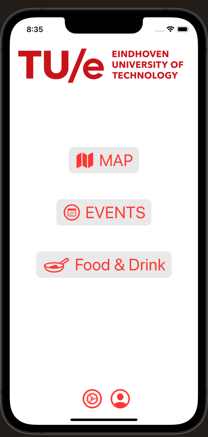
developing app using SWIFT and Xcode, for seamless easy app development, see gitlab for code Updates.
Week 2:
- simplistic user interface, allowing for easy and straight forward navigation.
- follows the TU/e colour portfolio, allowing for a logical and professional finish which matches TU/es values and use.
- further development would be to implement to the features and understand map works and user permission to allow for location services to be used
Future Developments: - more in-depth understanding on feature development.
- map implementation.
- layout development.
MAP dev
- this map design is also easy to read and allows for colour coordination and eye catching appearance.
- as shown each bridge and indoor route is associated with the colour and direction of which buildings connect to other ones.
- some improvement's needed, as my understanding of the TU/e layout is slightly incorrect.
Future Developments:
- understanding how to correctly orientate the map accordingly to the user position.
- colour coordinate and design the floor layouts of each building individually to allow for indoor map view
Week 3:
MAP DEV:
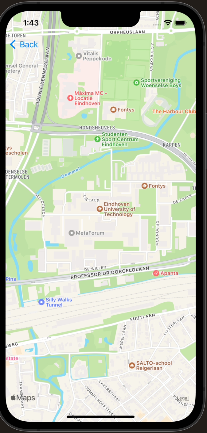
- this is a working map in the app showing the TU/e location on opening.
- using the built in apple MAPKIT libary, a good solution to use if our map development fails
Future Development:
- showing user exact location, adding path finding from building to building (externally)
- adding map and path finding for internal buildings
APP dev
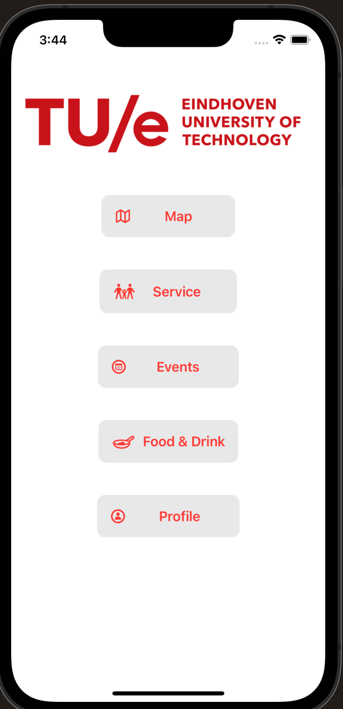
- contains working buttons, but only map button actually links to the map page
- having to change the the profile button from being a bottom tab to apart of the button list.
Future Development :
adding functional pages for the separate features.
creating a profile and login page
adding more TU/e branding, prehaps a background image?
User portfolio
Common problems first-year students and newcomers experience at the TU/e experience are for example:
- Underestimating walking times from one building to another -> In general it is very stressful being late for your lectures due to not being able to find the right room or underestimating the time required to get from one place to the room. Especially at time of exams, being late can have negative consequences.
- Bicycle parking in front of Atlas is always full, making it difficult to get your bike out of the racks. Many students do not know where to find alternative parking’s.
- Finding the stairs and elevators in particular buildings.
- Parking your car at TU/e, finding a spot at around 11:00 can sometimes take over fifteen minutes.
- Finding a good study spot without reservation can be a pain, especially finding a spot where you can sit with a couple of friends.
- Irregular building opening hours.
- Long lines at cafeteria's like Subway during lunch break and coffee machines in brakes of lectures.
- Events taking place, e.g. career expo in Auditorium -> Subway is closed, not really pleasant to study there.
- Presence of AED machines, first-aid kits, fire extinguishers in case of emergency.
- Gender-neutral restrooms.
- Ping-pong equipment for the ping pong tables.
- Parking for people with a disability.
TIME FRAMES
TODO next meeting!
HOURS
| WEEK | Jack - hours | Jack - breakdown | Wilbur - hours | Wilbur - breakdown | Jerome - hours | Jerome - breakdown | Quincy - hours | Quincy - breakdown | |||
|---|---|---|---|---|---|---|---|---|---|---|---|
| 1 | 0hr | N/A | |||||||||
| 2 | 10hrs | had the first meeting where we discussed approaches and where to start development processes. Started research into to the Idea and steps needed for app dev, see APP dev section now | |||||||||
| 3 | 12hrs | started app dev, please description above |


