PRE2020 3 Group2
Robot Desk Companion
Currently Working:Richard
Group Members
| Name | Student ID | Department | Email address |
|---|---|---|---|
| Okke Rikmenspoel | 1376489 | Psychology and Technology | o.m.rikmenspoel@student.tue.nl |
| Christian Janssen | 1458167 | Psychology and Technology | c.h.f.janssen@student.tue.nl |
| Richard van Loon | 1238071 | Computer Science and Engineering | r.p.a.v.loon@student.tue.nl |
| Ahmad Alsarakbi | 1285874 | Computer Science and Engineering | a.alsarakbi@student.tue.nl |
| Isabel Kuipers | 1297325 | Industrial Design | i.e.kuipers@student.tue.nl |
Problem statement
Due to the COVID-19 pandemic, which started in early 2020, students had to work from home for longer periods of time. Different types of health problems occurred due to the work-from-home situation.[1] Students sit in front of their screen for many hours, Concentration is heavily impacted as well by students neglecting their health and not taking breaks or taking care of themselves. Also a phone is almost always in sight and nobody is telling them not to use it. Mobile phones can be distracting depending on what you do with them. Studies have shown that texting or social media use is highly distracting when studying but listening to music does not have to.[2]
Students do not need a nanny bot, however, a robot that guides them in the right direction would be very beneficial. This robot will be placed on the desk where the student works. The robot should not be too distracting (1). It should guide and motivate studying (2). And it should give friendly concentration reminders (3).
Plan
Objectives
- Guide studying. Our robot should help the student concentrate and fulfill his or her study time.
- It should not be too distracting. It is very important that our robot is not distracting since that would go against our main goal of helping the student study
- Make the robot amiable and persuasive in a non-aggressive way
Method
To make sure what we want to build, the first thing we need to do is doing a literature research on what helps concentration in students (university). We also need to research what aspects of social robots best connect with this user group, and how to make the robot as persuasive as possible to positively influence their study behavior. The second thing we want to make a questionnaire to get better insights, especially since our initial look into literature showed a lack of research into our target user group when it comes to social robots, and a second questionnaire which we are going to base on the results we get from the research and the first questionnaire, to mainly look into design aspects that would most connect with our user group. Then we are going to create a simulation of the robot design and functionality, for that we might have to look for ways to make it possible to user test it within a normal environment, this is to get feedback on how to improve the robot. And finally we are going to create a presentation where we will demonstrate our work.
Deliverables
- A report on the project process in the form of a wiki page.
- Prototype robot
- Robot design
- presentation and promotional video
USE Analysis
To make sure we are designing our robot to be as helpful as possible for our users we did a USE analysis of the various users, which will be discussed in this section.
User analysis
The main users of this robot will be students, and people with concentration problems. But mostly students with concentration problems. This robot can help people with getting work or study done, by making sure the users follow their schedule. The goal is to help the user make a schedule, because without a schedule the robot will not work, after that the robot will help the user to make sure they actually follow the schedule. A secondary effect of the robot is that the user will stay healthier by making sure the user gets enough movement, enough breaks and makes sure the user will not get too distracted by the phone.
Society analysis
Schools and Universities will profit from this product because the students that need help with studying and have concentration issues can be assigned with such a robot to make sure the school needs to do less work to make sure the students do not get concentration issues, and if they have them, to solve it. Also parents will profit from this because they will not have to worry about their kids not concentrating or being on their phone constantly because the robot makes sure their user studies and otherwise tries to get the user to do the work. This is also the case when someone works for a business and has trouble working at home or at office. The product can help them work and take breaks when needed.
Enterprise analysis
Businesses will also have profit from this product. Students are being helped to study, which means they on average will get higher grades which means more knowledge. This knowledge will help with work. Also when working the users will be helped and be more time effective. This will help the overall economy grow. Because of corona more and more people are working at home and it has proven to be effective. This product will make working at home even more effective.
Scenario
Karl is a 20 year old computer science student, he spends a lot of time working and studying on his laptop. Due to COVID-19 he spends even more time in his room. He has started to have more problems with his concentrate and is stuck in bad habits which makes it even harder to do so.
Karl heard about Fibo and how it can help you follow good habits to increase your concentration and improve your study behaviour, so he decided to buy it. He puts Fibo on his desk in the corner so he could keep an eye on it, but it would not distract him. Karl sets a timer for a 30 minutes study session and Fibo makes sure Karl will stay away from his phone. After 15 minutes Fibo informs him that he should take a break, Karl thinks he should keep working so ignores Fibo. Fibo shows with his facial expression that it is disappointed, Karl feels bad. He decides to take a break and get a glass of water and not use his phone, since Fibo does not say he can use it. After the break Karl feels reenergized and ready to start again, Fibo found one of his bad study habits.
After the 30 minutes Fibo informs very happily that he has finished his study session, and as a reward it gives his phone back. Karl decides to take another break to go for a walk and start another session. He realized that Fibo did really help with his keeping him concentrated.
Research
Effect of colors on the brain
We also did research on colors, research by shift [3] shows that low wavelength colors can improve efficiency and focus. For example the color green or blue. The color orange is a mood lifter. The color is welcoming, it promotes comfort and it also improves neural functioning. Theorists argue that an environment that is rich of orange colors, could increase oxygen levels in the brain. This could eventually lead to feeling invigorated. And makes you ready to get things done, for example school work. Ofcourse it is not only color but also brightness and saturation. When you want to boost energy, use a bright orange and when you want to relax go for mellow. The last color that is spoken of is blue. About blue they say that it makes people more productive. Blue is the best used to enhance learning. Lighter shades of blue look more friendly and lighter ones more somber. Many color psychologists would recommend to use orange. But some orange should be added. Too much blue could create a cold environment and a sense of detachment.
In the article How Does Color Affect Memory [4] we searched for new findings and confirmation of our information we already gathered. This article also says blue enhances knowledge, and orange promotes warmth, joy and balance. A study in University of British Columbia found that Red and Blue colors are best for enhancing cognitive skills. With detail oriented tasks, but also with memory retention, red was much better than blue. Red heightened their attention as well. In this article we also found that when studying you should restrict the use of colors to 2. This is the case with making notes but might also be of use for our project.
At last the site barker whittle [5] states that the color blue encourages better mind flow and performance. It makes sure that the surroundings are relaxing and are better to study or work in. Strong shades of blue support brain thought processes, and lighter shades of blue improve concentration. This article also talks about orange. Orange promotes focus concentration and creativity. The color encourages to be organized and keep your room organized. This will help being motivated to study or work. The brightness of orange is important. Strong brightness can stimulate but be distracting. Orange is the perfect color when you need energy. Green is also ideal for study rooms. It has a calming effect. It also relieves stress.
In conclusion, we want to use the effects of the colors optimally. This is why we will use blue in our robot to enhance the productivity and learning of the users. We will use the color orange in the breaks to make sure the users get organized, creative and more joy in their breaks. The last colors red and green might also be good to use for our robot. We might give it as an option in the robot to use those colors. But blue and orange will be the main 2 colors. Improving concentration is the main goal of our robot and according to this research blue should be able to help the users with this.
Emotions
For our robot, we need to decide what emotion the robot will express when the user picks up their phone before being done with the study session. The emotions we are choosing from are, anger, disappointment and sadness. We compare the 3 emotions and try to answer the question, which emotion is best suited for our study robot. When someone is angry at you, most of the times we get forgiven by friends or family. So in a way we do not get what we deserve because we get forgiven. Or maybe the matter that made someone angry at you turns out not to be as bad as you thought. After this, we can move on and feel relief. But this is not the case with disappointment. When a person is disappointed, this person assure someone of a chilly calm. The disappointed person does not offer forgiveness. This is the big difference between being disappointed and being angry. [6] We do not get this relief, also we wont get the reassurance that the matter did not matter.
Psychologytoday: There is something depersonalizing, diminishing, and deflating about receiving disappointment rather than anger from our friends: It’s something we expect a parent or teacher to say to a wayward child. [6]
To choose between anger and disappointment is hard. But between those 2 emotions we think disappointment is best fitted. The robot is not meant to be a friend for the users. But it is meant to be nice for the users and to motivate them to study. But it will have minimal interactions with the user and it will have more of a teaching or coaching role then a friend role. This makes us think the best emotion between anger and disappointment is disappointment. We think disappointment will be a better motivator for the users to listen. We ourselves would also not like to study with a robot that is angry at us when we are not doing what is asked from us. We do however, need to watch out, because disappointment could have some unwanted effects when exposed to it for a longer time [7]. People tend to unconsciously mimic emotional expressions of others, which will make them feel the same in many cases. Jayden Mathews confirms this as well: "continuous exposure to unmet expectations and a lack of coping strategies may threaten the emotional and physical well being of a person, resulting in symptoms and effects such as depression, anger, apathy, denial and fear"[8]
When the users are continuously reminded that they do not meet the expectations of others (in this case the robot), this could threaten emotional and physical wellbeing. This is why we have to be careful with expressing too much disappointment. Sadness might be a solution to this. Because if the robot is disappointed, but not in the long term, it wont have such an emotional and physical effect on the users. This means that the robot has to start being disappointed. But when the user does not listen, the emotion changes into. This would mean the robot would look sad until the user puts their phone back in the robot. The users eventually probably feel guilty for leaving the robot sad, and will try making him happy. Emotions are contagious and we want the users to feel as happy as they can during the studying. This is why we will make sure the robot will also reward the people. This means, when the phone is put into the robot, the robot has to be happy, and really make sure the user sees this. If the user becomes more happy when the robot is happy, the user will try to make the robot happier and thus listen better. So rewarding the user with joy is a good way to do this.
Peripheral vision
To make sure the robot or app could attract attention to the user, we needed to study peripheral vision. Peripheral vision is also called indirect vision, and is the vision on the side of the eye. It allows people to view objects that are not in their central vision. Humans are able to see outside of their central vision because of different nerve cells and rods that are located outside of the macula (this is the spot in the center of the eye where the cones are very close together). Humans have a limited peripheral view. The human vision covers around 170 degrees around. The peripheral vision however only covers 100 degrees. In the center of the eye the eye is most sensitive to light, while in the edges there are less photoreceptors and the eye is less sensitive to light. This means that when we want to make sure someone sees the notification or signals from the app or robot, the eye wont see colors well so black and white movement would probably work as well, and maybe even better. The importance of peripheral vision is that it enables us to see things outside of our central vision. It makes us notice movements and objects that we do not look at and this helps us a lot. This human ability to see things that are on the sides of our visual field will be used for our project. The notification or signal for the user of our product will not pop up in the center of their visual field but on the side. But because of peripheral vision the user will still be able to notice this movement and then check what is expected from them. The fact that the color perception in the peripheral vision areas is very limited will not have an effect on our project if we make a physical robot with a light source. Because this light source will then bounce off of other objects that the viewer watches and the light will keep its effect. If the project will be an app on a computer we might not need the research about color or we will need to find a creative way to implement this light. In [9] there is said that a pulsing light might be too distracting, which is important to know because we can use this in our advantage if we need to attract someone’s attention, and to make sure we will not distract the users when this is not intended. [10] https://irisvision.com/all-about-peripheral-vision/ [11] https://www.oogziekenhuis.nl/macula-gele-vlek [9] https://pure.tue.nl/ws/portalfiles/portal/73326073/07927391.pdf Effects of ambient lighting displays on peripheral activity awareness K Davis, EB Owusu, L Marcenaro, L Feijs, C Regazzoni, J Hu IEEE Access 5, 9318-9335
Scheduling and Motivation
For our robot, we felt it was necessary to research when a student should take breaks. Since most studying is done with a computer we found an interesting study titled ‘Supplementary breaks and Stretching Exercises for Data Entry Operators’.[12] This paper states that hourly 5 minute breaks decrease musculoskeletal discomfort and eyestrain. This same paper did not find any significant differences in doing stretching exercises or not. This paper is interesting to us because we can base the work schedule our robot makes for the student on this information. Advising the student to take a 5-minute break every hour would be good.
Another interesting paper written by Kenneth T. Strongman & Christopher D. B. Burt shows that most breaks are related to hunger or thirst.[13] This is helpful knowledge because we can tackle people taking breaks by indicating to drink a glass of water every half hour. Provided that they keep a bottle at their desk and don’t refill their glass every time because that would take time.
Other studies give examples of things to avoid while taking a break and things that are good to do while taking a break.[14] Things to avoid are snacking junk food or taking a nap. Sleeping during the daytime actually makes you more tired, slows you down and makes you less productive. Watching television, browsing the internet or playing video games are activities that do not aid efficiency. Another thing that does not help is drinking a lot of caffeine, it may seem to give you concentration but you will only crash down harder eventually.
There are activities that do help your efficiency and concentration. Taking a walk outside will give you fresh air and moving your body will help the blood flow. For that same reason, stretching can help release tension. Phoning a friend or having a conversation with anyone will help take your mind of the study material and helps relax your mind.
Robots and persuasiveness
In order to really have an influence on the study behaviour of the student, the student should feel a connection with the robot through their interaction. The paper “Social eye gaze in human-robot interaction: a review” [15] explains how important the eyes of a robot are, they set the ‘tone of the robot and thus for the interaction. The eyes/eyebrows and eye gaze are very important for interaction since it also captures the attention of the person communicating. ‘’Simply having a virtual face on the flat-screen monitor of an embodied but non-anthropomorphic robot increases the number of users who stop when greeted by the robot’’ [15]. In other words, for our robot, a face is absolutely necessary for the interaction and to establish a connection.
Another aspect that is important to be able to influence behaviour is the persuasiveness of the robot. The paper also discusses this, they have found that eye gaze improves persuasiveness, even more than using an expressive voice or only the use of movements. Furthermore, the paper “Assessing the effect of persuasive robots interactive social cues on users’ psychological reactance, liking, trusting beliefs and compliance” [16] found that when a robot displays minimal social cues and enhanced social cues in combination with persuasive messages, there were lower levels of psychological reactance compared to when using text-only messages. They concluded that low psychological reactance towards an agent resulted in high liking and high trusting beliefs. This is very important for our robot since the student should trust and of course like it, otherwise, it will not have the wanted result. To conclude, our robot should have an expressive face in order to both be persuasive and create a more natural interaction with the student.
Robot concept
This robot will be designed towards students and high-schoolers between the age of 12 and 25. It will be designed to stand on their desk and guide them during their studying time. The robot has a screen, through which it can communicate with its owner. The robot will communicate on different kinds of things to help the student stay concentrated. It will show icons that will light up to remind the student to for instance drink water, sit up straight or not use their mobile phone. This will be done in a way that it does not distract the user when he/she is busy studying. Of course the robot should not inflict distractions upon the user. Reminding the user to sit up straight, and it would be ideal if the robot could detect the body posture of its user and work from there. Usage of a mobile phone is an interesting problem since there is a possibility to make a box where the user could put their phone into and put a time lock on it. We will research to what extent people are willing to hand in their mobile phone and let the robot restrict them on the use of it.
The robot will, as mentioned earlier, have a screen to communicate. Overall the robot should have a minimalistic design, to prevent possible distractions. Another function is an alarm, which the user can install him/herself. Because of this function, the robot can also remind the user when to go to sleep to get a sufficient amount of rest. The robot should remind the user to take breaks and exercise regularly during the study session to keep their concentration at it's peak while studying.
First Questionnaire results
To get an insight into what is considered distracting by students we made a questionnaire. We did this to help us make more informed decision about how our robot can better communicate with students, furthermore which type of interaction they would prefer with the robot. Also to what degree students would accept limitations on their phone usage. We also wanted to get some insight into which aspects of (facial) expressions are most preferred by our fellow students. And in this section, we will list our most important findings, for a more comprehensive overview of the findings take a look at appendix A table 1.
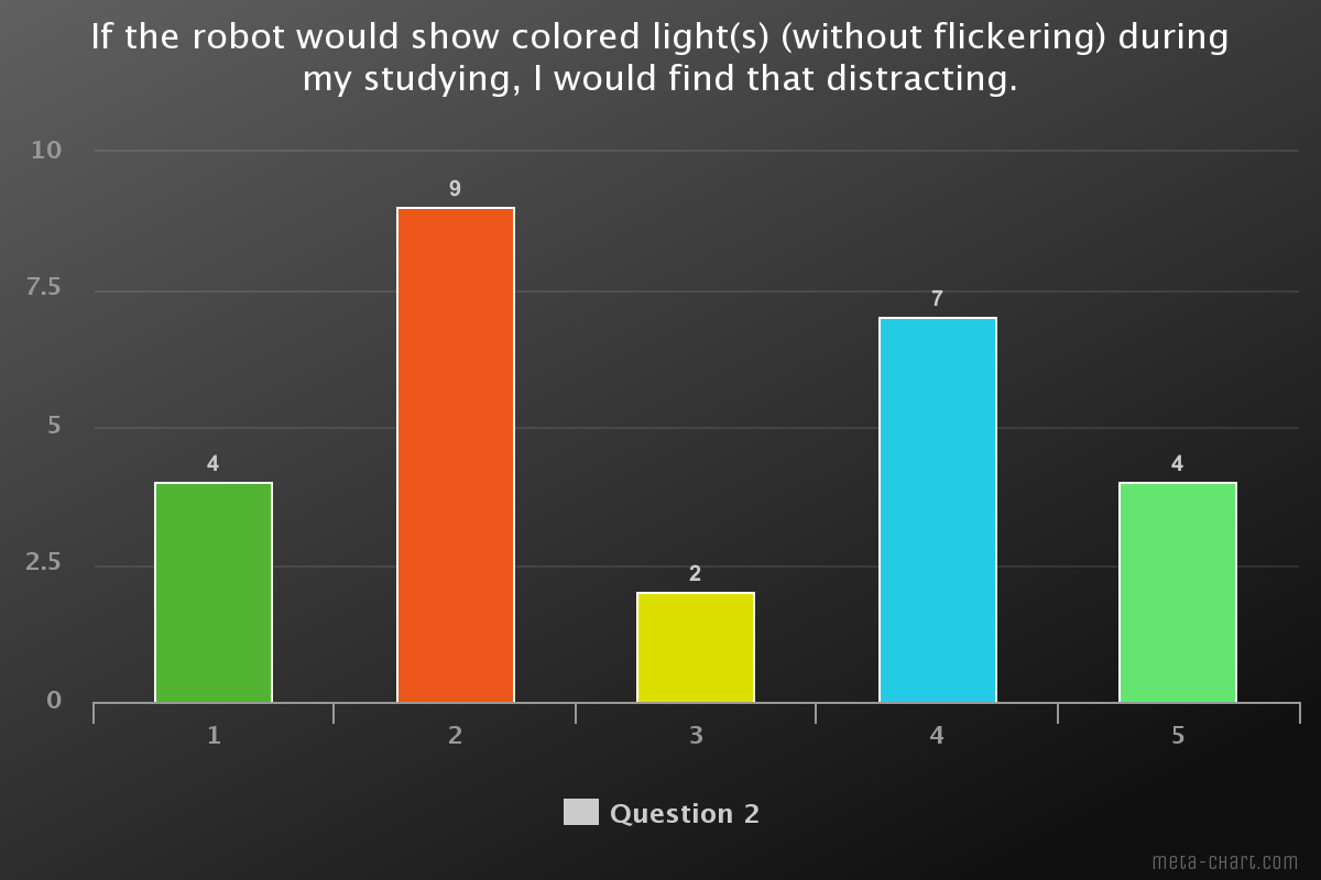
The second question in the survey was about how distracting the use of lights would be for them. The results are varying for this question. 35% would not find it distracting but 27% would. This thus mainly depends on the personal preference of the user.
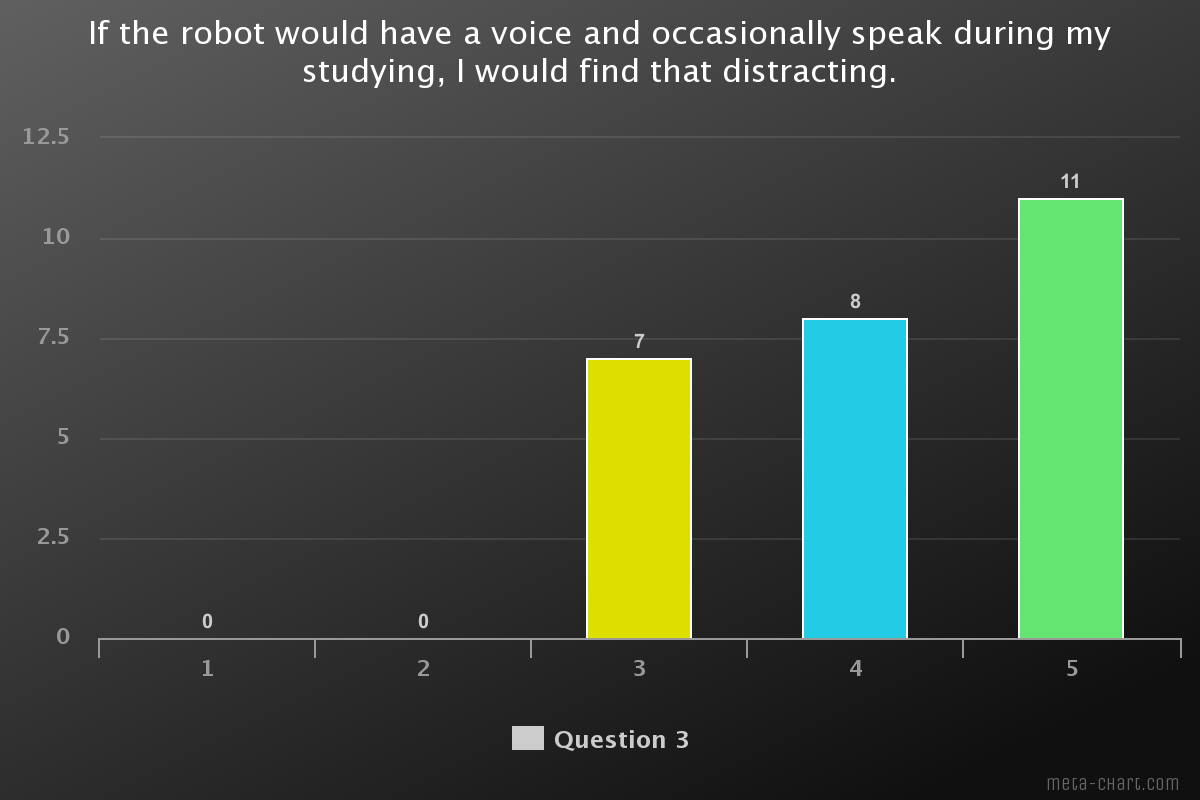
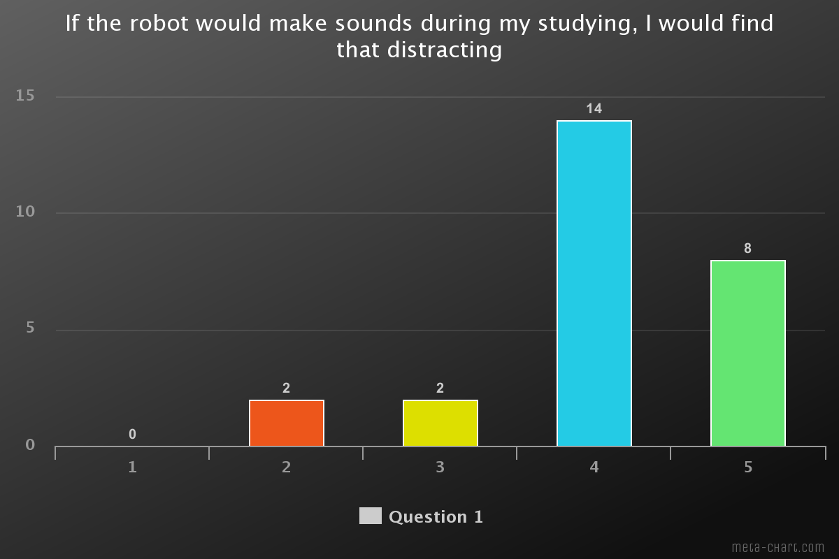
Question 3 was about the use of a voice, it is very clear that speaking is considered as very distracting since it is high in the 4-5 meaning they strongly agree with the question.
Overall lights seem to be the least distracting, it is important we can back this up with literature to be able to use it.
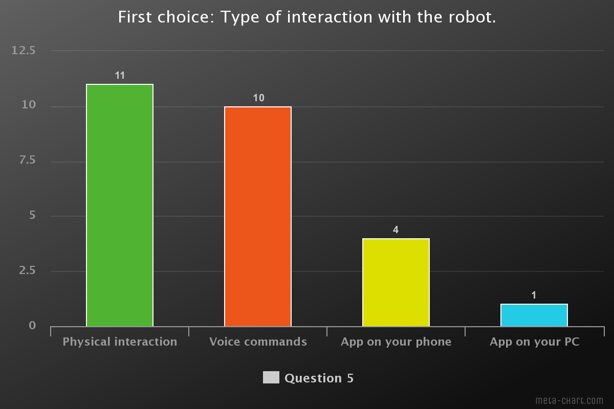
Looking at the chart there’s a majority for Physical interaction and voice commands, with a slightly higher percentage for physical interaction. A laptop application is favoured least. It is interesting that there are people saying they don’t want another app or would find the phone distracting.
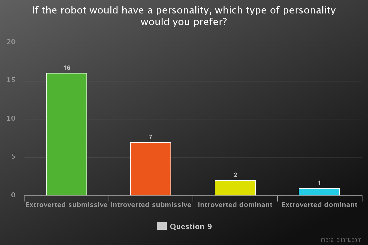
Looking at this chart it is obvious that an extroverted submissive robot is preferred. Meaning that the robot will not force the user and has a clear bubbly personality. Extroverted dominant and introverted dominant are clearly not preferred.
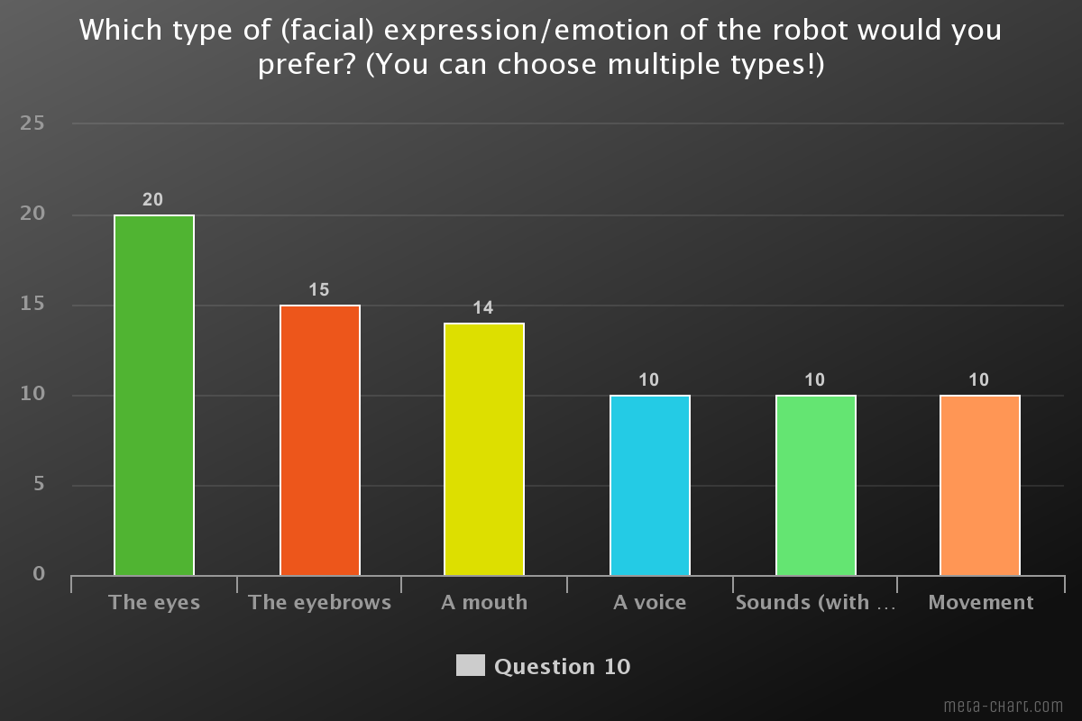
The eyes, eyebrows and a mouth are favoured the most. The rest of the options are in a tie, they have some significance but are not necessary. The eyes are clearly important. An unexpected result is the eyebrows, there aren’t many robots which use them.
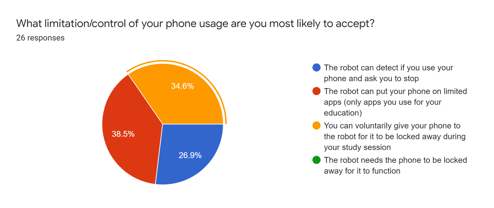
The opinions are very divided on this topic. One obvious answer was not chosen, the robot needing the phone. We did not think that the lock away would be chosen this much. This shows that students feel the need to give up their phone for a while.

As seen previously, the robot needing the phone is preferred the least. Second is the limited apps option, which is contradicting the previous result. The robot asking if you can stop using the phone is most accepted. Again the unexpected result is the voluntary give away, apparently, people do accept this.
For us it is now important to look into what is important. Since the limited app is very contradictory this option can be left alone.
Second Questionnaire results
We also made a second questionnaire to get more insight into what kind of design people would like. Since the eyes were quite important, we wanted to do this right. Round eyes are quite standard but we did not want to make any assumptions, therefore we made this questionnaire. We will show and discuss the most interesting findings. For all results take a look at appendix ...
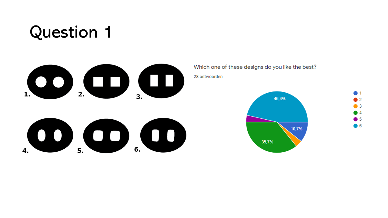
As we can see picture 1 got the most votes by quite a lot.
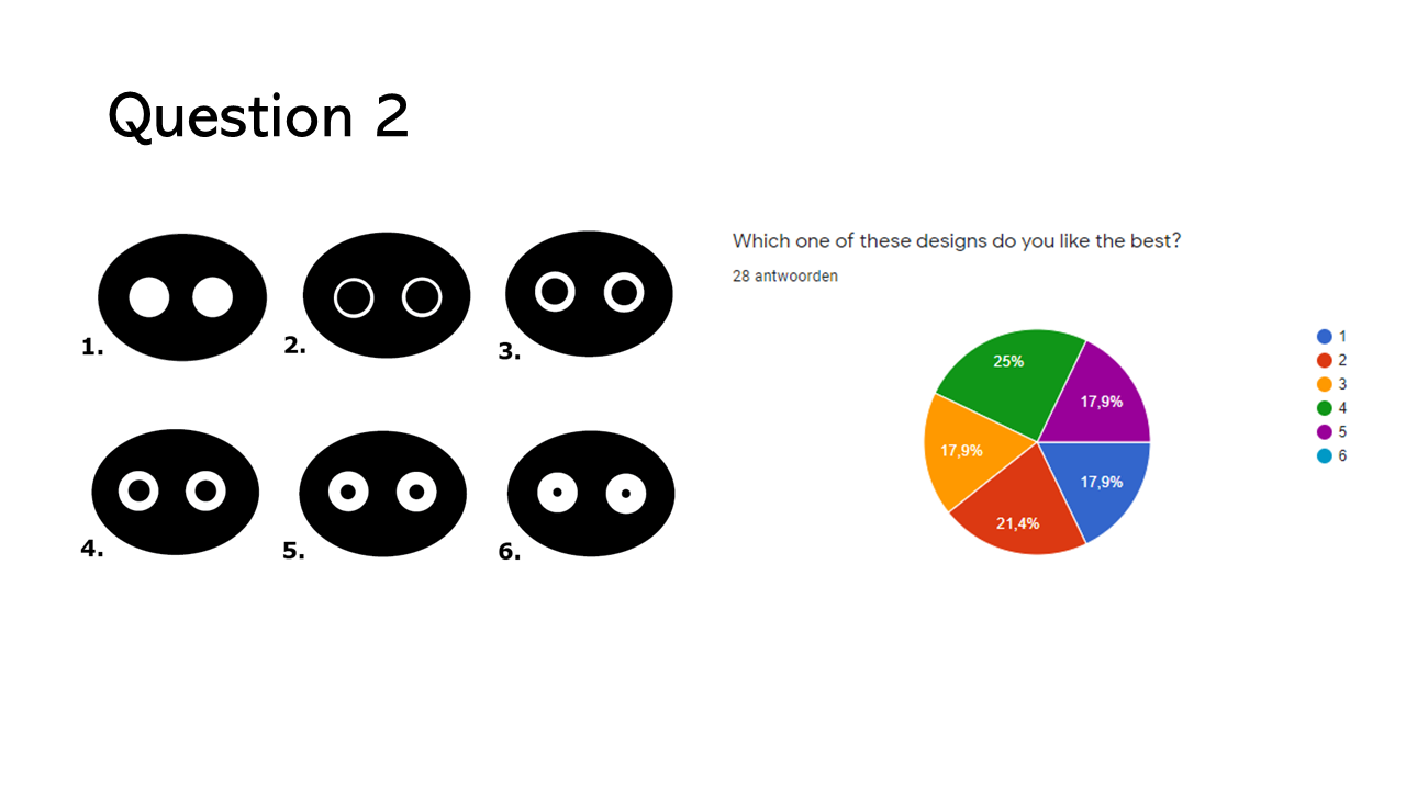
The opinions are very divided for this question, making it hard to pinpoint which is liked best. The highest are the eyes 2 and 4. It makes it more difficult since there is a difference between them and the middle one would be picture 3 which is not chosen a lot. It is clear though that 6 is liked the least.
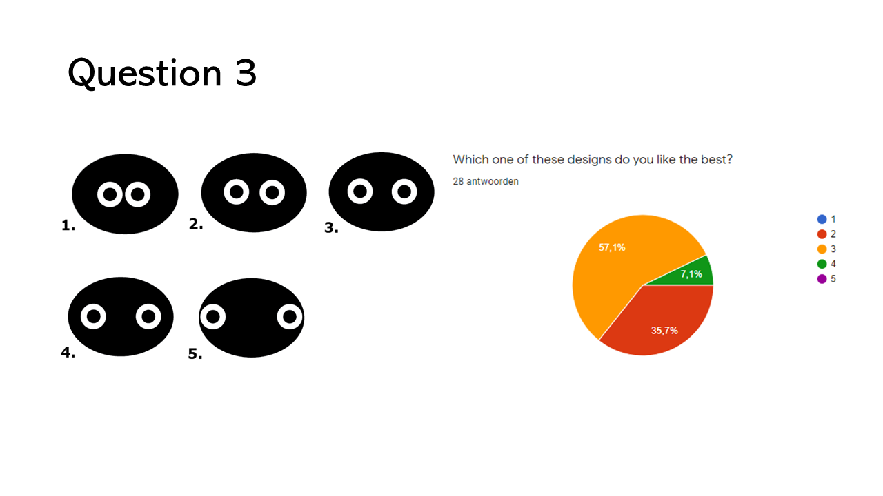
For the width of the pupils picture 3 is preferred most. They are the most centred and were also the expected result by us.
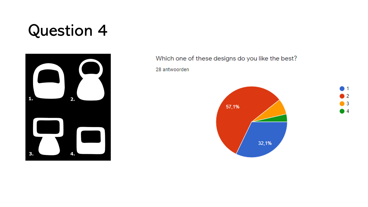
As expected by us design 2 was chosen the most, and second to this design 1. The round shape of the robot is clearly more preferred.
Design choices
The results of the first and second questionnaire (see appendix A) combined led to our important design choices. The first part of the questionnaire was about the distraction during studying. From these results it was concluded that voice is the most distracting, thus we decided not to give the robot a voice. The least distracting was light, after research, which can be found in the the-state-of-the-art section, we also found that light can positively influence study behaviour. We elaborate more on how we incorporated this in the design later.
The most important choice was if the robot would be an application on your laptop or phone or a physical robot. The majority showed not to be wanting an app, some even said in the suggestions “Please not another app”. Research by Wainer, J., Feil-Seifer, D. J., Shell, D. A., & Matarić, M. J. (2006)[17] and Fasola, J., & Mataric, M. (2013)[18] tells us that physical embodiment creates a better connection with a robot. It can make a difference in the perception of a social agent’s capacity and capabilities.
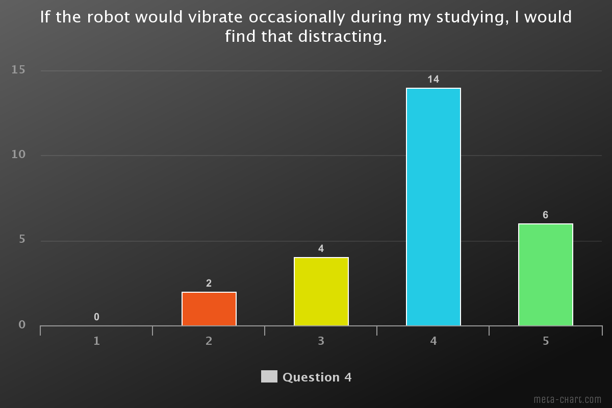
Although the robot is a physical one, we did decide that the robot will not be able to move. This choice was made, because the questionnaire indicated that movement is very distracting during studying. And if we want to keep the costs of the robot in mind, the fewer functions and parts the robot has the cheaper it will be, which is important for students with a tight budget.
An application on the phone would also be very distracting and this would contradict one of our major goals. With the questionnaire, we also wanted to find to what extent we could limit phone usage. The most prefered option was that the phone can be given away to the robot and the robot would “lock it away”, the least accepted was that the robot needs the phone to function. This was our initial idea since that would completely eliminate the distractions of phones. However, we realized with the results that we should change to voluntary options. We decided that the phone would be placed in the robot somewhere. The robot would be able to sense if the phone is there, we will further explain this in the final design.
This function of the robot also fits the chosen personality from the questionnaire. The robot needs to be extroverted and submissive, which means that it would only ask for the phone a couple of times, but it will not keep asking till you give the phone. If the robot needs the phone to function, it would be very dominant. The extroverted side of the robot will include mainly the facial expressions. In earlier research about emotions one of the outcomes was that emotions are contagious and if the users will see the robot disappointed or crying because the user does not give her phone, the user can actually also begin feeling bad or even get depressed after getting exposed to bad emotions for long periods of times. [7] This is why the robot will not keep pushing to give the phone away but the robot will stop pushing after a while.
The paper that was already discussed in the research section[15] showed how important the eyes and expressions are for the connection and the authority the robot can have. However, there was not a lot of research on how robot faces should look like for (university) students. With our second questionnaire, we thus asked which design was prefered the most, the results can be found in the questionnaire section. The first questionnaire also indicated that eyes, eyebrows and a mouth were chosen to be most important for the expression. These results combined led to the final design of the robot face. Here you can see the most important expressions, neutral, sad and happy. The other expressions can be found in appendix B.

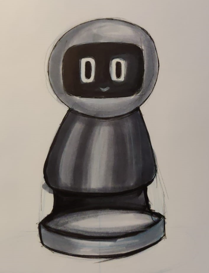
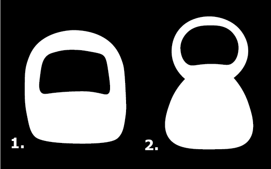
The final part of the design is the body shape of the robot. The initial design we had in mind was a very shapeless square robot, 1 in the figure below. The questionnaire clearly showed a preference for a pawn-like shape, 2 in the figure below.
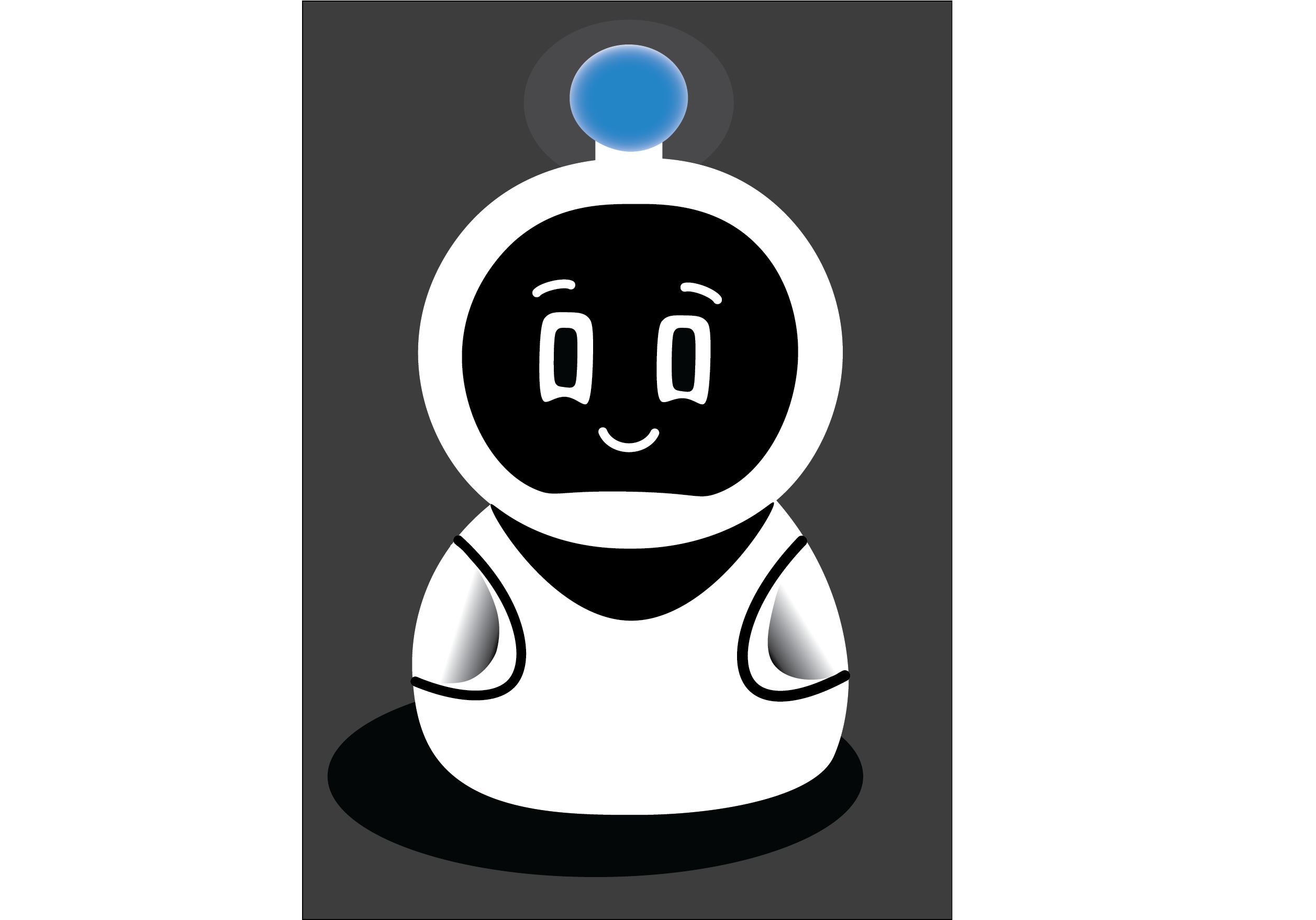
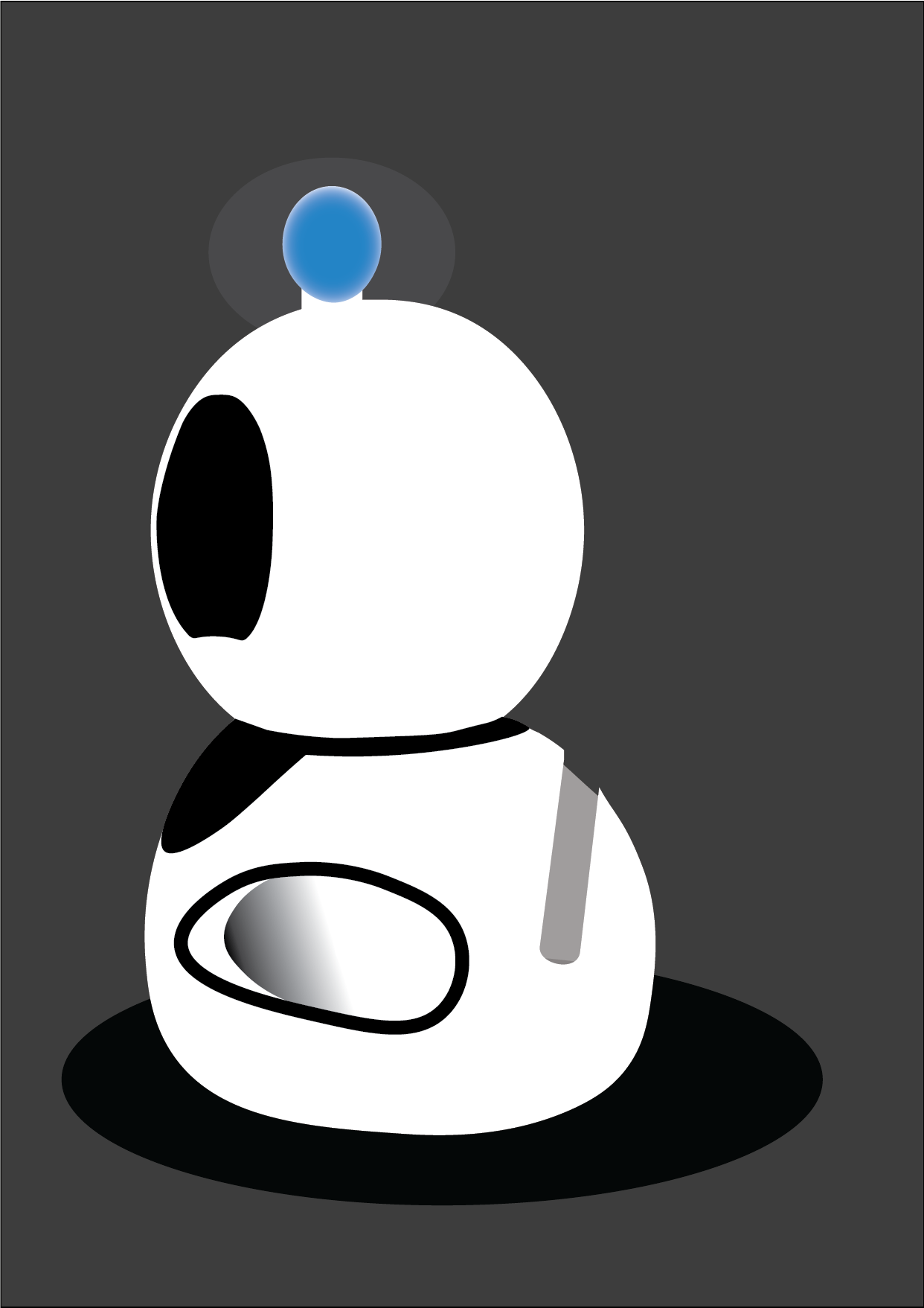
With all the gathered choices we started designing the complete robot. The first idea we had for “locking the phone away”, was a pressure plate underneath the robot where the phone could be placed on. We were doubting if it would show the phone fully from the front or only the sides from the back which can be seen figure 3). However, we did not like the design of it, and it also felt like it distracted from the “lifeness” effect of the robot. We kept ideating on the design and came to the final design which you can see in figure 4
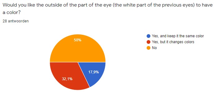
The questionnaire also indicated that people prefered a white robot over a robot which could change color or a black robot. To give the robot a little bit more life there are some details added, as the arm-like looking shapes. On top, you can also see a small light bulb, because changing the color of the robot was not appreciated, we decided to put a seperate light bulb on top of the robot, it also looks quite cute.
In our next section, the final design. We will explain the final functions we chose and how we made our prototype. After that we will also make design recommendations for further development.
Final design
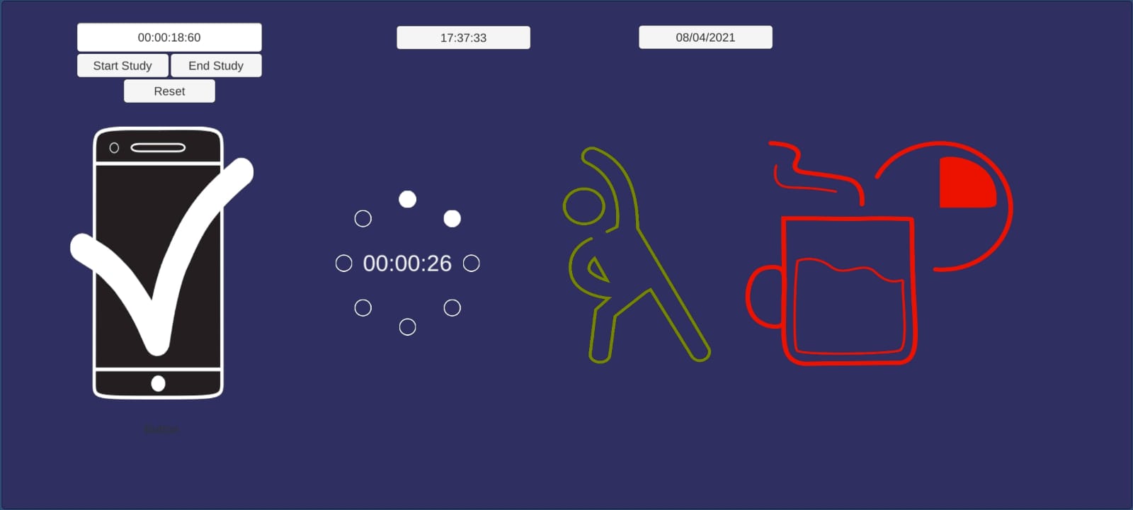
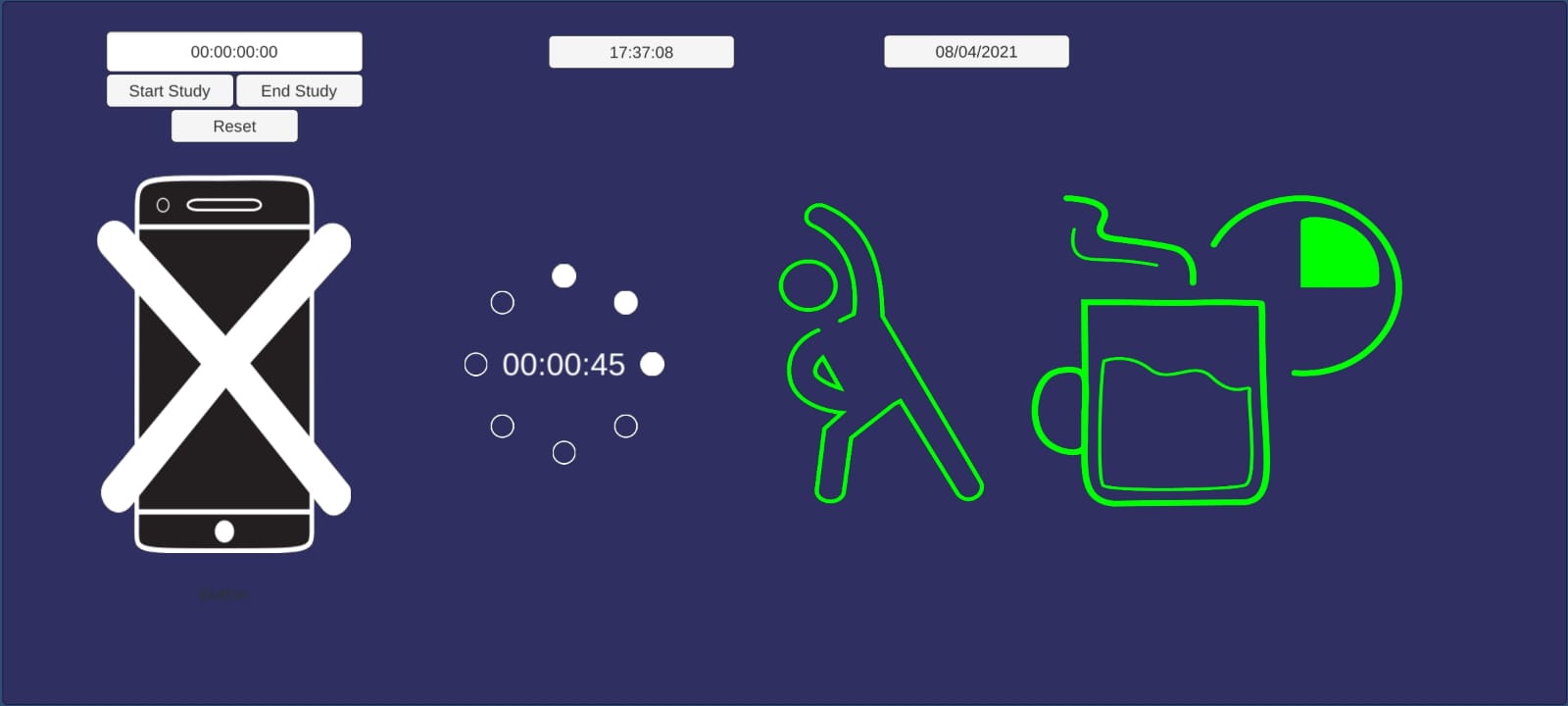
After making all the design choices and settling on what is the best thing to use, we made the final design of our product. the first thing we decided on was the functionality, this is because the core of our robot is how it can help the users, and for that goal and with the time constraint in mind we choose the most important functionalities which are:
- Set a study session period of no more than 2 hours.
- To set the study session duration a circular wheel is used which has 8 white dots where each dot represents 15 minutes.
- The white dots are empty circles if they are not set and filled circles if they are set.
- A button to start the study session, A button to stop the study session, A button to reset the study session.
- An icon for exercising which would turn from green to red as the time to exercise draws closer.
- The exercise icon can be tapped to start exercising time and when it’s tapped the study session is also stopped.
- When the exercise timer is working the exercising icon starts going back to green.
- An icon for break time which would turn from green to red as the time to take a break draws closer.
- The break icon can be tapped to start break time and when it’s tapped the study session is also stopped.
- When the break timer is working the break icon starts going back to green.
- It’s possible to tap both icons to indicate a break start which the user is going to use to exercise.
- The robot will ask the user for their phone when the study session is set using the timer wheel.
- The robot would display a sad face if the session is started without the phone being given to the robot.
- The robot will display a sad face whenever something is wrong for example it’s break time.
- The robot will display a happy face when the study session is completed and the user has followed the correct schedule of breaks and exercise.
After the functionality we created the final design of how our robot would look, for this we took the body shape we made through the questionnaire and decided to mount a small touch screen in the place where the face should be, the screen will display the face most of the time and only display the UI elements when the user is interacting with it, this is so that the connection between the user and the robot will be deeper. We also decided to mount a light bulb on top of the head of the robot which would give a calming light that is configurable by the user, where the user can dim or strengthen the light or if they prefer, turn it off. We also decided to put a groove on the backside of the robot as can be seen in figure 7 with a pressure sensor where the user can slide their phone in, the pressure sensor would detect if the phone is there and will send the signal to the robot. The placement of the groove was chosen on the backside to keep the phone outside of the sight of the user as much as possible so that they won't be tempted to pick it up when they see it.
The last part of our final design is the robot expressions, for this part we decided to keep negative facial expression to a minimum so that the user won't be depressed by constantly seeing negative feedback, that's why although the robot would display sadness and disappointment when the user doesn’t follow it’s advice, it will return to the natural expression after a while, on the contrast positive expressions such as happiness or encouraging expression would stay for longer periods and won't change unless there is something that went wrong or the user stopped following the advice.
For example if the user doesn’t hand the phone before starting the study session the robot will display a sad face, but even if the user doesn’t hand in the phone the robot will go back to normal after 3 minutes. In contrast if the user hands in the phone the robot will keep displaying a happy and content expression until there is a need for exercising or break time.
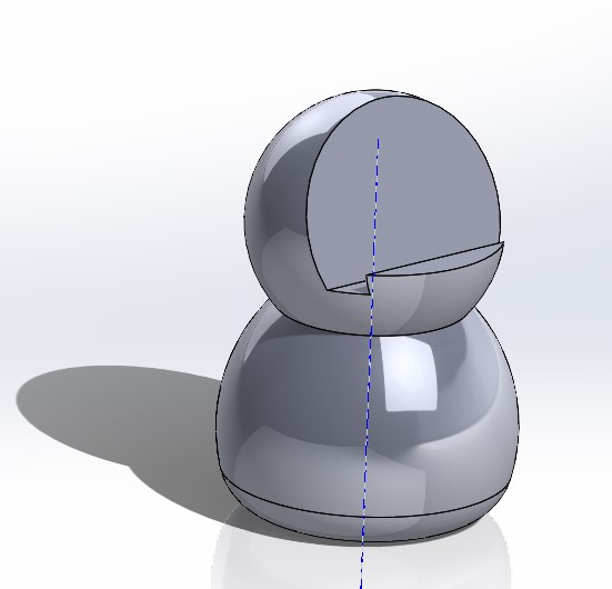
The final prototype we made consisted of a 3D printed body that had an extra place carved in it’s face as can be seen in figure 8 where we could insert the phone with the app installed on it, then using the phone as a replacement to the touch screen we built the program that has all the functionalities of our robot, unfortunately because the physical body was handled by one person we couldn't install the light antenna at the top of the robots head, this was the closest we could get to our final design within the capabilities available to us.
Appendix A
Table 1
| Question | Result 1 | Result 2 | Result 3 | Result 4 | Result 5 | Result 6 |
|---|---|---|---|---|---|---|
| If the robot would make sounds (with no words) during my studying, I would find that distracting. | 4.1 / 5 | |||||
| If the robot would show colored light(s) (without flickering) during my studying, I would find that distracting. | 2.9 / 5 | |||||
| If the robot would have a voice and occasionally speak during my studying, I would find that distracting. | 4.2 / 5 | |||||
| If the robot would vibrate occasionally during my studying, I would find that distracting. | 3.9 / 5 | |||||
| First choice: Type of interaction with the robot | Physical interaction = 11 (42.3%) | phone App = 4 (15.4%) | laptop app = 1 (3.8%) | voice command = 10 (38.5%) | ||
| Second choice: Type of interaction with the robot | Physical interaction = 7 (26.9%) | phone App = 10 (38.5%) | laptop app = 8 (30.8%) | voice command = 1 (3.8%) | ||
| Third choice: Type of interaction with the robot | Physical interaction = 5 (19.2%) | phone App = 8 (30.8%) | laptop app = 10 (38.5%) | voice command = 3 (11.5%) | ||
| If the robot would have a personality, which type of personality would you prefer? | Extroverted submissive = 16 (61.6%) | Introverted submissive = 7 (26.9%) | Introverted dominant = 2 (7.7%) | Extroverted dominant = 1 (3.8%) | ||
| Which type of (facial) expression/emotion of the robot would you prefer? (You can choose multiple types!) | The eyes = 20 (77%) | The eyebrows = 15 (57.7) | A mouth = 14 (53.9%) | A voice = 11 (42.3%) | Movement = 10 (38.5%) | Sounds = 10 (38.5%) |
| What limitation/control of your phone usage are you most likely to accept? | The robot can detect if you use your phone and ask you to stop = 7 (26.9%) | The robot can put your phone on limited apps = 10 (38.5%) | voluntarily give your phone to the robot = 9 (34.6%) | The robot needs the phone to be locked away for it to function = 0 (0%) | ||
| What limitation/control of your phone usage would you be least likely to accept? | The robot can detect if you use your phone and ask you to stop = 2 (7.7%) | The robot can put your phone on limited apps = 7 (26.9%) | voluntarily give your phone to the robot = 3 (11.5%) | The robot needs the phone to be locked away for it to function = 14 (53.8%) |
Questionnaire 1
First questionnaire question 1 result
First questionnaire question 4 result
First questionnaire question 6 result

First questionnaire question 7 result

link to the questionnaire: https://forms.gle/v4gfMp8bdNyuaJ8e6
Questionnaire 2
Second questionnaire question 5 result
Second questionnaire question 6 result
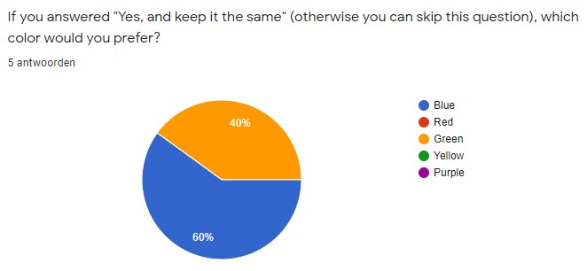
Second questionnaire question 7 result
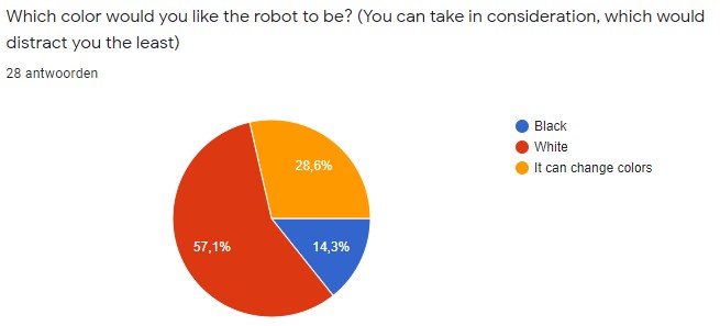
Link for questionnaire 2: https://forms.gle/XFqyykt1XE8u2ThQA
Appendix B

References
- ↑ Gualano, M. R., Lo Moro, G., Voglino, G., Bert, F., & Siliquini, R. (2020). Effects of COVID-19 lockdown on mental health and sleep disturbances in Italy. International Journal of Environmental Research and Public Health, 17(13), 1–13.
- ↑ David, P., Kim, J. H., Brickman, J. S., Ran, W., & Curtis, C. M. (2015). Mobile phone distraction while studying. New Media and Society, 17(10), 1661–1679.
- ↑ how do colors influence learning
- ↑ How Does Color Affect Memory
- ↑ barker whittle
- ↑ 6.0 6.1 Why Someone's Disappointment Hurts Us More Than Their Anger
- ↑ 7.0 7.1 Emotions Are Contagious
- ↑ Effects of Disappointment
- ↑ 9.0 9.1 [David, P., Kim, J. H., Brickman, J. S., Ran, W., & Curtis, C. M. (2015). Mobile phone distraction while studying. New Media and Society, 17(10), 1661–1679. https://doi.org/10.1177/1461444814531692]
- ↑ All about Peripheral Vision
- ↑ Macula
- ↑ [Galinsky, T., Swanson, N., Sauter, S., Dunkin, R., Hurrell, J., & Schleifer, L. (2007). Supplementary Breaks and Stretching Exercises for Data Entry Operators : A Follow-Up Field Study. 527, 519–527. https://doi.org/10.1002/ajim.20472]
- ↑ [Strongman, K. T., & Burt, C. D. B. (2000). Taking breaks from work: An exploratory inquiry. Journal of Psychology: Interdisciplinary and Applied, 134(3), 229–242. https://doi.org/10.1080/00223980009600864]
- ↑ [Mackey, K. E. (1999). Give Me a Break. IEEE Software, 16(1), 26–27. https://doi.org/10.1109/MS.1999.744562]
- ↑ 15.0 15.1 15.2 [Admoni, H., & Scassellati, B. (2017). Social Eye Gaze in Human-Robot Interaction: A Review. Journal of Human-Robot Interaction, 6(1), 25. https://doi.org/10.5898/jhri.6.1.admoni]
- ↑ [Ghazali, A. S., Ham, J., Barakova, E., & Markopoulos, P. (2019). Assessing the effect of persuasive robots interactive social cues on users’ psychological reactance, liking, trusting beliefs and compliance. Advanced Robotics, 33(7–8), 325–337. https://doi.org/10.1080/01691864.2019.1589570]
- ↑ [Wainer, J., Feil-Seifer, D. J., Shell, D. A., & Matarić, M. J. (2006). The role of physical embodiment in human-robot interaction. Proceedings - IEEE International Workshop on Robot and Human Interactive Communication, 117–122. https://doi.org/10.1109/ROMAN.2006.314404]
- ↑ [Fasola, J., & Mataric, M. (2013). A Socially Assistive Robot Exercise Coach for the Elderly. Journal of Human-Robot Interaction, 2(2), 1–16. https://doi.org/10.5898/jhri.2.2.fasola]
