PRE2023 3 Group6: Difference between revisions
Undo revision 126145 by A.bakhshi@student.tue.nl (talk) Tag: Undo |
m →Behavior Change Study: Fixed links |
||
| (51 intermediate revisions by 6 users not shown) | |||
| Line 36: | Line 36: | ||
|Computer Science and Engineering | |Computer Science and Engineering | ||
|v.chibulcutean@student.tue.nl | |v.chibulcutean@student.tue.nl | ||
|- | |||
|Jip van Hoef | |||
|Dropped Course | |||
|Computer Science and Engineering | |||
|j.v.hoef@student.tue.nl | |||
|} | |} | ||
| Line 41: | Line 46: | ||
===Problem Statement=== | ===Problem Statement=== | ||
Food waste can be defined as "Food appropriate for human consumption being discarded, whether after it is left to spoil or kept beyond its expiry date."<ref name=":0">Ishangulyyev, R., Kim, S., & Lee, S. (2019). Understanding food loss and waste—Why are we losing and wasting food? ''Foods'', ''8''(8), 297. https://doi.org/10.3390/foods8080297</ref> Food waste is recognized as a serious threat to food security and economy. But not only is it a humanitarian concern, it is also an environmental one. When food goes to waste all the energy it takes to grow, harvest transport and package it goes to waste as well. Also methane is released when food rots<ref> | Food waste can be defined as "Food appropriate for human consumption being discarded, whether after it is left to spoil or kept beyond its expiry date."<ref name=":0">Ishangulyyev, R., Kim, S., & Lee, S. (2019). Understanding food loss and waste—Why are we losing and wasting food? ''Foods'', ''8''(8), 297. https://doi.org/10.3390/foods8080297</ref> Food waste is recognized as a serious threat to food security and economy. But not only is it a humanitarian concern, it is also an environmental one. When food goes to waste all the energy it takes to grow, harvest transport and package it goes to waste as well. Also methane is released when food rots<ref>US EPA, O. (2023, October 12). ''Quantifying methane emissions from landfilled food waste'' [Data and Tools]. https://www.epa.gov/land-research/quantifying-methane-emissions-landfilled-food-waste</ref>. Both contribute to global warming. Yearly 1.3 billion tons of food is wasted globally. 37% percent of food is wasted in households in the US<ref name=":1">''Food waste in the united states''. (n.d.). Ballard Brief. Retrieved February 17, 2024, from https://ballardbrief.byu.edu/issue-briefs/food-waste-in-the-united-states</ref>, and in the EU, households generate more than half of the total food waste (54%)<ref>(N.d.). Retrieved February 17, 2024, from https://food.ec/safety/food-waste_en</ref>. The causes of food waste could be food expiration, overshopping, and often these relate to poor meal planning and insufficient food management skills. Solving the problem of food waste will help combat undernourishment and meet the increasing food demand across the world. | ||
| Line 64: | Line 69: | ||
== Design process == | == Design process == | ||
In the picture an overview can be seen of the design process the team has taken during this project. It summarizes the route the team has taken to eventually come the the final deliverable. Because of the time constraint of 8 weeks the team decided to take a rather unusual approach. The double diamond design thinking model<ref>Brown, V. (2024, | In the picture an overview can be seen of the design process the team has taken during this project. It summarizes the route the team has taken to eventually come the the final deliverable. Because of the time constraint of 8 weeks the team decided to take a rather unusual approach. The double diamond design thinking model<ref>Brown, V. (2024, January 19). Modern Double Diamond design: Rethinking a classic design process. ''LogRocket Blog''. https://blog.logrocket.com/ux-design/modern-double-diamond-design/</ref> was followed with the following activities within the four categories. | ||
[[File:Our Version of the Double Diamond Design Process.png|thumb|1029x1029px|Our Version of the Double Diamond Design Process]] | [[File:Our Version of the Double Diamond Design Process.png|thumb|1029x1029px|Our Version of the Double Diamond Design Process.]] | ||
'''Discover:''' Literature Study, User Interviews | '''Discover:''' Literature Study, User Interviews | ||
| Line 80: | Line 85: | ||
=== Definitions of Food Loss & Food Waste === | === Definitions of Food Loss & Food Waste === | ||
In general, food loss and waste collectively (FLW), as defined by FAO High Level Panel of Experts<ref name=":2" />, “refers to a decrease, at all stages of the food chain from harvest to consumption, in mass of food that was originally intended for human consumption, regardless of the cause”. | In general, food loss and waste collectively (FLW), as defined by FAO High Level Panel of Experts<ref name=":2">Principato, L. (2018). ''Food waste at consumer level''. Springer International Publishing. https://doi.org/10.1007/978-3-319-78887-6</ref>, “refers to a decrease, at all stages of the food chain from harvest to consumption, in mass of food that was originally intended for human consumption, regardless of the cause”. | ||
Food loss refers to “edible food mass that is discarded OR lost along the journey from production, post-harvest, storage, transport, and processing stages<ref>''The difference between food loss and food waste''. (n.d.). PostHarvest Technologies. Retrieved April 5, 2024, [[from https://www.postharvest.com/blog/the-difference-between-food-loss-and-food-waste]]</ref>.” Another definition of food loss is “A decrease, at all stages of the food supply chain (FSC) prior to the consumer level, in mass of food that was originally intended for human consumption, regardless of the cause<ref name=":0" />.” Thus, the definition of food loss excludes the last stage of the food supply chain, namely the consumption stage. | Food loss refers to “edible food mass that is discarded OR lost along the journey from production, post-harvest, storage, transport, and processing stages<ref>''The difference between food loss and food waste''. (n.d.). PostHarvest Technologies. Retrieved April 5, 2024, [[from https://www.postharvest.com/blog/the-difference-between-food-loss-and-food-waste]]</ref>.” Another definition of food loss is “A decrease, at all stages of the food supply chain (FSC) prior to the consumer level, in mass of food that was originally intended for human consumption, regardless of the cause<ref name=":0" />.” Thus, the definition of food loss excludes the last stage of the food supply chain, namely the consumption stage. | ||
| Line 99: | Line 104: | ||
Beyond the issue of undernourishment, the impact of food waste can be assessed in terms of environmental, economic, and social aspects. Environmentally, food losses signify a squandering of resources used in production, encompassing land, water, energy, and other inputs<ref name=":1" />. The global carbon footprint of wasted food is estimated to be nearly 3.3 gigatons of CO2, ranking third globally in emissions after the United States and China. This amount of CO2 surpasses twice the total greenhouse gas emissions from all US road transportation, equating to around 500 kg of CO2 per capita globally. Cereals contribute the most to this waste, followed by meat and fresh produce. | Beyond the issue of undernourishment, the impact of food waste can be assessed in terms of environmental, economic, and social aspects. Environmentally, food losses signify a squandering of resources used in production, encompassing land, water, energy, and other inputs<ref name=":1" />. The global carbon footprint of wasted food is estimated to be nearly 3.3 gigatons of CO2, ranking third globally in emissions after the United States and China. This amount of CO2 surpasses twice the total greenhouse gas emissions from all US road transportation, equating to around 500 kg of CO2 per capita globally. Cereals contribute the most to this waste, followed by meat and fresh produce. | ||
In terms of water wastage, the numbers are notably significant, with a staggering 92% of humanity's total water footprint attributed to the consumption of agricultural products. Specifically, the average water footprint of food waste per capita annually is 38 cubic meters<ref name=":3" />, equivalent to the annual flow of Russia’s Volga River when added up<ref name=":2" />. Land occupation and degradation are also significant factors. Global food wastage has occupied as much as 1.4 billion hectares of farming land, approximately 28% of the world’s total agricultural land area. When compared to the surface areas of the world’s largest countries, this is second only to that of the world’s largest country, the Russian Federation. Meat and milk contribute to 78% of this total area, but only 11% of overall food wastage. Biodiversity impacts, including deforestation, Red-listed species, and marine trophic levels, are of great importance. In developed nations, agriculture causes 44% of species threats, while in developing nations, this number rises to 72%. Globally, agriculture is responsible for 66% of threats to species, with mammals, amphibians, and birds being the most affected animal families<ref name=":3" />. | In terms of water wastage, the numbers are notably significant, with a staggering 92% of humanity's total water footprint attributed to the consumption of agricultural products. Specifically, the average water footprint of food waste per capita annually is 38 cubic meters<ref name=":3">Schanes, K., Dobernig, K., & Gözet, B. (2018). Food waste matters—A systematic review of household food waste practices and their policy implications. ''Journal of Cleaner Production'', ''182'', 978–991. https://doi.org/10.1016/j.jclepro.2018.02.030</ref>, equivalent to the annual flow of Russia’s Volga River when added up<ref name=":2" />. Land occupation and degradation are also significant factors. Global food wastage has occupied as much as 1.4 billion hectares of farming land, approximately 28% of the world’s total agricultural land area. When compared to the surface areas of the world’s largest countries, this is second only to that of the world’s largest country, the Russian Federation. Meat and milk contribute to 78% of this total area, but only 11% of overall food wastage. Biodiversity impacts, including deforestation, Red-listed species, and marine trophic levels, are of great importance. In developed nations, agriculture causes 44% of species threats, while in developing nations, this number rises to 72%. Globally, agriculture is responsible for 66% of threats to species, with mammals, amphibians, and birds being the most affected animal families<ref name=":3" />. | ||
Economically, food losses negatively impact the incomes of both farmers and consumers<ref name=":1" />. This impact has been measured at nearly 1 trillion dollars globally, with Indian and Southeast Asia contributing the most to these costs. Economic costs surpass environmental ones, amounting to approximately $700 billion, and social costs, totaling around $900 billion. In Italy, economic costs due to food waste in the last phase of the supply chain add up to as much as $12 billion annually. In the UK, food waste within the out-of-home industry accounts for more than £682 million annually, covering food procurement, labor and service costs, utilities, and waste management costs. Additionally, the economic cost of food waste for households in the UK is approximately £420 per year, €454 per year in Italy, and in the US, households discard 211 kg of food per year, costing at least US$587 annually for a family of four<ref name=":2" />. | Economically, food losses negatively impact the incomes of both farmers and consumers<ref name=":1" />. This impact has been measured at nearly 1 trillion dollars globally, with Indian and Southeast Asia contributing the most to these costs. Economic costs surpass environmental ones, amounting to approximately $700 billion, and social costs, totaling around $900 billion. In Italy, economic costs due to food waste in the last phase of the supply chain add up to as much as $12 billion annually. In the UK, food waste within the out-of-home industry accounts for more than £682 million annually, covering food procurement, labor and service costs, utilities, and waste management costs. Additionally, the economic cost of food waste for households in the UK is approximately £420 per year, €454 per year in Italy, and in the US, households discard 211 kg of food per year, costing at least US$587 annually for a family of four<ref name=":2" />. | ||
| Line 128: | Line 133: | ||
Another important factor that determines the amount of food waste produced is the individual’s knowledge, perceptions, and attitudes toward food waste. More specifically, the knowledge about the severity of food waste and attitude toward the problem can influence the behavior of the individual as well as their intentions. While the behaviors might not be consistent with the attitudes and intentions (also known as the attitude-behavior gap), the research indicates that in most cases, there is a positive correlation between attitude and actual behavior regarding food waste reduction. Moreover, attitudes and perceptions can also influence the problem of food waste indirectly. For example, various food-related routines, such as planning and shopping, are also influenced by attitudes<ref name=":0" />. | Another important factor that determines the amount of food waste produced is the individual’s knowledge, perceptions, and attitudes toward food waste. More specifically, the knowledge about the severity of food waste and attitude toward the problem can influence the behavior of the individual as well as their intentions. While the behaviors might not be consistent with the attitudes and intentions (also known as the attitude-behavior gap), the research indicates that in most cases, there is a positive correlation between attitude and actual behavior regarding food waste reduction. Moreover, attitudes and perceptions can also influence the problem of food waste indirectly. For example, various food-related routines, such as planning and shopping, are also influenced by attitudes<ref name=":0" />. | ||
Finally, it is instructive to look at a study conducted by Hermanussen et al.<ref name=":4" /> that revealed the most common reasons for food waste in German households. According to the results of the questionnaire, the most common driving force behind food waste is the lack of time to cook (or process) food. Another common reason is that respondents cook more food than they can consume, and the leftovers are disposed of. Finally, the third most common reason is, as mentioned by <ref name=":3" />, the large packaging size. | Finally, it is instructive to look at a study conducted by Hermanussen et al.<ref name=":4">Hermanussen, H., Loy, J.-P., & Egamberdiev, B. (2022). Determinants of food waste from household food consumption: A case study from field survey in germany. ''International Journal of Environmental Research and Public Health'', ''19''(21), 14253. https://doi.org/10.3390/ijerph192114253</ref> that revealed the most common reasons for food waste in German households. According to the results of the questionnaire, the most common driving force behind food waste is the lack of time to cook (or process) food. Another common reason is that respondents cook more food than they can consume, and the leftovers are disposed of. Finally, the third most common reason is, as mentioned by <ref name=":3" />, the large packaging size. | ||
=== Theory of Planned Behavior === | === Theory of Planned Behavior === | ||
| Line 136: | Line 141: | ||
According to the theory, three kinds of considerations guide the formation of intentions: behavioral beliefs and attitudes, normative beliefs and subjective norm, control beliefs and perceived behavioral control<ref name=":5" />. | According to the theory, three kinds of considerations guide the formation of intentions: behavioral beliefs and attitudes, normative beliefs and subjective norm, control beliefs and perceived behavioral control<ref name=":5" />. | ||
[[File:Theory of planned behavior.png | [[File:Theory of planned behavior.png|thumb|843x843px|Theory of Planned Behavior<ref name=":5" />.]] | ||
A behavioral belief is a perceived likelihood that engaging in a behavior will result in a certain outcome or involve a certain experience. For example, if someone believes that studying hard will result in good grades, they are more likely to have a positive attitude toward studying. Behavioral beliefs as a whole result in a positive or negative attitude toward a behavior. | A behavioral belief is a perceived likelihood that engaging in a behavior will result in a certain outcome or involve a certain experience. For example, if someone believes that studying hard will result in good grades, they are more likely to have a positive attitude toward studying. Behavioral beliefs as a whole result in a positive or negative attitude toward a behavior. | ||
| Line 175: | Line 180: | ||
==== Recipes & Meal Planning Apps ==== | ==== Recipes & Meal Planning Apps ==== | ||
[https://play.google.com/store/apps/details?id=com.foodient.whisk <big>Samsung Food: Meal Planning</big>] | [https://play.google.com/store/apps/details?id=com.foodient.whisk <big>Samsung Food: Meal Planning</big>] | ||
[[File:Samsung summary.png|none|thumb|1200x1200px| | [[File:Samsung summary.png|none|thumb|1200x1200px|Samsung Food App.]] | ||
Samsung Food is a multi-purpose cooking app that offers a large collection of recipes and assists in meal and grocery shopping planning. The user can join a large number of communities based on various cuisines and diets, such as vegetarian recipes, healthy eating, low-carb recipes, one-pot wonders, freezer meals, etc. In the communities, the user can view recipes from other people as well as share theirs. The user can also search for recipes within a certain community and apply filters, such as ingredients, meal type, diet, and cooking time. The user can also follow a specific creator. The recipes can be personalized by editing the ingredients manually or using AI for healthier alternatives. Another feature of the app is that the user can save recipes from the web and add them to the shopping list. Also, the app has a meal-planning feature. The user can add recipes to specific days and specific meals. Also, the app displays the total nutritional value, such as calories, carbs, fiber, protein, and fat, of the added recipes. The created meal plan can be shared with other users. Lastly, the app has an integrated shopping list, and the ingredients added to the list can be sorted by aisles or recipes. The shopping list can also be shared with others. Overall, the app has an intuitive interface and minimalist design. | Samsung Food is a multi-purpose cooking app that offers a large collection of recipes and assists in meal and grocery shopping planning. The user can join a large number of communities based on various cuisines and diets, such as vegetarian recipes, healthy eating, low-carb recipes, one-pot wonders, freezer meals, etc. In the communities, the user can view recipes from other people as well as share theirs. The user can also search for recipes within a certain community and apply filters, such as ingredients, meal type, diet, and cooking time. The user can also follow a specific creator. The recipes can be personalized by editing the ingredients manually or using AI for healthier alternatives. Another feature of the app is that the user can save recipes from the web and add them to the shopping list. Also, the app has a meal-planning feature. The user can add recipes to specific days and specific meals. Also, the app displays the total nutritional value, such as calories, carbs, fiber, protein, and fat, of the added recipes. The created meal plan can be shared with other users. Lastly, the app has an integrated shopping list, and the ingredients added to the list can be sorted by aisles or recipes. The shopping list can also be shared with others. Overall, the app has an intuitive interface and minimalist design. | ||
[https://play.google.com/store/apps/details?id=com.mealime <big>Mealime Meal Plans & Recipes</big>] | [https://play.google.com/store/apps/details?id=com.mealime <big>Mealime Meal Plans & Recipes</big>] | ||
[[File:Mealime summary.png|none|thumb|1200x1200px| | [[File:Mealime summary.png|none|thumb|1200x1200px|Mealime App.]] | ||
Mealime is an app that helps create meal plans and shopping lists based on that. The user starts by indicating the typical number of servings per meal, as well as allergens or food dislikes. Then, the user can choose from a large variety of meal plans offered in the meal plan section. The meal plans are sorted by various categories, such as Mediterranean, vegetarian, baked, BBQ & Grilling, Soups, Stews & Chillis, etc. After adding the recipes and the number of servings per dish, the app automatically creates a shopping list with all the necessary ingredients. The user can go grocery shopping or use the integrated online shopping option, where the ingredients can be ordered from one of the local stores. A distinct feature of the app is that it keeps track of the amount of food waste saved by creating meal plans and reusing the same ingredients in different dishes. Also, the user can add their recipes, either manually or by importing from the web. Overall, the app has a minimalist and intuitive interface. | Mealime is an app that helps create meal plans and shopping lists based on that. The user starts by indicating the typical number of servings per meal, as well as allergens or food dislikes. Then, the user can choose from a large variety of meal plans offered in the meal plan section. The meal plans are sorted by various categories, such as Mediterranean, vegetarian, baked, BBQ & Grilling, Soups, Stews & Chillis, etc. After adding the recipes and the number of servings per dish, the app automatically creates a shopping list with all the necessary ingredients. The user can go grocery shopping or use the integrated online shopping option, where the ingredients can be ordered from one of the local stores. A distinct feature of the app is that it keeps track of the amount of food waste saved by creating meal plans and reusing the same ingredients in different dishes. Also, the user can add their recipes, either manually or by importing from the web. Overall, the app has a minimalist and intuitive interface. | ||
| Line 186: | Line 191: | ||
[https://play.google.com/store/apps/details?id=com.hellofresh.androidapp <big>HelloFresh: Meal Kit Delivery</big>] | [https://play.google.com/store/apps/details?id=com.hellofresh.androidapp <big>HelloFresh: Meal Kit Delivery</big>] | ||
[[File:Hellofresh summary.png|none|thumb|1200x1200px| | [[File:Hellofresh summary.png|none|thumb|1200x1200px|HelloFresh App.]] | ||
HelloFresh is a meal-planning app with an emphasis on choosing meal plans and getting ingredients for the selected meals delivered to your doorstep. The user starts by indicating their preferences and the number of servings per meal. The app features a large collection of recipes that can be filtered based on cooking time, nutritional value, ingredients, and cuisines. The ingredients for the selected meals can be ordered directly from the app. The app has a green and minimalist design with a limited number of features. | HelloFresh is a meal-planning app with an emphasis on choosing meal plans and getting ingredients for the selected meals delivered to your doorstep. The user starts by indicating their preferences and the number of servings per meal. The app features a large collection of recipes that can be filtered based on cooking time, nutritional value, ingredients, and cuisines. The ingredients for the selected meals can be ordered directly from the app. The app has a green and minimalist design with a limited number of features. | ||
| Line 193: | Line 198: | ||
[https://play.google.com/store/apps/details?id=com.yinqs.weeklymealplanner <big>Meal Planner – Plan Weakly Meals</big>] | [https://play.google.com/store/apps/details?id=com.yinqs.weeklymealplanner <big>Meal Planner – Plan Weakly Meals</big>] | ||
[[File:Mealplanner summary.png|none|thumb|1200x1200px| | [[File:Mealplanner summary.png|none|thumb|1200x1200px|Meal Planner App.]] | ||
Meal Planner is a simple meal-planning app. The app features an agenda where meals can be added to different days and different meals. The created meal agenda can be shared with other users. The app also features a recipe tab, where the user can add their recipes as well as select from ones suggested by the app. Lastly, the app has an integrated shopping list, where the ingredients can be added manually as well as by scanning a barcode. The user can also keep track of the ingredients already available at home. The app features a minimalist design with limited features. | Meal Planner is a simple meal-planning app. The app features an agenda where meals can be added to different days and different meals. The created meal agenda can be shared with other users. The app also features a recipe tab, where the user can add their recipes as well as select from ones suggested by the app. Lastly, the app has an integrated shopping list, where the ingredients can be added manually as well as by scanning a barcode. The user can also keep track of the ingredients already available at home. The app features a minimalist design with limited features. | ||
| Line 200: | Line 205: | ||
[https://play.google.com/store/apps/details?id=com.supercook.app <big>SuperCook – Recipe Generator</big>] | [https://play.google.com/store/apps/details?id=com.supercook.app <big>SuperCook – Recipe Generator</big>] | ||
[[File:Supercook summary.png|none|thumb|1200x1200px| | [[File:Supercook summary.png|none|thumb|1200x1200px|SuperCook App.]] | ||
SuperCook is a recipe-suggesting app. The user can add ingredients available at home and based on that the app will suggest various recipes. A distinctive feature of the app is that the user can add ingredients to the virtual pantry via voice input. Also, the app assumes that salt, pepper, and water are available by default. The app has a large variety of categories and corresponding ingredients that can be added by pressing on an item. This presents an advantage as the user does not have to type in the ingredients manually. After selecting all the ingredients, the app suggests recipes that can be filtered by diet, rating, cooking time, meal type, key ingredients, etc. It is also possible to exclude or include additional ingredients. Also, the user can save recipes to favorites. Additionally, the app has an integrated shopping list. The user can add items that are running out to the shopping list directly from the virtual pantry. The app has a simple and intuitive interface equipped with unique features. | SuperCook is a recipe-suggesting app. The user can add ingredients available at home and based on that the app will suggest various recipes. A distinctive feature of the app is that the user can add ingredients to the virtual pantry via voice input. Also, the app assumes that salt, pepper, and water are available by default. The app has a large variety of categories and corresponding ingredients that can be added by pressing on an item. This presents an advantage as the user does not have to type in the ingredients manually. After selecting all the ingredients, the app suggests recipes that can be filtered by diet, rating, cooking time, meal type, key ingredients, etc. It is also possible to exclude or include additional ingredients. Also, the user can save recipes to favorites. Additionally, the app has an integrated shopping list. The user can add items that are running out to the shopping list directly from the virtual pantry. The app has a simple and intuitive interface equipped with unique features. | ||
| Line 207: | Line 212: | ||
[https://play.google.com/store/apps/details?id=com.sidechef.sidechef <big>SideChef: Recipes & Meal Plans</big>] | [https://play.google.com/store/apps/details?id=com.sidechef.sidechef <big>SideChef: Recipes & Meal Plans</big>] | ||
[[File:Sidechef summary.png|none|thumb|1200x1200px| | [[File:Sidechef summary.png|none|thumb|1200x1200px|SideChef App.]] | ||
Side Chef is a versatile meal-planning and recipe-suggesting app. The user receives recipe suggestions tailored to the user’s dietary preferences as well as allergens and dislikes. The recipes can be added to specific days of the week, and the serving size can be adjusted as well. The user can also add custom recipes or import from the web. After completing the meal plan, the user can add all the ingredients required for the recipes to the shopping cart. The user can add additional ingredients manually if necessary. The app also features a virtual pantry and corresponding recipe suggestions similar to previous apps. A unique feature of the app is that the pantry can be automatically prefilled with basic ingredients, such as dairy products, grains, sauces and condiments, spices and seasonings, etc. Then the user can manually add or remove items. Similar to SuperCook, the items can be added by pressing on corresponding pictures from the selection. Overall, the app has a simple and minimalist design. | Side Chef is a versatile meal-planning and recipe-suggesting app. The user receives recipe suggestions tailored to the user’s dietary preferences as well as allergens and dislikes. The recipes can be added to specific days of the week, and the serving size can be adjusted as well. The user can also add custom recipes or import from the web. After completing the meal plan, the user can add all the ingredients required for the recipes to the shopping cart. The user can add additional ingredients manually if necessary. The app also features a virtual pantry and corresponding recipe suggestions similar to previous apps. A unique feature of the app is that the pantry can be automatically prefilled with basic ingredients, such as dairy products, grains, sauces and condiments, spices and seasonings, etc. Then the user can manually add or remove items. Similar to SuperCook, the items can be added by pressing on corresponding pictures from the selection. Overall, the app has a simple and minimalist design. | ||
| Line 214: | Line 219: | ||
[https://play.google.com/store/apps/details?id=com.eatthismuch <big>Eat This Much – Meal Planner</big>] | [https://play.google.com/store/apps/details?id=com.eatthismuch <big>Eat This Much – Meal Planner</big>] | ||
[[File:Eatthismuch summary.png|none|thumb|1200x1200px| | [[File:Eatthismuch summary.png|none|thumb|1200x1200px|Eat This Much App.]] | ||
Eat This Much is a meal-planning and recipe-suggesting app. The app automatically creates a meal plan tailored to the physical parameters of the user (height, weight, sex, fat contents), lifestyle, dietary preferences, and allergens. The curated meal plan can be manually adjusted by the user. Additionally, the app offers a wide variety of recipes and collections created by other users. Also, the user can add specific ingredients to the meal plan and set them as recurring. The ingredients can be added by choosing from the app selection or scanning a barcode. The paid version of the app also includes a virtual pantry and an integrated shopping list. Overall, the app emphasizes the weight goal of the user and the nutritional value of the ingredients. | Eat This Much is a meal-planning and recipe-suggesting app. The app automatically creates a meal plan tailored to the physical parameters of the user (height, weight, sex, fat contents), lifestyle, dietary preferences, and allergens. The curated meal plan can be manually adjusted by the user. Additionally, the app offers a wide variety of recipes and collections created by other users. Also, the user can add specific ingredients to the meal plan and set them as recurring. The ingredients can be added by choosing from the app selection or scanning a barcode. The paid version of the app also includes a virtual pantry and an integrated shopping list. Overall, the app emphasizes the weight goal of the user and the nutritional value of the ingredients. | ||
| Line 221: | Line 226: | ||
The main features of the apps were summarized and compared in the table below. | The main features of the apps were summarized and compared in the table below. | ||
{| class="wikitable" | {| class="wikitable" | ||
|+ | |+Comparison of Recipe Suggesting and Meal Planning Apps. | ||
| | | | ||
|Requires sign up | |Requires sign up | ||
| Line 346: | Line 351: | ||
==== Expiry Date Tracking Apps ==== | ==== Expiry Date Tracking Apps ==== | ||
[https://play.google.com/store/apps/details?id=com.bgpworks.beep <big>BEEP - Expiry Date Tracking</big>] | [https://play.google.com/store/apps/details?id=com.bgpworks.beep <big>BEEP - Expiry Date Tracking</big>] | ||
[[File:Beep summary.png|none|thumb|720x720px| | [[File:Beep summary.png|none|thumb|720x720px|BEEP App.]] | ||
BEEP is an app that keeps track of the expiry date of products. The products can be added to the inventory by scanning the barcode and the expiry date indicated on the packaging. Alternatively, the user can add items manually via text input. The user also has an option to add a picture of the item. The items are displayed in the list with items close to the expiry date being on the top. Additionally, the items in the inventory can be sorted by categories specified by the user. The user can create groups and invite other users, for example family members. The app also sends notifications once certain products are about to expire. Overall, BEEP is a simple app with minimalist design and limited functionality. | BEEP is an app that keeps track of the expiry date of products. The products can be added to the inventory by scanning the barcode and the expiry date indicated on the packaging. Alternatively, the user can add items manually via text input. The user also has an option to add a picture of the item. The items are displayed in the list with items close to the expiry date being on the top. Additionally, the items in the inventory can be sorted by categories specified by the user. The user can create groups and invite other users, for example family members. The app also sends notifications once certain products are about to expire. Overall, BEEP is a simple app with minimalist design and limited functionality. | ||
[https://play.google.com/store/apps/details?id=com.peytu.bestbefore <big>Best Before - Food Tracker</big>] | [https://play.google.com/store/apps/details?id=com.peytu.bestbefore <big>Best Before - Food Tracker</big>] | ||
[[File:Bestbefore summary1.png|none|thumb|1200x1200px| | [[File:Bestbefore summary1.png|none|thumb|1200x1200px|Best Before App.]] | ||
Best Before is an expiry date managing app. Similarly to BEEP, the items and their corresponding expiry dates can be added to the pantry. Additionally, the items can be classified by food category and storage location. The user can also set notifications for each individual item in case of expiry or as a reminder after opening. The user can sort items in the list by name, purchase date, best before date, or remaining quantity. Also, the items can be grouped by category or storage location. Overall, the items in the pantry are divided into 3 categories: items ready to eat, items that have been opened, and items that have expired. The items that have expired are added to the corresponding section automatically. Additionally, in the “Consumption” section, the user can keep track of all the items that have been consumed and/or trashed. The app also features a “Shopping list” section. In conclusion, Best Before is an effective tool for food tracking and expiry date managing; however, the interface is difficult to navigate at first. | Best Before is an expiry date managing app. Similarly to BEEP, the items and their corresponding expiry dates can be added to the pantry. Additionally, the items can be classified by food category and storage location. The user can also set notifications for each individual item in case of expiry or as a reminder after opening. The user can sort items in the list by name, purchase date, best before date, or remaining quantity. Also, the items can be grouped by category or storage location. Overall, the items in the pantry are divided into 3 categories: items ready to eat, items that have been opened, and items that have expired. The items that have expired are added to the corresponding section automatically. Additionally, in the “Consumption” section, the user can keep track of all the items that have been consumed and/or trashed. The app also features a “Shopping list” section. In conclusion, Best Before is an effective tool for food tracking and expiry date managing; however, the interface is difficult to navigate at first. | ||
<big><br /> | <big><br /> | ||
[https://play.google.com/store/apps/details?id=com.lorenzovainigli.foodexpirationdates Food Expiration Dates]</big> | [https://play.google.com/store/apps/details?id=com.lorenzovainigli.foodexpirationdates Food Expiration Dates]</big> | ||
[[File:Food Expiration Dates .jpg|none|thumb|520x520px| | [[File:Food Expiration Dates .jpg|none|thumb|520x520px|Food Expiration Dates App.]] | ||
Food Expiration Dates is an app that keeps track of the expiry dates of the items in the pantry. Similar to the previous two apps, the items in the list are shown with the items closest to the expiry date being on top. The app has a simple and minimalist interface without any additional features. | Food Expiration Dates is an app that keeps track of the expiry dates of the items in the pantry. Similar to the previous two apps, the items in the list are shown with the items closest to the expiry date being on top. The app has a simple and minimalist interface without any additional features. | ||
| Line 365: | Line 370: | ||
==== Results ==== | ==== Results ==== | ||
The questions can be divided into two main categories: general questions regarding user food habits and knowledge about food waste, and questions related to the app design and functionality. The first part of the questionnaire aims to compare the data acquired from the literature study with the real-life responses, and the second part aims to aid app development and identify the functionality that the users require the most. | The questions can be divided into two main categories: general questions regarding user food habits and knowledge about food waste, and questions related to the app design and functionality. The first part of the questionnaire aims to compare the data acquired from the literature study with the real-life responses, and the second part aims to aid app development and identify the functionality that the users require the most. | ||
The first question asks the respondent to indicate their age. As can be seen from Figure ?, the majority of the respondents (61.5%) are between 18 and 24. As for other age groups, 17.3% (9 respondents) are between 35 and 44, 15.4% (8 respondents) are between 25 and 34, 3.8% (2 respondents) are between 55-64, and 1.9% (1 respondent) are between 45 and 54. Thus, the survey includes responses from a large variety of age groups, with most responses coming from younger users.[[File:Sq1.png|none|thumb|732x732px]]In the next series of questions, the respondents are asked to indicate to what extent they agree with the presented statements. | The first question asks the respondent to indicate their age. As can be seen from Figure ?, the majority of the respondents (61.5%) are between 18 and 24. As for other age groups, 17.3% (9 respondents) are between 35 and 44, 15.4% (8 respondents) are between 25 and 34, 3.8% (2 respondents) are between 55-64, and 1.9% (1 respondent) are between 45 and 54. Thus, the survey includes responses from a large variety of age groups, with most responses coming from younger users.[[File:Sq1.png|none|thumb|732x732px|Question 1. "Please indicate your age."]]In the next series of questions, the respondents are asked to indicate to what extent they agree with the presented statements. | ||
For the first statement, “I frequently throw away food,” the majority of the respondents, namely 67.3%, responded negatively, while 21.2% neither agreed nor disagreed. [[File:Sq2.png|none|thumb|732x732px]]As for the next statement, “I throw away a large amount of food,” most respondents (92.3%) replied negatively. [[File:Sq3.png|none|thumb|732x732px]]In response to the statement “I often forget about the food in my fridge,” a large portion of the votes (57.7%) replied negatively, 21.2% remained neutral, and 21.2% replied positively. [[File:Sq4.png|none|thumb|732x732px]]For the question "I cook more than I can eat", 63.5% replied negatively 15.4% neither agreed nor agreed, and 21.2% replied positively.[[File:Sq5.png|none|thumb|732x732px]]Regarding the statement “I don’t reuse leftovers,” the majority of the respondents (86.5%) replied negatively. [[File:Sq6.png|none|thumb|732x732px]]The next statement, “I don’t cook / don’t want to cook because I” aims to find the most common reasons why people avoid cooking. For half of the respondents (55.8%), the statement is not applicable, while 36.5% indicate that they don’t have enough time for cooking. As for the rest, 13.5% indicate that they don’t know what to cook, and 7.7% don’t cook well. Other responses attribute not cooking mainly to laziness. [[File:Sq7.png|none|thumb|732x732px]]As for the next two statements, “I am aware of the problem of food waste” and “I am willing to reduce the amount of food waste I produce,” the majority of votes (78.8% and 82.7%, respectively) were positive. [[File:Sq8.png|none|thumb|732x732px]] | For the first statement, “I frequently throw away food,” the majority of the respondents, namely 67.3%, responded negatively, while 21.2% neither agreed nor disagreed. [[File:Sq2.png|none|thumb|732x732px|Question 2. "I frequently throw away food" (1 - Strongly Disagree, 5 - Strongly Agree).]]As for the next statement, “I throw away a large amount of food,” most respondents (92.3%) replied negatively. [[File:Sq3.png|none|thumb|732x732px|Question 3. "I throw away a large amount of food" (1 - Strongly Disagree, 5 - Strongly Agree).]]In response to the statement “I often forget about the food in my fridge,” a large portion of the votes (57.7%) replied negatively, 21.2% remained neutral, and 21.2% replied positively. [[File:Sq4.png|none|thumb|732x732px|Question 4. "I often forget about the food in my fridge" (1 - Strongly Disagree, 5 - Strongly Agree).]]For the question "I cook more than I can eat", 63.5% replied negatively 15.4% neither agreed nor agreed, and 21.2% replied positively.[[File:Sq5.png|none|thumb|732x732px|Question 5. "I cook more than I can eat" (1 - Strongly Disagree, 5 - Strongly Agree).]]Regarding the statement “I don’t reuse leftovers,” the majority of the respondents (86.5%) replied negatively. [[File:Sq6.png|none|thumb|732x732px|Question 6. "I don't reuse leftovers" (1 - Strongly Disagree, 5 - Strongly Agree).]]The next statement, “I don’t cook / don’t want to cook because I” aims to find the most common reasons why people avoid cooking. For half of the respondents (55.8%), the statement is not applicable, while 36.5% indicate that they don’t have enough time for cooking. As for the rest, 13.5% indicate that they don’t know what to cook, and 7.7% don’t cook well. Other responses attribute not cooking mainly to laziness. [[File:Sq7.png|none|thumb|732x732px|Question 7. "I don't cook / don't want to cook because I..."]]As for the next two statements, “I am aware of the problem of food waste” and “I am willing to reduce the amount of food waste I produce,” the majority of votes (78.8% and 82.7%, respectively) were positive. [[File:Sq8.png|none|thumb|732x732px|Question 8. "I am aware of the problem of food waste" (1 - Strongly Disagree, 5 - Strongly Agree).]] | ||
[[File:Sq9.png|none|thumb|732x732px]]The second part of the questionnaire is related to app design and functionality. | [[File:Sq9.png|none|thumb|732x732px|Question 9. "I am willing to reduce the amount of food waste I produce" (1 - Strongly Disagree, 5 - Strongly Agree).]]The second part of the questionnaire is related to app design and functionality. | ||
First, the respondents were given a brief description of the app: | First, the respondents were given a brief description of the app: | ||
| Line 374: | Line 379: | ||
"To combat food waste at a consumer level, we are making a mobile application that keeps track of ingredients available at home and suggests recipes based on that." | "To combat food waste at a consumer level, we are making a mobile application that keeps track of ingredients available at home and suggests recipes based on that." | ||
For the statement “Would you consider using such an app," 30.8% of respondents replied “Yes,” and 50% replied “Maybe.” Thus, the answers indicate that there is an interest in such an app. [[File:Sq10.png|none|thumb|732x732px]]The next three questions ask the respondent to choose a mock-up that looks most appealing. The results can be seen in the figures below. [[File:Sq11.png|none|thumb|732x732px]] | For the statement “Would you consider using such an app," 30.8% of respondents replied “Yes,” and 50% replied “Maybe.” Thus, the answers indicate that there is an interest in such an app. [[File:Sq10.png|none|thumb|732x732px|Question 10. "Would you consider using such an app?"]]The next three questions ask the respondent to choose a mock-up that looks most appealing. The results can be seen in the figures below. [[File:Sq11.png|none|thumb|732x732px|Question 11. "Overall look."]] | ||
[[File:Sq12.png|none|thumb|732x732px]] | [[File:Sq12.png|none|thumb|732x732px|Question 12. "Login page."]] | ||
[[File:Sq13.png|none|thumb|732x732px]]The next question is related to the preferred method of inputting items into the virtual inventory. The most popular options are via taking a picture and via text input with 31 and 27 votes, respectively. [[File:Sq14.png|none|thumb|732x732px]]The following question reads “What additional features would you like to see in an app?” The most popular request with 45 votes is to notify when the product in the inventory is about to expire. Also, adding the expiry date to the product automatically and recipe filtering were popular choices, with 31 and 32 votes, respectively. [[File:Sq15.png|none|thumb|732x732px]]Finally, the respondents are asked to provide additional comments or suggestions. In total, 11 responses were submitted. These can be found below. | [[File:Sq13.png|none|thumb|732x732px|Question 13. "Display of food items."]]The next question is related to the preferred method of inputting items into the virtual inventory. The most popular options are via taking a picture and via text input with 31 and 27 votes, respectively. [[File:Sq14.png|none|thumb|732x732px|Question 14. "What would be the most convenient way to add food items to the inventory?"]]The following question reads “What additional features would you like to see in an app?” The most popular request with 45 votes is to notify when the product in the inventory is about to expire. Also, adding the expiry date to the product automatically and recipe filtering were popular choices, with 31 and 32 votes, respectively. [[File:Sq15.png|none|thumb|732x732px|Question 15. "What additional feature would you like to see in an app?"]]Finally, the respondents are asked to provide additional comments or suggestions. In total, 11 responses were submitted. These can be found below. | ||
{| class="wikitable" | {| class="wikitable" | ||
|+Question 16. "If you have any additional comments / suggestions please leave them below." | |||
|Nice idea guys | |Nice idea guys | ||
|- | |- | ||
| Line 408: | Line 414: | ||
Secondly, it can be observed that most of the respondents (61.5%) are in the age group of 18-24. In other words, this age group represents students and/or recent graduates. Therefore, it can be presumed that the amount of food waste in this age group correlates with limited finances. As noted by <ref name=":3" />, financial concerns create a stronger motivation to limit the amount of food waste than environmental or social ones. | Secondly, it can be observed that most of the respondents (61.5%) are in the age group of 18-24. In other words, this age group represents students and/or recent graduates. Therefore, it can be presumed that the amount of food waste in this age group correlates with limited finances. As noted by <ref name=":3" />, financial concerns create a stronger motivation to limit the amount of food waste than environmental or social ones. | ||
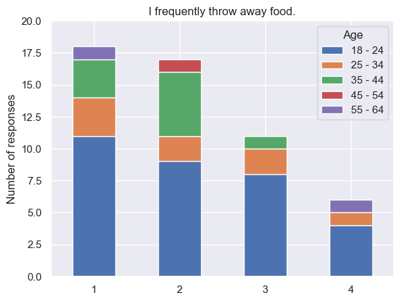
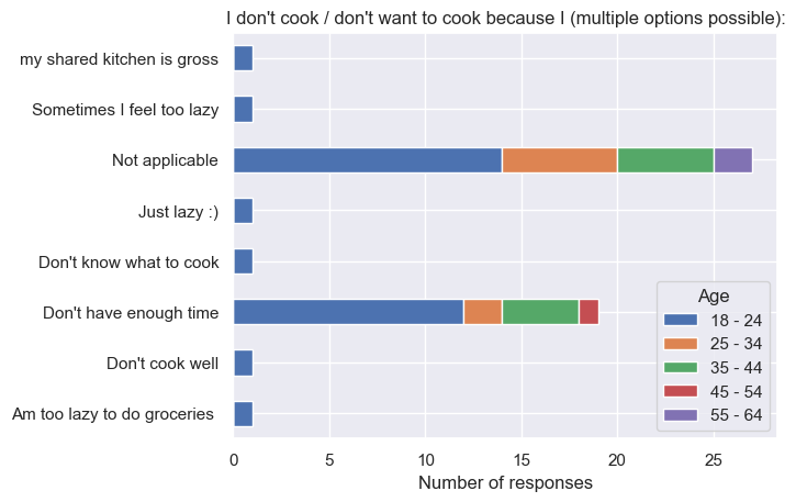
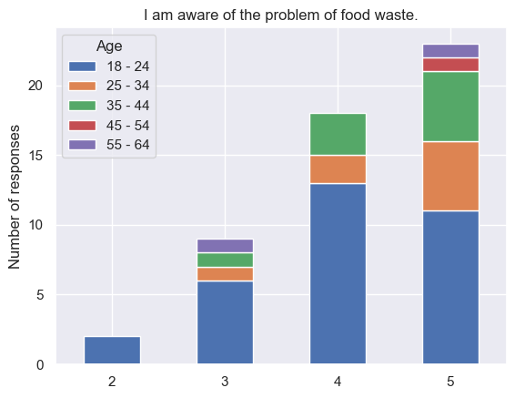
Another conclusion that can be drawn from questions 2 and 8 specifically is that there is a correlation between the amount of food waste and the awareness about food waste in general. As mentioned by <ref name=":3" />, concern about food waste is a significant factor regarding food waste reduction. To explore this hypothesis more, a | As there were participants from various age groups, it would be interesting to explore the correlation between the responses and the age of the participants. Thus, this was done for questions 2 ("I frequently throw away food."), 7 ("I don't cook / don't want to cook because I..."), and 8 ("I am aware of the problem of food waste."). The results can be seen below. <gallery widths="550" heights="385"> | ||
File:Frequency vs age.png|Plot showing correlation between food waste frequency and age (1 - Strongly Disagree, 5 - Strongly Agree). | |||
File:Dont cook vs age.png|Plot showing correlation between reasons for not cooking at home and age (1 - Strongly Disagree, 5 - Strongly Agree). | |||
File:Aware vs age.png|Plot showing correlation between food waste awareness and age (1 - Strongly Disagree, 5 - Strongly Agree). | |||
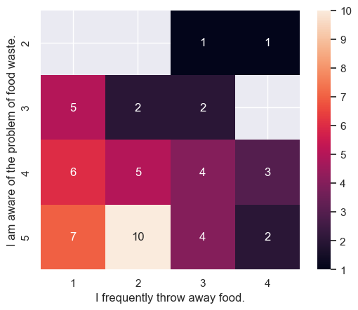
File:Heat matrix.png|Heat map showing correlation between food waste awareness and frequency (1 - Strongly Disagree, 5 - Strongly Agree). | |||
</gallery>Another conclusion that can be drawn from questions 2 and 8 specifically is that there is a correlation between the amount of food waste and the awareness about food waste in general. As mentioned by <ref name=":3" />, concern about food waste is a significant factor regarding food waste reduction. To explore this hypothesis more, a heat map was created. The horizontal axis represents the responses to the statement “I frequently throw away food,” and the vertical axis represents the responses to the statement “I am aware of the problem of food waste.” The numbers on the heat map indicate the number of people who have selected a specific answer. As can be seen, the respondents who answered 1 or 2 (Strongly Disagree and Disagree, respectively) are highly aware of the food waste problem with scores of 4 and 5 (Agree and Strongly Agree, respectively). Also, as can be noted, the number of respondents who are aware of food waste but still throw away food frequently is significantly less. Therefore, one of the strategies for reducing food waste could be raising awareness about food waste among the public. More specifically, the users can be informed about food waste via a dedicated info tab in the mobile application. | |||
Lastly, the information collected via a survey is limited and does not provide the full picture of the causes of food waste and food-related habits. Thus, further investigation in the form of interviews is required. | Lastly, the information collected via a survey is limited and does not provide the full picture of the causes of food waste and food-related habits. Thus, further investigation in the form of interviews is required. | ||
=== Interview === | === Interview === | ||
==== Interview setup and methodology ==== | ==== Interview setup and methodology ==== | ||
For the interview study, 10 participants were recruited, taking into consideration that different groups have different reasons to waste food <ref name=":6">O’Connor, P., & Nguyen, T. ( | For the interview study, 10 participants were recruited, taking into consideration that different groups have different reasons to waste food <ref name=":6">O’Connor, P., & Nguyen, T. (2023, October 12). ''We found 3 types of food wasters, which one are you?'' The Conversation. http://theconversation.com/we-found-3-types-of-food-wasters-which-one-are-you-214482</ref>. With that in mind, during recruiting it was made sure that all the groups were represented by at least one participant. An ERB form was used and approved by the teachers of this course and participants signed a consent form. In the transcription, the interviewees’ names are anonymized to increase confidentiality. The interviews we conducted provided many insights which are summarized in this short essay. | ||
For the process of conducting the interviews, the participants were interviewed 1 on 1 and recorded. The recording was eventually transcribed and the most important findings were highlighted based on relevance to the app, relevance to the literature, and how much the participants stressed the point. After this, all these highlights were converted to sticky notes and put into one big MIRO board. Using an Affinity Diagram process the notes were then clustered by theme. Using the clusters together with discussions within the team these findings were concluded. Later based on these findings, a MOSCOW requirement list was made. | For the process of conducting the interviews, the participants were interviewed 1 on 1 and recorded. The recording was eventually transcribed and the most important findings were highlighted based on relevance to the app, relevance to the literature, and how much the participants stressed the point. After this, all these highlights were converted to sticky notes and put into one big MIRO board. Using an Affinity Diagram process the notes were then clustered by theme. Using the clusters together with discussions within the team these findings were concluded. Later based on these findings, a MOSCOW requirement list was made. | ||
| Line 426: | Line 437: | ||
Firstly, when discussing incentives for individuals to use the app, it was obvious that while many users appreciated discounts and rewards offered by large retailers, there were also individuals who were primarily interested in the app's core functionality. This suggested that a one-size-fits-all approach to incentivizing may not be optimal and that offering different features for different user preferences could enhance overall satisfaction. | Firstly, when discussing incentives for individuals to use the app, it was obvious that while many users appreciated discounts and rewards offered by large retailers, there were also individuals who were primarily interested in the app's core functionality. This suggested that a one-size-fits-all approach to incentivizing may not be optimal and that offering different features for different user preferences could enhance overall satisfaction. | ||
Health-related features garnered significant interest among participants, especially those focused on the tracking of calories and nutritional analysis. Users expressed a desire to monitor their dietary habits and track changes over time, reflecting a growing awareness of the importance of healthy eating habits. This underscored the potential for the app to serve as a valuable tool for promoting wellness and facilitating behavior change besides aiding in the mitigation of food waste. The combination of these two elements is especially fitting since the data health statistics required (like | Health-related features garnered significant interest among participants, especially those focused on the tracking of calories and nutritional analysis. Users expressed a desire to monitor their dietary habits and track changes over time, reflecting a growing awareness of the importance of healthy eating habits. This underscored the potential for the app to serve as a valuable tool for promoting wellness and facilitating behavior change besides aiding in the mitigation of food waste. The combination of these two elements is especially fitting since the data health statistics required (like calorie tracking) could automatically become available by using the app for saving food, no other additional inputs could be required. Some participants underlined the importance that the statistics should be very clear whether your eating habits have improved compared to your eating habits in the recent past: ''“Did I make some progress in being more healthy or is it going the wrong direction?”'' (transcription). | ||
Concerns about food waste emerged as a notable issue, with users displaying frustration over portion sizes and the obligation to purchase some items in bulk. Many felt that current cooking practices were out of sync with actual consumption needs, which highlighted an opportunity for the app to provide guidance on portion control and meal planning. Also, users wanted features like expiry date notifications and inventory management tools to help minimize waste and optimize food usage. | Concerns about food waste emerged as a notable issue, with users displaying frustration over portion sizes and the obligation to purchase some items in bulk. Many felt that current cooking practices were out of sync with actual consumption needs, which highlighted an opportunity for the app to provide guidance on portion control and meal planning. Also, users wanted features like expiry date notifications and inventory management tools to help minimize waste and optimize food usage. | ||
| Line 444: | Line 455: | ||
Educational content was welcomed by most users, although they preferred it to be presented in a subtle and optional manner within the app. This highlighted the importance of striking a balance between providing valuable information and allowing users to engage with the content on their own terms. | Educational content was welcomed by most users, although they preferred it to be presented in a subtle and optional manner within the app. This highlighted the importance of striking a balance between providing valuable information and allowing users to engage with the content on their own terms. | ||
When it came to participants’ perspectives of their own food waste contributions, the majority believed their individual impact on food waste was minimal. There were very few who acknowledged their likely role in contributing to the issue, a trend also observed in the survey results. This diversity of opinions highlighted varying levels of awareness and responsibility among users regarding food waste in general, indicating a need for educational initiatives even more within the app to promote mindful consumption and reduce waste. But even more specifically participant are likely ignorant about their own personal food waste. When all participants assume they don't waste any food it does not match up with the statistics from the literature. When they are asked to motivate their answer, the response often is that they don't recall throwing stuff away. This however is more likely due to them not perceiving throwing the food away as very significant at the time. This might be an opportunity for a statistics function in the app that tracks the amount of food wasted to point out to the users what their contribution is to the problem. It could compare the users to one another and give feedback on their behavior by telling them whether they are doing well. This could give them a sense of responsibility for doing their part which is important in the problem of food waste <ref | When it came to participants’ perspectives of their own food waste contributions, the majority believed their individual impact on food waste was minimal. There were very few who acknowledged their likely role in contributing to the issue, a trend also observed in the survey results. This diversity of opinions highlighted varying levels of awareness and responsibility among users regarding food waste in general, indicating a need for educational initiatives even more within the app to promote mindful consumption and reduce waste. But even more specifically participant are likely ignorant about their own personal food waste. When all participants assume they don't waste any food it does not match up with the statistics from the literature. When they are asked to motivate their answer, the response often is that they don't recall throwing stuff away. This however is more likely due to them not perceiving throwing the food away as very significant at the time. This might be an opportunity for a statistics function in the app that tracks the amount of food wasted to point out to the users what their contribution is to the problem. It could compare the users to one another and give feedback on their behavior by telling them whether they are doing well. This could give them a sense of responsibility for doing their part which is important in the problem of food waste <ref name=":7" />. This interaction could also give the user a sense of empowerment as the results in personal food waste of their actions will become evident, which is important according to the CEASE framework<ref name=":8" />. | ||
Participants also noted that sometimes they would cook recipes with other ingredients if a certain ingredient was not available. A function in the app that shows possible substitute ingredients for the recipe would be a nice addition to aid this which some participants even suggested their selves during the interviews. | Participants also noted that sometimes they would cook recipes with other ingredients if a certain ingredient was not available. A function in the app that shows possible substitute ingredients for the recipe would be a nice addition to aid this which some participants even suggested their selves during the interviews. | ||
[[File:Fridge 1 Mockup.png|thumb|Fridge 1 Mockup]] | [[File:Fridge 1 Mockup.png|thumb|Fridge 1 Mockup.]] | ||
| Line 453: | Line 464: | ||
The desire for the app to keep track of users’ progress in the app was evident among participants, albeit with mixed opinions. While some users expressed interest in monitoring their progress and behavior over time, others were more reserved about sharing personal data. This highlighted the importance of providing users with control over their data and ensuring transparency in how statistics are collected, stored, and presented within the app. | The desire for the app to keep track of users’ progress in the app was evident among participants, albeit with mixed opinions. While some users expressed interest in monitoring their progress and behavior over time, others were more reserved about sharing personal data. This highlighted the importance of providing users with control over their data and ensuring transparency in how statistics are collected, stored, and presented within the app. | ||
To increase efficiency even more and have more ease of use the app could make use of an expiry date prediction model. A participant also noted that the app could show the effects on expiry date storing food in different places (shelf, fridge, and freezer) as they would age differently. Also, with some participants there seemed to be a need to know not only when something is still edible but also when something is fresh (optimally tasty) since these two things are not the same. However considering the | To increase efficiency even more and have more ease of use the app could make use of an expiry date prediction model. A participant also noted that the app could show the effects on expiry date storing food in different places (shelf, fridge, and freezer) as they would age differently. Also, with some participants there seemed to be a need to know not only when something is still edible but also when something is fresh (optimally tasty) since these two things are not the same. However considering the time frame for the development of the app, these will more likely become an implementation for the future. For now, a more feasible way to enhance efficiency would be to have a tutorial the very first time starting the app. | ||
Lastly, app design feedback from participants offered valuable insights into their preferences and expectations. Users favored a minimalist approach that emphasized simplicity and clarity in design elements. They appreciated interfaces free from loads of information, instead opting for clean layouts that prioritize essential information without overwhelming visuals. Additionally, participants highlighted the importance of intuitive navigation, emphasizing the need for user-friendly interactions that facilitate effortless engagement with the app's features. | Lastly, app design feedback from participants offered valuable insights into their preferences and expectations. Users favored a minimalist approach that emphasized simplicity and clarity in design elements. They appreciated interfaces free from loads of information, instead opting for clean layouts that prioritize essential information without overwhelming visuals. Additionally, participants highlighted the importance of intuitive navigation, emphasizing the need for user-friendly interactions that facilitate effortless engagement with the app's features. | ||
| Line 471: | Line 482: | ||
With the goal of designing an interface that is intuitive, clear, efficient, and has a pleasant user experience for the virtual fridge, three mockups were produced and evaluated during the interviews. | With the goal of designing an interface that is intuitive, clear, efficient, and has a pleasant user experience for the virtual fridge, three mockups were produced and evaluated during the interviews. | ||
The first mockup was very graphical. Realistic PNG images with a transparent background were used for the food. The food was placed into an actual fridge. Health bars would indicate how long the food had before it would expire. Food is sorted by expiry date with the smallest expiration time on top. This interface does not make use of text. The idea is that because of it would be intuitive and in one eyesight you can see all the information you need.[[File:Fridge 2 Mockup.png|thumb|Fridge 2 Mockup]] | The first mockup was very graphical. Realistic PNG images with a transparent background were used for the food. The food was placed into an actual fridge. Health bars would indicate how long the food had before it would expire. Food is sorted by expiry date with the smallest expiration time on top. This interface does not make use of text. The idea is that because of it would be intuitive and in one eyesight you can see all the information you need.[[File:Fridge 2 Mockup.png|thumb|Fridge 2 Mockup.]] | ||
The second mockup represents more kind of the interface of an advanced list. Color coding would have to convey the expiration time left fairly easily. The images of the food were made in pixel art, this would support the idea of gamification <ref>Goethe, O. (2019). Visual | The second mockup represents more kind of the interface of an advanced list. Color coding would have to convey the expiration time left fairly easily. The images of the food were made in pixel art, this would support the idea of gamification <ref>Goethe, O. (2019). Visual aesthetics in games and gamification. In O. Goethe, ''Gamification Mindset'' (pp. 85–92). Springer International Publishing. https://doi.org/10.1007/978-3-030-11078-9_8</ref>. | ||
| Line 482: | Line 493: | ||
The eventual findings were that the ideal virtual fridge interface would be a combination of elements from the three mockups. From Figure 4 having it look like an actual fridge would be good was the main takeaway since people liked how it looked and thought it was intuitive. This might be a bit hard to implement development-wise and it has more impact on the user experience than functionality, so it does not have the highest priority. The color coding and expiry date made it most clear in Figure 5. And the high-quality pictures from Figure 6 were liked. | The eventual findings were that the ideal virtual fridge interface would be a combination of elements from the three mockups. From Figure 4 having it look like an actual fridge would be good was the main takeaway since people liked how it looked and thought it was intuitive. This might be a bit hard to implement development-wise and it has more impact on the user experience than functionality, so it does not have the highest priority. The color coding and expiry date made it most clear in Figure 5. And the high-quality pictures from Figure 6 were liked. | ||
[[File:Fridge 3 Mockup.png|thumb|Fridge 3 Mockup]] | [[File:Fridge 3 Mockup.png|thumb|Fridge 3 Mockup.]] | ||
Overall, users described their ideal app as reliable, user-friendly, and visually appealing, with a focus on functionality and efficiency. They emphasized the importance of features that help them save time, reduce waste, and improve their cooking habits, while also allowing for customization and learning opportunities. By incorporating these insights into the app's design and development process, developers can create a platform that meets the diverse needs and preferences of users, ultimately enhancing their overall experience and satisfaction. | Overall, users described their ideal app as reliable, user-friendly, and visually appealing, with a focus on functionality and efficiency. They emphasized the importance of features that help them save time, reduce waste, and improve their cooking habits, while also allowing for customization and learning opportunities. By incorporating these insights into the app's design and development process, developers can create a platform that meets the diverse needs and preferences of users, ultimately enhancing their overall experience and satisfaction. | ||
| Line 531: | Line 542: | ||
The user interface of the app was designed in Figma, a powerful tool for wireframe and interface design and one of the industry standards for UI designers and frontend developers. The research team included some design options in the survey, which included the login screens below and also some AI generated layouts for the inventory page. The most liked designs from the survey participants turned out to be the login screen we designed and list layouts for the ingredients. Hence, these were taken into consideration during the design process. Some of the initial designs are shown below in this section, however, as it may be noticed, not all pages of the app had a design. This is because, due to the time constraints of the project, it was often more time efficient to immediately design the pages in XML in Android Studio itself. However, this process was not always effective, as the app had to be completely redesigned multiple times (which meant changing the color and style of every single component for example) because it did not end up looking professional or put-together enough. This could have been avoided if we had more time to create actual design variations before jumping into implementation, nonetheless, we managed to deliver a satisfactory final look. | The user interface of the app was designed in Figma, a powerful tool for wireframe and interface design and one of the industry standards for UI designers and frontend developers. The research team included some design options in the survey, which included the login screens below and also some AI generated layouts for the inventory page. The most liked designs from the survey participants turned out to be the login screen we designed and list layouts for the ingredients. Hence, these were taken into consideration during the design process. Some of the initial designs are shown below in this section, however, as it may be noticed, not all pages of the app had a design. This is because, due to the time constraints of the project, it was often more time efficient to immediately design the pages in XML in Android Studio itself. However, this process was not always effective, as the app had to be completely redesigned multiple times (which meant changing the color and style of every single component for example) because it did not end up looking professional or put-together enough. This could have been avoided if we had more time to create actual design variations before jumping into implementation, nonetheless, we managed to deliver a satisfactory final look. | ||
We generated our broccoli mascot figure with the help of Microsoft Copilot AI, though we indeed had the idea of a | We generated our broccoli mascot figure with the help of Microsoft Copilot AI, though we indeed had the idea of a broccoli-man beforehand. We received multiple satisfactory results which we tweaked further until we got the alternative below, which we thought would be the best option. | ||
[[File:Mascot.jpg|none|thumb|Mascot]] | [[File:Mascot.jpg|none|thumb|Mascot.]] | ||
Below the initial designs for the Login and Signup pages are shown. The first idea was to use a dark green primary color and to match the secondary colors such as buttons to the dominant green used in our mascot figure.[[File:Login and signup.png|none|thumb|498x498px|Login and Signup]] | Below the initial designs for the Login and Signup pages are shown. The first idea was to use a dark green primary color and to match the secondary colors such as buttons to the dominant green used in our mascot figure.[[File:Login and signup.png|none|thumb|498x498px|Login and Signup.]] | ||
On the Inventory and Recipe page designs, it can be seen that slightly different greens and font styles were tried out, in order to experiment with various looks. Thanks to previous UI design experience, two different fonts were chosen for the app: one heavier and interesting font for the headers and other important text and a simple, well-readable font for all other text. A placeholder image depicting our mascot in black and white in case of missing recipe images was also designed from the start and later used in the app.[[File:Invandrecipes.png|none|thumb|842x842px|Inventory page (left) and Recipes page (right)]] | On the Inventory and Recipe page designs, it can be seen that slightly different greens and font styles were tried out, in order to experiment with various looks. Thanks to previous UI design experience, two different fonts were chosen for the app: one heavier and interesting font for the headers and other important text and a simple, well-readable font for all other text. A placeholder image depicting our mascot in black and white in case of missing recipe images was also designed from the start and later used in the app.[[File:Invandrecipes.png|none|thumb|842x842px|Inventory page (left) and Recipes page (right).]] | ||
On the image below, the general look of all popup dialogs is shown. This was later altered in changing the radius of the corners and the buttons were also redesigned, however, this initial design served as a great starting point for all dialogs, which was useful as we chose to heavily use popup dialogs as means of interaction. | On the image below, the general look of all popup dialogs is shown. This was later altered in changing the radius of the corners and the buttons were also redesigned, however, this initial design served as a great starting point for all dialogs, which was useful as we chose to heavily use popup dialogs as means of interaction. | ||
[[File:Popup.png|none|thumb|General popup dialog]] | [[File:Popup.png|none|thumb|General popup dialog.]] | ||
=== UI Design - iterations === | === UI Design - iterations === | ||
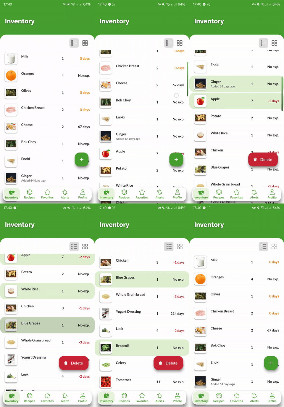
The most difficult part of the design process was undoubtedly choosing the most fitting color scheme for the app, and it took several iterations to get the best results. In the first few versions of the app, a dark green was chosen as primary color, mainly because the initial Login and Signup pages were designed with a dark green accent, so the idea was to match the app to these pages. Apart from the primary color, the layout of the main header and the page content for the app pages posed another great challenge, as this layout was used on every page for consistency, hence it was an important visual feature of the app. | The most difficult part of the design process was undoubtedly choosing the most fitting color scheme for the app, and it took several iterations to get the best results. In the first few versions of the app, a dark green was chosen as primary color, mainly because the initial Login and Signup pages were designed with a dark green accent, so the idea was to match the app to these pages. Apart from the primary color, the layout of the main header and the page content for the app pages posed another great challenge, as this layout was used on every page for consistency, hence it was an important visual feature of the app. | ||
==== Iteration 1 - dark green with small header ==== | ==== Iteration 1 - dark green with small header ==== | ||
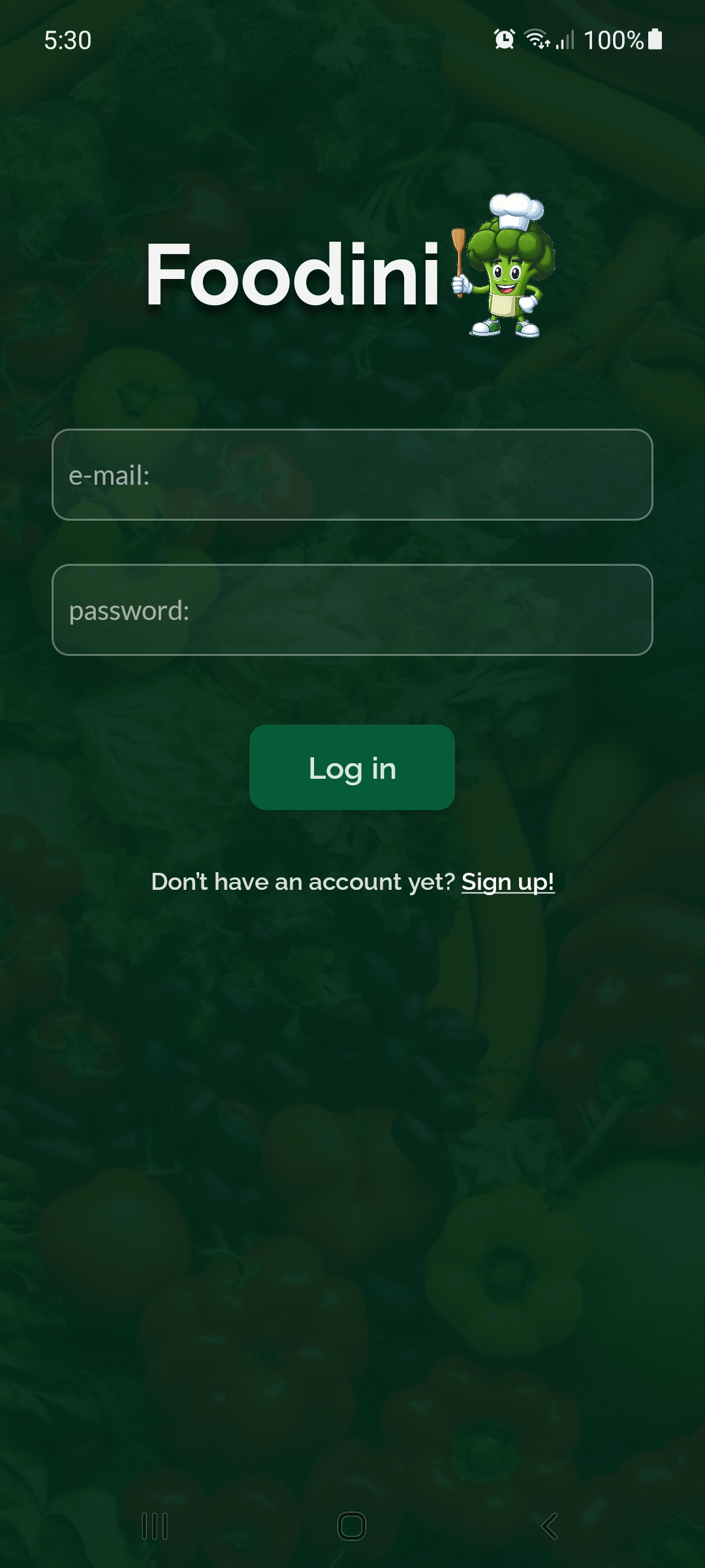
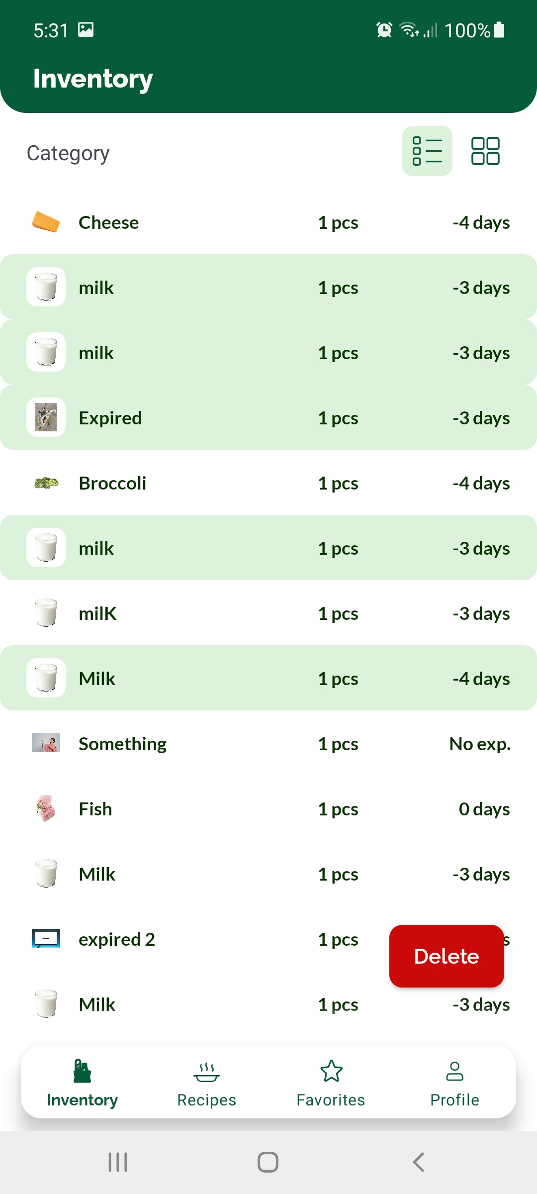
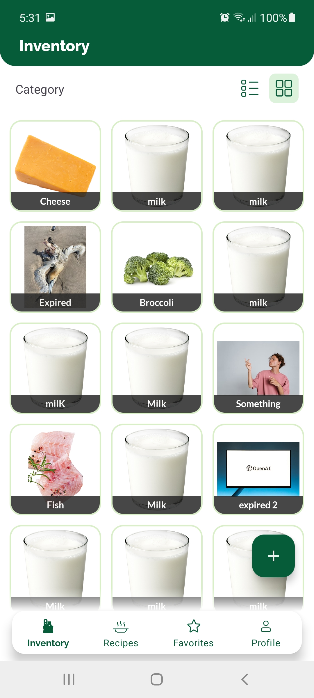
In the first version of the app the login and signup screens were slightly redesigned, with | In the first version of the app the login and signup screens were slightly redesigned, with stylish opaque-effect input boxes and larger buttons. The header on the app pages was quite small in this phase, and the primary color was dark green. An interesting design choice was to use a floating bottom navigation view compared to a regular bottom navigation (seen in the initial designs). The elevation and drop shadow make the menu pop out and creates a stylish look. <gallery mode="nolines" widths="300" heights="667" perrow="3" caption="Iteration 1"> | ||
File:Login small redesign.jpg|Login page 1st version | File:Login small redesign.jpg|Login page 1st version | ||
File:Inventory first.jpg|Inventory list view 1st version | File:Inventory first.jpg|Inventory list view 1st version | ||
| Line 555: | Line 566: | ||
==== Iteration 2 - Green gradient with large header and dark green primary ==== | ==== Iteration 2 - Green gradient with large header and dark green primary ==== | ||
In the second phase of the app, the headers were replaced and the new style was a larger header with a green gradient background. The larger header style turned out to be a better look compared to the previous version, so the size was kept in later iterations. The gradient on the other hand introduced the issue that looking at the same gradient on each page header felt heavy on the eye, but changing the gradient color scheme for each specific page would have introduced a lot of color clash and visual clutter. The inventory items were made into a card view with an elevation effect.[[File:Gradient.png|none|thumb|Iteration 2 - Inventory page]] | In the second phase of the app, the headers were replaced and the new style was a larger header with a green gradient background. The larger header style turned out to be a better look compared to the previous version, so the size was kept in later iterations. The gradient on the other hand introduced the issue that looking at the same gradient on each page header felt heavy on the eye, but changing the gradient color scheme for each specific page would have introduced a lot of color clash and visual clutter. The inventory items were made into a card view with an elevation effect.[[File:Gradient.png|none|thumb|Iteration 2 - Inventory page.]] | ||
==== Iteration 3 - Dark green with large header ==== | ==== Iteration 3 - Dark green with large header ==== | ||
The 3rd iteration was a stable one for our app, as it was used for longest time without being replaced. Here the dark green returned in the headers and it seemed that the larger header style matched well with the color choice. On image | The 3rd iteration was a stable one for our app, as it was used for longest time without being replaced. Here the dark green returned in the headers and it seemed that the larger header style matched well with the color choice. On the image below is a full overview of the app at the time of week 5-6 of the project. An important design decision we took at this point was to color code the days till expiry text on the inventory items such that items with no expiry or that expire later than today have no color, those that expire today have an orange color and those that expired have a red color. This idea was reinforced by the participants of our surveys as well. At this point, the rounded corners, button styles and elevation effects were used consistently, creating a modern UI which followed Android's [https://m3.material.io/ Material 3 guidelines]. An extra green highlight was added to the selected bottom menu item (the page the user is on) to make it more noticeable. [[File:Mankadesign4.png|thumb|1285x1285px|Iteration 3 overview. |none]] | ||
==== Iteration 4 (final iteration) - Light green with large headers and login redesign ==== | ==== Iteration 4 (final iteration) - Light green with large headers and login redesign ==== | ||
In week 7 of development, the app went through a final transformation, by replacing the dark green with a much brighter green. Our reasoning was that the dark green made the app feel too heavy and it did not convey the idea of freshness as the actual purpose of the app would have required it to. Changing to a lighter green resolved this issue perfectly and resulted in a much more positive looking UI. Even though this meant that the login and signup pages had to be redesigned to match the new green, it was a positive decision and it was worth the effort. Additional changes included the addition of the advanced filters popup and the redesign of the profile page such that users are able to input | In week 7 of development, the app went through a final transformation, by replacing the dark green with a much brighter green. Our reasoning was that the dark green made the app feel too heavy and it did not convey the idea of freshness as the actual purpose of the app would have required it to. Changing to a lighter green resolved this issue perfectly and resulted in a much more positive looking UI. Even though this meant that the login and signup pages had to be redesigned to match the new green, it was a positive decision and it was worth the effort. Additional changes included the addition of the advanced filters popup and the redesign of the profile page such that users are able to input excluded ingredients and intolerances there. A final redesign of ingredient items was also done, by removing the card view but keeping elevation on the ingredient items so that when the user switches to grid view, the design of the pictures follows the same style. The final color scheme and the final looks can be seen below. | ||
[[File:Color swatch.png|none|thumb|457x457px|Final color scheme.]] | |||
<gallery mode="nolines" widths=" | <gallery mode="nolines" widths="200" heights="450" perrow="6" caption="Iteration 4 - final"> | ||
File:Screenshot 20240329-224747 Foodini.jpg|Login page final | File:Screenshot 20240329-224747 Foodini.jpg|Login page final | ||
File:Screenshot 20240329-225712 Foodini.jpg|Inventory list final | File:Screenshot 20240329-225712 Foodini.jpg|Inventory list final | ||
| Line 573: | Line 586: | ||
==== Icon choices ==== | ==== Icon choices ==== | ||
Icons are a very determining part of an app UI, as they are a fundamental part of displays. A good display should convey information non-ambiguously, and that means that in the best scenario, it has a well readable, well understandable and informative text, coupled with an image or icon that represents the action/warning/display message straightforwardly. Accordingly, icons were chosen with great care for our app and much like the actual UI, they went through several replacements until the best ones were chosen. An example of this process can be seen on image | Icons are a very determining part of an app UI, as they are a fundamental part of displays. A good display should convey information non-ambiguously, and that means that in the best scenario, it has a well readable, well understandable and informative text, coupled with an image or icon that represents the action/warning/display message straightforwardly. Accordingly, icons were chosen with great care for our app and much like the actual UI, they went through several replacements until the best ones were chosen. An example of this process can be seen on the image below where, for example, the inventory icons, recipe icons, star icons and bell icons all have multiple variations shown. For instance, the inventory icon was switched from a bag holding some food items to a basket with a checkbox, where the latter better represents the idea of "food that is present at home", and it is better recognizable. Of course, the color of the icons were matched with the UI of the app, such as the alert icons on the bottom right which have the same red and orange color that is used in the inventory page for the color codes of expiration dates. [[File:Icons.png|none|thumb|755x755px|Icons.]] | ||
=== Frontend Development === | === Frontend Development === | ||
The development the UI and interactions of the app was done using XML for the layouts and views and Java for the logic of navigation and interactivity. An overview of the fragments can be seen in the next section. An important technical choice we made was to use Android's RecyclerView component for displaying all of the item lists in the app (ingredients, recipes). This was for two reasons. First, this technology allows for seamless switching between a list and a grid view, which is exactly what we needed for the | The development the UI and interactions of the app was done using XML for the layouts and views and Java for the logic of navigation and interactivity. An overview of the fragments can be seen in the next section. An important technical choice we made was to use Android's RecyclerView component for displaying all of the item lists in the app (ingredients, recipes). This was for two reasons. First, this technology allows for seamless switching between a list and a grid view, which is exactly what we needed for the Inventory page. Second, RecylerView is the most memory-efficient component for the task of list rendering, as it literally recycles the views of data objects instead of rendering a new view per object<ref>''Create dynamic lists with RecyclerView | Views''. (n.d.). Android Developers. Retrieved April 10, 2024, from https://developer.android.com/develop/ui/views/layout/recyclerview</ref>. In practice, this means that as the user scrolls down a list, items that are further down inherit the views of items that are further up on the list, essentially rendering only a few actual views on the screen at all times, and repopulating them with different data. While this technology is very efficient, it also comes with some side-effects, like a mix-up of object data for items that "share" the same view. During development we fixed all of these little issues with the help of research. | ||
==== Gesture vs Soft-key navigation ==== | ==== Gesture vs Soft-key navigation ==== | ||
| Line 585: | Line 598: | ||
==== Reactive feedback & animations ==== | ==== Reactive feedback & animations ==== | ||
In order to keep the user experience smooth, interactive and reactive, we made sure to always include highlights, transitions, animations etc., to make sure the user | In order to keep the user experience smooth, interactive and reactive, we made sure to always include highlights, transitions, animations etc., to make sure the user receives useful feedback about their actions. For instance, when tapping on a button, option or editable field, the element is highlighted on click. On the Inventory page RecyclerView's in-built animation provided a nice transition for switching between list and grid views. Transition animations were added for fragments that relate to the same parent fragment, such as between the main recipes page and the recipe show page or between the profile page and the food waste info page. For visual appeal and satisfying feedback, an external library was used to achieve push-down effect on the intolerance buttons on the profile page. These can be seen in the gifs below. <gallery mode="nolines" widths="300" heights="667" perrow="3" caption="Transitions and animations"> | ||
File:Screen Recording 20240329-230810 Foodini (MConverter.eu).gif|Switching between list and grid view | File:Screen Recording 20240329-230810 Foodini (MConverter.eu).gif|Switching between list and grid view | ||
File:Transitions (MConverter.eu).gif|Fragment transitions | File:Transitions (MConverter.eu).gif|Fragment transitions | ||
| Line 593: | Line 606: | ||
== App Overview == | == App Overview == | ||
The app consists of five main pages: Inventory page, Recipes page, Favorites page, Alerts page and Profile page. In this section we will show all pages and go through all actions that are possible within the app. Furthermore, we convey our thinking process by explaining the decisions we took for each page, component or action. | The app consists of five main pages: Inventory page, Recipes page, Favorites page, Alerts page and Profile page. In this section we will show all pages and go through all actions that are possible within the app. Furthermore, we convey our thinking process by explaining the decisions we took for each page, component or action. | ||
[https://tuenl-my.sharepoint.com/:v:/g/personal/y_h_cheung_student_tue_nl/EeHQThTC8ehKu6LyldTt5twBAoq4EkbRHDaJsqJ_WhKAsg?nav=eyJyZWZlcnJhbEluZm8iOnsicmVmZXJyYWxBcHAiOiJPbmVEcml2ZUZvckJ1c2luZXNzIiwicmVmZXJyYWxBcHBQbGF0Zm9ybSI6IldlYiIsInJlZmVycmFsTW9kZSI6InZpZXciLCJyZWZlcnJhbFZpZXciOiJNeUZpbGVzTGlua0NvcHkifX0&e=ixWmKM Here is a video demonstrating the app. (3:34)] | |||
[https://tuenl-my.sharepoint.com/:f:/g/personal/y_h_cheung_student_tue_nl/Esi6QtoCPEVFh2pX571PqFMBe261RH4wONXz9RHpx9Artw?e=H4oCfe Link to app builds .apk files] | |||
=== Sign up and Sign in Fragments === | === Sign up and Sign in Fragments === | ||
<div style="display:flex;"> | <div style="display:flex;"> | ||
[[File:Signup.gif|none|thumb|Sign Up|200px]] | [[File:Signup.gif|none|thumb|Sign Up.|200px]] | ||
[[File:Log in.gif|none|thumb|Sign In|200px]] | [[File:Log in.gif|none|thumb|Sign In.|200px]] | ||
[[File:Anonymous sign in.gif|none|thumb|Anonymous sign in|200px]] | [[File:Anonymous sign in.gif|none|thumb|Anonymous sign in.|200px]] | ||
[[File:Sign out.gif|none|thumb|Sign Out|200px]] | [[File:Sign out.gif|none|thumb|Sign Out.|200px]] | ||
</div> | </div> | ||
==== Actions ==== | ==== Actions ==== | ||
| Line 609: | Line 626: | ||
=== Inventory Fragment === | === Inventory Fragment === | ||
<div style="display:flex;"> | <div style="display:flex;"> | ||
[[File:Add ingredient.gif|none|thumb|Add Ingredient|200px]] | [[File:Add ingredient.gif|none|thumb|Add Ingredient.|200px]] | ||
[[File:Edit ingredient.gif|none|thumb|Edit Ingredient|200px]] | [[File:Edit ingredient.gif|none|thumb|Edit Ingredient.|200px]] | ||
[[File:Change view.gif|none|thumb|Change View|200px]] | [[File:Change view.gif|none|thumb|Change View.|200px]] | ||
[[File:Batch delete.gif|none|thumb|Batch delete|200px]] | [[File:Batch delete.gif|none|thumb|Batch delete.|200px]] | ||
</div> | </div> | ||
==== Actions ==== | ==== Actions ==== | ||
| Line 633: | Line 650: | ||
=== Recipe Fragment === | === Recipe Fragment === | ||
<div style="display:flex;"> | <div style="display:flex;"> | ||
[[File:Change amount shown.gif|none|thumb|Change amount of recipes shown|200px]] | [[File:Change amount shown.gif|none|thumb|Change amount of recipes shown.|200px]] | ||
[[File:Advanced search.gif|none|thumb|Advanced Search|200px]] | [[File:Advanced search.gif|none|thumb|Advanced Search.|200px]] | ||
[[File:Show recipe.gif|none|thumb|Show recipe|200px]] | [[File:Show recipe.gif|none|thumb|Show recipe.|200px]] | ||
[[File:Scroll recipes.gif|none|thumb|Scroll through recipes|200px]] | [[File:Scroll recipes.gif|none|thumb|Scroll through recipes.|200px]] | ||
</div> | </div> | ||
==== Actions ==== | ==== Actions ==== | ||
| Line 643: | Line 660: | ||
The recipes can be tapped on. Once tapped, the a recipe page will show up. The recipe page shows the cook time, cuisine, ingredients (ingredients in your possession have a checkmark), and instructions on how to make the recipe. | The recipes can be tapped on. Once tapped, the a recipe page will show up. The recipe page shows the cook time, cuisine, ingredients (ingredients in your possession have a checkmark), and instructions on how to make the recipe. | ||
On the recipe page itself there are three actions. You can view the webpage of the recipe, in case our instructions differ from what was the original. You can cook a meal, which subtracts the ingredients from your | On the recipe page itself there are three actions. You can view the webpage of the recipe by clicking on the link button, in case our instructions differ from what was the original. You can cook a meal, which subtracts the required amount of ingredients from your inventory (this feature has its limits due to time constraints). Lastly, you can add a recipe to your favorites for later. | ||
==== Decisions ==== | ==== Decisions ==== | ||
| Line 650: | Line 667: | ||
=== Favorites Fragment === | === Favorites Fragment === | ||
<div style="display:flex;"> | <div style="display:flex;"> | ||
[[File:Add to favorites.gif|none|thumb|Add to favorites|200px]] | [[File:Add to favorites.gif|none|thumb|Add to favorites.|200px]] | ||
[[File: | [[File:Remove from favorites.gif|none|thumb|Remove from favorites.|200px]] | ||
</div> | </div> | ||
| Line 662: | Line 679: | ||
=== Alerts Fragment === | === Alerts Fragment === | ||
<div style="display:flex;"> | <div style="display:flex;"> | ||
[[File:Notifications.gif|none|thumb|Notifications|200px]] | [[File:Notifications.gif|none|thumb|Notifications.|200px]] | ||
</div> | </div> | ||
| Line 670: | Line 687: | ||
=== Profile Fragment === | === Profile Fragment === | ||
<div style="display:flex;"> | <div style="display:flex;"> | ||
[[File:Intolerances.gif|none|thumb|Select intolerances and excluded ingredients|200px]] | [[File:Intolerances.gif|none|thumb|Select intolerances and excluded ingredients.|200px]] | ||
[[File:Info page.gif|none|thumb|Display information page|200px]] | [[File:Info page.gif|none|thumb|Display information page.|200px]] | ||
</div> | </div> | ||
| Line 681: | Line 698: | ||
== APIs & Back-end development == | == APIs & Back-end development == | ||
[[File:UML class diagram app.png|thumb|1202x1202px|UML Class Diagram|none]] | [[File:UML class diagram app.png|thumb|1202x1202px|UML Class Diagram.|none]]The provided class diagram offers a comprehensive overview of the application's architecture, delineating the interconnections between different classes. It encompasses numerous UI-related classes, each corresponding to distinct screens, along with other classes designated for modeling various object types. | ||
In the subsequent sections, we will delve into the individual core components depicted in the diagram, including the classes associated with Spoonacular and Pexels functionalities. The UI files will not be discussed further, as they have already been extensively detailed above. | |||
=== API === | === API === | ||
Because Firebase is mentioned below, this section will mainly focus on the APIs that were used for our images and recipes. | |||
For our final build of our application, these APIs were used: | |||
* Spoonacular<ref>''Spoonacular recipe and food API''. (n.d.). Retrieved April 11, 2024, from https://spoonacular.com/food-api/docs</ref> | |||
* Pexels<ref>''Documentation Pexels API''. (n.d.). Retrieved April 11, 2024, from https://www.pexels.com/api/documentation/</ref> | |||
Furthermore, it was deemed efficient to create an abstract class for both the Spoonacular and Pexels classes, consolidating essential HTTP GET methods. This simplified API calls within the classes and minimized code redundancy. | |||
==== Decisions ==== | ==== Decisions ==== | ||
=== | |||
===== Recipe Searching ===== | |||
We've chosen Spoonacular for the main source of a lot of the fetching because of it's flexible nature and easy to use API. However, due to the limitations to their image repository for ingredients, we've additionally opted for another source as backup in case there are issues related to either request limits or non existent images for things that are added into the inventory page. | |||
Prior to the final decision for APIs, others were tested as well: | |||
* MealDB<ref>TheMealDB. (n.d.). ''Free Meal API | TheMealDB.com''. Retrieved April 11, 2024, from https://www.themealdb.com/api.php</ref> | |||
* Edamam<ref>Ignatiev, I., & Penev, V. (n.d.). ''Recipe Search API Documentation''. Retrieved April 11, 2024, from https://developer.edamam.com/edamam-docs-recipe-api</ref> | |||
MealDB API is a simpler and potentially free option that is ideal for basic recipe data and straightforward integration. On the other hand, Spoonacular offers a more comprehensive suite of features including detailed nutritional information, meal planning, and dietary filters. While it may be more costly, Spoonacular is the better choice in our use case since it offers in-depth food data, catering to a wide variety of users. | |||
To gather a broad range of recipes, third-party APIs are utilized. However, since Spoonacular meets our needs better than Edamam in terms of coverage, it was chosen instead. Furthermore, during our experimentation of Edamam, it was discovered that ingredient searches within their API were not possible. Given our desire to display ingredient images in our app, we found that Spoonacular was better suited to our requirements. | |||
The the two classes were left in, in case we wanted to switch back to them during development. This would minimize development time since they wont need to be rewritten again. | |||
===== Ingredient Image Searching ===== | |||
As previously mentioned, Spoonacular is used for the ingredient image fetching. However during testing we've realized that in Spoonacular we have a request limit of 1 request per second, thus we've decided to used a general image repository for the ingredient as a fallback. The advantage of this is that if the user enters an ingredient into their application and the ingredient/item doesn't exist in Spoonacular, the general image repo. will take care of it. | |||
In our case, Pexels ensures comprehensive coverage and access to high-quality, royalty-free images, enhancing the user experience with diverse and visually appealing photos. This approach provides reliability and redundancy, safeguarding against potential downtimes or gaps in Spoonacular's database. | |||
=== Firebase Back-end === | |||
==== Authentication ==== | ==== Authentication ==== | ||
[[File:Firebase authentication.jpg|none|thumb| | [[File:Firebase authentication.jpg|none|thumb|Firebase Authentication.|800px]]For the log in and sign up functionality we are completely relying on Google's Firebase. As you can see each user has an userID associated with them. This is how users are distinguished within the app. | ||
==== Firestore ==== | ==== Firestore ==== | ||
[[File:Firebase Firestore.gif|none|thumb|Firebase Firestore|800px]] | [[File:Firebase Firestore.gif|none|thumb|Firebase Firestore.|800px]] | ||
The same UserID that was used for authentication is again used in the Firestore database. Firestore is a NoSQL database. | The same UserID that was used for authentication is again used in the Firestore database. Firestore is a NoSQL database. | ||
Database schema: | Database schema: | ||
| Line 715: | Line 761: | ||
==== Cloud Messaging ==== | ==== Cloud Messaging ==== | ||
<div style="display:flex;"> | <div style="display:flex;"> | ||
[[File:Firebase cloud messaging.gif|none|thumb|Foodini Server Demo|800px]] | [[File:Firebase cloud messaging.gif|none|thumb|Foodini Server Demo.|800px]] | ||
[[File:Foodini Notifcations Diagram.png|none|thumb|Foodini Notifcations Diagram|430px]] | [[File:Foodini Notifcations Diagram.png|none|thumb|Foodini Notifcations Diagram.|430px]] | ||
</div> | </div> | ||
| Line 723: | Line 769: | ||
The script iterates through all ingredients in everyone's fridge. If the item is close to expiration, it will send out a message. If it has already expired it will send out a different message. That message is received by the Google Cloud Messaging Service and forwards it in the form of a notification to the Android phone. | The script iterates through all ingredients in everyone's fridge. If the item is close to expiration, it will send out a message. If it has already expired it will send out a different message. That message is received by the Google Cloud Messaging Service and forwards it in the form of a notification to the Android phone. | ||
== Validation User Study | == Validation User Study == | ||
===== Methodology ===== | ===== Methodology ===== | ||
After a prototype version of the app was built this prototype was deployed with two main goals in mind. The first goal was to find any errors in the app which then could be | After a prototype version of the app was built this prototype was deployed with two main goals in mind. The first goal was to find any errors in the app which then could be eliminated with further iterations of the app in the future. The second goal was to validate whether the app did in fact work regarding fulfilling its purpose, namely successfully combating food waste. Two different approaches were used for the two different goals of the user study. | ||
To find any errors in the app the usability of it was tested. For this persons who have never seen Foodini before were given the prototype version of the app. Then they were tasked to perform certain actions like for example: ''“put 1L of milk in your fridge”''. The time it took the participants was measured. This way the usability and efficiency of the app was tested. When a participant does not manage to complete a certain task, this is a major indication that the usability for that task is flawed, and a redesign of the interface should be considered. | To find any errors in the app the usability of it was tested. For this persons who have never seen Foodini before were given the prototype version of the app. Then they were tasked to perform certain actions like for example: ''“put 1L of milk in your fridge”''. The time it took the participants was measured. This way the usability and efficiency of the app was tested. When a participant does not manage to complete a certain task, this is a major indication that the usability for that task is flawed, and a redesign of the interface should be considered. | ||
To test whether the app manages to combat food waste it must be measured whether users in fact change their behavior. For this study the prototype is deployed for a longer time since behavior change does not happen instantly<ref>Zenger, J. (2020, July 20). ''Why does changing behavior take so long? 3 solutions to speed up the process''. Forbes. Retrieved April 11, 2024, from https://www.forbes.com/sites/jackzenger/2020/07/21/why-does-changing-behavior-take-so-long-3-solutions-to-speed-up-the-process/ </ref>. Ideally we would measure whether the amount of wasted food decreases after the user starts using the app compared to before. However, this was unfortunately not possible because we lack certain data to do this. However another way of measuring behavior change is by using qualitative data to indicate behavior change metrics like for example: perceived usefulness. To find out what these metrics exactly are first a literature study was conducted. The results of that were used to create a questionnaire which was given to the participants after 5 days of using the prototype. | |||
===== Behavior Change Study ===== | |||
The data gathered for this study will be qualitative data with the theory of planned behavior in mind. For example target information are the attitudes, subjective norms and perceived behavioral control. | |||
The following survey was made to give to the participants after the study/5 days: [https://docs.google.com/forms/d/e/1FAIpQLSf26CfWB9FVqBi2IsTdSVVr0vPnQMyhxoAWUl3kjyXf8ZzBcA/viewform?amp;usp=embed_facebook link] | |||
After the 5 days however we discovered that due to the small amount of participants (some participants quit participation) and the small amount of time given to test the app it was better to instead of having them fill in the survey just have a small talk. Although 5 days is longer than the other user study, it is still very short for behavior change metrics<ref>Sustainable Behavior Change: Metrics, Measurements and Methods. (z.d.). In D. Dagger, B. Kok, & P. Parskey (Reds.), ''EmpowerTheUser''. https://www.etu.co/hubfs/sr/ETU_BC19_Paper-Sustainable_Behavior_Change.pdf</ref>. We discovered that most of the participants did in fact try a few new recipes with the exception of one. They did mention that they had glitches with food quantity put this was expected as we could not use the absolute final build of the app for this user study. They mentioned that because of this the app felt unreliable but if these glitches were fixed the user experience would be considered as nice. When asked about the perceived usefulness of the app the majority mentioned that they did find it useful but whether they would have the motivation to keep on using it for a longer period of time remained to be seen. For that a longer user study is required. This methodology is very unscientific, but it is still from a designer perspective useful to do since it very indicatively validates whether there is potential. | |||
===== Usability Study ===== | ===== Usability Study ===== | ||
The usability test was given to 3 participants. They were given the following task prompts and the time it took them to complete the task if they completed it was noted underneath. | |||
# Make a account | # Make a account | ||
| Line 810: | Line 860: | ||
Average time: 86 seconds | Average time: 86 seconds | ||
If you look at the average time, nothing seems to be majorly out of order. It is noticeable that the first time entering the recipes it takes a bit longer than the second and third time. The learning curve is small, since the time immediately improves the second time. The times for finding recipes are relatively long but this is also because it takes rather long to sort the recipes (which could have been the caused by the phone), so it is just loading time, not the interface of the listing of recipes. No person failed to complete a task. However it did occur that a person did not select kilogram instead of gram. Also once a person typed in the ingredients in Dutch which resulted in the wrong display of images and did not work for the recipe suggestion system. The conclusion is that the app interface is usable but things like the language could use some clarification. | |||
== Discussion == | |||
=== Limitations === | |||
'''A. Research Limitations''' | |||
The following section will describe the limitations of our research process, which was carried out to draw up the requirements for the Foodini food waste app. Thus, it will consist of six distinct sections, one for each of the different major steps we undertook as part of this process. | |||
'''1. Literature Study Limitations:''' | |||
Ultimately, our team is proud of our work on the literature study, as we examined numerous distinct sources (and thus perspectives) and focused on a range of varying topics related to our project. These were the issue of food waste generally, statistics on the issue, food waste at consumer levels, theory of planned behaviour, ways to combat food waste, and state-of-the-art solutions. Nevertheless, we still were able to identify a number of different limitations throughout the process which we will now explore. | |||
One frustrating limitation was the limited access to certain academic databases and resources. It happened at least a dozen times that our research team members would come across seemingly valuable sources, but were not able to gain access to them due to subscriptions or payments needing to be made on the host websites. This was not the biggest limitation, as we were still able to gather many valuable sources, but we undoubtedly feel that our study could have been improved had there been no such restrictions. Another significant limitation were the time constraints. Initially, we only dedicated two weeks for the literature study, though the process slightly extended into the third and fourth weeks. Despite this rather long time spent collecting data, we still felt that there were undoubtedly aspects of the problem relevant to our project that we were not able to entirely tackle. A reason for this was our prioritisation of quantity over quality during the first two weeks, which later pushed us to have to complete our writing about a lot of different relevant topics. | |||
Another relevant limitation of our study was the abundance of sources from the United States compared to European ones. Evidently, our project was primarily aimed at European markets, since this is the continent that all team members currently inhabit. Nevertheless, the United States generally does a better job of collecting data and publishing it widely, at least when it comes to the information being available in English. Consequently, we were forced to use a lot of data from the United States when this was not exactly ideal for our project. Lastly, due to our lack of extensive experience in conducting academic research, we unquestionably did not extract all of the information we could have from the sources available, though this is a limitation which could only be improved with time and practice. | |||
'''2. Interview Limitations:''' | |||
One obvious limitation of our interviews was our rather small sample size of only ten individuals. With ten people, the diversity of perspectives presented regarding our questions could not possibly represent what is there to be found in the real world, likely leading to valuable feedback on our project being lost. This issue was most likely worsened by our convenience sampling strategy, which had us mostly interview our university colleagues or family members, undoubtedly missing out on certain demographics relevant to the project. | |||
Another relevant drawback of our interview process was our likely lack of expertise and experience in creating the questions and establishing a coherent structure. During the interviews, some of our inquiries felt somewhat unnecessary, whilst others were too similar to one another. Moreover, our interview ended up having twenty-nine different questions, which made some discussions take over one hour and a half to complete for those participants giving detailed answers to every question. Consequently, this also made the processing of the data from the interviews far more time-consuming and tiring, while also slightly bothering some of the interviewees. | |||
Lastly, the fact that the interviewers knew the interviewees personally, and vice versa, could have possibly created some level of social desirability bias, where the participants felt inclined to provide positive answers as to please or not upset the interviewing peers. We did discuss this as a team, and felt that this could not have had a highly impactful effect on the interview results, but we still consider this a notable limitation for future projects. | |||
'''3. Survey Limitations:''' | |||
The survey conducted by our team also encountered several significant limitations that impacted the depth and reliability of our findings. Firstly, the most glaring limitation was the small number of participants, approximately 50 in number. Due to time constraints and limited outreach efforts, our survey garnered a smaller pool of respondents than anticipated. As a result, the sample size was insufficient to capture the full spectrum of perspectives or provide highly, statistically significant results. This limitation considerably undermined our ability to generalise our findings, as well as their reliability, which in turn limited the applicability of our conclusions to the broader population. | |||
Another critical limitation arose from the design of our survey questions. Specifically, the fact that we opted for primarily multiple-choice questions constrained the diversity and depth of the responses we obtained. By offering a limited number of answer options, we restricted participants' ability to express nuanced opinions or provide detailed insights into their experiences and perspectives. Consequently, the data collected lacked the granularity needed for a comprehensive analysis, potentially overlooking important aspects or alternative viewpoints. Notably, however, we considered this limitation and thus also carried out the interviews. | |||
Additionally, our team's own limitations played a role in shaping the shortcomings of the survey. Limited experience in survey design and methodology hindered our ability to construct questions effectively or implement appropriate sampling strategies. As beginner researchers, we may have overlooked crucial factors such as survey length, question wording, and response options, which could have influenced participant engagement and data quality. Moreover, constraints in resources and access to survey tools may have further constrained our survey's effectiveness and reach, as we used the very basic google survey software. | |||
'''4. Affinity Diagram Limitations:''' | |||
Our affinity diagram, aimed at organising feedback from the interviews and survey to derive our app requirements, encountered several significant limitations. One major challenge stemmed from the varied responses to questions posed during the interviews and survey. The diversity of opinions and perspectives made it challenging to create coherent groups of feedback, resulting in potential overlap or fragmentation of ideas within the affinity diagram. This limitation hindered the clarity and effectiveness of the diagram in identifying common themes and requirements. | |||
Another notable limitation was the difficulty in summarising in-depth survey and interview questions into concise notes suitable for the affinity diagram. The complexity of the questions and the depth of responses posed challenges in processing key insights into brief, actionable points. This limitation constrained the effectiveness of the diagram in capturing the richness of participant feedback and translating it into actionable requirements for the product being developed. | |||
Furthermore, the affinity diagram process proved to be highly time-consuming for our research team. The task of creating notes from survey and interview responses, followed by the labour-intensive process of grouping them into coherent categories, consumed significant time and effort. This time constraint posed challenges in ensuring thoroughness and accuracy in the organisation of feedback, potentially leading to oversights or rushed decisions in the diagramming process. | |||
Additionally, a further limitation was the potential for bias in the categorization process. The team members tasked with creating the diagram may have inadvertently imposed their own perspectives or biases, leading to subjective interpretations of the feedback. This could have taken place during the creation of the notes or the actual grouping. Either way, it may have resulted in misclassification or overlooking of important insights, thereby compromising the accuracy and reliability of the diagram. | |||
'''5. Requirements List Limitations:''' | |||
One significant constraint was the timing of the requirements list completion, which occurred late in the development process. Consequently, while the list influenced the app development, the evolving development process also shaped the requirements list. This dynamic interaction between development and requirement specification may have led to inconsistencies or discrepancies between the initial vision and the final product. | |||
Moreover, the inclusion of several requirements that users expressed excitement about posed a challenge due to resource limitations. For instance, features such as inputting products into the virtual inventory through QR code scanning or offering discounts from grocery stores for extended app use were deemed unfeasible with the available resources. This discrepancy between user expectations and implementation feasibility resulted in the exclusion of potentially valuable features from our requirements list, potentially impacting user satisfaction and app effectiveness. | |||
Furthermore, the requirements list inadvertently incorporated several ideas that were not directly related to the core functionality of the envisioned app. These arose during the consumer research carried out through interviews and surveys. These extra features, while innovative and appealing, may have diluted the focus of the development efforts and diverted resources away from essential functionalities, leading to a less streamlined and effective app. Nevertheless, obtaining new ideas about a project is an expected and ultimately desirable effect of carrying out consumer research, and some of the previously-overlooked functionalities that arose during the research process ended up being core features of our app. | |||
'''6. User Study Limitations:''' | |||
One significant constraint lied in the absence of a long-term assessment of behaviour change. Typically, studies aimed at assessing behaviour change require an extended duration to capture the behavioural shifts adequately. However, due to the time constraints present in our project, the study might not accurately reflect the long-term effectiveness of our app in altering user behaviour. | |||
Another notable limitation stemmed from the failure to fully incorporate the MOSCOW (Must-have, Should-have, Could-have, Won’t-have) criteria into the prototype. Our MOSCOW list served as a vital guideline for prioritising features and functionalities in the development process. One “Should Have” feature as well as all “Could Have” were not implemented in time for the final presentation, which could have decreased the value of the product in the minds of the participants of the user study. | |||
Furthermore, the homogeneity of the interview participants, all hailing from Western countries, introduced a significant bias into the study. This lack of diversity in the sample population limited the generalisability of the findings, as the perspectives and experiences of individuals from other cultural backgrounds may differ significantly. Consequently, the insights gathered from the study may not accurately represent the preferences and behaviours of a more globally diverse user base, undermining the applicability of the app's feedback and recommendations beyond Western contexts. | |||
'''B. Development Limitations:''' | |||
==== Cook feature & unit conversion ==== | |||
In the planning phase, our goal was to facilitate users in efficiently managing their inventory through the 'Cook Feature.' However, during implementation and testing, a significant obstacle emerged. The inconsistency between the ingredient names entered by users and those listed in recipes posed a challenge in selecting the correct ingredient from the inventory. This prompted us to allocate additional time to explore algorithms that could address this issue. | |||
Additionally, inconsistency in the units provided by the API posed another hurdle. Sometimes the amount attributes were accurately filled in the JSON response, while other times the quantity attribute was used instead, complicating unit conversion. Unfortunately, due to the project timeline constraints, we ultimately decided to prioritize cleaning and bug-fixing activities before the final demo. | |||
==== External API Dependency ==== | |||
We've encountered significant limitations with our current API usage. The selected APIs impose strict limits on calls, and while switching to alternatives could potentially resolve this issue, however it's costly. Nevertheless, our project has become heavily reliant on these third-party APIs, creating a substantial dependency. Additionally, since we lack control over these services, any disruptions such as server downtime or service discontinuation could render our application inoperable. | |||
One potential solution is to develop our own recipe search system. However, the primary obstacle lies in curating a high-quality repository with a diverse range of unique recipes. Given the timeframe of our project, achieving this would be impractical. | |||
' | ==== Testing ==== | ||
Due to time constraints within our course, our team prioritized implementing features and conducting user studies over writing tests. We've primarily relied on manual testing, identifying and addressing reported bugs through replication and debugging iterations. While this process has been our mainstay, it leaves room for instability and lacks robustness, particularly evident when multiple users interact simultaneously, potentially causing breakdowns in certain app functionalities due to API call limitations and inadequate fallback mechanisms. Integrating unit tests, UI tests, and integration tests would significantly enhance the stability and resilience of our application. | |||
=== Future Improvements === | |||
By the end of this course we managed to build an app with a fair amount of working functionality, and managed to deliver all of the Must Have and even some Should Have requirements from our MoSCoW list. However, there are still many improvements that could be done in this project, which we gathered in this section. | |||
==== Sorting ==== | |||
Firstly, the app would benefit from a sort function for both the ingredients in the Inventory page and the recipes. For instance, we could sort the ingredients based on their expiry date, amount, or category. Sorting based on category would separate the items into respective category groups in the list. Especially the expiry date sorting would be a useful feature for the users in the case they want to get a quick overview on what expired or is close to expiry. Sorting based on expiry date would also work for the recipes, such that recipes with the most ingredients that are close to expiry in the inventory are shown on the top. This would enable the user to cook meals that would use up the "critical" ingredients they have at home. In fact, we attempted to include this sorting function for the recipes in the app, since Spoonacular does offer this function. Unfortunately, we ran into obstacles as the ingredients used in a recipe given by Spoonacular do not exactly match the ingredients the user enters into their inventory and Spoonacular would need its own ingredient objects as input for this sort function. | |||
==== Analytics/Statistics ==== | |||
Based on the user requirements we gathered from our user research, we understood that there would be demand for a place where users could see statistics about their performance and usage, possibly even some analytics about this data. This would include personalized information on how well the user is utilizing the app, like streaks of daily use and perhaps comparisons to other users. This feature was completely out of scope for this project and it is quite advanced to implement. We did look into the option of Google Analytics services, but that would have not offered personalized information, only global information about app usage across all users. Nonetheless, it would make our app more professional and it could possibly also encourage users to waste less food if they see their own results in a summarized form. | |||
==== Reward/Point System ==== | |||
Relating to the previous point, we could also introduce a reward/point system, similar to that of Duolingo's online point system for instance. Users could earn points and bigger rewards by cooking meals that use up ingredients that are about to expire, hence wasting less food. According to our survey results, probably not all users would be interested in this, as mostly students responded that this would be fun for them, but again, it may encourage users to waste less food if they see how they compare to other users locally. Global comparisons would not be a good idea, as food waste habits vary greatly between countries. | |||
==== Food Waste Info Page ==== | |||
Our app already has a working information page about food waste. However, we thought it would be useful if the facts displayed on this page would change daily, for example by fetching them with an API, or by simply cycling through a large enough list of facts. This way, the user would get informed with new facts and might build a habit of looking into the info page often. | |||
==== Tutorial ==== | |||
Lastly, we planned to incorporate a startup tutorial into the app, in order to help first-time novice users get acquainted with the main features and actions. Preferably, this would be in the format of a click-through tutorial where the user must click through a list of explanatory popups and demos. We also thought of adding a slide of explanatory images when the user opens the app for the very first time, however, due to time constraints, we could not manage this in the end. | |||
== Summary == | |||
In summary, over the past 8 weeks, a mobile application was created that helps the user keep track of the contents of their fridge and pantry and suggest how to utilize those items in the form of recipes. The goal of the app was to reduce the amount of food waste by helping the user utilize the ingredients close to expiry. | |||
The project started with an in-depth research into the problem of food waste. Thus, the definition of food waste was established and the most common reasons for food waste at the consumer level were identified. As a next step, a user study was conducted to verify the findings of the literature study and gain insight into the technical requirements for the app. The user study consisted of two parts, namely survey and interviews. The survey results gave an insight into the problem of food waste from the consumer perspective, and a large amount of advice regarding the app design and functionality was received. However, the results of the survey did not provide the full picture of the problem. Therefore, as a next step, interviews were conducted. The participants of the interviews provided invaluable information regarding the problem of food waste as well as technical details of the app, namely design choices and functionality. Next, from the transcripts of the surveys, the most important points were selected and organized in an affinity diagram. This allowed us to structure the acquired information and identify the requirements for the app. Thus, as a next step, the final list of requirements was compiled. The requirements were arranged using a MoSCoW framework. | |||
After establishing the requirements, the requested functionality could be implemented in the app. First, for the app user interface, several UI designs were created in Figma and later implemented in the actual app. The UI design has undergone several iterations before achieving its final look. As for the functionality, the app was divided into five main sections, namely inventory, recipes, favorites, alerts, and profile pages. The inventory page of the app contains the items available in the household, as well as their quantity and expiry date. The recipes page suggests recipes based on the contents of the inventory as well as dietary preferences indicated by the user. The recipes can be additionally filtered by diets, cuisines, available cooking utensils, and the amount of calories per serving. Furthermore, the recipes can be saved for later use and will be displayed on the favorites page. The user also receives notifications once the item in the inventory is close to the expiry date, and all the notifications can be seen on the alerts page. Finally, the profile page of the app contains the user details as well as any dietary preferences or restrictions. The user can also access information about food waste and tips on how to preserve certain food products. | |||
Once the main functionality of the app was implemented, it was distributed among several users for the purpose of testing and reporting any bugs. No major issues were found, and the app received generally positive feedback in terms of design and functionality. | |||
Overall, the main goal of the project was achieved successfully. In the future, additional functionality, such as a reward system or user analytics, could be implemented. | |||
== Appendix == | |||
=== Survey questions === | |||
[https://forms.gle/2RRD5r4F2SRnbFrW9 Link to Google Forms] | |||
1. Please indicate your age: | |||
* Below 18 | |||
* 18-24 | |||
* 25-34 | |||
* 35-44 | |||
* 45-54 | |||
* 55-64 | |||
* Above 65 | |||
'''''For the first part of the survey, please choose the options that best reflect your experience.''''' | |||
(On a scale from 1 to 5, with 1 and 5 being "Strongly disagree" and "Strongly agree", respectively.) | |||
2. I frequently throw away food. | |||
3. I throw away a large amount of food. | |||
4. I often forget about the food in my fridge. | |||
5. I cook more than I can eat. | |||
6. I don’t reuse leftovers. | |||
7. I don’t cook / don’t want to cook because I (multiple options possible): | |||
* Don’t have enough time | |||
* Don’t know what to cook | |||
* Don’t cook well | |||
* Not applicable | |||
* Other: | |||
8. I am aware of the problem of food waste. | |||
9. I am willing to reduce the amount of food waste I produce. | |||
'''''To combat food waste at a consumer level, we are making a mobile application that keeps track of ingredients available at home and suggests recipes based on that.''''' | |||
10. Would you consider using such an app? | |||
* Yes | |||
* No | |||
* Maybe | |||
'''''For the next three questions, please choose designs that are most appealing to you (multiple options possible).''''' | |||
11. Overall look: | |||
* Option 1 | |||
* Option 2 | |||
* Option 3 | |||
* Option 4 | |||
* Option 5 | |||
* Option 6 | |||
12. Login page: | |||
* Option 1 | |||
* Option 2 | |||
* Option 3 | |||
* Option 4 | |||
13. Display of food items: | |||
* Option 1 | |||
* Option 2 | |||
* Option 3 | |||
14. What would be the most convenient way to add food items to the inventory (multiple options possible)? | |||
* Via text input | |||
* Via voice input | |||
* Via scanning a barcode | |||
* Via taking a picture of the product | |||
* Other: | |||
15. What additional features would you like to see in an app (multiple options possible)? | |||
* Notify when the product is about to expire | |||
* Have an integrated shopping list | |||
* Add expiration date to the list automatically | |||
* Filter recipes (by preparation time, cuisine, etc.) | |||
* Inform the user about food waste | |||
* Other: | |||
16. If you have any additional comments / suggestions please leave them below: | |||
=== Interview questions === | |||
# How significant do you think the global issue of food waste is, and to what degree do you believe your actions contribute to this problem? | |||
# Would you welcome support in addressing your impact on the issue of food waste, regardless of the specific medium? If yes, can you specify the areas where you would most appreciate assistance? | |||
# How do you personally imagine that current technologies could be used to minimize household food waste? Provide some examples, if possible. | |||
# Our proposed solution is a mobile application designed to combat food waste by suggesting recipes tailored to the user's fridge contents. Additionally, the app may recommend specific, additional products to purchase when the fridge inventory is insufficient. What, in your opinion, are the advantages and disadvantages of such an app? Also, which features, whether mentioned or not in our description, do you view as essential for this application's effectiveness? | |||
# Would you consider it inconvenient to manually enter your kitchen ingredients, their expiry dates and potentially their quantities into the app? To what degree would you prefer an automated input system, like using QR codes or photo analysis for product information? | |||
# How important is it for you to tailor the app's recipe suggestions to match users’ personal preferences and restrictions, like allergies and preferred cuisines? Additionally, are there any other possible customizations you would want the app to offer? | |||
# Are you currently using any existing applications or methods to help reduce food waste in your daily life? If yes, please share your experiences and any limitations you've encountered. | |||
# Are there any concerns or reservations you have about the privacy and security of personal information when using an application that involves tracking kitchen inventory and consumption patterns? If so, please briefly describe them. | |||
# Would you be willing to share your food waste reduction efforts on social media or participate in a community aspect within the app to encourage and inspire others? Generally, would you be interested in the application including any sort of social features? | |||
# How open would you be to trying new recipes and ingredients suggested by the app, especially if they contribute to minimizing food waste? | |||
# How important do you view user interface design in influencing your decision to use and engage with the application regularly? What would be some specific features that you would like to see included in the user interface? | |||
# Would you be more inclined to use the app if it offered incentives, rewards, or discounts related to sustainable practices or reduced food waste? If so, what such rewards would motivate you most? | |||
# Would you prefer the app to offer educational content or tips on sustainable cooking practices to further enhance your awareness and knowledge about reducing food waste? | |||
# Considering potential time constraints in your daily life, how much time would you be willing to dedicate to using the app for meal planning and managing food inventory every day, or week? | |||
# Are there specific social or cultural considerations that you believe the app should incorporate to be more inclusive and relevant to diverse user demographics? | |||
'''Design related questions''' | |||
Furthermore we have design related questions for this interview. First of all, the design Aesthetic. | |||
# If you imagine an app that supports you in combating food waste at home. What kind of feel would you prefer. Use keywords to describe it. | |||
# If you take a look at the following theme of aesthetic (figure 1). Which aspects do you like and which aspects do you dislike? Does it give you the feeling of empowerment and sustainability? | |||
# If you take a look at the following theme of aesthetic (figure 2). Which aspects do you like and which aspects do you dislike? Does it give you the feeling of empowerment and sustainability? | |||
# If you take a look at the following theme of aesthetic (figure 3). Which aspects do you like and which aspects do you dislike? Does it give you the feeling of empowerment and sustainability? | |||
Look at the following interface. This interface is a virtual fridge, it keeps inventory on all the items that are placed in you're fridge and it should give an clear overview opposed to your chaotic fridge. The goal would be to motivate you to waste less food. | |||
5. Take a look at figure 4. What are your impressions? Do you think this interface is intuitive, clear, pleasant to use and efficient? Also mention why. | |||
6. Take a look at figure 5. What are your impressions? Do you think this interface is intuitive, clear, pleasant to use and efficient? Also mention why. | |||
7. Take a look at figure 6. What are your impressions? Do you think this interface is intuitive, clear, pleasant to use and efficient? Also mention why. | |||
Now in terms of Aesthetics, look at the following pictures of interfaces. What emotions or feels do come up when you look at each interface. Which ones do you like/dislike and why? What do you think of the different kind of styles the food ingredients are displayed (pixel art/realistic...) and what consequences do they have for the clarity of the interface? | |||
8. Figure 7 | |||
9. Figure 8 | |||
10. Figure 9 | |||
11. Figure 10 | |||
12. If you compare the 3 different options, what main differences do you see and which differences do you prefer between them and why? | |||
13. Which of the three variation of the virtual fridge has your preference? Explain why | |||
14. Do you feel like these interfaces that show statistics about you food waste analytics would make you feel more in control of the food waste as a societal issue? Why would that be or not be? (show figure 11) | |||
[https://tuenl-my.sharepoint.com/:p:/r/personal/y_h_cheung_student_tue_nl/_layouts/15/Doc.aspx?sourcedoc=%7BAE9ECC3E-09E6-4A0D-AB51-C92C02CDA097%7D&file=Interview%20Complementary%20Images.pptx&action=edit&mobileredirect=true Link to complementary figures in Interview] | |||
[https://tuenl-my.sharepoint.com/:w:/g/personal/y_h_cheung_student_tue_nl/EYEKGUElG7RKm8AD4kttwxkBNKEbbVmjBoBGf8lGvHBzbA?e=aMQALr Link to the transcription of the first 5 interviews] | |||
[https://miro.com/app/board/uXjVNxRrTmo= Link to the MIRO Board] | |||
=== Preliminary literature study (week 1) === | |||
<big>'''Food waste matters - A systematic review of household food waste practices and their policy implications'''</big><ref name=":3" /> | |||
In recent years concerns regarding food waste have increased due to its environmental impact . Resource depletion and greenhouse gas emissions that food waste causes are a important reason for this. "Globally, nearly one third of food produced for human consumption is lost or wasted, equaling a total of 1.3. billion tonnes of food per year”. Food waste is also indirectly accompanied by other environmental impacts like: soil erosion, deforestation, water and air pollution as well as green house emissions which occur during the food production process, also think of transportation. In the food supply chain, households represent the largest food waste section. In summary, if food is wasted in households, all energy was in vain and the complementary environmental impacts are for nothing. A holistic food waste prevention has to go beyond putting the responsibility solely on the consumers, policy makers need to be committed as well. Food waste prevention has to become the more attractive option for households. | |||
'''<big>< | '''<big>Learning from and designing after pandemics. CEASE: A design thinking approach to maintaining food consumer behaviour and achieving zero waste</big>'''<ref name=":8">Massari, S., Principato, L., Antonelli, M., & Pratesi, C. A. (2022). Learning from and designing after pandemics. CEASE: A design thinking approach to maintaining food consumer behaviour and achieving zero waste. ''Socio-Economic Planning Sciences'', ''82'', 101143. https://doi.org/10.1016/j.seps.2021.101143</ref> | ||
According to this article, a CEASE (Community, Engagement, Actions, Shareability and Ecosystem) approach to the food waste problem would be beneficial. What this means is that the design to combat food waste should be: 1) Community based, it should emphasize with the user. This focuses on the emotional and social desires of a community, the goal is to highlight the value that are basis for emerging behaviour patterns. Secondly, Engagement, interacting with the users is important and they need a sense of empowerment. Thirdly, actions, this is the part where you ideate for solutions and come up with potential prototype. Shareability is about creating a prototype that can be shared. Lastly Eco-systems are tested in to predict long term results and possible problems. | |||
'''<big>Food Waste Prevention: a design intervention for Households</big>'''<ref name=":7">Dott, J. (2020). ''Food waste prevention: A design intervention for households''. https://repository.tudelft.nl/islandora/object/uuid%3A9f7cceaf-9942-4fa4-aadf-7109d53f51e8</ref> | |||
This is the report of an Industrial Design student from Delft who did a design project about food waste prevention in households. The article discovers the main traits of the wasters. For example, young adults mainly waste food because of their busy lifestyle while large households (4+ members) generally waste the most due to less consciousness in reusing leftovers into new meals. It also takes a look at already existing initiatives like: Eetmaatje, the fridge and freezer sticker, slim koken app, de verspillingsvrijeweek, and educational initiatives in general. | |||
The final design were the “Eetkaartjes”, a design that aimed to make leftovers more apparent, force a sense of responsibility on the user and have the fridge more organized. | |||
'''<big>Design an Intervention to Support Food Waste Prevention at Home</big>'''<ref>Fauza Karomatul Masyhuroh, F. (2021). ''Design an intervention to support food waste prevention at home''. https://repository.tudelft.nl/islandora/object/uuid%3A20e9fe37-3853-4366-ae9f-37e6e3d0c3ec</ref> | |||
Another Design graduation project was that of by Fauza Karomatul Masyhuroh, also from the TU Delft. From user research, it was concluded that “In the current practice, people already display food. However, sometimes this makes the kitchen a bit messy, and some food is still discarded due to getting rotten. So they expect the food in a neat and pretty way and ease them organizing older and newer food to prevent spillage. | |||
The final design that was created was Foodi, a storage system for fruits and partly vegetables. To slow down the ripening process, different fruits were separated to contain their Ethylene gasses. | |||
'''<big>Food Waste at Consumer Level</big>'''<ref name=":2" /> | |||
This source explores food waste at consumer level in depth. It tries to understand the consumer behaviour that causes food waste. The general conclusion this paper made was that . It concluded that household food waste depends on consumer food management which means: “planning, provisioning, storing, preparing, consuming, disposal, and the consumer decision process: planning, pre-acquisition, acquisition, preparation, consumption, disposition.” | |||
'''<big>Food Waste Management: Solving the Wicked Problem</big>'''<ref>Närvänen, E., Mesiranta, N., Mattila, M., & Heikkinen, A. (Eds.). (2020). ''Food waste management: Solving the wicked problem''. Springer International Publishing. https://doi.org/10.1007/978-3-030-20561-4</ref> | |||
This article gives an research-based overview of food-waste by looking at environmental, socioeconomic, economic, social and ethical considerations. In the 4th part it also looks at practical innovative solutions like for example insect-based bioconversion or Gleaning. The first one being about how insects could consume waste while producing valuable resources. Gleaning however is a very old technique used to salvage crops from farms which would otherwise rot. It also looks at assumptions made about consumers and how they relate to campaigns against food waste. Additionally, the book explored food waste reducing apps. | |||
'''<big>Over Orbisk</big>'''<ref>''Over Orbisk—Op een missie om het wereldvoedselsysteem duurzamer te maken.'' (n.d.). Orbisk. Retrieved February 17, 2024, from https://orbisk.com/nl/over-orbisk/</ref> | |||
Orbisk is a start-up company that aims to make the global food system more sustainable. They want to use emerging technologies like Computer Vision and AI to automatically monitor all food that is thrown away on ingredient level. The sensors used would be a camera above the trash bin. These insights can then be used by for example restaurants to adjust their menu. | |||
'''<big> | '''<big>Healthy cooking behavior monitoring devices</big>'''<ref>Raber, M., Baranowski, T., Crawford, K., Sharma, S. V., Schick, V., Markham, C., Jia, W., Sun, M., Steinman, E., & Chandra, J. (2020). The healthy cooking index: Nutrition optimizing home food preparation practices across multiple data collection methods. ''Journal of the Academy of Nutrition and Dietetics'', ''120''(7), 1119–1132. https://doi.org/10.1016/j.jand.2020.01.008</ref> | ||
This article is about a study regarding at home cooking practices using the healthy cooking index. This could be relevant to Foodini since optimizing nutrition values is also an important aspect of food. This article user tested the effectiveness of using devices that could asses (healthy) cooking behaviour and it concluded that these tools have the potential to enhance cooking education, disease prevention and health outcomes. | |||
'''<big>Understanding Food Loss and Waste—Why are we losing and wasting food?</big>'''<ref name=":0" /> | |||
Definitions of food loss and food waste, quantification, causes of food loss and waste at different stages of the food supply chain. | |||
Key points: | |||
*Four main criteria affect food waste during the consumption stage: household size and composition, income, culture, and demographic factors; | |||
*In addition to these four main factors, it has been widely confirmed in the literature that the individual attitudinal factor could also influence the FLW reduction. | |||
'''<big><br /></big>''' | |||
'''<big>A systematic literature review on food waste/loss prevention and minimization methods</big>'''<ref>Moraes, N. V., Lermen, F. H., & Echeveste, M. E. S. (2021). A systematic literature review on food waste/loss prevention and minimization methods. ''Journal of Environmental Management'', ''286'', 112268. https://doi.org/10.1016/j.jenvman.2021.112268</ref> | |||
*1/3 of the edible parts of food produced for human consumption worldwide is either wasted or lost | |||
*food loss and prevention methods can be an effective alternative for substantially reducing food waste through | |||
**food waste policies | |||
** programs | |||
**campaigns | |||
**changes in human behavior | |||
<big>'''A systems approach to assessing environmental and economic effects of food loss and waste interventions in the United States'''</big><ref>Muth, M. K., Birney, C., Cuéllar, A., Finn, S. M., Freeman, M., Galloway, J. N., Gee, I., Gephart, J., Jones, K., Low, L., Meyer, E., Read, Q., Smith, T., Weitz, K., & Zoubek, S. (2019). A systems approach to assessing environmental and economic effects of food loss and waste interventions in the United States. ''Science of The Total Environment'', ''685'', 1240–1254. https://doi.org/10.1016/j.scitotenv.2019.06.230</ref> | |||
'''<big>Digital platforms: mapping the territory of new technologies to fight food waste</big>'''<ref>Cane, M., & Parra, C. (2020). Digital platforms: Mapping the territory of new technologies to fight food waste. ''British Food Journal'', ''122''(5), 1647–1669. https://doi.org/10.1108/BFJ-06-2019-0391</ref> | |||
This article presents a comprehensive list of digital platforms for food waste management. | |||
<big>'''Using artificial intelligence to tackle food waste and enhance the circular economy: Maximising resource Efficiency and Minimising Environmental Impact: A review'''</big><ref>Onyeaka, H., Tamasiga, P., Nwauzoma, U. M., Miri, T., Juliet, U. C., Nwaiwu, O., & Akinsemolu, A. A. (2023). Using artificial intelligence to tackle food waste and enhance the circular economy: Maximising resource efficiency and minimising environmental impact: a review. ''Sustainability'', ''15''(13), 10482. https://doi.org/10.3390/su151310482</ref> | |||
The role of AI in preventing food waste, more specifically in smart monitoring, predictive analytics, smart inventory management, consumer awareness and education, donation and redistribution. | |||
'''<big>Food Waste Management: AI Driven Food Waste Technologies</big>'''<ref>Singh, S. (2023, January 16). Food waste management: Ai driven food waste technologies. ''Analytics Vidhya''. https://www.analyticsvidhya.com/blog/2023/01/food-waste-management-ai-driven-food-waste-technologies/</ref> | |||
This article is about how AI driven technologies can be utilized to combat food waste. It describes that current strategies exist out off combating food waste mainly in the supply chain and however these have their limitation. The article discusses how AI can be used to optimize supply chain management, predict demand and could reduce food spillage. Food Cowboy and Winnow are an example, they help commercial kitchens distribute the surplus of food and hereby prevent spillage. It also talks about the ethical and societal consequences AI in food waste combat could potentially have. | |||
'''<big>Smart strategies for household food waste management</big>'''<ref>Cappelletti, F., Papetti, A., Rossi, M., & Germani, M. (2022). Smart strategies for household food waste management. ''Procedia Computer Science'', ''200'', 887–895. https://doi.org/10.1016/j.procs.2022.01.286</ref> | |||
The article presents an integrated system that aims at reducing household food waste. The system consists of a cloud database, a smart fridge, and a web application. The web application allows the user to interact with the smart system. The 4 main app features are: | |||
*Ingredients management: Tracks food in the fridge, freezer, and pantry, the left quantity, and the date of purchase, opening, and/or expiration. Suggests actions depending on the expiry date on a daily basis. Adds depleted items to the shopping list. | |||
*Proper food placement guiding: Leads the user in placing the products in the right fridge compartment to guarantee better storage conditions and increase the shelf life. | |||
*Shopping list management: Remembers the products available at home. Also notifies the user of promotional items and adds them to the list of suggested products. | |||
*Smart recipes suggestion: Suggests recipes by checking, filtering, and ordering ingredients available at home and closest to their expiration date. | |||
< | '''<big>Determinants of Food Waste from Household Food Consumption: A Case Study from Field Survey in Germany</big>'''<ref name=":4" /> | ||
A study conducted in Germany revealed that households in high-income countries contribute significantly to food loss and waste. On average, per capita food waste stands at 59.6 kg annually, with 49% of it being avoidable. Fruits and vegetables are the most wasted food items as per the compiled estimated composition of food waste. The study identified many reasons for food disposal, with 38% of the respondents citing lack of time to process food as the primary driving force. The second most common reason was that people cook more food than required, leading to leftovers being disposed of. | |||
<big>'''Household food waste: Attitudes, barriers and motivations'''</big><ref>Nunkoo, R., Bhadain, M., & Baboo, S. (2021). Household food waste: Attitudes, barriers and motivations. ''British Food Journal'', ''123''(6), 2016–2035. https://doi.org/10.1108/BFJ-03-2020-0195</ref> | |||
This study delves into people's attitudes towards food waste, examining the obstacles that hinder efforts to reduce it and the underlying factors that cause wastage. The key findings reveal that "Lack of environmental awareness" and "Exemption from responsibility" due to bulk and near-to-expiry sales are major contributors. Furthermore, it has been observed that guilt is a powerful tool in curbing food waste, as it encourages individuals to provide only the necessary amount of food for themselves or their loved ones. | |||
To address these issues, several recommendations have been made. These include educational campaigns in collaboration with educational institutions and workplaces to inform the public about the environmental and socioeconomic impacts of food waste. Additionally, practical measures such as providing free waste sorting bins to households, implementing financial incentives or penalties like the "Pay-As-You-Throw" system, and strengthening legal and regulatory frameworks are suggested. These approaches have been proven effective in various countries. | |||
<big>'''Preventing wasted food at home'''</big><ref>US EPA, O. (2013, April 18). ''Preventing wasted food at home'' [Overviews and Factsheets]. https://www.epa.gov/recycle/preventing-wasted-food-home</ref> | |||
benefits of saving food: | |||
* | *save money by buying only what you actually need and consume | ||
* | *reduce environmental and climate footprint | ||
* | **wasted food = wasted services like: transport, processing, preparing, storing etc. | ||
ways to prevent food waste: | |||
*Keep list of meals and their ingredients that your household already enjoys → shop for meals that are most likely to be consumed | |||
* Look in your refrigerator to avoid buying food you already have | |||
* Make a list each week of what needs to be used up and plan upcoming meals around it. | |||
* Plan your meals for the week before you go shopping and buy only the things needed for those meals. | |||
* Take into consideration how many days you will eat out vs eat at home and think about eating leftovers before you shop | |||
*Include quantities on your shopping list noting how many meals you’ll make with each item to avoid overbuying. For example: “salad greens - enough for two lunches” | |||
*Buying in large quantities (e.g., buy one get one free deals/discount deals) only saves money if you use all the food before it spoils | |||
*Purchase imperfect produce or upcycled products. Imperfect produce may have physical imperfections but is just as safe and nutritious and can sometimes be found at discounted prices. Upcycled products are made from ingredients that might have otherwise gone to waste | |||
Storage tips | |||
* | *Properly store fruits and vegetables for maximum freshness | ||
* | **Most veggies should go in the high humidity drawer of the fridge | ||
**Most fruits should go in the low humidity drawer of the fridge | |||
**Some fruits (such as bananas, apples, pears, stone fruits, and avocados) release ethylene gas as they ripen, making other nearby produce ripen, and potentially spoil, faster. Store these away from other vegetables and fruits. | |||
**Some vegetables, such as potatoes, eggplant, winter squash, onions, and garlic, should be stored in a cool, dry, dark, and well-ventilated place | |||
* | *Make sure you are properly storing food in your refrigerator. | ||
* | ** refrigerator door is the warmest part of the fridge → store condiments there, but it is not recommended to store milk or eggs in the door | ||
* | **The lower shelves are the coldest part of the fridge. Store meat, poultry, and fish here. | ||
* Store grains in airtight containers and label containers with contents and the dates. | |||
*Befriend your freezer and visit it often. Freeze food such as bread, sliced fruit, meat, or leftovers that you know won’t be eaten in time. Label with the contents and dates. | |||
Cooking and preparation tips | |||
*Produce that is past its prime, as well as odds and ends of ingredients and leftovers, may still be fine for cooking. Repurpose these ingredients in soups, casseroles, stir fries, frittatas, sauces, baked goods, pancakes, or smoothies | |||
*Learn the difference between “sell-by,” “use-by,” “best-by,” and expiration dates. | |||
<big>'''Household Food Waste: The Meaning of Product’s Attributes and Food-Related Lifestyle'''</big><ref>Szymkowiak, A., Borusiak, B., Pierański, B., Kotyza, P., & Smutka, L. (2022). Household food waste: The meaning of product’s attributes and food-related lifestyle. ''Frontiers in Environmental Science'', ''10'', 918485. https://doi.org/10.3389/fenvs.2022.918485</ref><big><br /></big>product attributes that contribute to waste: | |||
* | * meat, seafood, fruits and vegetables are wasted the most because they are fresh products | ||
* | *visually non appealing foods are wasted a lot, e.g, imperfect fruit | ||
consumer related determinants of food waste include | |||
* | *time for food related activities | ||
*cooking skills | |||
*knowledge and awareness | |||
' | households' inability to estimate their own consumption is a major contributor to food waste | ||
3 consumer clusters were found in the study | |||
#consumers who are against wasting products with favorable taste or healthy products → mostly women and people with the highest income | |||
#consumers who are against wasting food that is convenient/easy to prepare → mostly students | |||
#consumers who have no food wasting morale and who are thus the most wasteful → mostly people with full time jobs | |||
=== Planning & Timesheet === | |||
Research | === Planning === | ||
'''Research team''' | |||
* | *Sem | ||
* | *Aydan | ||
*Vlad | |||
'''Development team''' | |||
*Manka | |||
*Yi Hang | |||
*Bohao Ye | |||
<u>Underlined</u> = deliverables | |||
'''Week 1''' | |||
Research | |||
* | *Choose a subject - Everyone | ||
* | *Research the problem - Everyone | ||
*Find 25 articles and summarize (partly for now) – Sem, Aydan, Bohao | |||
Development | |||
* Implement sign up and sign in – Yi Hang | |||
'''Week 2''' | |||
Development | |||
*Complete mock-up user interface designs ½ - Manka, Sem | |||
*Start Page | |||
* Login | |||
*Sign up | |||
Research | |||
*Investigate state-of-the-art apps, add to wiki ½ – Aydan, Vlad | |||
*Survey questions - Aydan | |||
*App requirements (MoSCoW) - Bohao | |||
'''Week 3''' – <u>Complete the survey</u> | |||
Development | |||
*Complete mock-up user interface designs 2/2 - by Wednesday – Manka, Sem | |||
*Inventory page | |||
*Recipe page | |||
* XML for login, sign up and inventory – Manka | |||
*App Logo - Manka | |||
*Implement Inventory – Yi Hang | |||
*Page for item entry | |||
*Enter expiration date | |||
Research | |||
*Investigate state-of-the-art apps, add to wiki 2/2 - Aydan, Vlad | |||
*Summary of survey, add to wiki - Aydan | |||
'''Week 4''' | |||
Development | |||
* XML for recipe page – Manka | |||
*Implement Recipe page – Bohao, Yi Hang | |||
*Notifications – Bohao | |||
Research | |||
*Put together contents for info page – Aydan, Vlad | |||
'''Week 5''' – <u>First working version</u> | |||
Development | |||
*Notifications – Bohao | |||
*Information page – Manka | |||
'''Week 6''' | |||
Research | |||
*Conduct user test – Everyone + 3rd party | |||
*Collect and analyze user test results - Everyone | |||
==== Week | '''Week 7''' – <u>Final version</u> | ||
{| class="wikitable" | |||
! | Development | ||
!Time (H) | |||
!Summary | *Add fixes to app according to user feedback – Development team | ||
!Notes | |||
'''Week 8''' | |||
*Create final presentation - Everyone | |||
*Peer review - Everyone | |||
=== Timesheet === | |||
[https://tuenl-my.sharepoint.com/:x:/g/personal/y_h_cheung_student_tue_nl/Ec0gxGrXtYFPnCmip9Bl6QEBBsN9uDAZBCQ1pp9uvGZwfw?e=sXMecf Timesheet Excel file] | |||
==== Week 1 ==== | |||
{| class="wikitable" | |||
! | |||
!Time (H) | |||
!Summary | |||
!Notes | |||
|- | |- | ||
|Yi Hang | |Yi Hang | ||
|11: | |||
| | |11:45 | ||
|Meetings, implement sign up and login, Implement firebase connection | |||
| | | | ||
|- | |- | ||
|Manka | |Manka | ||
| | |08:50 | ||
| | |Meetings, work on UI designs, research, summaries, wiki edits | ||
| | | | ||
|- | |- | ||
|Aydan | |Aydan | ||
| | |16:10 | ||
|Meetings, | |Meetings, research, summaries, editing wiki | ||
| | | | ||
|- | |- | ||
|Bohao | |Bohao | ||
| | |11:40 | ||
| | |Meetings, research, summaries | ||
| | | | ||
|- | |- | ||
|Sem | |Sem | ||
| | |10:25 | ||
| | |Meetings, research, summaries | ||
| | | | ||
|- | |- | ||
|Vlad | |Vlad | ||
| | |7:10 | ||
| | |Meetings, research | ||
| | | | ||
|} | |} | ||
==== Week | ==== Week 2 ==== | ||
{| class="wikitable" | {| class="wikitable" | ||
! | ! | ||
!Time (H) | !Time (H) | ||
!Summary | !Summary | ||
!Notes | !Notes | ||
|- | |- | ||
|Yi Hang | |Yi Hang | ||
| | |13:18 | ||
| | |Meetings, Implement uploading and retrieval of food items to and from Firebase Firestore | ||
| | | | ||
|- | |- | ||
|Manka | |Manka | ||
| | |14:35 | ||
| | |Meetings, Design, Frontend programming | ||
| | | | ||
|- | |- | ||
|Aydan | |Aydan | ||
| | |11:10 | ||
| | |Meetings, writing survey questions, research and testing state-of-the-art apps, editing wiki | ||
| | | | ||
|- | |- | ||
|Bohao | |Bohao | ||
| | |12:20 | ||
| | |Meeting, Research, Recommendation Class structure Design, Planning of Recommendation Algorithm | ||
| | | | ||
|- | |- | ||
| Sem | |Sem | ||
| | |10:15 | ||
| | |Meetings, Aesthetic Literature Research, Interface Design Photoshop, Aesthetic Related Interview Questions, Reading/Writing | ||
| | | | ||
|- | |- | ||
|Vlad | |Vlad | ||
| | |15:00 | ||
| | |Meetings, Creating Interview Questions, Researching, Carrying out Interviews | ||
| | | | ||
|} | |} | ||
==== Week | ==== Week 3 ==== | ||
{| class="wikitable" | {| class="wikitable" | ||
! | ! | ||
| Line 1,532: | Line 1,496: | ||
|- | |- | ||
|Yi Hang | |Yi Hang | ||
| | |16:10 | ||
| | |Implement date of food items, username, anonymous sign in, editing food items, deletion, add more attributes, and refractor code | ||
| | | | ||
|- | |- | ||
|Manka | |Manka | ||
| | |16:37 | ||
| | |Design polishing, frontend programming (adding new features to the UI) | ||
| | | | ||
|- | |- | ||
|Aydan | |Aydan | ||
| | |08:00 | ||
| | |Meetings, data analysis, editing wiki, writing survey analysis | ||
| | | | ||
|- | |- | ||
|Bohao | |Bohao | ||
| | |07:00 | ||
| | |Feedback Session, Meeting, Finding Alternative APIs with more call limits, Implementing and testing extra API | ||
| | | | ||
|- | |- | ||
|Sem | |Sem | ||
| | |||
| | |5:30 | ||
|Making informed consent form and conducting 3 interviews | |||
| | | | ||
|- | |- | ||
|Vlad | |Vlad | ||
|14:00 | |||
|Meetings, Interviews, Further Research, Literature Study Writing, Rewriting | |||
| | | | ||
| | |- | ||
|Jip | |||
|5:30 | |||
|Meetings, recommendation algorithm, thinking of back-end choices | |||
| | | | ||
|} | |} | ||
==== Week | ==== Week 4 ==== | ||
{| class="wikitable" | {| class="wikitable" | ||
! | ! | ||
| Line 1,570: | Line 1,540: | ||
|- | |- | ||
|Yi Hang | |Yi Hang | ||
| | |13:38 | ||
| | |Refracting and bug fixing, and releasing first build | ||
| | | | ||
|- | |- | ||
|Manka | |Manka | ||
| | |||
| | |20:25 | ||
|Color days till expiration, savestate of fragments, onbackpressed behavior, recipe page, profile page, full deisgn update | |||
| | | | ||
|- | |- | ||
|Aydan | |Aydan | ||
| | |04:45 | ||
| | |Meetings, writing literature study, food waste facts for the info tab, survey analysis | ||
| | | | ||
|- | |- | ||
|Bohao | |Bohao | ||
| | |10:00 | ||
| | |Meeting + Discussion, Simple Recommendation Algorithm Implementation, Recipe Pulling API Fixes and changes, Implementation for recipe substitutes | ||
| | | | ||
|- | |- | ||
|Sem | |Sem | ||
|4:15 | |||
| | |Transcribing, Analizing audio listening, Affinity Diagramming + conducting 2 interviews | ||
| | |Luski | ||
| | |||
|- | |- | ||
|Vlad | |Vlad | ||
|12:00 | |||
|Meetings, Writing Interview Transcripts, Literature Study Writing | |||
| | | | ||
|} | |||
==== Week 5 ==== | |||
{| class="wikitable" | |||
! | |||
!Time (H) | |||
!Summary | |||
!Notes | |||
|- | |||
|Yi Hang | |||
|11:10 | |||
|Implement username and email in profile page, Firestore notification history storing and fetching, partial implementation inventory subtraction, add information to show recipe fragment, debugging, and making second build | |||
| | |||
|- | |||
|Manka | |||
|23:00 | |||
|Recipe show page, bottom navigation for both gesture and soft key navigation, info page, small fixes | |||
| | | | ||
| | |- | ||
|} | |Aydan | ||
|08:35 | |||
==== Total ==== | |Meetings, affinity diagramming, writing literature study, editing wiki | ||
{| class="wikitable" | | | ||
! | |- | ||
!Time (H) | |Bohao | ||
|- | |13:00 | ||
|Yi Hang | |Implemented Auto complete ingredient search, Added method for returning a list of instructions for recipe, Implemented ingredient substitutes, Added fetching of extra information of recipe + refactoring, Added a simple sorting algorithm that takes expiration into account | ||
| | | | ||
|- | |- | ||
|Manka | |Sem | ||
| | |8:25 | ||
|- | |Affinity Diagramming | ||
|Aydan | | | ||
| | |- | ||
|- | |Vlad | ||
|Bohao | |15:00 | ||
| | |Affinity Diagramming, Wrote Requirements for App, Meetings, Planning Testing Methods | ||
|- | | | ||
|Sem | |} | ||
| | |||
|- | ==== Week 6 ==== | ||
|Vlad | {| class="wikitable" | ||
| | ! | ||
!Time (H) | |||
!Summary | |||
!Notes | |||
|- | |||
|Yi Hang | |||
|20:59 | |||
|Make new release build, fix subtraction to update in Firestore, debug web view, implement diet preferences and exclusions to store in Firebase, implement advanced search, favorites page, make new release build, and try the app myself on my own fridge (dogfooding). | |||
| | |||
|- | |||
|Manka | |||
|12:50 | |||
|Advanced fiters and intolerances design + implementation | |||
| | |||
|- | |||
|Aydan | |||
|10:00 | |||
|Meetings, research, writing literature study (behavior change) | |||
| | |||
|- | |||
|Bohao | |||
|13:50 | |||
|Upgraded search method, integrated URLs to recipes, enhanced complex search with more options, resolved pantry item display issue, transitioned to a paid API, debugged transition related issues, implemented bulk recipe fetching by IDs. | |||
| | |||
|- | |||
| Sem | |||
|4:30 | |||
|Creating and conducting usability test | |||
| | |||
|- | |||
|Vlad | |||
|12:00 | |||
|Meetings, Using App with Friends, Family, Created User Survey for App Use, Wrote More for Literature Study | |||
| | |||
|} | |||
==== Week 7 ==== | |||
{| class="wikitable" | |||
! | |||
!Time (H) | |||
!Summary | |||
!Notes | |||
|- | |||
|Yi Hang | |||
|17:57 | |||
|Implement notifications with GCM, debugging, debug cook feature, release new build, and make app video | |||
| | |||
|- | |||
|Manka | |||
|18:22 | |||
|Complete color redesign, recyclerview fixes, notification item, other style fixes, final presentation | |||
| | |||
|- | |||
|Aydan | |||
|6:15 | |||
|Meetings, working on presentation, writing literature study (behavior change) | |||
| | |||
|- | |||
|Bohao | |||
|5:30 | |||
|Feedback Session, Added unit conversion with Spoonacular, Changed the conversion to fully perform calculations locally, Writing up notes on API usages for app | |||
| | |||
|- | |||
|Sem | |||
|8:00 | |||
|Writing out presentation + conducting 5 day long user study for behavior change | |||
| | |||
|- | |||
|Vlad | |||
|14:00 | |||
|Meetings, Summary of Interview and Survey Findsings, Presentation Writing and Practice, Citations for all Written Work | |||
| | |||
|} | |||
==== Week 8 ==== | |||
{| class="wikitable" | |||
! | |||
!Time (H) | |||
!Summary | |||
!Notes | |||
|- | |||
|Yi Hang | |||
|11:27 + 5:39 | |||
|Meetings, writing script for presentation, presentation itself, and editing the wiki, and making longer video for the wiki | |||
| | |||
|- | |||
|Manka | |||
|6:30 | |||
|Editing the wiki | |||
| | |||
|- | |||
|Aydan | |||
|15:20 | |||
|Meetings, working on presentation, editing wiki | |||
| | |||
|- | |||
|Bohao | |||
|6:10 | |||
|Work on presentation, Memorizing script, Writing up wiki | |||
| | |||
|- | |||
|Sem | |||
|18:50 | |||
|Writing and editing wiki and finalizing user study | |||
| | |||
|- | |||
|Vlad | |||
|11:00 | |||
|Added Everything to Wiki, Wrote Limitations of Research Process Piece, Meetings, Peer Review, | |||
| | |||
|} | |||
==== Total ==== | |||
{| class="wikitable" | |||
! | |||
!Time (H) | |||
|- | |||
|Yi Hang | |||
|122:03 | |||
|- | |||
|Manka | |||
|121:09 | |||
|- | |||
|Aydan | |||
|80:15 | |||
|- | |||
|Bohao | |||
|79:30 | |||
|- | |||
|Sem | |||
|70:10 | |||
|- | |||
|Vlad | |||
|104:05 | |||
|- | |||
|Jip | |||
|5:30 | |||
|} | |} | ||
==References== | ==References== | ||
<references /><br /> | <references /><br /> | ||
Latest revision as of 21:58, 11 April 2024
Foodini
Group members
| Name | Student number | Study | |
| Sem van Birgelen | 1813862 | Industrial Design | s.v.birgelen@student.tue.nl |
| Manka Huszár | 1581368 | Computer Science and Engineering | m.huszar@student.tue.nl |
| Aydan Bakhshi | 1671189 | Applied Physics | a.bakhshi@student.tue.nl |
| Yi Hang Cheung | 1014298 | Computer Science and Engineering | y.h.cheung@student.tue.nl |
| Bohao Ye | 1809903 | Computer Science and Engineering | b.ye1@student.tue.nl |
| Vlad Chibulcutean | 1780980 | Computer Science and Engineering | v.chibulcutean@student.tue.nl |
| Jip van Hoef | Dropped Course | Computer Science and Engineering | j.v.hoef@student.tue.nl |
Introduction
Problem Statement
Food waste can be defined as "Food appropriate for human consumption being discarded, whether after it is left to spoil or kept beyond its expiry date."[1] Food waste is recognized as a serious threat to food security and economy. But not only is it a humanitarian concern, it is also an environmental one. When food goes to waste all the energy it takes to grow, harvest transport and package it goes to waste as well. Also methane is released when food rots[2]. Both contribute to global warming. Yearly 1.3 billion tons of food is wasted globally. 37% percent of food is wasted in households in the US[3], and in the EU, households generate more than half of the total food waste (54%)[4]. The causes of food waste could be food expiration, overshopping, and often these relate to poor meal planning and insufficient food management skills. Solving the problem of food waste will help combat undernourishment and meet the increasing food demand across the world.
There seem to be opportunities for robots to reduce the number of food wasted at a consumer level so in this project the team aimed to tackle food waste in households.
Objectives
- Create an app that suggests recipes based on the contents of the user's fridge;
- Investigate how technology can be used to combat food waste. More specifically:
- How much food is wasted in households;
- What are the main reasons for food waste;
- How to prevent food waste;
- What would be a convenient way for users to keep oversight of fridge contents;
- What incentives could be used to motivate consumers to prevent food waste
- How AI can assist in preventing food waste
- Check other recipe suggesting apps / websites, what features would be useful to add / what's missing.
Users
Food waste is a global concern and impacts everyone whether it is directly or indirectly. So the app should target as many people as possible whether they are young or old. However it is important to understand that there are different groups of people who waste food due to different reasons. Using this knowledge the app can leverage a variety of motivational factors to help reduce food waste.
Research categorizes food wasters in three different categories[5] namely: warriors, strugglers and slackers. Warriors represent roughly 40% and are people who are highly motivate to not waste food and produce minimal waste. Often these are older people and the things they do waste are hard to avoid: like peels. Strugglers mainly consist out of families with children. They produce the largest amount of food waste despite having a bit of motivation to not waste food. Slackers also form roughly 40%. They don’t care much about sorting food and are often younger people. They also often live individually and although they waste moderately due to the size of this group the impact is still big. Problems slackers often face is buying products for cooking for a single person. Supermarkets often sell in bulk which results in leftovers. It is also important to note that the app does not only have to restrict itself to solely household users. Corporations like restaurants and grocery stores could also benefit.
Design process
In the picture an overview can be seen of the design process the team has taken during this project. It summarizes the route the team has taken to eventually come the the final deliverable. Because of the time constraint of 8 weeks the team decided to take a rather unusual approach. The double diamond design thinking model[6] was followed with the following activities within the four categories.
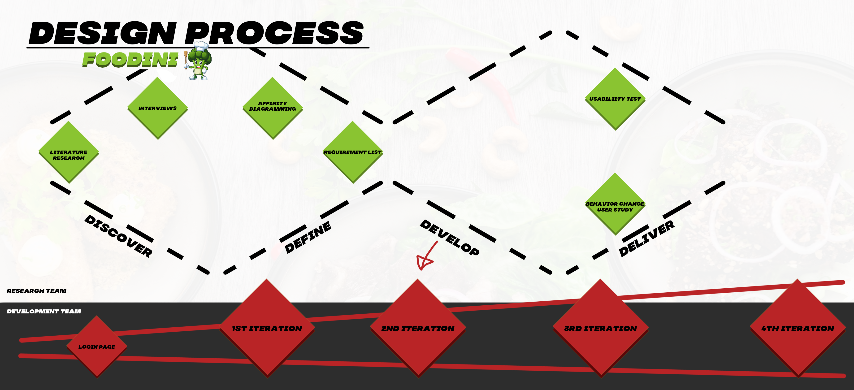
Discover: Literature Study, User Interviews
Define: Affinity Diagramming, Requirement List
Develop: App development (1st, 2nd and 3rd iteration)
Deliver: User Study (Usability test and Behavior Change)
Normally within the double diamond these parts are followed chronologically but with the desire to in the end have an actual working app of high fidelity it was decided to split the team separate parts. The team was split in research and development who would work parallel with each other. The development would start developing right from the beginning and would add, adjust and remove things from the app builds based upon the findings of the research team.
Literature study
Definitions of Food Loss & Food Waste
In general, food loss and waste collectively (FLW), as defined by FAO High Level Panel of Experts[7], “refers to a decrease, at all stages of the food chain from harvest to consumption, in mass of food that was originally intended for human consumption, regardless of the cause”.
Food loss refers to “edible food mass that is discarded OR lost along the journey from production, post-harvest, storage, transport, and processing stages[8].” Another definition of food loss is “A decrease, at all stages of the food supply chain (FSC) prior to the consumer level, in mass of food that was originally intended for human consumption, regardless of the cause[1].” Thus, the definition of food loss excludes the last stage of the food supply chain, namely the consumption stage.
On the other hand, food waste, as suggested by Ishagulyyev et al.[1], is “food appropriate for human consumption being discarded, whether after it is left to spoil of kept beyond its expiry date”.
According to the FUSION'S framework food waste is: “Food waste is any food, and inedible parts of food, removed from the food supply chain to be recovered or disposed (including composted, crops ploughed in/not harvested, anaerobic digestion, bio-energy production, co-generation, incineration, disposal to sewer, landfill or discarded to sea)[9].” However, in this research, the term “food waste” will refer only to the losses at the consumption stage of the FSC.
Additionally, it is important to distinguish avoidable FLW from unavoidable FLW[1]. Unavoidable FLW refers to the types of food that cannot be consumed by humans, for example, meat bones and watermelon skins, while avoidable FLW encompasses “the types of foods that could have been used or eaten at some point of FSC but neither used nor eaten”. Naturally, the latter definition will be considered.
Statistics
Despite abundant global food resources, challenges in physical and economic access, food utilization, and political stability hinder worldwide food security. As a result, approximately 815 million people, around 11% of the world's population, suffered from chronic undernourishment in 2016. Predominantly, these individuals were from lower-middle-income countries, with developed nations having only 11 million undernourished people. In the mid-2010s, Africa had the highest prevalence of malnutrition, while Asia had the largest number of malnourished individuals.
This issue leads to an estimated 3.1 million child deaths annually. In 2017, 150 million young children globally experienced growth stunting, while 50 million suffered from muscle wasting. Similarly, deficiencies of micronutrients like iron, vitamin A, and iodine have significant health effects, causing poor pregnancy outcomes, impaired development, night blindness, and weakened disease resistance, among others. Iodine deficiency, specifically, impairs cognitive development and affects close to 40 million babies worldwide[1].
The more alarming aspect of this issue is that it persists while one-third of all food produced globally is lost or wasted. This waste amounts to approximately 1.3 billion tons of food, costing the global economy nearly one trillion dollars yearly. Per capita food loss in Europe and North America is around 300 kilograms a year, while per capita food waste is approximately 100 kilograms per year. To put these numbers into perspective, annual food waste at the consumer level in developed countries—222 tons—is nearly as high as the total net food production in Sub-Saharan Africa, at 230 tons[3].
Beyond the issue of undernourishment, the impact of food waste can be assessed in terms of environmental, economic, and social aspects. Environmentally, food losses signify a squandering of resources used in production, encompassing land, water, energy, and other inputs[3]. The global carbon footprint of wasted food is estimated to be nearly 3.3 gigatons of CO2, ranking third globally in emissions after the United States and China. This amount of CO2 surpasses twice the total greenhouse gas emissions from all US road transportation, equating to around 500 kg of CO2 per capita globally. Cereals contribute the most to this waste, followed by meat and fresh produce.
In terms of water wastage, the numbers are notably significant, with a staggering 92% of humanity's total water footprint attributed to the consumption of agricultural products. Specifically, the average water footprint of food waste per capita annually is 38 cubic meters[10], equivalent to the annual flow of Russia’s Volga River when added up[7]. Land occupation and degradation are also significant factors. Global food wastage has occupied as much as 1.4 billion hectares of farming land, approximately 28% of the world’s total agricultural land area. When compared to the surface areas of the world’s largest countries, this is second only to that of the world’s largest country, the Russian Federation. Meat and milk contribute to 78% of this total area, but only 11% of overall food wastage. Biodiversity impacts, including deforestation, Red-listed species, and marine trophic levels, are of great importance. In developed nations, agriculture causes 44% of species threats, while in developing nations, this number rises to 72%. Globally, agriculture is responsible for 66% of threats to species, with mammals, amphibians, and birds being the most affected animal families[10].
Economically, food losses negatively impact the incomes of both farmers and consumers[3]. This impact has been measured at nearly 1 trillion dollars globally, with Indian and Southeast Asia contributing the most to these costs. Economic costs surpass environmental ones, amounting to approximately $700 billion, and social costs, totaling around $900 billion. In Italy, economic costs due to food waste in the last phase of the supply chain add up to as much as $12 billion annually. In the UK, food waste within the out-of-home industry accounts for more than £682 million annually, covering food procurement, labor and service costs, utilities, and waste management costs. Additionally, the economic cost of food waste for households in the UK is approximately £420 per year, €454 per year in Italy, and in the US, households discard 211 kg of food per year, costing at least US$587 annually for a family of four[7].
Looking at social costs, their primary implications revolve around increased poverty, food insecurity, unequal distribution of resources, strain on social services, public health issues, and negative impact on mental health, as described in the above paragraphs. Food being lost or wasted worsens each of these factors, amplifying an immense variety of social issues[7].
Food Waste at Consumer Level
There are five main stages of FSC that can be identified: production, handling and storage, processing, distribution and market, and consumption[1]. Food loss can be identified in the first three stages, while food waste occurs in the last two. In this study, only the last stage of FSC, namely the consumption stage, will be considered. This choice can be justified by the fact that a large portion of food waste that can be avoided occurs at the consumption stage. For instance, in Europe, this amounts to 42% of all the produced food, or 88 million tonnes, wasted per year; two-thirds of this amount belongs to avoidable or possibly avoidable food waste. In the United States, 31% of all the food available for consumption is lost at the retail and consumer levels[7]. Thus, the issue of food waste in the consumption stage of the FSC is particularly common in developed countries[1][7]. The most common reasons for food waste at this stage are discussed below.
One of the deciding factors is household size. Smaller households tend to generate more food waste due to over-provisioning or cooking more than can be consumed[1]. Also, households with children generate more food waste due to children’s unpredictable behavior and varying food preferences[1][7]. However, in general, large households tend to generate less food waste than single-person households. Moreover, single-person households generate the most food waste per capita[1].
Another key factor is the household income. Households with higher incomes are prone to generating more food waste as food costs are low relative to other expenditures. This also accounts for the fact that more food is wasted at the consumption stage in the developed countries than in the developing countries. For comparison, U.S. citizens spent 6.1% of their income on food, while in Pakistan and Cameroon, the proportion was 47.7% and 45.9%, respectively[1].
As for socio-demographic factors, such as age or gender, there is no clear correlation with the amount of food waste generated in households. On the other hand, culture has a significant impact on food waste; countries that emphasize the quality of food over quantity tend to generate less food waste. Various cultural events, such as weddings, parties, or religious gatherings also produce a significant amount of food waste[1].
Other reasons for food waste at the consumer level can be attributed to various household practices, such as meal planning, grocery shopping, storing, cooking, eating, and managing leftover food[10]. These are explored in detail below.
Overprovisioning is a prevalent problem when it comes to food waste. While most consumers claim to buy adequate amounts of food, according to [10], people tend to buy more produce than necessary. The reasons for overprovisioning can be attributed to differences in taste among household members, stockpiling food for unexpected circumstances, limited amount of time that can be dedicated to cooking, bulk purchasing, and large packaging size. While it is commonly thought that bulk purchasing results in more waste, the research indicates that the opposite is true, that is, households that buy discounted food or consider low prices generate less waste. Therefore, households that can afford to spend more money on food generate more waste, which agrees with the argument about household income[10].
Another common reason for food waste can be attributed to improper storage of certain food products and poor organizing practices[1][10]. For instance, a wrong temperature setting in the fridge, a common occurrence in households, can affect the longevity of the stored food[10].
Poor cooking and leftover management practices can also result in food waste. The inability to assess the freshness and safety of food leftovers often results in their disposal. Also, as mentioned above, households with children experience difficulties in planning and cooking meals, which also affects the amount of food waste. Lastly, an improper portion size estimate also affects the amount of food waste[10].
Evaluating the freshness and edibility of food has a direct correlation with the amount of food waste produced by a household. It has been shown that people who use their own senses to assess edibility discard less food than those who discard food after it has been kept in the fridge for several days. It has been pointed out that people experience a conflict between reducing food waste and avoiding food-borne illnesses. Safety concerns are a primary reason for food waste[10].
A common reason leading to food waste is misinterpretation of various food labels; people tend to rely on “use by date” and discard expired food items even if they are still safe to consume[10].
Another important factor that determines the amount of food waste produced is the individual’s knowledge, perceptions, and attitudes toward food waste. More specifically, the knowledge about the severity of food waste and attitude toward the problem can influence the behavior of the individual as well as their intentions. While the behaviors might not be consistent with the attitudes and intentions (also known as the attitude-behavior gap), the research indicates that in most cases, there is a positive correlation between attitude and actual behavior regarding food waste reduction. Moreover, attitudes and perceptions can also influence the problem of food waste indirectly. For example, various food-related routines, such as planning and shopping, are also influenced by attitudes[1].
Finally, it is instructive to look at a study conducted by Hermanussen et al.[11] that revealed the most common reasons for food waste in German households. According to the results of the questionnaire, the most common driving force behind food waste is the lack of time to cook (or process) food. Another common reason is that respondents cook more food than they can consume, and the leftovers are disposed of. Finally, the third most common reason is, as mentioned by [10], the large packaging size.
Theory of Planned Behavior
As mentioned before, a significant factor in food waste reduction is the individual’s attitude, intentions and behaviors. Therefore, studying behavior change can provide more insight into the underlying reasons for food waste and, consequently, aid in designing interventions that will cause a positive shift in the behavior and habits among consumers.
One of the theories that can be applied to the problem of food waste is the theory of planned behavior[12][13]. The theory of planned behavior predicts an individual’s intention to engage in a behavior at a specific time and place. The theory aims to explain the behaviors over which people can exert self-control.
According to the theory, three kinds of considerations guide the formation of intentions: behavioral beliefs and attitudes, normative beliefs and subjective norm, control beliefs and perceived behavioral control[12].
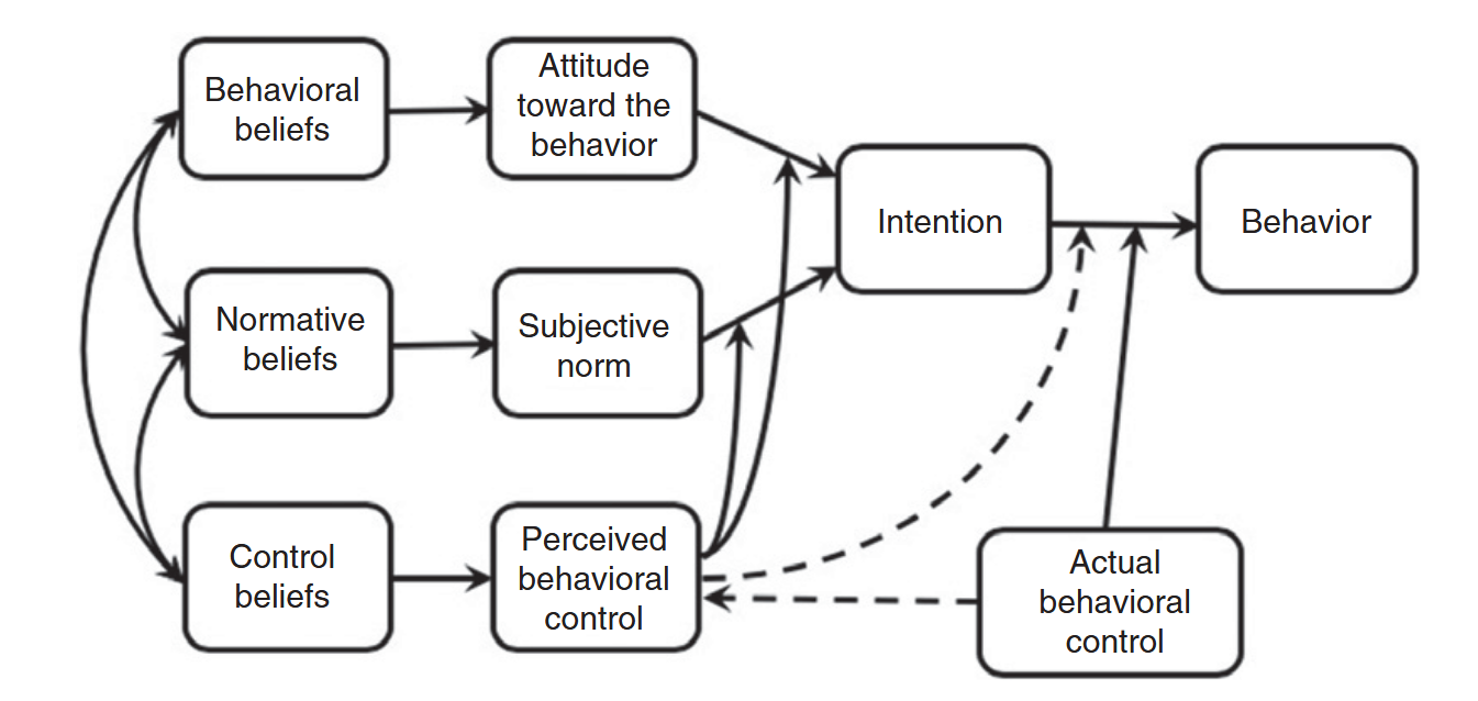
A behavioral belief is a perceived likelihood that engaging in a behavior will result in a certain outcome or involve a certain experience. For example, if someone believes that studying hard will result in good grades, they are more likely to have a positive attitude toward studying. Behavioral beliefs as a whole result in a positive or negative attitude toward a behavior.
As for normative beliefs, two types can be distinguished, namely injunctive and descriptive. An injunctive normative belief is the probability or expectation that an important figure(s), such as friends, family members, or coworkers, approve of the behavior in question. A descriptive normative belief, on the other hand, refers to expectations that important figures themselves would engage in the desired behavior. Both types of belief contribute to the perceived social pressure to engage in a behavior or subjective norm.
Finally, control beliefs refer to the presence of factors that can aid or hinder performing the desired behavior, such as required skills and abilities, amount of available time, money and other resources, cooperation by others, etc. Altogether, control beliefs constitute the perceived behavioral control. Moreover, two subfactors of control can be identified, namely capacity and autonomy. Capacity refers to the perceived ability to perform the behavior (as dictated by perceived available skills and resources), while autonomy refers to the extent to which a person believes that the decision to engage in a behavior is completely up to them.
A study by Srivastava et al.[14] has shown that the attitude, subjective norm and perceived behavioral control significantly impact the intention to reduce food waste. Moreover, it was concluded that personal attitudes and perceived behavioral control directly hits food loss behavior. People’s intentions to do something are strengthened once they have a favorable attitude toward the behavior, consider that prominent people want them to act in a confident approach, and assume that they have enough power to engage in the desired behavior. Almost all of these structures reflect a person’s personal beliefs.
Another study conducted by Ali et al.[15] concluded that attitude and social norms influence consumer intentions to purchase certain green product productions, purchase, and consumption. In particular, social media among other electronic sources is the most widely used (surfed) media, strongly reshaping and changing consumer behaviors. Thus, consumers are more aware of environmental sustainability, green consumption, and green production.
The theory of planned behavior can be used to achieve behavior change in three different ways[12]. First, this can be done by influencing behavioral or normative beliefs, which results in a more favorable attitude toward the behavior or a more supportive subjective norm, and increased motivation to engage in a behavior. Next, increasing perceived behavioral control can amplify the effects of attitude and/or subjective norm on intention to perform the behavior. Finally, behavior change can be achieved by changing the relative importance of attitude and subjective norm as determinants of intention. In other words, if the behavior was mainly influenced by attitudinal control, an intervention targeted at normative beliefs may raise awareness of social norms and increase their influence on intention.
Thus, the theory of planned behavior provides a framework for shifting attitudes and behaviors toward the desired ones. Several techniques from the theory can be applied to the design of an intervention in the form of a mobile application. In this case, the behavior change can be achieved mainly through raising perceived behavioral control over the problem of food waste. Also, the app can be used to shift the beliefs and attitudes toward food waste in general. Several specific examples are presented below.
For instance, various recipe suggestions based on the products in the user’s fridge can motivate the user to waste less produce and not to buy excessively. Also, providing information about expiry dates and tips on food storage can increase the user’s perceived control over food waste and thus help them increase the lifespan of the goods in their inventory. Sending notifications when the product is about to expire can motivate users to engage in the desired behavior more (consuming or cooking with items close to expiry date and thus reducing food waste).
More generally, informing users about food waste via a dedicated info tab can shift their beliefs and attitudes and thus motivate them to produce less food waste. Lastly, a simple and intuitive app design can motivate people to engage in the desired behavior more, namely organizing your fridge and pantry, and cooking suggested recipes.
Ways to Combat Food Waste
The issue of food waste can be combated in various ways. For instance, planning strategies, such as making a shopping list, meal-planning in advance, checking the inventory before shopping can reduce the amount of food waste. For example, it was shown by [10] that using a shopping list reduced the amount of waste by approximately 20%. Also, establishing communication between household members can help avoid buying unnecessary products[10].
Additionally, storing strategies, such as freezing food, can help extend the shelf life of a product and, thus, prevent food waste. Also, it is speculated that informing the consumers about how to store food may affect the attitude toward food waste and, consequently, induce changes in food waste behavior[10].
Moreover, an individual’s knowledge and attitudes toward food waste also affects the amount of food waste produced. Consumers that are more aware about food waste and understand its consequences are more determined to reduce the amount of food waste they produce. Thus, it is important to conduct campaigns and expose people to the problem of food waste more[1].
In terms of technological developments, current literature highlights various that hold promise in mitigating food waste, with applications and websites standing out as particularly versatile tools. These platforms offer a range of functionalities, from meal planning and recipe recommendation to food tracking, catering to different needs across the food supply chain. For example, meal planning apps optimize food usage by suggesting recipes based on available ingredients, lowering waste by ensuring everything gets used efficiently. Additionally, they streamline meal organization, leading to more strategic grocery shopping and less over-purchasing. Similarly, food tracking apps empower users to monitor pantry and fridge contents, nudging timely consumption of perishable items before they spoil. Lastly, initiatives like food sharing apps promote the redistribution of extra food, preventing waste and increasing food security efforts by connecting excess food with those in need.
Another helpful development has been the "smartification" of everyday objects as well as the immense growth of the Internet of Things. Smart refrigerators, which are equipped with sensors and connectivity features, can now constantly monitor internal conditions and track expiration dates, ensuring that food stays fresh for longer periods and alerting users before items spoil. Moreover, the integration of IoT technology into food inventory management systems has revolutionized the way food stocks are tracked and utilized. Real-time monitoring of inventory levels enables highly accurate demand forecasting and prevents over-purchasing. Smart food storage containers offer additional layers of protection against spoilage, by providing users with insights into the freshness of stored items and offering suggestions on how to use them efficiently. Furthermore, IoT-integrated food delivery services optimize logistics operations, minimize transit times, and ensure that perishable goods arrive at their destinations in optimal condition. As for the application of IoT technology in agriculture, this has enhanced productivity and reduced losses throughout the food supply chain. Sensors deployed in fields collect valuable data on soil conditions, moisture levels, and crop health, enabling farmers to implement precision agriculture practices that maximize yields while minimizing waste.
The last notable technological development that we mention here, and that is likely to create significant impacts, is artificial intelligence. AI holds immense potential in mitigating food waste through its capabilities in data analysis, prediction, and optimization. Through machine learning algorithms, AI systems can analyze vast datasets related to food production, distribution, and consumption to identify patterns and trends associated with waste. This insight should enable stakeholders to make more informed decisions and implement targeted interventions to minimize waste at various stages of the food supply chain. For instance, AI-powered demand forecasting models can accurately predict consumer preferences and market demand, allowing retailers and food manufacturers to optimize production schedules and inventory levels, thereby reducing the likelihood of overproduction and excess inventory. Additionally, AI-driven optimization algorithms can optimize logistics operations, route planning, and inventory management, ensuring efficient distribution of perishable goods and minimizing the risk of spoilage during transportation. Moreover, AI can facilitate personalized meal planning and recipe recommendations based on individual preferences and dietary restrictions, encouraging consumers to make more efficient use of ingredients and leftovers, ultimately reducing household food waste.
In summary, a multitude of methods exist for mitigating food waste, with many making use of recent technological advancements, like our initiative. It's crucial to thoroughly research these methods before implementing any new strategies to reduce food waste, as this maximizes the likelihood of success. By carefully considering and utilizing the available tools and technologies, the issue of food waste can be addressed effectively, and a more sustainable food system can be worked towards.
State-of-the-art Apps
Prior to creating a mobile application, it is instructive to look at the state-of-the-art apps and investigate their functionality. For this purpose, ten apps were selected from Google Play based on the number of downloads and user ratings. The selected apps can be divided into two main categories: apps that suggest recipes and help with meal planning and apps that keep track of expiry dates. The summaries are provided below.
Recipes & Meal Planning Apps
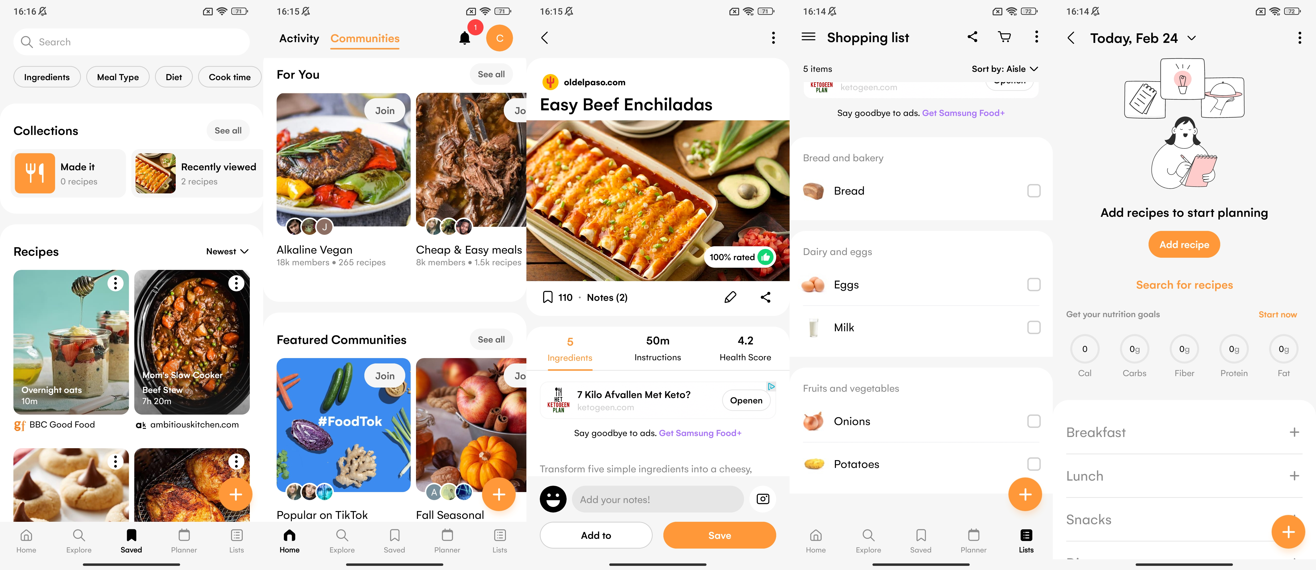
Samsung Food is a multi-purpose cooking app that offers a large collection of recipes and assists in meal and grocery shopping planning. The user can join a large number of communities based on various cuisines and diets, such as vegetarian recipes, healthy eating, low-carb recipes, one-pot wonders, freezer meals, etc. In the communities, the user can view recipes from other people as well as share theirs. The user can also search for recipes within a certain community and apply filters, such as ingredients, meal type, diet, and cooking time. The user can also follow a specific creator. The recipes can be personalized by editing the ingredients manually or using AI for healthier alternatives. Another feature of the app is that the user can save recipes from the web and add them to the shopping list. Also, the app has a meal-planning feature. The user can add recipes to specific days and specific meals. Also, the app displays the total nutritional value, such as calories, carbs, fiber, protein, and fat, of the added recipes. The created meal plan can be shared with other users. Lastly, the app has an integrated shopping list, and the ingredients added to the list can be sorted by aisles or recipes. The shopping list can also be shared with others. Overall, the app has an intuitive interface and minimalist design.
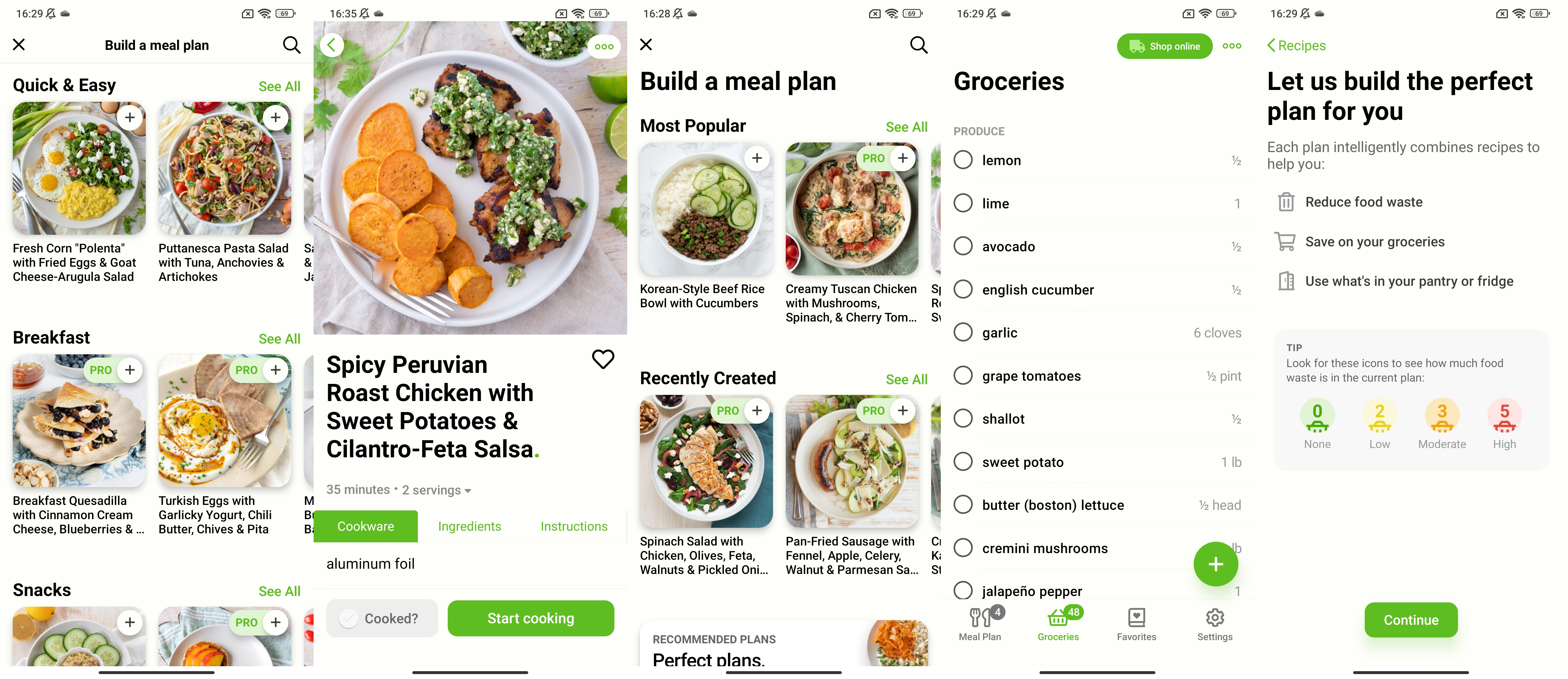
Mealime is an app that helps create meal plans and shopping lists based on that. The user starts by indicating the typical number of servings per meal, as well as allergens or food dislikes. Then, the user can choose from a large variety of meal plans offered in the meal plan section. The meal plans are sorted by various categories, such as Mediterranean, vegetarian, baked, BBQ & Grilling, Soups, Stews & Chillis, etc. After adding the recipes and the number of servings per dish, the app automatically creates a shopping list with all the necessary ingredients. The user can go grocery shopping or use the integrated online shopping option, where the ingredients can be ordered from one of the local stores. A distinct feature of the app is that it keeps track of the amount of food waste saved by creating meal plans and reusing the same ingredients in different dishes. Also, the user can add their recipes, either manually or by importing from the web. Overall, the app has a minimalist and intuitive interface.
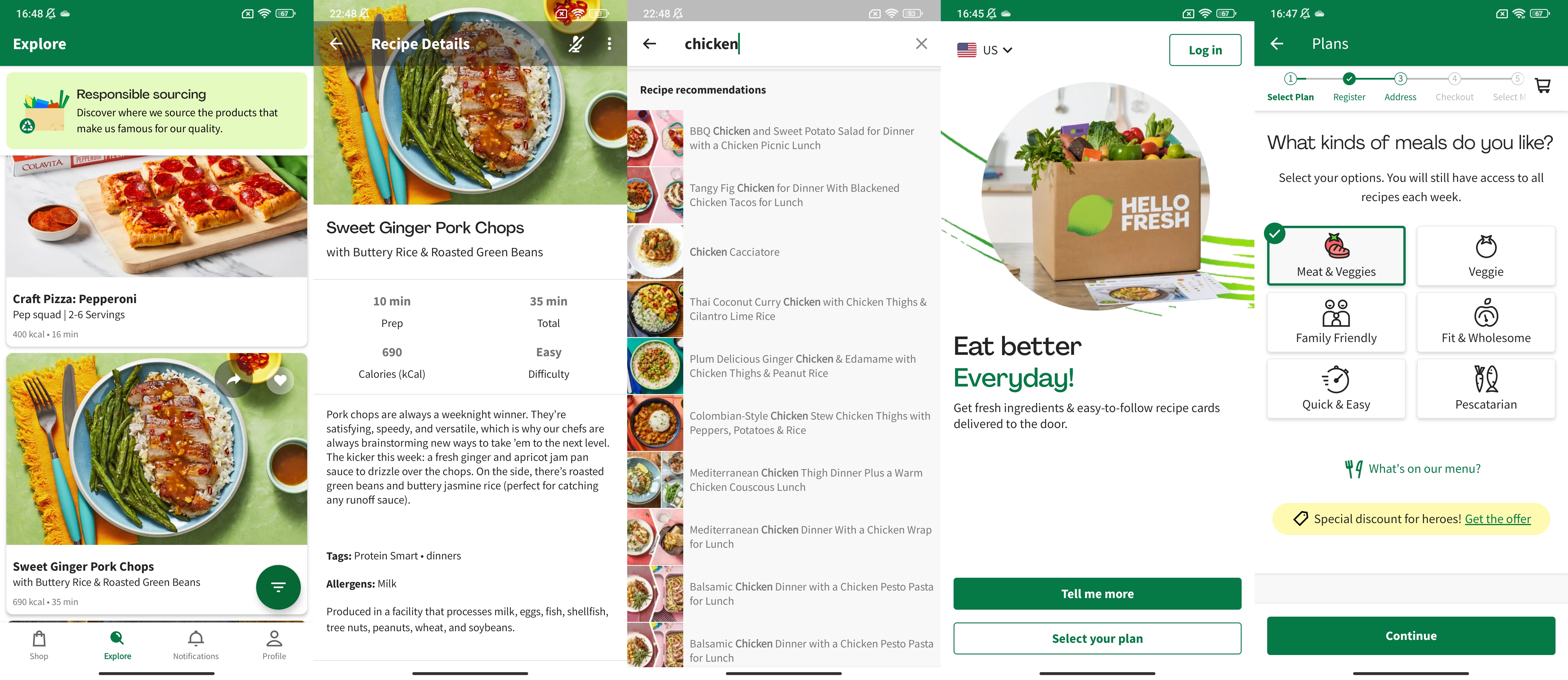
HelloFresh is a meal-planning app with an emphasis on choosing meal plans and getting ingredients for the selected meals delivered to your doorstep. The user starts by indicating their preferences and the number of servings per meal. The app features a large collection of recipes that can be filtered based on cooking time, nutritional value, ingredients, and cuisines. The ingredients for the selected meals can be ordered directly from the app. The app has a green and minimalist design with a limited number of features.
Meal Planner – Plan Weakly Meals
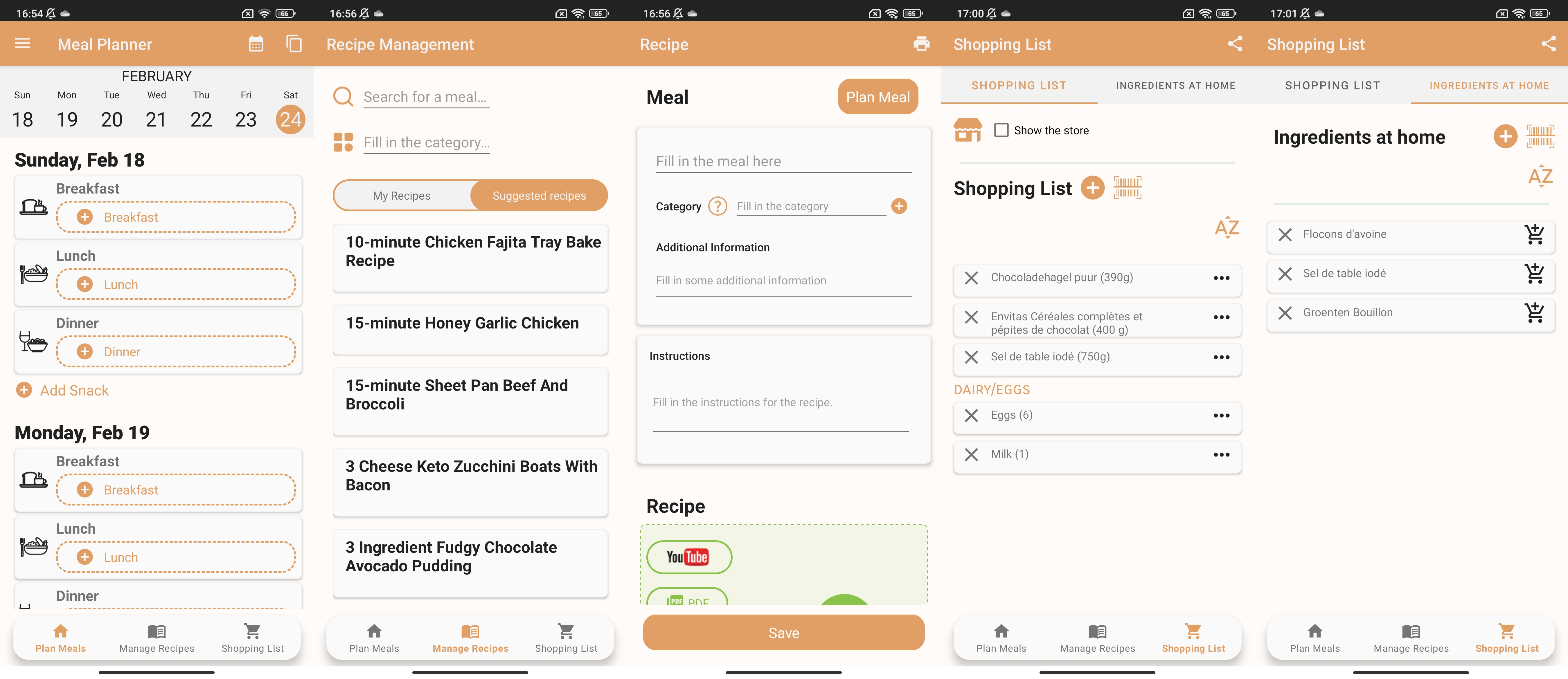
Meal Planner is a simple meal-planning app. The app features an agenda where meals can be added to different days and different meals. The created meal agenda can be shared with other users. The app also features a recipe tab, where the user can add their recipes as well as select from ones suggested by the app. Lastly, the app has an integrated shopping list, where the ingredients can be added manually as well as by scanning a barcode. The user can also keep track of the ingredients already available at home. The app features a minimalist design with limited features.
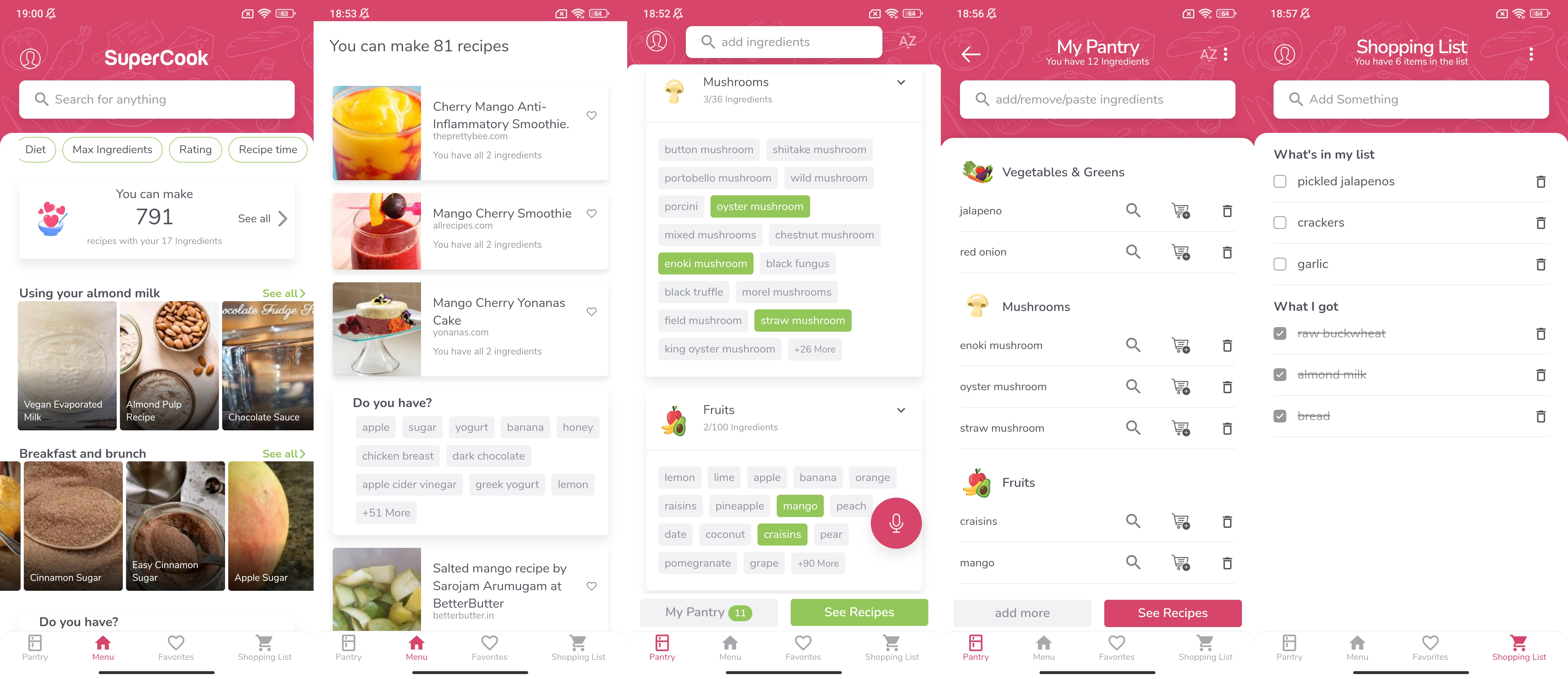
SuperCook is a recipe-suggesting app. The user can add ingredients available at home and based on that the app will suggest various recipes. A distinctive feature of the app is that the user can add ingredients to the virtual pantry via voice input. Also, the app assumes that salt, pepper, and water are available by default. The app has a large variety of categories and corresponding ingredients that can be added by pressing on an item. This presents an advantage as the user does not have to type in the ingredients manually. After selecting all the ingredients, the app suggests recipes that can be filtered by diet, rating, cooking time, meal type, key ingredients, etc. It is also possible to exclude or include additional ingredients. Also, the user can save recipes to favorites. Additionally, the app has an integrated shopping list. The user can add items that are running out to the shopping list directly from the virtual pantry. The app has a simple and intuitive interface equipped with unique features.
SideChef: Recipes & Meal Plans
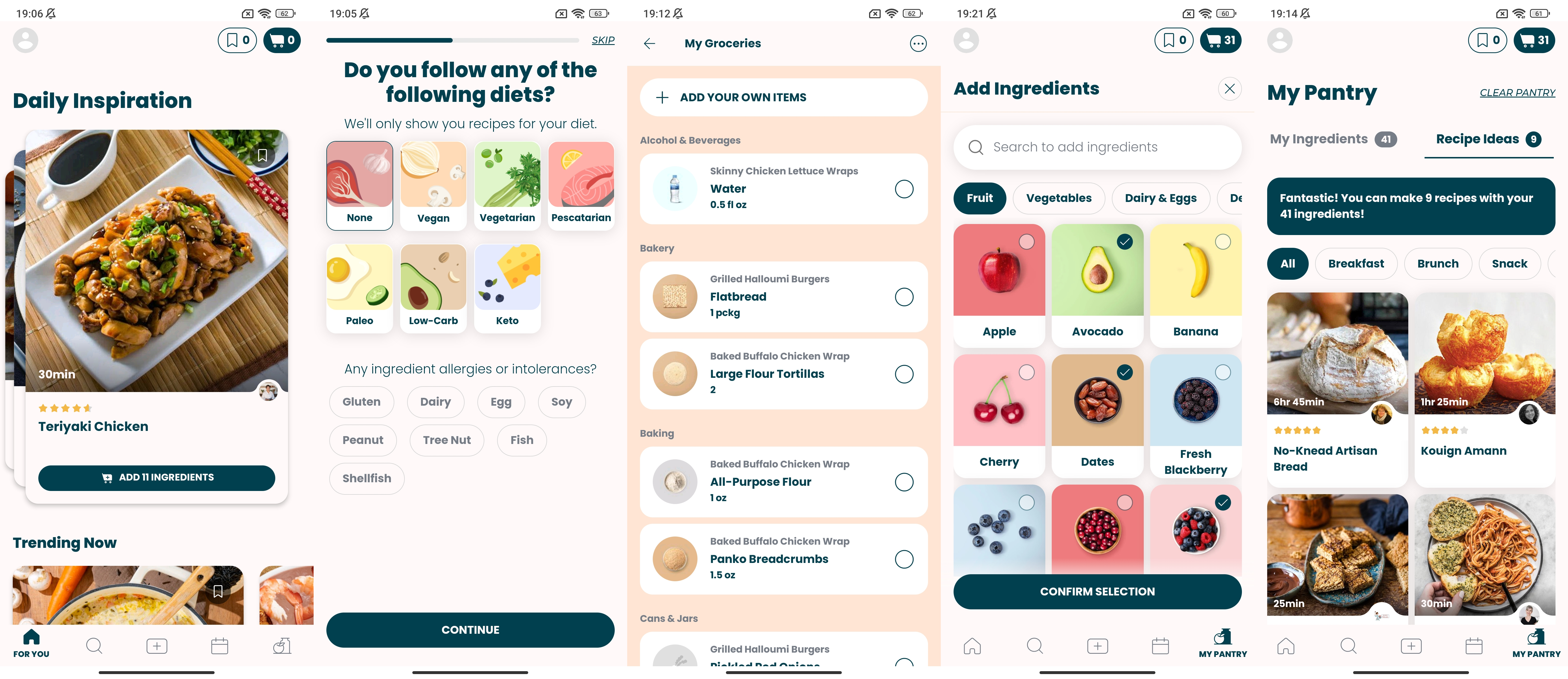
Side Chef is a versatile meal-planning and recipe-suggesting app. The user receives recipe suggestions tailored to the user’s dietary preferences as well as allergens and dislikes. The recipes can be added to specific days of the week, and the serving size can be adjusted as well. The user can also add custom recipes or import from the web. After completing the meal plan, the user can add all the ingredients required for the recipes to the shopping cart. The user can add additional ingredients manually if necessary. The app also features a virtual pantry and corresponding recipe suggestions similar to previous apps. A unique feature of the app is that the pantry can be automatically prefilled with basic ingredients, such as dairy products, grains, sauces and condiments, spices and seasonings, etc. Then the user can manually add or remove items. Similar to SuperCook, the items can be added by pressing on corresponding pictures from the selection. Overall, the app has a simple and minimalist design.

Eat This Much is a meal-planning and recipe-suggesting app. The app automatically creates a meal plan tailored to the physical parameters of the user (height, weight, sex, fat contents), lifestyle, dietary preferences, and allergens. The curated meal plan can be manually adjusted by the user. Additionally, the app offers a wide variety of recipes and collections created by other users. Also, the user can add specific ingredients to the meal plan and set them as recurring. The ingredients can be added by choosing from the app selection or scanning a barcode. The paid version of the app also includes a virtual pantry and an integrated shopping list. Overall, the app emphasizes the weight goal of the user and the nutritional value of the ingredients.
The main features of the apps were summarized and compared in the table below.
| Requires sign up | Recipe suggestions | Social media aspect | Shopping list | Meal planning | Add own recipes | (Explicit) use of AI | Dietary preferences | Allergies | Food waste awareness | User physical profile | Expiry date tracking | Unique features | |
| Samsung Food | Y | Y | Y | Y | Y | Y | Y | Y | N | N | Y | N | |
| Mealime | Y | Y | N | Y | Y | Y | N | Y | Y | Y | N | N | |
| HelloFresh | N | Y | N | N | Y | N | N | Y | N | Y | N | N | |
| Meal Planner | N | Y | N | Y | Y | Y | N | Y | N | N | N | N | Barcode scanner |
| SuperCook | N | Y | N | Y | N | N | N | Y | N | N | N | N | Voice input |
| SideChef | Y | Y | Y | Y | Y | Y | N | Y | Y | N | N | N | Prefill pantry |
| Eat This Much | Y | Y | N | Y | Y | Y | Y? | Y | Y | N | Y | N | Automatic meal planning, tutorial, barcode scanner |
As can be seen, none of the apps mentioned above include expiry date tracking. Therefore, the apps with this specific functionality are investigated below.
Expiry Date Tracking Apps
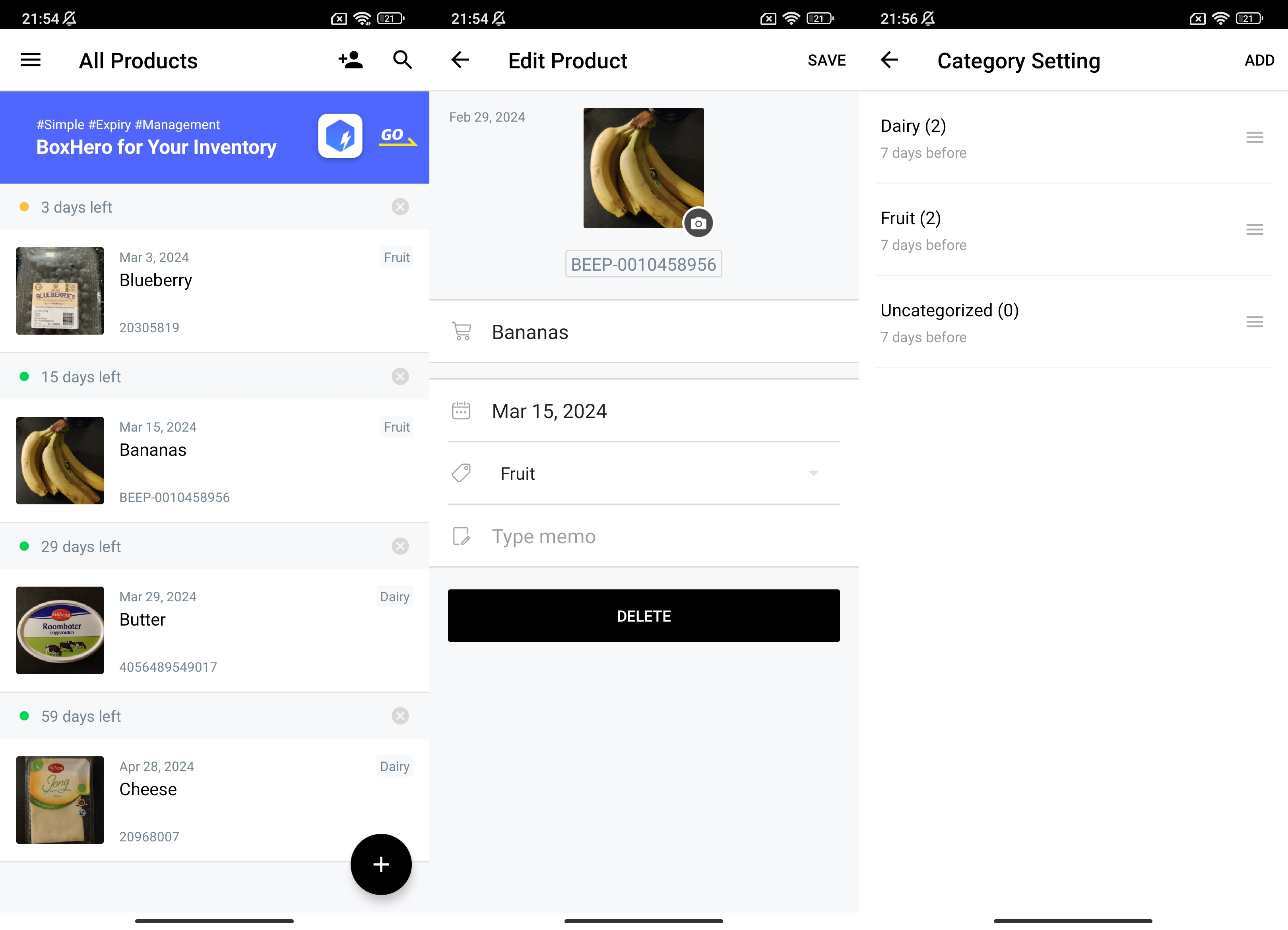
BEEP is an app that keeps track of the expiry date of products. The products can be added to the inventory by scanning the barcode and the expiry date indicated on the packaging. Alternatively, the user can add items manually via text input. The user also has an option to add a picture of the item. The items are displayed in the list with items close to the expiry date being on the top. Additionally, the items in the inventory can be sorted by categories specified by the user. The user can create groups and invite other users, for example family members. The app also sends notifications once certain products are about to expire. Overall, BEEP is a simple app with minimalist design and limited functionality.
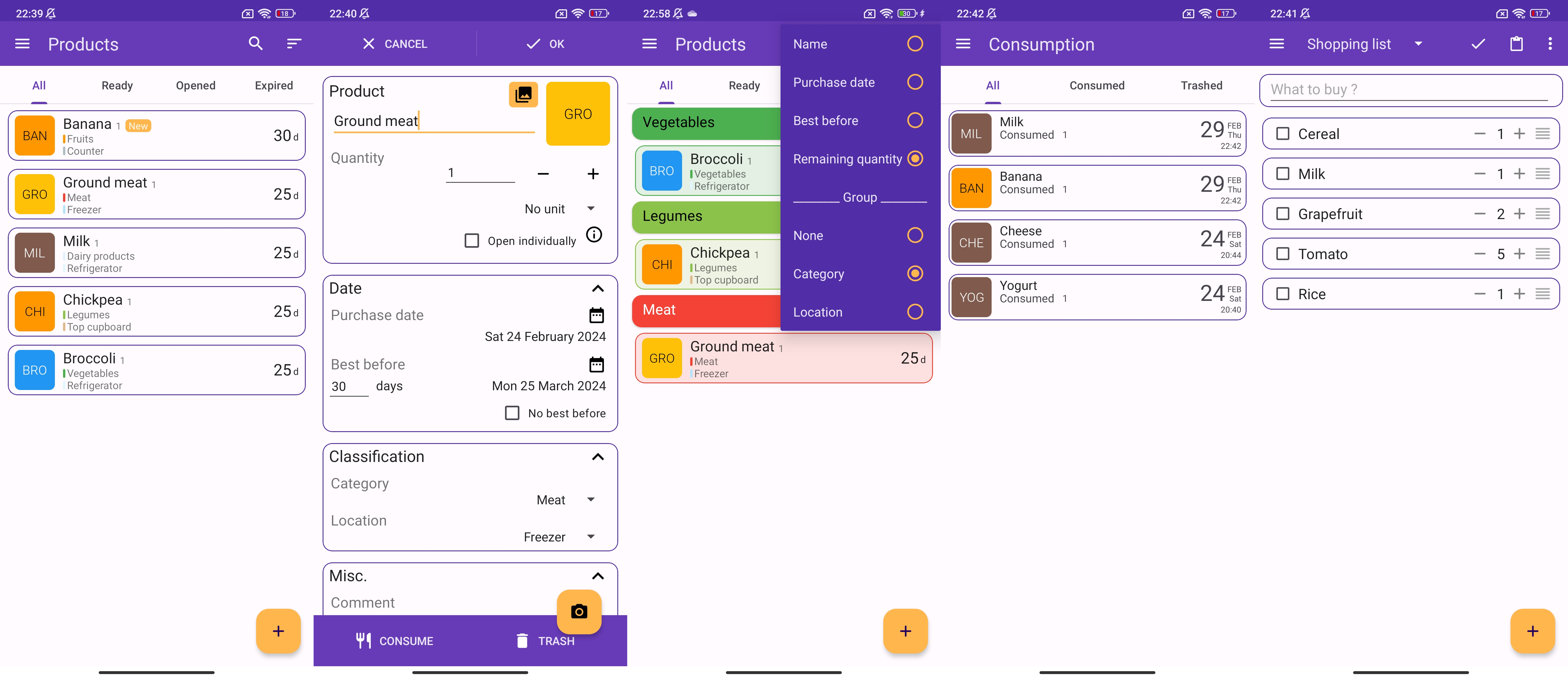
Best Before is an expiry date managing app. Similarly to BEEP, the items and their corresponding expiry dates can be added to the pantry. Additionally, the items can be classified by food category and storage location. The user can also set notifications for each individual item in case of expiry or as a reminder after opening. The user can sort items in the list by name, purchase date, best before date, or remaining quantity. Also, the items can be grouped by category or storage location. Overall, the items in the pantry are divided into 3 categories: items ready to eat, items that have been opened, and items that have expired. The items that have expired are added to the corresponding section automatically. Additionally, in the “Consumption” section, the user can keep track of all the items that have been consumed and/or trashed. The app also features a “Shopping list” section. In conclusion, Best Before is an effective tool for food tracking and expiry date managing; however, the interface is difficult to navigate at first.
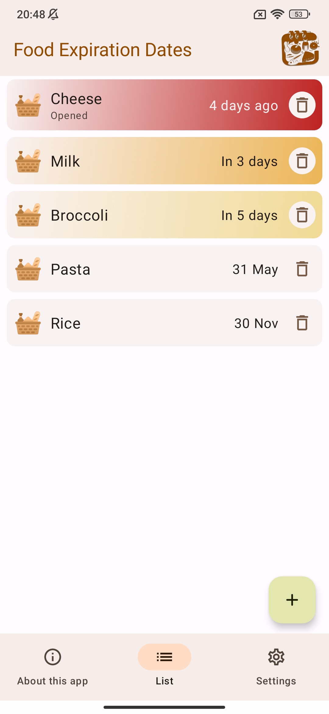
Food Expiration Dates is an app that keeps track of the expiry dates of the items in the pantry. Similar to the previous two apps, the items in the list are shown with the items closest to the expiry date being on top. The app has a simple and minimalist interface without any additional features.
User Studies
Survey
To investigate whether there is a demand for an expiry-tracking and recipe-suggesting app, a survey was conducted. The results and the analysis of the survey are presented below.
Results
The questions can be divided into two main categories: general questions regarding user food habits and knowledge about food waste, and questions related to the app design and functionality. The first part of the questionnaire aims to compare the data acquired from the literature study with the real-life responses, and the second part aims to aid app development and identify the functionality that the users require the most.
The first question asks the respondent to indicate their age. As can be seen from Figure ?, the majority of the respondents (61.5%) are between 18 and 24. As for other age groups, 17.3% (9 respondents) are between 35 and 44, 15.4% (8 respondents) are between 25 and 34, 3.8% (2 respondents) are between 55-64, and 1.9% (1 respondent) are between 45 and 54. Thus, the survey includes responses from a large variety of age groups, with most responses coming from younger users.
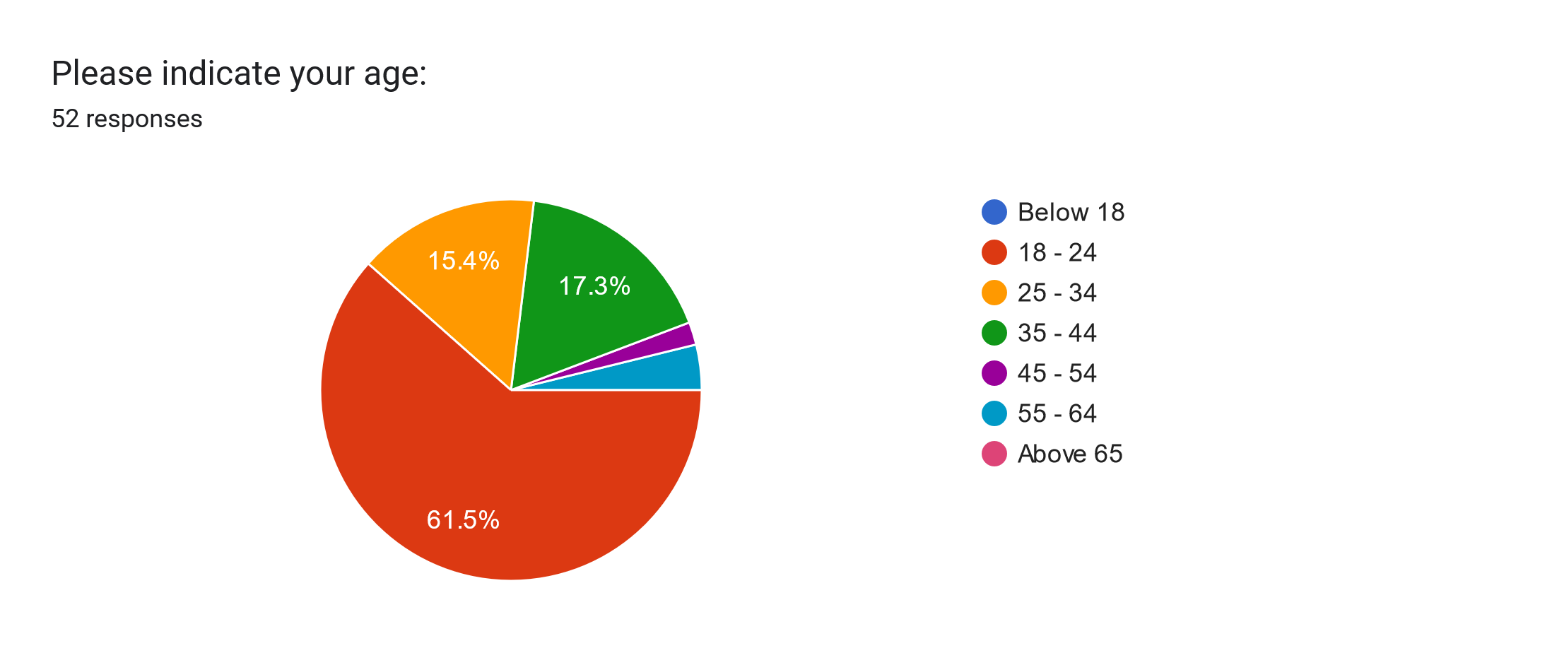
In the next series of questions, the respondents are asked to indicate to what extent they agree with the presented statements. For the first statement, “I frequently throw away food,” the majority of the respondents, namely 67.3%, responded negatively, while 21.2% neither agreed nor disagreed.
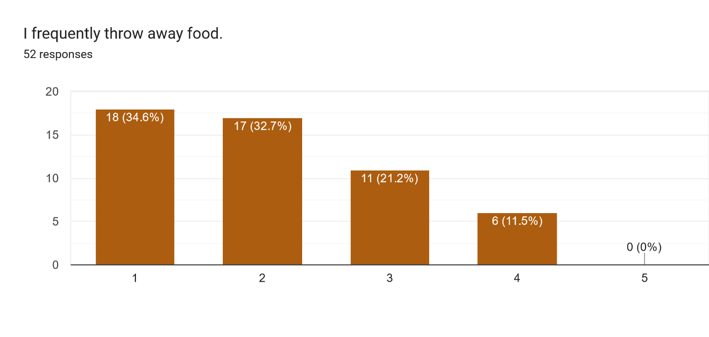
As for the next statement, “I throw away a large amount of food,” most respondents (92.3%) replied negatively.
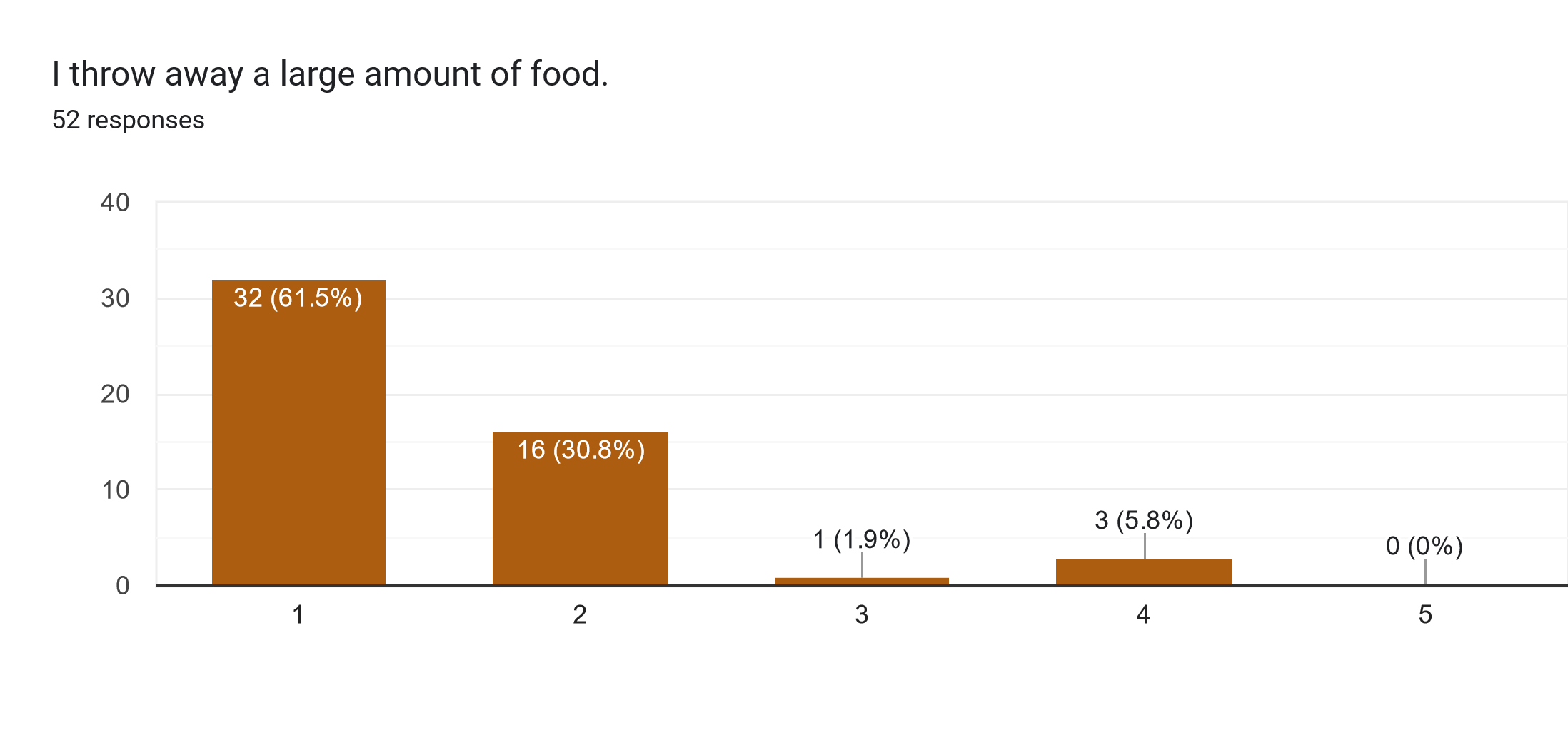
In response to the statement “I often forget about the food in my fridge,” a large portion of the votes (57.7%) replied negatively, 21.2% remained neutral, and 21.2% replied positively.
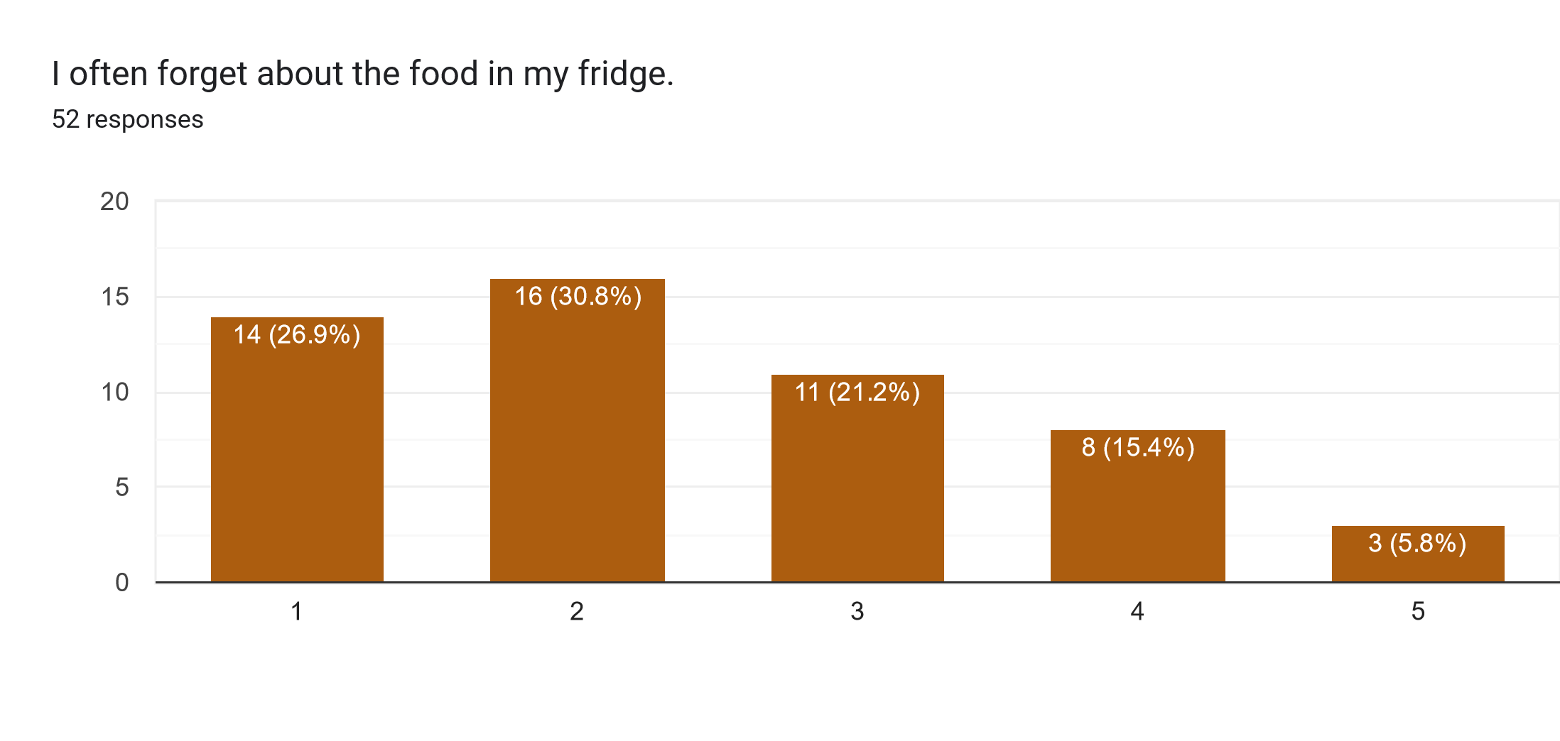
For the question "I cook more than I can eat", 63.5% replied negatively 15.4% neither agreed nor agreed, and 21.2% replied positively.
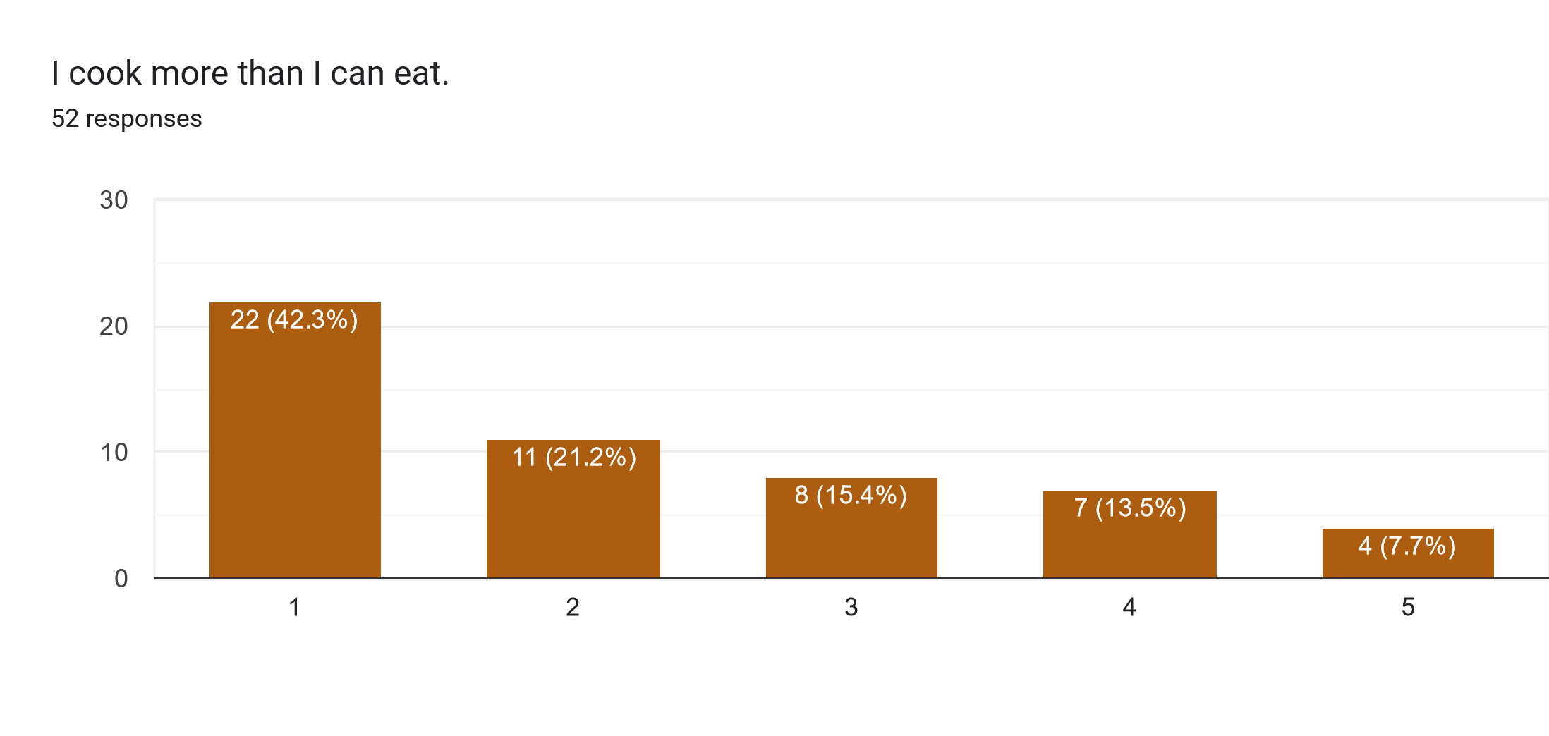
Regarding the statement “I don’t reuse leftovers,” the majority of the respondents (86.5%) replied negatively.
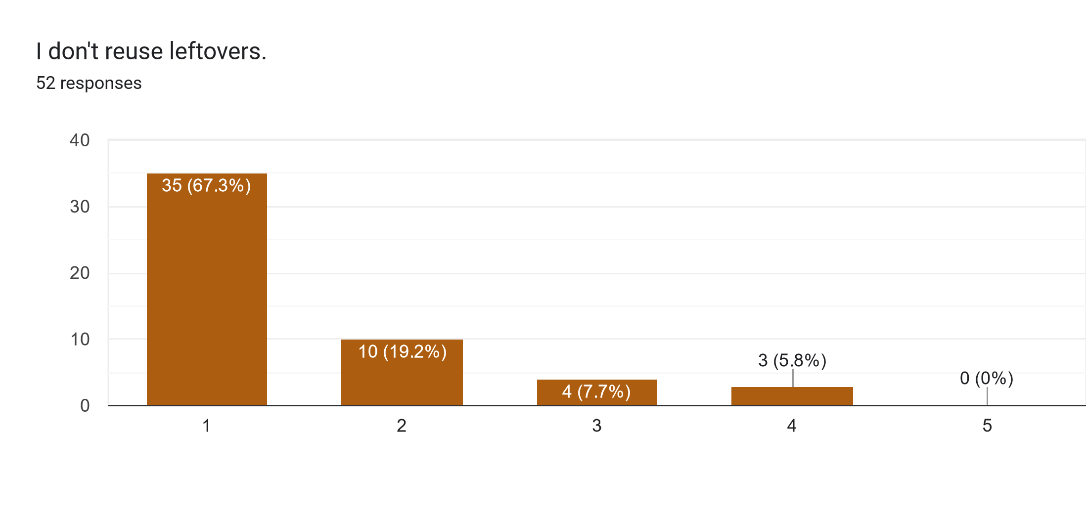
The next statement, “I don’t cook / don’t want to cook because I” aims to find the most common reasons why people avoid cooking. For half of the respondents (55.8%), the statement is not applicable, while 36.5% indicate that they don’t have enough time for cooking. As for the rest, 13.5% indicate that they don’t know what to cook, and 7.7% don’t cook well. Other responses attribute not cooking mainly to laziness.
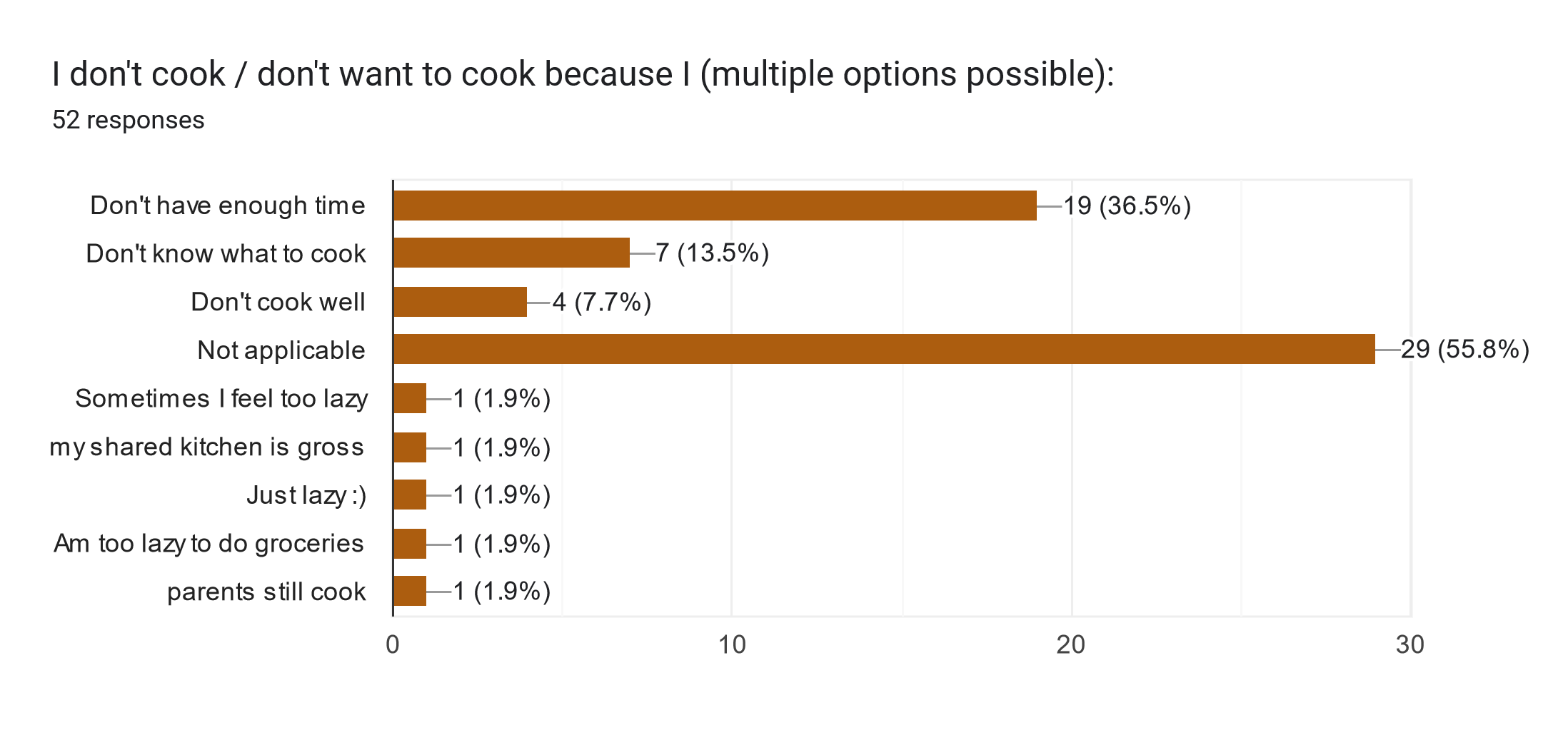
As for the next two statements, “I am aware of the problem of food waste” and “I am willing to reduce the amount of food waste I produce,” the majority of votes (78.8% and 82.7%, respectively) were positive.
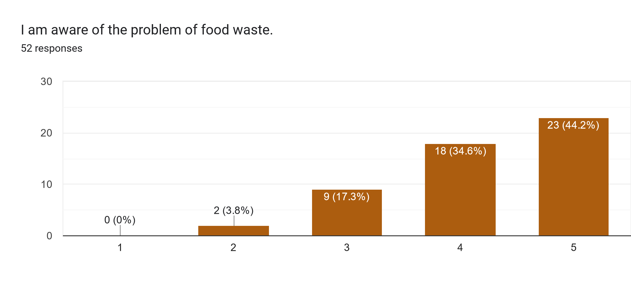
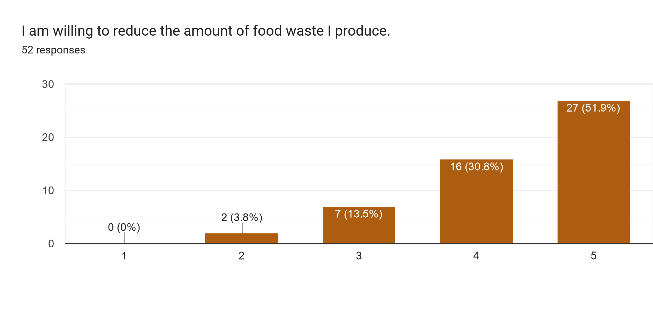
The second part of the questionnaire is related to app design and functionality.
First, the respondents were given a brief description of the app:
"To combat food waste at a consumer level, we are making a mobile application that keeps track of ingredients available at home and suggests recipes based on that."
For the statement “Would you consider using such an app," 30.8% of respondents replied “Yes,” and 50% replied “Maybe.” Thus, the answers indicate that there is an interest in such an app.
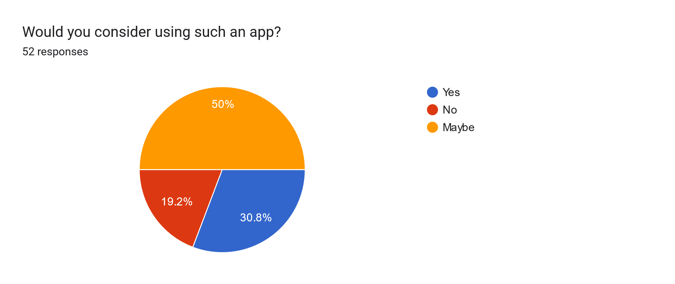
The next three questions ask the respondent to choose a mock-up that looks most appealing. The results can be seen in the figures below.
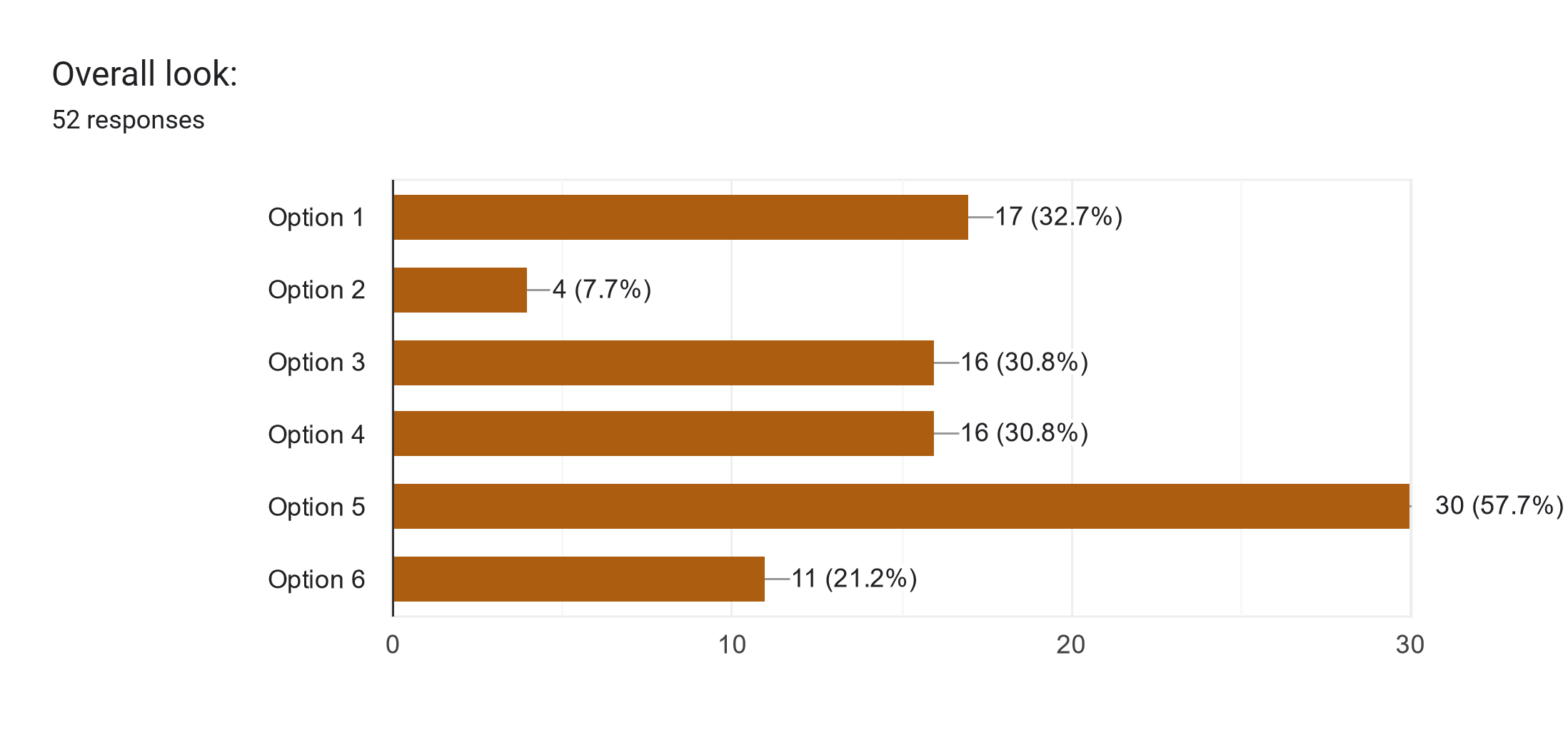
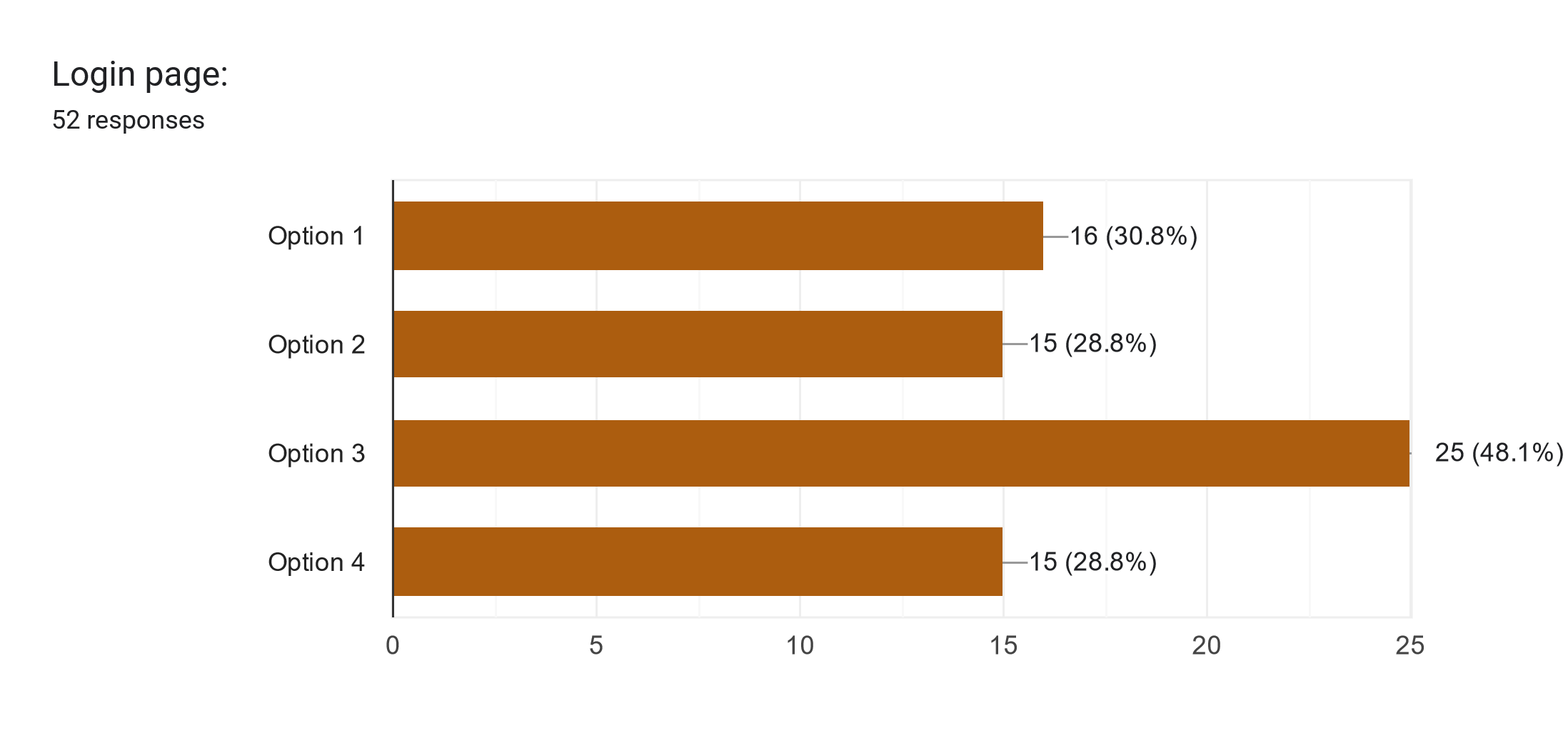
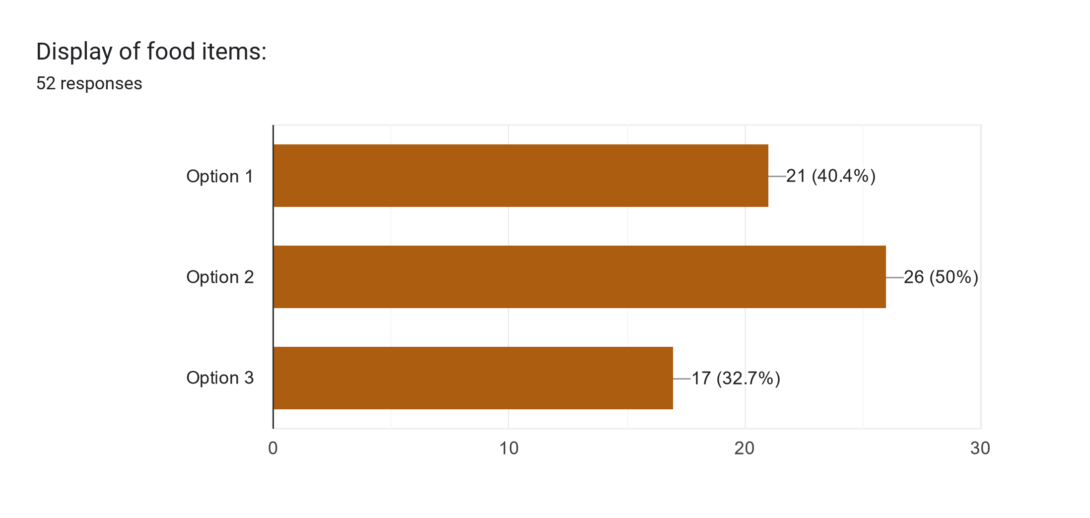
The next question is related to the preferred method of inputting items into the virtual inventory. The most popular options are via taking a picture and via text input with 31 and 27 votes, respectively.
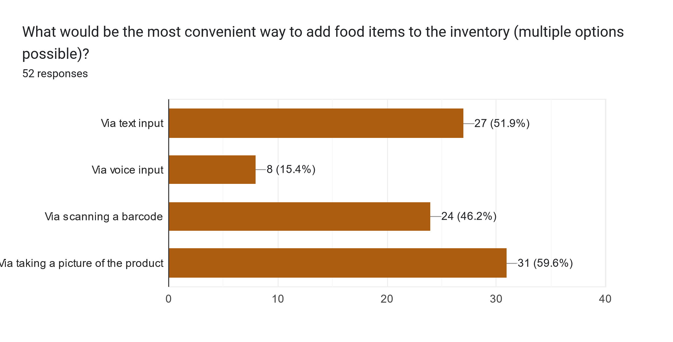
The following question reads “What additional features would you like to see in an app?” The most popular request with 45 votes is to notify when the product in the inventory is about to expire. Also, adding the expiry date to the product automatically and recipe filtering were popular choices, with 31 and 32 votes, respectively.
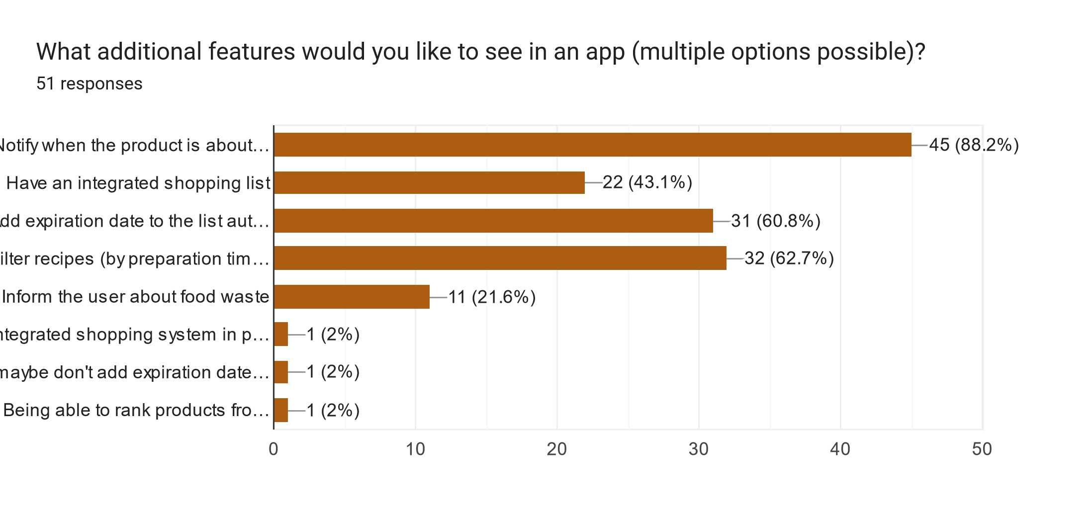
Finally, the respondents are asked to provide additional comments or suggestions. In total, 11 responses were submitted. These can be found below.
| Nice idea guys |
| Using expiration dates given by manufacturer labels is problematic as they are completely arbitrary. I often have items in my fridge weeks beyond their stated expiration date but still in a very good condition. I am fairly convinced manufacturers inentionally set very early expiration dates to boost their sales |
| It would be interesting to see how you implement expiration date compared to when the food actually spoils. Of course you could send a notification of when food is about to hit its expiration date, but it would be much more useful if you could actually estimate how far away the food is from spoiling. |
| You could provide advices on how to reduce use of packaging - list of brands/locations/shops where the same products can be bought with less plastic packaging. |
| Inform me about where I’m supposed to store food (fridge or no) |
| The app should have a dark theme. |
| The ways I had for adding food items are nice and fast, however they do not account for the expiration date as cameras can not see when a piece of food will expire especially when the food is in a carton since the expiration date could just happen to be on the back of the product. the same goes for the barcode, as far as I am concerned, barcodes do not have any information on expiration date on them as the barcode is the exact same on every product of a single type, I would like to know how the app tracks when a product will expire. |
| For the rest, I like the idea, I believe things like this have been done before (Fridgely, BEEP, Best before etc) so I would like to know what your selling point is. There is definitely a market (and a need!) for such a product as food waste is a huge issue. Good luck :) |
| This kind of app should be possible without an account, I'm a bit wary about user data harvesting. |
| would love tips about increasing lifespan or freshness e.g. putting lemons in water |
| Being able to connect the app to an Albert Heijn bonus kaart or Jumbo extras account to avoid manual input |
| I really like the concept of this app, would definitely use if it delivers on this concept |
Discussion
Several conclusions can be drawn from the results of the survey. Firstly, the sample size of 52 is too small and, therefore, not representative of the full population. Therefore, definitive conclusions cannot be drawn. Moreover, the information provided by the literature might not agree with the questionnaire results.
Secondly, it can be observed that most of the respondents (61.5%) are in the age group of 18-24. In other words, this age group represents students and/or recent graduates. Therefore, it can be presumed that the amount of food waste in this age group correlates with limited finances. As noted by [10], financial concerns create a stronger motivation to limit the amount of food waste than environmental or social ones.
As there were participants from various age groups, it would be interesting to explore the correlation between the responses and the age of the participants. Thus, this was done for questions 2 ("I frequently throw away food."), 7 ("I don't cook / don't want to cook because I..."), and 8 ("I am aware of the problem of food waste."). The results can be seen below.
-
Plot showing correlation between food waste frequency and age (1 - Strongly Disagree, 5 - Strongly Agree).
-
Plot showing correlation between reasons for not cooking at home and age (1 - Strongly Disagree, 5 - Strongly Agree).
-
Plot showing correlation between food waste awareness and age (1 - Strongly Disagree, 5 - Strongly Agree).
-
Heat map showing correlation between food waste awareness and frequency (1 - Strongly Disagree, 5 - Strongly Agree).
Another conclusion that can be drawn from questions 2 and 8 specifically is that there is a correlation between the amount of food waste and the awareness about food waste in general. As mentioned by [10], concern about food waste is a significant factor regarding food waste reduction. To explore this hypothesis more, a heat map was created. The horizontal axis represents the responses to the statement “I frequently throw away food,” and the vertical axis represents the responses to the statement “I am aware of the problem of food waste.” The numbers on the heat map indicate the number of people who have selected a specific answer. As can be seen, the respondents who answered 1 or 2 (Strongly Disagree and Disagree, respectively) are highly aware of the food waste problem with scores of 4 and 5 (Agree and Strongly Agree, respectively). Also, as can be noted, the number of respondents who are aware of food waste but still throw away food frequently is significantly less. Therefore, one of the strategies for reducing food waste could be raising awareness about food waste among the public. More specifically, the users can be informed about food waste via a dedicated info tab in the mobile application.
Lastly, the information collected via a survey is limited and does not provide the full picture of the causes of food waste and food-related habits. Thus, further investigation in the form of interviews is required.
Interview
Interview setup and methodology
For the interview study, 10 participants were recruited, taking into consideration that different groups have different reasons to waste food [5]. With that in mind, during recruiting it was made sure that all the groups were represented by at least one participant. An ERB form was used and approved by the teachers of this course and participants signed a consent form. In the transcription, the interviewees’ names are anonymized to increase confidentiality. The interviews we conducted provided many insights which are summarized in this short essay.
For the process of conducting the interviews, the participants were interviewed 1 on 1 and recorded. The recording was eventually transcribed and the most important findings were highlighted based on relevance to the app, relevance to the literature, and how much the participants stressed the point. After this, all these highlights were converted to sticky notes and put into one big MIRO board. Using an Affinity Diagram process the notes were then clustered by theme. Using the clusters together with discussions within the team these findings were concluded. Later based on these findings, a MOSCOW requirement list was made.
Findings
Firstly, when discussing incentives for individuals to use the app, it was obvious that while many users appreciated discounts and rewards offered by large retailers, there were also individuals who were primarily interested in the app's core functionality. This suggested that a one-size-fits-all approach to incentivizing may not be optimal and that offering different features for different user preferences could enhance overall satisfaction.
Health-related features garnered significant interest among participants, especially those focused on the tracking of calories and nutritional analysis. Users expressed a desire to monitor their dietary habits and track changes over time, reflecting a growing awareness of the importance of healthy eating habits. This underscored the potential for the app to serve as a valuable tool for promoting wellness and facilitating behavior change besides aiding in the mitigation of food waste. The combination of these two elements is especially fitting since the data health statistics required (like calorie tracking) could automatically become available by using the app for saving food, no other additional inputs could be required. Some participants underlined the importance that the statistics should be very clear whether your eating habits have improved compared to your eating habits in the recent past: “Did I make some progress in being more healthy or is it going the wrong direction?” (transcription).
Concerns about food waste emerged as a notable issue, with users displaying frustration over portion sizes and the obligation to purchase some items in bulk. Many felt that current cooking practices were out of sync with actual consumption needs, which highlighted an opportunity for the app to provide guidance on portion control and meal planning. Also, users wanted features like expiry date notifications and inventory management tools to help minimize waste and optimize food usage.
Participants' thoughts on privacy varied, with the majority expressing indifference towards data handling practices “Albert Heijns Bonuscard already tracks it anyway”, and others emphasizing the importance of transparency and anonymity. This suggested a need for clear communication regarding data privacy policies and options for users to control their personal information within the app, as well as providing users with the option to not have any of their data collected.
Time allocation was another area of divergence, with users reporting varying levels of engagement ranging from brief daily interactions to more extended weekly sessions. This underscored the importance of designing the app to accommodate different usage patterns and preferences, ensuring that users can engage with the platform according to their individual needs and schedules. Making the minimal required interaction to make use of the app short is important in order to not exclude the group that preferred brief daily interactions, for example, the people who said they would not spend more than 10 minutes daily on the app. Making use of for example bar-code scanning to enter recipes could be a way to make the app more time-efficient.
Regarding the inventory input issue, participants expressed a strong preference for automated methods over manual entry. This preference underscored the importance of user interactions within the app to maximize convenience and efficiency. By implementing quick and effective inventory management features such as barcode scanning or photo-taking and reading of products, we could enhance user satisfaction and encourage greater engagement with the app.
Feedback on the app being an app itself was mixed, with some users expressing reservations about over-reliance on technology, and concerns about potential inconveniences such as the need to purchase additional ingredients to complete recipes or update quantities as items are consumed. However, others appreciated the app's potential to promote better shopping and cooking habits, as well as its ability to provide personalized recommendations based on current inventory.
Social features were not a top priority for most users, although some expressed interest in the possibility of connecting with others who share similar dietary restrictions or preferences. This suggested that while social networking capabilities may not be essential for all users, there is still value in providing options for community engagement and peer support within the app. However, it still would be helpful to give statistical feedback about the user's performance compared to others without having to share it since there is a need for that which later will be discussed. An example would be a ranking in the least food wasted percentage to fellow countrymen.
Customization options were highly valued by participants, particularly those related to cultural, religious, and medical factors. Users expressed a desire for the app to accommodate their individual needs and preferences, indicating a need for flexibility and adaptability in design.
Educational content was welcomed by most users, although they preferred it to be presented in a subtle and optional manner within the app. This highlighted the importance of striking a balance between providing valuable information and allowing users to engage with the content on their own terms.
When it came to participants’ perspectives of their own food waste contributions, the majority believed their individual impact on food waste was minimal. There were very few who acknowledged their likely role in contributing to the issue, a trend also observed in the survey results. This diversity of opinions highlighted varying levels of awareness and responsibility among users regarding food waste in general, indicating a need for educational initiatives even more within the app to promote mindful consumption and reduce waste. But even more specifically participant are likely ignorant about their own personal food waste. When all participants assume they don't waste any food it does not match up with the statistics from the literature. When they are asked to motivate their answer, the response often is that they don't recall throwing stuff away. This however is more likely due to them not perceiving throwing the food away as very significant at the time. This might be an opportunity for a statistics function in the app that tracks the amount of food wasted to point out to the users what their contribution is to the problem. It could compare the users to one another and give feedback on their behavior by telling them whether they are doing well. This could give them a sense of responsibility for doing their part which is important in the problem of food waste [16]. This interaction could also give the user a sense of empowerment as the results in personal food waste of their actions will become evident, which is important according to the CEASE framework[17].
Participants also noted that sometimes they would cook recipes with other ingredients if a certain ingredient was not available. A function in the app that shows possible substitute ingredients for the recipe would be a nice addition to aid this which some participants even suggested their selves during the interviews.
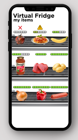
The desire for the app to keep track of users’ progress in the app was evident among participants, albeit with mixed opinions. While some users expressed interest in monitoring their progress and behavior over time, others were more reserved about sharing personal data. This highlighted the importance of providing users with control over their data and ensuring transparency in how statistics are collected, stored, and presented within the app.
To increase efficiency even more and have more ease of use the app could make use of an expiry date prediction model. A participant also noted that the app could show the effects on expiry date storing food in different places (shelf, fridge, and freezer) as they would age differently. Also, with some participants there seemed to be a need to know not only when something is still edible but also when something is fresh (optimally tasty) since these two things are not the same. However considering the time frame for the development of the app, these will more likely become an implementation for the future. For now, a more feasible way to enhance efficiency would be to have a tutorial the very first time starting the app.
Lastly, app design feedback from participants offered valuable insights into their preferences and expectations. Users favored a minimalist approach that emphasized simplicity and clarity in design elements. They appreciated interfaces free from loads of information, instead opting for clean layouts that prioritize essential information without overwhelming visuals. Additionally, participants highlighted the importance of intuitive navigation, emphasizing the need for user-friendly interactions that facilitate effortless engagement with the app's features.
Color schemes were another crucial aspect of app design feedback, with participants expressing preferences for vibrant yet soothing colors. They favored pastel tones and bright hues, suggesting a desire for interfaces that evoke warmth and positivity. Moreover, users appreciated the use of color coding to differentiate various elements within the app, such as products in the virtual inventory based on their expiry dates. This indicated a preference for visual cues that enhance usability and facilitate navigation within the app.
Participants also provided feedback on imagery within the app, expressing a preference for diverse and eye-catching visuals. They appreciated high-quality photos that showcase food items and backgrounds featuring appetizing dishes, adding to the overall appeal of the app. Furthermore, users favored the use of animated pictures and icons, which add a playful element to the interface and contribute to a more engaging user experience.
Feedback on the app’s branding and identity was positive, with users generally appreciating the logo, app name, and slogan, as they felt the elements resonated with the overall theme and purpose of the platform. Additionally, participants valued specificity in expressing product expiry dates, suggesting a need for clear and informative visual representations.
Design Findings
With the goal of designing an interface that is intuitive, clear, efficient, and has a pleasant user experience for the virtual fridge, three mockups were produced and evaluated during the interviews.
The first mockup was very graphical. Realistic PNG images with a transparent background were used for the food. The food was placed into an actual fridge. Health bars would indicate how long the food had before it would expire. Food is sorted by expiry date with the smallest expiration time on top. This interface does not make use of text. The idea is that because of it would be intuitive and in one eyesight you can see all the information you need.
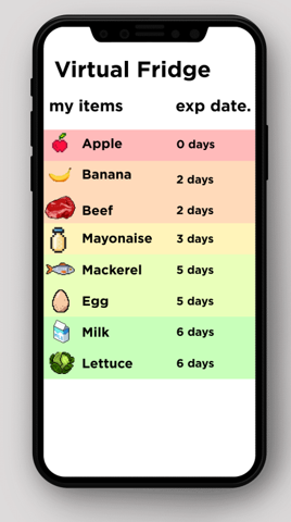
The second mockup represents more kind of the interface of an advanced list. Color coding would have to convey the expiration time left fairly easily. The images of the food were made in pixel art, this would support the idea of gamification [18].
The third interview made use of clusters. Ingredients could for example be clustered by expiration date. However other categories could also be possible, like food type. The ingredients were displayed like professional food photography. High-quality images within a setting that make it look tasty. But also more tasty than your actual food looks and thus not in line with reality.
The eventual findings were that the ideal virtual fridge interface would be a combination of elements from the three mockups. From Figure 4 having it look like an actual fridge would be good was the main takeaway since people liked how it looked and thought it was intuitive. This might be a bit hard to implement development-wise and it has more impact on the user experience than functionality, so it does not have the highest priority. The color coding and expiry date made it most clear in Figure 5. And the high-quality pictures from Figure 6 were liked.
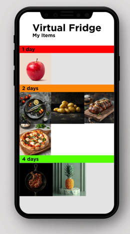
Overall, users described their ideal app as reliable, user-friendly, and visually appealing, with a focus on functionality and efficiency. They emphasized the importance of features that help them save time, reduce waste, and improve their cooking habits, while also allowing for customization and learning opportunities. By incorporating these insights into the app's design and development process, developers can create a platform that meets the diverse needs and preferences of users, ultimately enhancing their overall experience and satisfaction.
Affinity Diagram
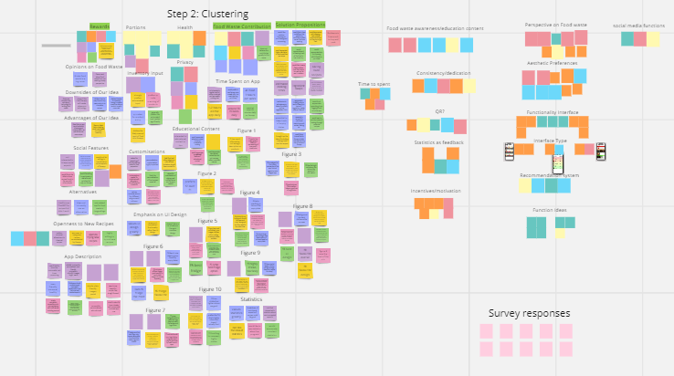
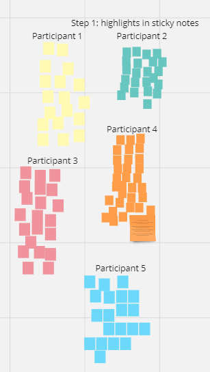
User Requirements
Based on the findings from the interviews a MOSCOW list was created.
Must have
- Virtual Inventory: The users can store their product inventories in the app.
- Textual input: The users can input their bought products into the app by writing down their names, quantities, and expiration dates.
- Notifications: The app informs the user when a product in the inventory is about to expire.
- Recipe suggestions & filtering: The app suggests recipes based on the ingredients available in the user’s inventory. The recipes can be filtered by cuisines, cooking time, calorie count, and available cooking utensils.
- Storage of User Information (relevant to recipe filtering): The users can input their allergies, chronic diseases, cultural/religious food limitations, and diets, which are stored in the user profile and then accounted for when recommending recipes.
- Anonymous Login: The users can log in to the app anonymously to maintain their privacy.
Should have
- Adjustable portion size: Users can adjust the portion size depending on the number of people in the household.
- Info tab: General information about food waste, could also include tips on how to store various groceries, such as fruit and vegetables and generally on cooking sustainably. This should be at the back of the app, accessible but not too annoying
- Scanning Data Input: QR scanning for inputting bought items into the virtual inventory.
- Expiry Date Prediction: The app predicts the approximate expiry date of certain products that do not have a specific expiry date, also based upon where it is stored (fridge, freezer or shelf).
- Saving Liked Recipes: The app has a “favorite” page where users’ favorite recipes are stored.
- Ingredient Substitutes: Have the possibility to substitute ingredients in the recipes with analogous products.
Could have
- Rewards: Continuous use of the app can gain the user some sort of virtual points, which can be used to acquire discounts at big retailers or even full-on food packages.
- Calorie Tracking: Users of the app can select the number of calories that they want to eat of their chosen meals, and the app consequently recommends ingredient quantities.
- Statistics: The app includes personalized information on how well the user is utilizing the app, like streaks of daily use and perhaps comparisons to other users.
- Tutorial: When a new user joins the app, there is a short, optional tutorial that teaches the user how to properly use the app.
- Integrated shopping list: The user can add ingredients that are required for a specific recipe to the shopping list. Also, when a product runs out it gets added to the shopping list automatically.
- Social Features: Users can contact each other and form communities where they can share information and interact.
Won’t have
- Filling per calorie: List meals based upon how much they fill
- Food Freshness: An additional indicator based on predictions, next to whether the food is within the expiry date and whether one indicating food is still fresh (nice to eat).
- Health Statistics: Month overview of food eating patterns and health wise comparison to yourself
- Custom recipes: The user can add their custom recipes to the app, with option to share it with others
General Findings
- People don't think they need assistance because they don't waste a lot, which however they do.
- The design should be minimalistic and intuitive, prioritizing functionality.
- Virtual Fridge: mix different elements from the 3 fridges: From 1st fridge, have it look like an actual fridge, use PNG images. 2nd fridge: color coding and expiry date. 3rd fridge: group by expiry date, high quality pictures
- People want bright aesthetics, food is a happy thing
App Design & Frontend Development
UI Design - initial designs
The user interface of the app was designed in Figma, a powerful tool for wireframe and interface design and one of the industry standards for UI designers and frontend developers. The research team included some design options in the survey, which included the login screens below and also some AI generated layouts for the inventory page. The most liked designs from the survey participants turned out to be the login screen we designed and list layouts for the ingredients. Hence, these were taken into consideration during the design process. Some of the initial designs are shown below in this section, however, as it may be noticed, not all pages of the app had a design. This is because, due to the time constraints of the project, it was often more time efficient to immediately design the pages in XML in Android Studio itself. However, this process was not always effective, as the app had to be completely redesigned multiple times (which meant changing the color and style of every single component for example) because it did not end up looking professional or put-together enough. This could have been avoided if we had more time to create actual design variations before jumping into implementation, nonetheless, we managed to deliver a satisfactory final look.
We generated our broccoli mascot figure with the help of Microsoft Copilot AI, though we indeed had the idea of a broccoli-man beforehand. We received multiple satisfactory results which we tweaked further until we got the alternative below, which we thought would be the best option.
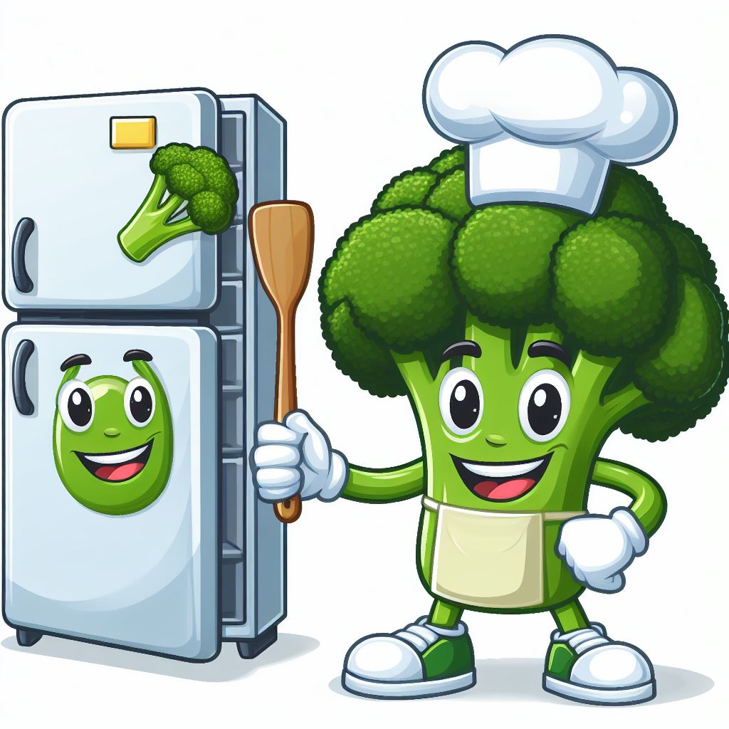
Below the initial designs for the Login and Signup pages are shown. The first idea was to use a dark green primary color and to match the secondary colors such as buttons to the dominant green used in our mascot figure.
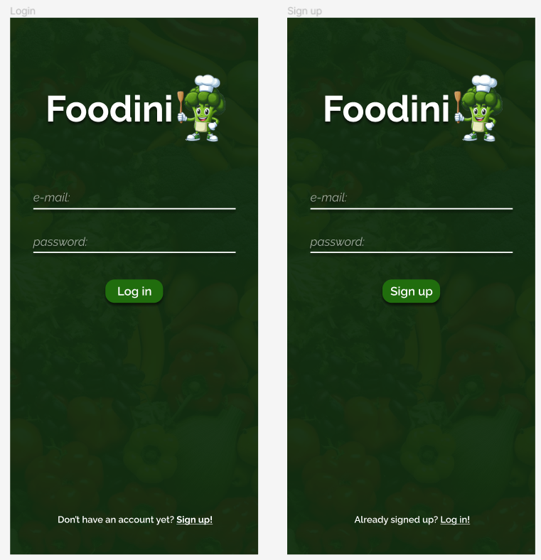
On the Inventory and Recipe page designs, it can be seen that slightly different greens and font styles were tried out, in order to experiment with various looks. Thanks to previous UI design experience, two different fonts were chosen for the app: one heavier and interesting font for the headers and other important text and a simple, well-readable font for all other text. A placeholder image depicting our mascot in black and white in case of missing recipe images was also designed from the start and later used in the app.
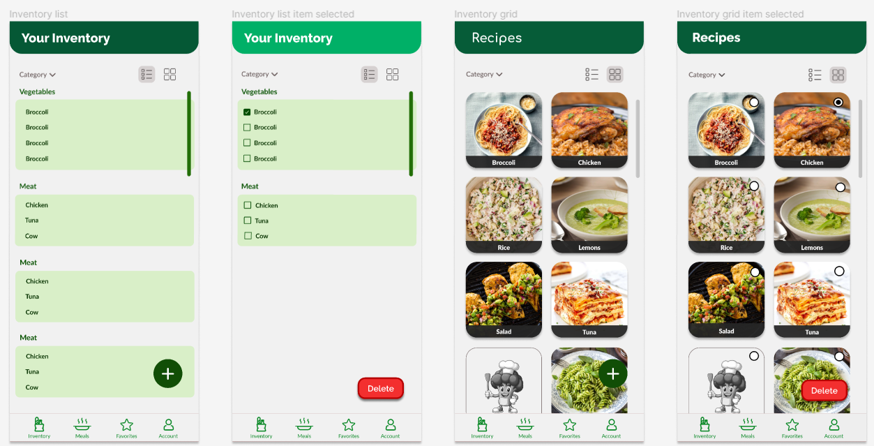
On the image below, the general look of all popup dialogs is shown. This was later altered in changing the radius of the corners and the buttons were also redesigned, however, this initial design served as a great starting point for all dialogs, which was useful as we chose to heavily use popup dialogs as means of interaction.
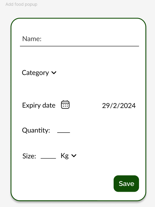
UI Design - iterations
The most difficult part of the design process was undoubtedly choosing the most fitting color scheme for the app, and it took several iterations to get the best results. In the first few versions of the app, a dark green was chosen as primary color, mainly because the initial Login and Signup pages were designed with a dark green accent, so the idea was to match the app to these pages. Apart from the primary color, the layout of the main header and the page content for the app pages posed another great challenge, as this layout was used on every page for consistency, hence it was an important visual feature of the app.
Iteration 1 - dark green with small header
In the first version of the app the login and signup screens were slightly redesigned, with stylish opaque-effect input boxes and larger buttons. The header on the app pages was quite small in this phase, and the primary color was dark green. An interesting design choice was to use a floating bottom navigation view compared to a regular bottom navigation (seen in the initial designs). The elevation and drop shadow make the menu pop out and creates a stylish look.
- Iteration 1
-
Login page 1st version
-
Inventory list view 1st version
-
Inventory grid view 1st version
Iteration 2 - Green gradient with large header and dark green primary
In the second phase of the app, the headers were replaced and the new style was a larger header with a green gradient background. The larger header style turned out to be a better look compared to the previous version, so the size was kept in later iterations. The gradient on the other hand introduced the issue that looking at the same gradient on each page header felt heavy on the eye, but changing the gradient color scheme for each specific page would have introduced a lot of color clash and visual clutter. The inventory items were made into a card view with an elevation effect.
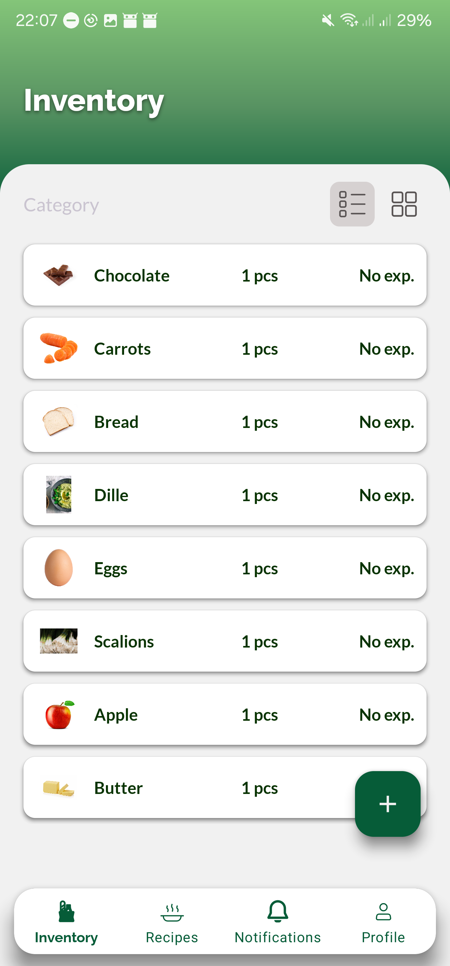
Iteration 3 - Dark green with large header
The 3rd iteration was a stable one for our app, as it was used for longest time without being replaced. Here the dark green returned in the headers and it seemed that the larger header style matched well with the color choice. On the image below is a full overview of the app at the time of week 5-6 of the project. An important design decision we took at this point was to color code the days till expiry text on the inventory items such that items with no expiry or that expire later than today have no color, those that expire today have an orange color and those that expired have a red color. This idea was reinforced by the participants of our surveys as well. At this point, the rounded corners, button styles and elevation effects were used consistently, creating a modern UI which followed Android's Material 3 guidelines. An extra green highlight was added to the selected bottom menu item (the page the user is on) to make it more noticeable.

Iteration 4 (final iteration) - Light green with large headers and login redesign
In week 7 of development, the app went through a final transformation, by replacing the dark green with a much brighter green. Our reasoning was that the dark green made the app feel too heavy and it did not convey the idea of freshness as the actual purpose of the app would have required it to. Changing to a lighter green resolved this issue perfectly and resulted in a much more positive looking UI. Even though this meant that the login and signup pages had to be redesigned to match the new green, it was a positive decision and it was worth the effort. Additional changes included the addition of the advanced filters popup and the redesign of the profile page such that users are able to input excluded ingredients and intolerances there. A final redesign of ingredient items was also done, by removing the card view but keeping elevation on the ingredient items so that when the user switches to grid view, the design of the pictures follows the same style. The final color scheme and the final looks can be seen below.
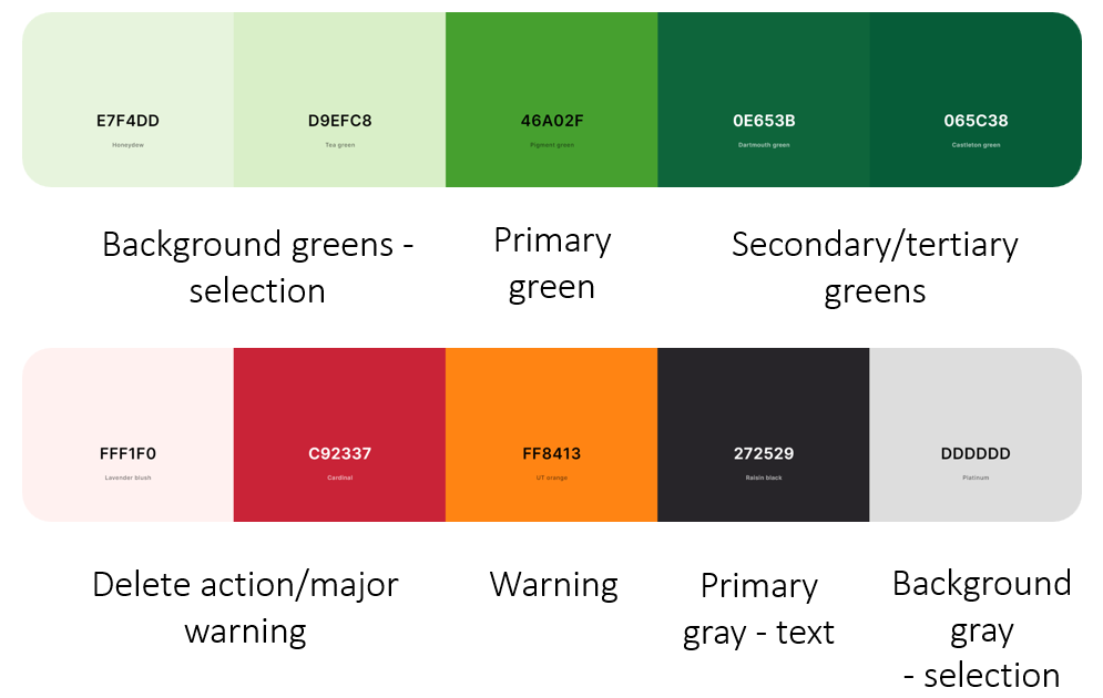
- Iteration 4 - final
-
Login page final
-
Inventory list final
-
Inventory grid final
-
Recipes final
-
Recipe show page
-
Profile page redesign
Icon choices
Icons are a very determining part of an app UI, as they are a fundamental part of displays. A good display should convey information non-ambiguously, and that means that in the best scenario, it has a well readable, well understandable and informative text, coupled with an image or icon that represents the action/warning/display message straightforwardly. Accordingly, icons were chosen with great care for our app and much like the actual UI, they went through several replacements until the best ones were chosen. An example of this process can be seen on the image below where, for example, the inventory icons, recipe icons, star icons and bell icons all have multiple variations shown. For instance, the inventory icon was switched from a bag holding some food items to a basket with a checkbox, where the latter better represents the idea of "food that is present at home", and it is better recognizable. Of course, the color of the icons were matched with the UI of the app, such as the alert icons on the bottom right which have the same red and orange color that is used in the inventory page for the color codes of expiration dates.
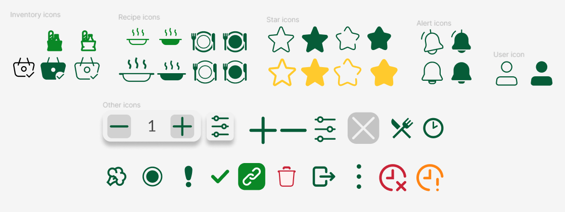
Frontend Development
The development the UI and interactions of the app was done using XML for the layouts and views and Java for the logic of navigation and interactivity. An overview of the fragments can be seen in the next section. An important technical choice we made was to use Android's RecyclerView component for displaying all of the item lists in the app (ingredients, recipes). This was for two reasons. First, this technology allows for seamless switching between a list and a grid view, which is exactly what we needed for the Inventory page. Second, RecylerView is the most memory-efficient component for the task of list rendering, as it literally recycles the views of data objects instead of rendering a new view per object[19]. In practice, this means that as the user scrolls down a list, items that are further down inherit the views of items that are further up on the list, essentially rendering only a few actual views on the screen at all times, and repopulating them with different data. While this technology is very efficient, it also comes with some side-effects, like a mix-up of object data for items that "share" the same view. During development we fixed all of these little issues with the help of research.
One great challenge about coding the UI was dealing with gesture based and soft-key based navigation. Android devices offer the option to change the phone's navigation type, and let the user choose between a 2 or 3-button soft-key navigation, or gesture navigation in which users control the phone with hand gestures. From a technical point of view, the difference shows in the height of the phone's navigation menu, which, if using soft-keys, comes out to be a fixed 48dp[20] (density-independent pixels, written as dp (pronounced "dips"), are flexible units that scale to have uniform dimensions on any screen[21]), but has varying height for the gesture navigation depending on different phone models (see picture below for reference). Why this matters is because depending on which navigation is used, the floating elements like action buttons and especially the app's bottom navigation view should have a different bottom offset. This issue was fixed for the bottom navigation view, so the bottom menu always looks perfect, however we did not have time to fix it for every other element that required fixing.
- Soft-key vs gesture navigation
-
3-button Soft keys
-
Gesture navigation
Reactive feedback & animations
In order to keep the user experience smooth, interactive and reactive, we made sure to always include highlights, transitions, animations etc., to make sure the user receives useful feedback about their actions. For instance, when tapping on a button, option or editable field, the element is highlighted on click. On the Inventory page RecyclerView's in-built animation provided a nice transition for switching between list and grid views. Transition animations were added for fragments that relate to the same parent fragment, such as between the main recipes page and the recipe show page or between the profile page and the food waste info page. For visual appeal and satisfying feedback, an external library was used to achieve push-down effect on the intolerance buttons on the profile page. These can be seen in the gifs below.
- Transitions and animations
-
Switching between list and grid view
-
Fragment transitions
-
Button push-down effect
App Overview
The app consists of five main pages: Inventory page, Recipes page, Favorites page, Alerts page and Profile page. In this section we will show all pages and go through all actions that are possible within the app. Furthermore, we convey our thinking process by explaining the decisions we took for each page, component or action.
Here is a video demonstrating the app. (3:34)
Sign up and Sign in Fragments
Actions
This part of the app is meant for account creation. Thus you can sign up, sign in, sign in anonymously, and sign out. For signing up an email, username and password is required. Signing in anonymously does not require anything. Signing out can be done through the profile fragment, upon opening the 3 dots menu.
Decisions
The option for anonymous sign in had been added, as that was desired from the participants of the initial app survey. The requirement of a username is done, in order to display it on the profile page. That username can be used to address the user.
Inventory Fragment
Actions
This is the main page of the app essentially. This fragment is supposed to be a digital representation of your fridge, or storage in your kitchen. From here you can have a glance at your ingredients, their quantities, and when it is going to expire.
You can switch between a list and grid view. The grid view is meant to have a better look at the images.
From this fragment users can add new ingredients, modify them, and delete ingredients.
Decisions
There was an extensive discussions about what attributes an ingredient in one's fridge should have. Thus the team has taken items from their fridge and evaluated what the appropriate attributes would be. After numerous changes we decided on that the ingredient should have a:
- Name (required)
- Category (required)
- Expiry Date (not required)
- Quantity (not required)
- Size with a unit (not required)
Some attributes are thus not required before adding an ingredient. In the case of Expiry date, it could be the case that you simply do not know the expiry date. For Quantity, not all foods are specified in quantity. For example grapes. In case the quantity is not specified, an automatic 1 will will be used in the database. Size is rather particular, since depending on the unit something else gets stored in the database. In case you choose kg or g as the unit, the ingredient will get a weight attribute. In case you choose ml or L the attribute will be called volume.
Recipe Fragment
Actions
The recipe fragment is where the recipes are generated. The generation begins upon entering the fragment. You can change the amount of recipes shown, and also apply more advanced, and granular filters to the recipes.
The recipes can be tapped on. Once tapped, the a recipe page will show up. The recipe page shows the cook time, cuisine, ingredients (ingredients in your possession have a checkmark), and instructions on how to make the recipe.
On the recipe page itself there are three actions. You can view the webpage of the recipe by clicking on the link button, in case our instructions differ from what was the original. You can cook a meal, which subtracts the required amount of ingredients from your inventory (this feature has its limits due to time constraints). Lastly, you can add a recipe to your favorites for later.
Decisions
Initially the fragment was only meant for showing the generated recipes. However from the feedback from the surveys we gathered that people would like more fine granular search options for recipes. That has resulted in the advanced search dialog and the ability to choose excluded ingredients and intolerances from the profile fragment. Attributes for searching food that is more or less permanent (less likely to change), would be put into the profile fragment. The other attributes were put into the advanced search dialog. There has also been a bit of a discussion what a card should show. Initially we were going to show the cuisine and cooking time, however due to API constraints that was not possible. Thus that information ended up instead in the page you get to when clicking on a fragment.
Favorites Fragment
Actions
This page is similar to the recipe page, however it only shows your favorite recipes. Upon clicking on the recipe you get to again see the other attributes of a recipe.
Decisions
The cards on this page was also meant to show you the present ingredients which you have in your fridge on the card of the recipe. However due to API constraints this was again not possible. If we were to implement it we would have to do the calculation on-device. While possible, it would take some loading and calculating time, and we could not implement that in the time we had left for this project.
Alerts Fragment
Actions
The alert page is meant to show you a history of your notifications. In case you miss a notification or swipe it away you can find them back here.
Profile Fragment
Actions
From the profile fragment the user can select their intolerances and exclude ingredients from recipes. Upon selecting the information immediately gets updated in Firebase. This is also the fragment from which they can log out and go to the information page.
Decisions
As as alluded to earlier, the decision to have intolerances and excluded ingredients there is because that kind of information is often not changed as much as the attributes in the advanced search dialog.
APIs & Back-end development

The provided class diagram offers a comprehensive overview of the application's architecture, delineating the interconnections between different classes. It encompasses numerous UI-related classes, each corresponding to distinct screens, along with other classes designated for modeling various object types.
In the subsequent sections, we will delve into the individual core components depicted in the diagram, including the classes associated with Spoonacular and Pexels functionalities. The UI files will not be discussed further, as they have already been extensively detailed above.
API
Because Firebase is mentioned below, this section will mainly focus on the APIs that were used for our images and recipes. For our final build of our application, these APIs were used:
Furthermore, it was deemed efficient to create an abstract class for both the Spoonacular and Pexels classes, consolidating essential HTTP GET methods. This simplified API calls within the classes and minimized code redundancy.
Decisions
Recipe Searching
We've chosen Spoonacular for the main source of a lot of the fetching because of it's flexible nature and easy to use API. However, due to the limitations to their image repository for ingredients, we've additionally opted for another source as backup in case there are issues related to either request limits or non existent images for things that are added into the inventory page.
Prior to the final decision for APIs, others were tested as well:
MealDB API is a simpler and potentially free option that is ideal for basic recipe data and straightforward integration. On the other hand, Spoonacular offers a more comprehensive suite of features including detailed nutritional information, meal planning, and dietary filters. While it may be more costly, Spoonacular is the better choice in our use case since it offers in-depth food data, catering to a wide variety of users.
To gather a broad range of recipes, third-party APIs are utilized. However, since Spoonacular meets our needs better than Edamam in terms of coverage, it was chosen instead. Furthermore, during our experimentation of Edamam, it was discovered that ingredient searches within their API were not possible. Given our desire to display ingredient images in our app, we found that Spoonacular was better suited to our requirements.
The the two classes were left in, in case we wanted to switch back to them during development. This would minimize development time since they wont need to be rewritten again.
Ingredient Image Searching
As previously mentioned, Spoonacular is used for the ingredient image fetching. However during testing we've realized that in Spoonacular we have a request limit of 1 request per second, thus we've decided to used a general image repository for the ingredient as a fallback. The advantage of this is that if the user enters an ingredient into their application and the ingredient/item doesn't exist in Spoonacular, the general image repo. will take care of it.
In our case, Pexels ensures comprehensive coverage and access to high-quality, royalty-free images, enhancing the user experience with diverse and visually appealing photos. This approach provides reliability and redundancy, safeguarding against potential downtimes or gaps in Spoonacular's database.
Firebase Back-end
Authentication
For the log in and sign up functionality we are completely relying on Google's Firebase. As you can see each user has an userID associated with them. This is how users are distinguished within the app.
Firestore
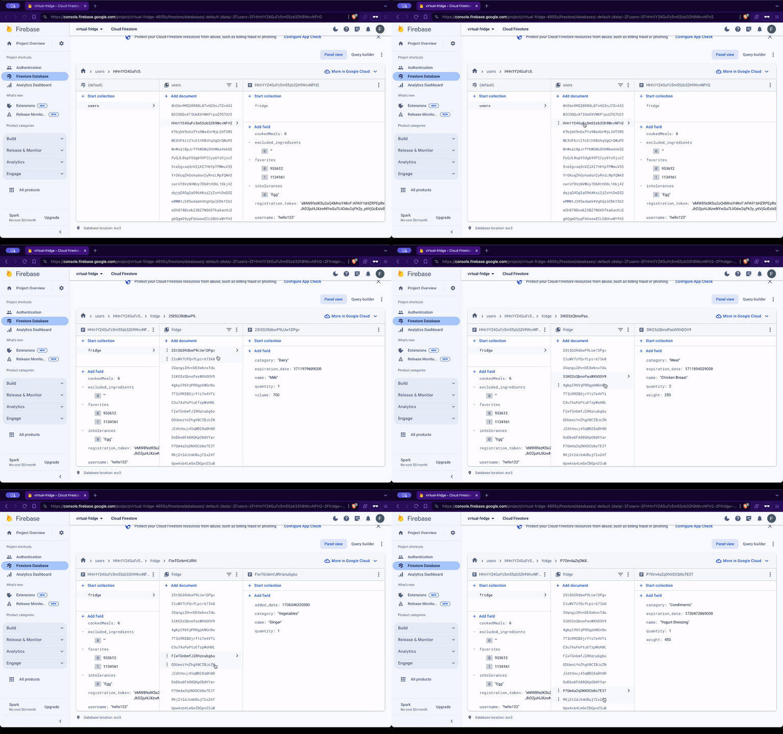
The same UserID that was used for authentication is again used in the Firestore database. Firestore is a NoSQL database. Database schema:
- users
- user
- fridge
- ingredients
- ingredient
- name
- category
- expiration_date
- quantity
- weight
- volume
- ingredient
- ingredients
- notifications
- notification
- cookedMeals
- excluded_ingredients
- favorites
- intolerances
- registration_token
- username
- fridge
- user
Cloud Messaging
The notification system makes use of Google Cloud Messaging and an external server (Foodini Server). The code for the Foodini Server resides in a javascript file. Node.js is needed to run the script. The script should be run every 24 hours to push out notifications. Google cloud messaging is a service that runs in the background on every Android Phone with Google Play Services installed. The reason for choosing this approach of an external server instead of on-device notification generation, is because the on-device method needs to have the app running in some state. Some Android manufacturers kill all background services associated with your app upon being idle for too long. Thus notifications would not come through anymore.
The script iterates through all ingredients in everyone's fridge. If the item is close to expiration, it will send out a message. If it has already expired it will send out a different message. That message is received by the Google Cloud Messaging Service and forwards it in the form of a notification to the Android phone.
Validation User Study
Methodology
After a prototype version of the app was built this prototype was deployed with two main goals in mind. The first goal was to find any errors in the app which then could be eliminated with further iterations of the app in the future. The second goal was to validate whether the app did in fact work regarding fulfilling its purpose, namely successfully combating food waste. Two different approaches were used for the two different goals of the user study.
To find any errors in the app the usability of it was tested. For this persons who have never seen Foodini before were given the prototype version of the app. Then they were tasked to perform certain actions like for example: “put 1L of milk in your fridge”. The time it took the participants was measured. This way the usability and efficiency of the app was tested. When a participant does not manage to complete a certain task, this is a major indication that the usability for that task is flawed, and a redesign of the interface should be considered.
To test whether the app manages to combat food waste it must be measured whether users in fact change their behavior. For this study the prototype is deployed for a longer time since behavior change does not happen instantly[26]. Ideally we would measure whether the amount of wasted food decreases after the user starts using the app compared to before. However, this was unfortunately not possible because we lack certain data to do this. However another way of measuring behavior change is by using qualitative data to indicate behavior change metrics like for example: perceived usefulness. To find out what these metrics exactly are first a literature study was conducted. The results of that were used to create a questionnaire which was given to the participants after 5 days of using the prototype.
Behavior Change Study
The data gathered for this study will be qualitative data with the theory of planned behavior in mind. For example target information are the attitudes, subjective norms and perceived behavioral control.
The following survey was made to give to the participants after the study/5 days: link
After the 5 days however we discovered that due to the small amount of participants (some participants quit participation) and the small amount of time given to test the app it was better to instead of having them fill in the survey just have a small talk. Although 5 days is longer than the other user study, it is still very short for behavior change metrics[27]. We discovered that most of the participants did in fact try a few new recipes with the exception of one. They did mention that they had glitches with food quantity put this was expected as we could not use the absolute final build of the app for this user study. They mentioned that because of this the app felt unreliable but if these glitches were fixed the user experience would be considered as nice. When asked about the perceived usefulness of the app the majority mentioned that they did find it useful but whether they would have the motivation to keep on using it for a longer period of time remained to be seen. For that a longer user study is required. This methodology is very unscientific, but it is still from a designer perspective useful to do since it very indicatively validates whether there is potential.
Usability Study
The usability test was given to 3 participants. They were given the following task prompts and the time it took them to complete the task if they completed it was noted underneath.
- Make a account
00:48
00:55
00:54
Average time: 52 seconds
- Put 1L of milk in your fridge that expires in 7 days
00:44
00:35
00:48
Average time: 42 seconds
- Put 500 gr of meat in your fridge that expires in 4 days
00:27
00:24
00:35
Average time: 44 seconds
- Put 500 gr of spaghetti sticks in your fridge
00:30
00:38
00:35
Average time:36 seconds
- Put 2 cans of 400 gr canned tomatoes in your fridge that expires in 1 month
00:38
00:45
00:52
Average time: 44 seconds
- Find a recipe you would like to make
00:29
00:34
01:20
Average time: 48 seconds
- Check which ingredients you still need to make pasta Bolognese
01:00
01:23
01:54
Average time: 86 seconds
If you look at the average time, nothing seems to be majorly out of order. It is noticeable that the first time entering the recipes it takes a bit longer than the second and third time. The learning curve is small, since the time immediately improves the second time. The times for finding recipes are relatively long but this is also because it takes rather long to sort the recipes (which could have been the caused by the phone), so it is just loading time, not the interface of the listing of recipes. No person failed to complete a task. However it did occur that a person did not select kilogram instead of gram. Also once a person typed in the ingredients in Dutch which resulted in the wrong display of images and did not work for the recipe suggestion system. The conclusion is that the app interface is usable but things like the language could use some clarification.
Discussion
Limitations
A. Research Limitations
The following section will describe the limitations of our research process, which was carried out to draw up the requirements for the Foodini food waste app. Thus, it will consist of six distinct sections, one for each of the different major steps we undertook as part of this process.
1. Literature Study Limitations:
Ultimately, our team is proud of our work on the literature study, as we examined numerous distinct sources (and thus perspectives) and focused on a range of varying topics related to our project. These were the issue of food waste generally, statistics on the issue, food waste at consumer levels, theory of planned behaviour, ways to combat food waste, and state-of-the-art solutions. Nevertheless, we still were able to identify a number of different limitations throughout the process which we will now explore.
One frustrating limitation was the limited access to certain academic databases and resources. It happened at least a dozen times that our research team members would come across seemingly valuable sources, but were not able to gain access to them due to subscriptions or payments needing to be made on the host websites. This was not the biggest limitation, as we were still able to gather many valuable sources, but we undoubtedly feel that our study could have been improved had there been no such restrictions. Another significant limitation were the time constraints. Initially, we only dedicated two weeks for the literature study, though the process slightly extended into the third and fourth weeks. Despite this rather long time spent collecting data, we still felt that there were undoubtedly aspects of the problem relevant to our project that we were not able to entirely tackle. A reason for this was our prioritisation of quantity over quality during the first two weeks, which later pushed us to have to complete our writing about a lot of different relevant topics.
Another relevant limitation of our study was the abundance of sources from the United States compared to European ones. Evidently, our project was primarily aimed at European markets, since this is the continent that all team members currently inhabit. Nevertheless, the United States generally does a better job of collecting data and publishing it widely, at least when it comes to the information being available in English. Consequently, we were forced to use a lot of data from the United States when this was not exactly ideal for our project. Lastly, due to our lack of extensive experience in conducting academic research, we unquestionably did not extract all of the information we could have from the sources available, though this is a limitation which could only be improved with time and practice.
2. Interview Limitations:
One obvious limitation of our interviews was our rather small sample size of only ten individuals. With ten people, the diversity of perspectives presented regarding our questions could not possibly represent what is there to be found in the real world, likely leading to valuable feedback on our project being lost. This issue was most likely worsened by our convenience sampling strategy, which had us mostly interview our university colleagues or family members, undoubtedly missing out on certain demographics relevant to the project.
Another relevant drawback of our interview process was our likely lack of expertise and experience in creating the questions and establishing a coherent structure. During the interviews, some of our inquiries felt somewhat unnecessary, whilst others were too similar to one another. Moreover, our interview ended up having twenty-nine different questions, which made some discussions take over one hour and a half to complete for those participants giving detailed answers to every question. Consequently, this also made the processing of the data from the interviews far more time-consuming and tiring, while also slightly bothering some of the interviewees.
Lastly, the fact that the interviewers knew the interviewees personally, and vice versa, could have possibly created some level of social desirability bias, where the participants felt inclined to provide positive answers as to please or not upset the interviewing peers. We did discuss this as a team, and felt that this could not have had a highly impactful effect on the interview results, but we still consider this a notable limitation for future projects.
3. Survey Limitations:
The survey conducted by our team also encountered several significant limitations that impacted the depth and reliability of our findings. Firstly, the most glaring limitation was the small number of participants, approximately 50 in number. Due to time constraints and limited outreach efforts, our survey garnered a smaller pool of respondents than anticipated. As a result, the sample size was insufficient to capture the full spectrum of perspectives or provide highly, statistically significant results. This limitation considerably undermined our ability to generalise our findings, as well as their reliability, which in turn limited the applicability of our conclusions to the broader population.
Another critical limitation arose from the design of our survey questions. Specifically, the fact that we opted for primarily multiple-choice questions constrained the diversity and depth of the responses we obtained. By offering a limited number of answer options, we restricted participants' ability to express nuanced opinions or provide detailed insights into their experiences and perspectives. Consequently, the data collected lacked the granularity needed for a comprehensive analysis, potentially overlooking important aspects or alternative viewpoints. Notably, however, we considered this limitation and thus also carried out the interviews.
Additionally, our team's own limitations played a role in shaping the shortcomings of the survey. Limited experience in survey design and methodology hindered our ability to construct questions effectively or implement appropriate sampling strategies. As beginner researchers, we may have overlooked crucial factors such as survey length, question wording, and response options, which could have influenced participant engagement and data quality. Moreover, constraints in resources and access to survey tools may have further constrained our survey's effectiveness and reach, as we used the very basic google survey software.
4. Affinity Diagram Limitations:
Our affinity diagram, aimed at organising feedback from the interviews and survey to derive our app requirements, encountered several significant limitations. One major challenge stemmed from the varied responses to questions posed during the interviews and survey. The diversity of opinions and perspectives made it challenging to create coherent groups of feedback, resulting in potential overlap or fragmentation of ideas within the affinity diagram. This limitation hindered the clarity and effectiveness of the diagram in identifying common themes and requirements.
Another notable limitation was the difficulty in summarising in-depth survey and interview questions into concise notes suitable for the affinity diagram. The complexity of the questions and the depth of responses posed challenges in processing key insights into brief, actionable points. This limitation constrained the effectiveness of the diagram in capturing the richness of participant feedback and translating it into actionable requirements for the product being developed.
Furthermore, the affinity diagram process proved to be highly time-consuming for our research team. The task of creating notes from survey and interview responses, followed by the labour-intensive process of grouping them into coherent categories, consumed significant time and effort. This time constraint posed challenges in ensuring thoroughness and accuracy in the organisation of feedback, potentially leading to oversights or rushed decisions in the diagramming process.
Additionally, a further limitation was the potential for bias in the categorization process. The team members tasked with creating the diagram may have inadvertently imposed their own perspectives or biases, leading to subjective interpretations of the feedback. This could have taken place during the creation of the notes or the actual grouping. Either way, it may have resulted in misclassification or overlooking of important insights, thereby compromising the accuracy and reliability of the diagram.
5. Requirements List Limitations:
One significant constraint was the timing of the requirements list completion, which occurred late in the development process. Consequently, while the list influenced the app development, the evolving development process also shaped the requirements list. This dynamic interaction between development and requirement specification may have led to inconsistencies or discrepancies between the initial vision and the final product.
Moreover, the inclusion of several requirements that users expressed excitement about posed a challenge due to resource limitations. For instance, features such as inputting products into the virtual inventory through QR code scanning or offering discounts from grocery stores for extended app use were deemed unfeasible with the available resources. This discrepancy between user expectations and implementation feasibility resulted in the exclusion of potentially valuable features from our requirements list, potentially impacting user satisfaction and app effectiveness.
Furthermore, the requirements list inadvertently incorporated several ideas that were not directly related to the core functionality of the envisioned app. These arose during the consumer research carried out through interviews and surveys. These extra features, while innovative and appealing, may have diluted the focus of the development efforts and diverted resources away from essential functionalities, leading to a less streamlined and effective app. Nevertheless, obtaining new ideas about a project is an expected and ultimately desirable effect of carrying out consumer research, and some of the previously-overlooked functionalities that arose during the research process ended up being core features of our app.
6. User Study Limitations:
One significant constraint lied in the absence of a long-term assessment of behaviour change. Typically, studies aimed at assessing behaviour change require an extended duration to capture the behavioural shifts adequately. However, due to the time constraints present in our project, the study might not accurately reflect the long-term effectiveness of our app in altering user behaviour.
Another notable limitation stemmed from the failure to fully incorporate the MOSCOW (Must-have, Should-have, Could-have, Won’t-have) criteria into the prototype. Our MOSCOW list served as a vital guideline for prioritising features and functionalities in the development process. One “Should Have” feature as well as all “Could Have” were not implemented in time for the final presentation, which could have decreased the value of the product in the minds of the participants of the user study.
Furthermore, the homogeneity of the interview participants, all hailing from Western countries, introduced a significant bias into the study. This lack of diversity in the sample population limited the generalisability of the findings, as the perspectives and experiences of individuals from other cultural backgrounds may differ significantly. Consequently, the insights gathered from the study may not accurately represent the preferences and behaviours of a more globally diverse user base, undermining the applicability of the app's feedback and recommendations beyond Western contexts.
B. Development Limitations:
Cook feature & unit conversion
In the planning phase, our goal was to facilitate users in efficiently managing their inventory through the 'Cook Feature.' However, during implementation and testing, a significant obstacle emerged. The inconsistency between the ingredient names entered by users and those listed in recipes posed a challenge in selecting the correct ingredient from the inventory. This prompted us to allocate additional time to explore algorithms that could address this issue.
Additionally, inconsistency in the units provided by the API posed another hurdle. Sometimes the amount attributes were accurately filled in the JSON response, while other times the quantity attribute was used instead, complicating unit conversion. Unfortunately, due to the project timeline constraints, we ultimately decided to prioritize cleaning and bug-fixing activities before the final demo.
External API Dependency
We've encountered significant limitations with our current API usage. The selected APIs impose strict limits on calls, and while switching to alternatives could potentially resolve this issue, however it's costly. Nevertheless, our project has become heavily reliant on these third-party APIs, creating a substantial dependency. Additionally, since we lack control over these services, any disruptions such as server downtime or service discontinuation could render our application inoperable.
One potential solution is to develop our own recipe search system. However, the primary obstacle lies in curating a high-quality repository with a diverse range of unique recipes. Given the timeframe of our project, achieving this would be impractical.
Testing
Due to time constraints within our course, our team prioritized implementing features and conducting user studies over writing tests. We've primarily relied on manual testing, identifying and addressing reported bugs through replication and debugging iterations. While this process has been our mainstay, it leaves room for instability and lacks robustness, particularly evident when multiple users interact simultaneously, potentially causing breakdowns in certain app functionalities due to API call limitations and inadequate fallback mechanisms. Integrating unit tests, UI tests, and integration tests would significantly enhance the stability and resilience of our application.
Future Improvements
By the end of this course we managed to build an app with a fair amount of working functionality, and managed to deliver all of the Must Have and even some Should Have requirements from our MoSCoW list. However, there are still many improvements that could be done in this project, which we gathered in this section.
Sorting
Firstly, the app would benefit from a sort function for both the ingredients in the Inventory page and the recipes. For instance, we could sort the ingredients based on their expiry date, amount, or category. Sorting based on category would separate the items into respective category groups in the list. Especially the expiry date sorting would be a useful feature for the users in the case they want to get a quick overview on what expired or is close to expiry. Sorting based on expiry date would also work for the recipes, such that recipes with the most ingredients that are close to expiry in the inventory are shown on the top. This would enable the user to cook meals that would use up the "critical" ingredients they have at home. In fact, we attempted to include this sorting function for the recipes in the app, since Spoonacular does offer this function. Unfortunately, we ran into obstacles as the ingredients used in a recipe given by Spoonacular do not exactly match the ingredients the user enters into their inventory and Spoonacular would need its own ingredient objects as input for this sort function.
Analytics/Statistics
Based on the user requirements we gathered from our user research, we understood that there would be demand for a place where users could see statistics about their performance and usage, possibly even some analytics about this data. This would include personalized information on how well the user is utilizing the app, like streaks of daily use and perhaps comparisons to other users. This feature was completely out of scope for this project and it is quite advanced to implement. We did look into the option of Google Analytics services, but that would have not offered personalized information, only global information about app usage across all users. Nonetheless, it would make our app more professional and it could possibly also encourage users to waste less food if they see their own results in a summarized form.
Reward/Point System
Relating to the previous point, we could also introduce a reward/point system, similar to that of Duolingo's online point system for instance. Users could earn points and bigger rewards by cooking meals that use up ingredients that are about to expire, hence wasting less food. According to our survey results, probably not all users would be interested in this, as mostly students responded that this would be fun for them, but again, it may encourage users to waste less food if they see how they compare to other users locally. Global comparisons would not be a good idea, as food waste habits vary greatly between countries.
Food Waste Info Page
Our app already has a working information page about food waste. However, we thought it would be useful if the facts displayed on this page would change daily, for example by fetching them with an API, or by simply cycling through a large enough list of facts. This way, the user would get informed with new facts and might build a habit of looking into the info page often.
Tutorial
Lastly, we planned to incorporate a startup tutorial into the app, in order to help first-time novice users get acquainted with the main features and actions. Preferably, this would be in the format of a click-through tutorial where the user must click through a list of explanatory popups and demos. We also thought of adding a slide of explanatory images when the user opens the app for the very first time, however, due to time constraints, we could not manage this in the end.
Summary
In summary, over the past 8 weeks, a mobile application was created that helps the user keep track of the contents of their fridge and pantry and suggest how to utilize those items in the form of recipes. The goal of the app was to reduce the amount of food waste by helping the user utilize the ingredients close to expiry.
The project started with an in-depth research into the problem of food waste. Thus, the definition of food waste was established and the most common reasons for food waste at the consumer level were identified. As a next step, a user study was conducted to verify the findings of the literature study and gain insight into the technical requirements for the app. The user study consisted of two parts, namely survey and interviews. The survey results gave an insight into the problem of food waste from the consumer perspective, and a large amount of advice regarding the app design and functionality was received. However, the results of the survey did not provide the full picture of the problem. Therefore, as a next step, interviews were conducted. The participants of the interviews provided invaluable information regarding the problem of food waste as well as technical details of the app, namely design choices and functionality. Next, from the transcripts of the surveys, the most important points were selected and organized in an affinity diagram. This allowed us to structure the acquired information and identify the requirements for the app. Thus, as a next step, the final list of requirements was compiled. The requirements were arranged using a MoSCoW framework.
After establishing the requirements, the requested functionality could be implemented in the app. First, for the app user interface, several UI designs were created in Figma and later implemented in the actual app. The UI design has undergone several iterations before achieving its final look. As for the functionality, the app was divided into five main sections, namely inventory, recipes, favorites, alerts, and profile pages. The inventory page of the app contains the items available in the household, as well as their quantity and expiry date. The recipes page suggests recipes based on the contents of the inventory as well as dietary preferences indicated by the user. The recipes can be additionally filtered by diets, cuisines, available cooking utensils, and the amount of calories per serving. Furthermore, the recipes can be saved for later use and will be displayed on the favorites page. The user also receives notifications once the item in the inventory is close to the expiry date, and all the notifications can be seen on the alerts page. Finally, the profile page of the app contains the user details as well as any dietary preferences or restrictions. The user can also access information about food waste and tips on how to preserve certain food products.
Once the main functionality of the app was implemented, it was distributed among several users for the purpose of testing and reporting any bugs. No major issues were found, and the app received generally positive feedback in terms of design and functionality.
Overall, the main goal of the project was achieved successfully. In the future, additional functionality, such as a reward system or user analytics, could be implemented.
Appendix
Survey questions
1. Please indicate your age:
- Below 18
- 18-24
- 25-34
- 35-44
- 45-54
- 55-64
- Above 65
For the first part of the survey, please choose the options that best reflect your experience.
(On a scale from 1 to 5, with 1 and 5 being "Strongly disagree" and "Strongly agree", respectively.)
2. I frequently throw away food.
3. I throw away a large amount of food.
4. I often forget about the food in my fridge.
5. I cook more than I can eat.
6. I don’t reuse leftovers.
7. I don’t cook / don’t want to cook because I (multiple options possible):
- Don’t have enough time
- Don’t know what to cook
- Don’t cook well
- Not applicable
- Other:
8. I am aware of the problem of food waste.
9. I am willing to reduce the amount of food waste I produce.
To combat food waste at a consumer level, we are making a mobile application that keeps track of ingredients available at home and suggests recipes based on that.
10. Would you consider using such an app?
- Yes
- No
- Maybe
For the next three questions, please choose designs that are most appealing to you (multiple options possible).
11. Overall look:
- Option 1
- Option 2
- Option 3
- Option 4
- Option 5
- Option 6
12. Login page:
- Option 1
- Option 2
- Option 3
- Option 4
13. Display of food items:
- Option 1
- Option 2
- Option 3
14. What would be the most convenient way to add food items to the inventory (multiple options possible)?
- Via text input
- Via voice input
- Via scanning a barcode
- Via taking a picture of the product
- Other:
15. What additional features would you like to see in an app (multiple options possible)?
- Notify when the product is about to expire
- Have an integrated shopping list
- Add expiration date to the list automatically
- Filter recipes (by preparation time, cuisine, etc.)
- Inform the user about food waste
- Other:
16. If you have any additional comments / suggestions please leave them below:
Interview questions
- How significant do you think the global issue of food waste is, and to what degree do you believe your actions contribute to this problem?
- Would you welcome support in addressing your impact on the issue of food waste, regardless of the specific medium? If yes, can you specify the areas where you would most appreciate assistance?
- How do you personally imagine that current technologies could be used to minimize household food waste? Provide some examples, if possible.
- Our proposed solution is a mobile application designed to combat food waste by suggesting recipes tailored to the user's fridge contents. Additionally, the app may recommend specific, additional products to purchase when the fridge inventory is insufficient. What, in your opinion, are the advantages and disadvantages of such an app? Also, which features, whether mentioned or not in our description, do you view as essential for this application's effectiveness?
- Would you consider it inconvenient to manually enter your kitchen ingredients, their expiry dates and potentially their quantities into the app? To what degree would you prefer an automated input system, like using QR codes or photo analysis for product information?
- How important is it for you to tailor the app's recipe suggestions to match users’ personal preferences and restrictions, like allergies and preferred cuisines? Additionally, are there any other possible customizations you would want the app to offer?
- Are you currently using any existing applications or methods to help reduce food waste in your daily life? If yes, please share your experiences and any limitations you've encountered.
- Are there any concerns or reservations you have about the privacy and security of personal information when using an application that involves tracking kitchen inventory and consumption patterns? If so, please briefly describe them.
- Would you be willing to share your food waste reduction efforts on social media or participate in a community aspect within the app to encourage and inspire others? Generally, would you be interested in the application including any sort of social features?
- How open would you be to trying new recipes and ingredients suggested by the app, especially if they contribute to minimizing food waste?
- How important do you view user interface design in influencing your decision to use and engage with the application regularly? What would be some specific features that you would like to see included in the user interface?
- Would you be more inclined to use the app if it offered incentives, rewards, or discounts related to sustainable practices or reduced food waste? If so, what such rewards would motivate you most?
- Would you prefer the app to offer educational content or tips on sustainable cooking practices to further enhance your awareness and knowledge about reducing food waste?
- Considering potential time constraints in your daily life, how much time would you be willing to dedicate to using the app for meal planning and managing food inventory every day, or week?
- Are there specific social or cultural considerations that you believe the app should incorporate to be more inclusive and relevant to diverse user demographics?
Design related questions
Furthermore we have design related questions for this interview. First of all, the design Aesthetic.
- If you imagine an app that supports you in combating food waste at home. What kind of feel would you prefer. Use keywords to describe it.
- If you take a look at the following theme of aesthetic (figure 1). Which aspects do you like and which aspects do you dislike? Does it give you the feeling of empowerment and sustainability?
- If you take a look at the following theme of aesthetic (figure 2). Which aspects do you like and which aspects do you dislike? Does it give you the feeling of empowerment and sustainability?
- If you take a look at the following theme of aesthetic (figure 3). Which aspects do you like and which aspects do you dislike? Does it give you the feeling of empowerment and sustainability?
Look at the following interface. This interface is a virtual fridge, it keeps inventory on all the items that are placed in you're fridge and it should give an clear overview opposed to your chaotic fridge. The goal would be to motivate you to waste less food.
5. Take a look at figure 4. What are your impressions? Do you think this interface is intuitive, clear, pleasant to use and efficient? Also mention why.
6. Take a look at figure 5. What are your impressions? Do you think this interface is intuitive, clear, pleasant to use and efficient? Also mention why.
7. Take a look at figure 6. What are your impressions? Do you think this interface is intuitive, clear, pleasant to use and efficient? Also mention why.
Now in terms of Aesthetics, look at the following pictures of interfaces. What emotions or feels do come up when you look at each interface. Which ones do you like/dislike and why? What do you think of the different kind of styles the food ingredients are displayed (pixel art/realistic...) and what consequences do they have for the clarity of the interface?
8. Figure 7
9. Figure 8
10. Figure 9
11. Figure 10
12. If you compare the 3 different options, what main differences do you see and which differences do you prefer between them and why?
13. Which of the three variation of the virtual fridge has your preference? Explain why
14. Do you feel like these interfaces that show statistics about you food waste analytics would make you feel more in control of the food waste as a societal issue? Why would that be or not be? (show figure 11)
Link to complementary figures in Interview
Link to the transcription of the first 5 interviews
Preliminary literature study (week 1)
Food waste matters - A systematic review of household food waste practices and their policy implications[10]
In recent years concerns regarding food waste have increased due to its environmental impact . Resource depletion and greenhouse gas emissions that food waste causes are a important reason for this. "Globally, nearly one third of food produced for human consumption is lost or wasted, equaling a total of 1.3. billion tonnes of food per year”. Food waste is also indirectly accompanied by other environmental impacts like: soil erosion, deforestation, water and air pollution as well as green house emissions which occur during the food production process, also think of transportation. In the food supply chain, households represent the largest food waste section. In summary, if food is wasted in households, all energy was in vain and the complementary environmental impacts are for nothing. A holistic food waste prevention has to go beyond putting the responsibility solely on the consumers, policy makers need to be committed as well. Food waste prevention has to become the more attractive option for households.
Learning from and designing after pandemics. CEASE: A design thinking approach to maintaining food consumer behaviour and achieving zero waste[17]
According to this article, a CEASE (Community, Engagement, Actions, Shareability and Ecosystem) approach to the food waste problem would be beneficial. What this means is that the design to combat food waste should be: 1) Community based, it should emphasize with the user. This focuses on the emotional and social desires of a community, the goal is to highlight the value that are basis for emerging behaviour patterns. Secondly, Engagement, interacting with the users is important and they need a sense of empowerment. Thirdly, actions, this is the part where you ideate for solutions and come up with potential prototype. Shareability is about creating a prototype that can be shared. Lastly Eco-systems are tested in to predict long term results and possible problems.
Food Waste Prevention: a design intervention for Households[16]
This is the report of an Industrial Design student from Delft who did a design project about food waste prevention in households. The article discovers the main traits of the wasters. For example, young adults mainly waste food because of their busy lifestyle while large households (4+ members) generally waste the most due to less consciousness in reusing leftovers into new meals. It also takes a look at already existing initiatives like: Eetmaatje, the fridge and freezer sticker, slim koken app, de verspillingsvrijeweek, and educational initiatives in general.
The final design were the “Eetkaartjes”, a design that aimed to make leftovers more apparent, force a sense of responsibility on the user and have the fridge more organized.
Design an Intervention to Support Food Waste Prevention at Home[28]
Another Design graduation project was that of by Fauza Karomatul Masyhuroh, also from the TU Delft. From user research, it was concluded that “In the current practice, people already display food. However, sometimes this makes the kitchen a bit messy, and some food is still discarded due to getting rotten. So they expect the food in a neat and pretty way and ease them organizing older and newer food to prevent spillage.
The final design that was created was Foodi, a storage system for fruits and partly vegetables. To slow down the ripening process, different fruits were separated to contain their Ethylene gasses.
Food Waste at Consumer Level[7]
This source explores food waste at consumer level in depth. It tries to understand the consumer behaviour that causes food waste. The general conclusion this paper made was that . It concluded that household food waste depends on consumer food management which means: “planning, provisioning, storing, preparing, consuming, disposal, and the consumer decision process: planning, pre-acquisition, acquisition, preparation, consumption, disposition.”
Food Waste Management: Solving the Wicked Problem[29]
This article gives an research-based overview of food-waste by looking at environmental, socioeconomic, economic, social and ethical considerations. In the 4th part it also looks at practical innovative solutions like for example insect-based bioconversion or Gleaning. The first one being about how insects could consume waste while producing valuable resources. Gleaning however is a very old technique used to salvage crops from farms which would otherwise rot. It also looks at assumptions made about consumers and how they relate to campaigns against food waste. Additionally, the book explored food waste reducing apps.
Over Orbisk[30]
Orbisk is a start-up company that aims to make the global food system more sustainable. They want to use emerging technologies like Computer Vision and AI to automatically monitor all food that is thrown away on ingredient level. The sensors used would be a camera above the trash bin. These insights can then be used by for example restaurants to adjust their menu.
Healthy cooking behavior monitoring devices[31]
This article is about a study regarding at home cooking practices using the healthy cooking index. This could be relevant to Foodini since optimizing nutrition values is also an important aspect of food. This article user tested the effectiveness of using devices that could asses (healthy) cooking behaviour and it concluded that these tools have the potential to enhance cooking education, disease prevention and health outcomes.
Understanding Food Loss and Waste—Why are we losing and wasting food?[1]
Definitions of food loss and food waste, quantification, causes of food loss and waste at different stages of the food supply chain.
Key points:
- Four main criteria affect food waste during the consumption stage: household size and composition, income, culture, and demographic factors;
- In addition to these four main factors, it has been widely confirmed in the literature that the individual attitudinal factor could also influence the FLW reduction.
A systematic literature review on food waste/loss prevention and minimization methods[32]
- 1/3 of the edible parts of food produced for human consumption worldwide is either wasted or lost
- food loss and prevention methods can be an effective alternative for substantially reducing food waste through
- food waste policies
- programs
- campaigns
- changes in human behavior
A systems approach to assessing environmental and economic effects of food loss and waste interventions in the United States[33]
Digital platforms: mapping the territory of new technologies to fight food waste[34]
This article presents a comprehensive list of digital platforms for food waste management.
Using artificial intelligence to tackle food waste and enhance the circular economy: Maximising resource Efficiency and Minimising Environmental Impact: A review[35]
The role of AI in preventing food waste, more specifically in smart monitoring, predictive analytics, smart inventory management, consumer awareness and education, donation and redistribution.
Food Waste Management: AI Driven Food Waste Technologies[36]
This article is about how AI driven technologies can be utilized to combat food waste. It describes that current strategies exist out off combating food waste mainly in the supply chain and however these have their limitation. The article discusses how AI can be used to optimize supply chain management, predict demand and could reduce food spillage. Food Cowboy and Winnow are an example, they help commercial kitchens distribute the surplus of food and hereby prevent spillage. It also talks about the ethical and societal consequences AI in food waste combat could potentially have.
Smart strategies for household food waste management[37]
The article presents an integrated system that aims at reducing household food waste. The system consists of a cloud database, a smart fridge, and a web application. The web application allows the user to interact with the smart system. The 4 main app features are:
- Ingredients management: Tracks food in the fridge, freezer, and pantry, the left quantity, and the date of purchase, opening, and/or expiration. Suggests actions depending on the expiry date on a daily basis. Adds depleted items to the shopping list.
- Proper food placement guiding: Leads the user in placing the products in the right fridge compartment to guarantee better storage conditions and increase the shelf life.
- Shopping list management: Remembers the products available at home. Also notifies the user of promotional items and adds them to the list of suggested products.
- Smart recipes suggestion: Suggests recipes by checking, filtering, and ordering ingredients available at home and closest to their expiration date.
Determinants of Food Waste from Household Food Consumption: A Case Study from Field Survey in Germany[11]
A study conducted in Germany revealed that households in high-income countries contribute significantly to food loss and waste. On average, per capita food waste stands at 59.6 kg annually, with 49% of it being avoidable. Fruits and vegetables are the most wasted food items as per the compiled estimated composition of food waste. The study identified many reasons for food disposal, with 38% of the respondents citing lack of time to process food as the primary driving force. The second most common reason was that people cook more food than required, leading to leftovers being disposed of.
Household food waste: Attitudes, barriers and motivations[38]
This study delves into people's attitudes towards food waste, examining the obstacles that hinder efforts to reduce it and the underlying factors that cause wastage. The key findings reveal that "Lack of environmental awareness" and "Exemption from responsibility" due to bulk and near-to-expiry sales are major contributors. Furthermore, it has been observed that guilt is a powerful tool in curbing food waste, as it encourages individuals to provide only the necessary amount of food for themselves or their loved ones.
To address these issues, several recommendations have been made. These include educational campaigns in collaboration with educational institutions and workplaces to inform the public about the environmental and socioeconomic impacts of food waste. Additionally, practical measures such as providing free waste sorting bins to households, implementing financial incentives or penalties like the "Pay-As-You-Throw" system, and strengthening legal and regulatory frameworks are suggested. These approaches have been proven effective in various countries.
Preventing wasted food at home[39]
benefits of saving food:
- save money by buying only what you actually need and consume
- reduce environmental and climate footprint
- wasted food = wasted services like: transport, processing, preparing, storing etc.
ways to prevent food waste:
- Keep list of meals and their ingredients that your household already enjoys → shop for meals that are most likely to be consumed
- Look in your refrigerator to avoid buying food you already have
- Make a list each week of what needs to be used up and plan upcoming meals around it.
- Plan your meals for the week before you go shopping and buy only the things needed for those meals.
- Take into consideration how many days you will eat out vs eat at home and think about eating leftovers before you shop
- Include quantities on your shopping list noting how many meals you’ll make with each item to avoid overbuying. For example: “salad greens - enough for two lunches”
- Buying in large quantities (e.g., buy one get one free deals/discount deals) only saves money if you use all the food before it spoils
- Purchase imperfect produce or upcycled products. Imperfect produce may have physical imperfections but is just as safe and nutritious and can sometimes be found at discounted prices. Upcycled products are made from ingredients that might have otherwise gone to waste
Storage tips
- Properly store fruits and vegetables for maximum freshness
- Most veggies should go in the high humidity drawer of the fridge
- Most fruits should go in the low humidity drawer of the fridge
- Some fruits (such as bananas, apples, pears, stone fruits, and avocados) release ethylene gas as they ripen, making other nearby produce ripen, and potentially spoil, faster. Store these away from other vegetables and fruits.
- Some vegetables, such as potatoes, eggplant, winter squash, onions, and garlic, should be stored in a cool, dry, dark, and well-ventilated place
- Make sure you are properly storing food in your refrigerator.
- refrigerator door is the warmest part of the fridge → store condiments there, but it is not recommended to store milk or eggs in the door
- The lower shelves are the coldest part of the fridge. Store meat, poultry, and fish here.
- Store grains in airtight containers and label containers with contents and the dates.
- Befriend your freezer and visit it often. Freeze food such as bread, sliced fruit, meat, or leftovers that you know won’t be eaten in time. Label with the contents and dates.
Cooking and preparation tips
- Produce that is past its prime, as well as odds and ends of ingredients and leftovers, may still be fine for cooking. Repurpose these ingredients in soups, casseroles, stir fries, frittatas, sauces, baked goods, pancakes, or smoothies
- Learn the difference between “sell-by,” “use-by,” “best-by,” and expiration dates.
Household Food Waste: The Meaning of Product’s Attributes and Food-Related Lifestyle[40]
product attributes that contribute to waste:
- meat, seafood, fruits and vegetables are wasted the most because they are fresh products
- visually non appealing foods are wasted a lot, e.g, imperfect fruit
consumer related determinants of food waste include
- time for food related activities
- cooking skills
- knowledge and awareness
households' inability to estimate their own consumption is a major contributor to food waste
3 consumer clusters were found in the study
- consumers who are against wasting products with favorable taste or healthy products → mostly women and people with the highest income
- consumers who are against wasting food that is convenient/easy to prepare → mostly students
- consumers who have no food wasting morale and who are thus the most wasteful → mostly people with full time jobs
Planning & Timesheet
Planning
Research team
- Sem
- Aydan
- Vlad
Development team
- Manka
- Yi Hang
- Bohao Ye
Underlined = deliverables
Week 1
Research
- Choose a subject - Everyone
- Research the problem - Everyone
- Find 25 articles and summarize (partly for now) – Sem, Aydan, Bohao
Development
- Implement sign up and sign in – Yi Hang
Week 2
Development
- Complete mock-up user interface designs ½ - Manka, Sem
- Start Page
- Login
- Sign up
Research
- Investigate state-of-the-art apps, add to wiki ½ – Aydan, Vlad
- Survey questions - Aydan
- App requirements (MoSCoW) - Bohao
Week 3 – Complete the survey
Development
- Complete mock-up user interface designs 2/2 - by Wednesday – Manka, Sem
- Inventory page
- Recipe page
- XML for login, sign up and inventory – Manka
- App Logo - Manka
- Implement Inventory – Yi Hang
- Page for item entry
- Enter expiration date
Research
- Investigate state-of-the-art apps, add to wiki 2/2 - Aydan, Vlad
- Summary of survey, add to wiki - Aydan
Week 4
Development
- XML for recipe page – Manka
- Implement Recipe page – Bohao, Yi Hang
- Notifications – Bohao
Research
- Put together contents for info page – Aydan, Vlad
Week 5 – First working version
Development
- Notifications – Bohao
- Information page – Manka
Week 6
Research
- Conduct user test – Everyone + 3rd party
- Collect and analyze user test results - Everyone
Week 7 – Final version
Development
- Add fixes to app according to user feedback – Development team
Week 8
- Create final presentation - Everyone
- Peer review - Everyone
Timesheet
Week 1
| Time (H) | Summary | Notes | |
|---|---|---|---|
| Yi Hang | 11:45 | Meetings, implement sign up and login, Implement firebase connection | |
| Manka | 08:50 | Meetings, work on UI designs, research, summaries, wiki edits | |
| Aydan | 16:10 | Meetings, research, summaries, editing wiki | |
| Bohao | 11:40 | Meetings, research, summaries | |
| Sem | 10:25 | Meetings, research, summaries | |
| Vlad | 7:10 | Meetings, research |
Week 2
| Time (H) | Summary | Notes | |
|---|---|---|---|
| Yi Hang | 13:18 | Meetings, Implement uploading and retrieval of food items to and from Firebase Firestore | |
| Manka | 14:35 | Meetings, Design, Frontend programming | |
| Aydan | 11:10 | Meetings, writing survey questions, research and testing state-of-the-art apps, editing wiki | |
| Bohao | 12:20 | Meeting, Research, Recommendation Class structure Design, Planning of Recommendation Algorithm | |
| Sem | 10:15 | Meetings, Aesthetic Literature Research, Interface Design Photoshop, Aesthetic Related Interview Questions, Reading/Writing | |
| Vlad | 15:00 | Meetings, Creating Interview Questions, Researching, Carrying out Interviews |
Week 3
| Time (H) | Summary | Notes | |
|---|---|---|---|
| Yi Hang | 16:10 | Implement date of food items, username, anonymous sign in, editing food items, deletion, add more attributes, and refractor code | |
| Manka | 16:37 | Design polishing, frontend programming (adding new features to the UI) | |
| Aydan | 08:00 | Meetings, data analysis, editing wiki, writing survey analysis | |
| Bohao | 07:00 | Feedback Session, Meeting, Finding Alternative APIs with more call limits, Implementing and testing extra API | |
| Sem | 5:30 | Making informed consent form and conducting 3 interviews | |
| Vlad | 14:00 | Meetings, Interviews, Further Research, Literature Study Writing, Rewriting | |
| Jip | 5:30 | Meetings, recommendation algorithm, thinking of back-end choices |
Week 4
| Time (H) | Summary | Notes | |
|---|---|---|---|
| Yi Hang | 13:38 | Refracting and bug fixing, and releasing first build | |
| Manka | 20:25 | Color days till expiration, savestate of fragments, onbackpressed behavior, recipe page, profile page, full deisgn update | |
| Aydan | 04:45 | Meetings, writing literature study, food waste facts for the info tab, survey analysis | |
| Bohao | 10:00 | Meeting + Discussion, Simple Recommendation Algorithm Implementation, Recipe Pulling API Fixes and changes, Implementation for recipe substitutes | |
| Sem | 4:15 | Transcribing, Analizing audio listening, Affinity Diagramming + conducting 2 interviews | Luski |
| Vlad | 12:00 | Meetings, Writing Interview Transcripts, Literature Study Writing |
Week 5
| Time (H) | Summary | Notes | |
|---|---|---|---|
| Yi Hang | 11:10 | Implement username and email in profile page, Firestore notification history storing and fetching, partial implementation inventory subtraction, add information to show recipe fragment, debugging, and making second build | |
| Manka | 23:00 | Recipe show page, bottom navigation for both gesture and soft key navigation, info page, small fixes | |
| Aydan | 08:35 | Meetings, affinity diagramming, writing literature study, editing wiki | |
| Bohao | 13:00 | Implemented Auto complete ingredient search, Added method for returning a list of instructions for recipe, Implemented ingredient substitutes, Added fetching of extra information of recipe + refactoring, Added a simple sorting algorithm that takes expiration into account | |
| Sem | 8:25 | Affinity Diagramming | |
| Vlad | 15:00 | Affinity Diagramming, Wrote Requirements for App, Meetings, Planning Testing Methods |
Week 6
| Time (H) | Summary | Notes | |
|---|---|---|---|
| Yi Hang | 20:59 | Make new release build, fix subtraction to update in Firestore, debug web view, implement diet preferences and exclusions to store in Firebase, implement advanced search, favorites page, make new release build, and try the app myself on my own fridge (dogfooding). | |
| Manka | 12:50 | Advanced fiters and intolerances design + implementation | |
| Aydan | 10:00 | Meetings, research, writing literature study (behavior change) | |
| Bohao | 13:50 | Upgraded search method, integrated URLs to recipes, enhanced complex search with more options, resolved pantry item display issue, transitioned to a paid API, debugged transition related issues, implemented bulk recipe fetching by IDs. | |
| Sem | 4:30 | Creating and conducting usability test | |
| Vlad | 12:00 | Meetings, Using App with Friends, Family, Created User Survey for App Use, Wrote More for Literature Study |
Week 7
| Time (H) | Summary | Notes | |
|---|---|---|---|
| Yi Hang | 17:57 | Implement notifications with GCM, debugging, debug cook feature, release new build, and make app video | |
| Manka | 18:22 | Complete color redesign, recyclerview fixes, notification item, other style fixes, final presentation | |
| Aydan | 6:15 | Meetings, working on presentation, writing literature study (behavior change) | |
| Bohao | 5:30 | Feedback Session, Added unit conversion with Spoonacular, Changed the conversion to fully perform calculations locally, Writing up notes on API usages for app | |
| Sem | 8:00 | Writing out presentation + conducting 5 day long user study for behavior change | |
| Vlad | 14:00 | Meetings, Summary of Interview and Survey Findsings, Presentation Writing and Practice, Citations for all Written Work |
Week 8
| Time (H) | Summary | Notes | |
|---|---|---|---|
| Yi Hang | 11:27 + 5:39 | Meetings, writing script for presentation, presentation itself, and editing the wiki, and making longer video for the wiki | |
| Manka | 6:30 | Editing the wiki | |
| Aydan | 15:20 | Meetings, working on presentation, editing wiki | |
| Bohao | 6:10 | Work on presentation, Memorizing script, Writing up wiki | |
| Sem | 18:50 | Writing and editing wiki and finalizing user study | |
| Vlad | 11:00 | Added Everything to Wiki, Wrote Limitations of Research Process Piece, Meetings, Peer Review, |
Total
| Time (H) | |
|---|---|
| Yi Hang | 122:03 |
| Manka | 121:09 |
| Aydan | 80:15 |
| Bohao | 79:30 |
| Sem | 70:10 |
| Vlad | 104:05 |
| Jip | 5:30 |
References
- ↑ 1.00 1.01 1.02 1.03 1.04 1.05 1.06 1.07 1.08 1.09 1.10 1.11 1.12 1.13 1.14 1.15 Ishangulyyev, R., Kim, S., & Lee, S. (2019). Understanding food loss and waste—Why are we losing and wasting food? Foods, 8(8), 297. https://doi.org/10.3390/foods8080297
- ↑ US EPA, O. (2023, October 12). Quantifying methane emissions from landfilled food waste [Data and Tools]. https://www.epa.gov/land-research/quantifying-methane-emissions-landfilled-food-waste
- ↑ 3.0 3.1 3.2 3.3 Food waste in the united states. (n.d.). Ballard Brief. Retrieved February 17, 2024, from https://ballardbrief.byu.edu/issue-briefs/food-waste-in-the-united-states
- ↑ (N.d.). Retrieved February 17, 2024, from https://food.ec/safety/food-waste_en
- ↑ 5.0 5.1 O’Connor, P., & Nguyen, T. (2023, October 12). We found 3 types of food wasters, which one are you? The Conversation. http://theconversation.com/we-found-3-types-of-food-wasters-which-one-are-you-214482
- ↑ Brown, V. (2024, January 19). Modern Double Diamond design: Rethinking a classic design process. LogRocket Blog. https://blog.logrocket.com/ux-design/modern-double-diamond-design/
- ↑ 7.0 7.1 7.2 7.3 7.4 7.5 7.6 7.7 Principato, L. (2018). Food waste at consumer level. Springer International Publishing. https://doi.org/10.1007/978-3-319-78887-6
- ↑ The difference between food loss and food waste. (n.d.). PostHarvest Technologies. Retrieved April 5, 2024, from https://www.postharvest.com/blog/the-difference-between-food-loss-and-food-waste
- ↑ Food waste definition. (n.d.). Retrieved April 5, 2024, from https://www.eu-fusions.org/index.php/about-food-waste/280-food-waste-definition
- ↑ 10.00 10.01 10.02 10.03 10.04 10.05 10.06 10.07 10.08 10.09 10.10 10.11 10.12 10.13 10.14 10.15 10.16 Schanes, K., Dobernig, K., & Gözet, B. (2018). Food waste matters—A systematic review of household food waste practices and their policy implications. Journal of Cleaner Production, 182, 978–991. https://doi.org/10.1016/j.jclepro.2018.02.030
- ↑ 11.0 11.1 Hermanussen, H., Loy, J.-P., & Egamberdiev, B. (2022). Determinants of food waste from household food consumption: A case study from field survey in germany. International Journal of Environmental Research and Public Health, 19(21), 14253. https://doi.org/10.3390/ijerph192114253
- ↑ 12.0 12.1 12.2 12.3 Ajzen, I., & Schmidt, P. (2020). Changing behavior using the theory of planned behavior. In M. S. Hagger, L. D. Cameron, K. Hamilton, N. Hankonen, & T. Lintunen (Eds.), The Handbook of Behavior Change (1st ed., pp. 17–31). Cambridge University Press. https://doi.org/10.1017/9781108677318.002
- ↑ Behavioral change models. (n.d.). Retrieved April 5, 2024, from https://sphweb.bumc.bu.edu/otlt/MPH-Modules/SB/BehavioralChangeTheories/BehavioralChangeTheories_print.html
- ↑ Srivast, S. K., Mishra, A., Singh, S., & Jaiswal, D. (2022). Household food waste and theory of planned behavior: A systematic review and meta-analysis [Preprint]. In Review. https://doi.org/10.21203/rs.3.rs-1906539/v1
- ↑ Ali, M., Ullah, S., Ahmad, M. S., Cheok, M. Y., & Alenezi, H. (2022). Assessing the impact of green consumption behavior and green purchase intention among millennials toward sustainable environment. Environmental Science and Pollution Research, 30(9), 23335–23347. https://doi.org/10.1007/s11356-022-23811-1
- ↑ 16.0 16.1 Dott, J. (2020). Food waste prevention: A design intervention for households. https://repository.tudelft.nl/islandora/object/uuid%3A9f7cceaf-9942-4fa4-aadf-7109d53f51e8
- ↑ 17.0 17.1 Massari, S., Principato, L., Antonelli, M., & Pratesi, C. A. (2022). Learning from and designing after pandemics. CEASE: A design thinking approach to maintaining food consumer behaviour and achieving zero waste. Socio-Economic Planning Sciences, 82, 101143. https://doi.org/10.1016/j.seps.2021.101143
- ↑ Goethe, O. (2019). Visual aesthetics in games and gamification. In O. Goethe, Gamification Mindset (pp. 85–92). Springer International Publishing. https://doi.org/10.1007/978-3-030-11078-9_8
- ↑ Create dynamic lists with RecyclerView | Views. (n.d.). Android Developers. Retrieved April 10, 2024, from https://developer.android.com/develop/ui/views/layout/recyclerview
- ↑ Core/res/res/values/dimens. Xml—Platform/frameworks/base—Git at google. (n.d.). Retrieved April 10, 2024, from https://android.googlesource.com/platform/frameworks/base/+/android-7.1.2_r1/core/res/res/values/dimens.xml
- ↑ Material design. (n.d.). Material Design. Retrieved April 10, 2024, from https://m2.material.io/design/layout/pixel-density.html#density-independence
- ↑ Spoonacular recipe and food API. (n.d.). Retrieved April 11, 2024, from https://spoonacular.com/food-api/docs
- ↑ Documentation Pexels API. (n.d.). Retrieved April 11, 2024, from https://www.pexels.com/api/documentation/
- ↑ TheMealDB. (n.d.). Free Meal API | TheMealDB.com. Retrieved April 11, 2024, from https://www.themealdb.com/api.php
- ↑ Ignatiev, I., & Penev, V. (n.d.). Recipe Search API Documentation. Retrieved April 11, 2024, from https://developer.edamam.com/edamam-docs-recipe-api
- ↑ Zenger, J. (2020, July 20). Why does changing behavior take so long? 3 solutions to speed up the process. Forbes. Retrieved April 11, 2024, from https://www.forbes.com/sites/jackzenger/2020/07/21/why-does-changing-behavior-take-so-long-3-solutions-to-speed-up-the-process/
- ↑ Sustainable Behavior Change: Metrics, Measurements and Methods. (z.d.). In D. Dagger, B. Kok, & P. Parskey (Reds.), EmpowerTheUser. https://www.etu.co/hubfs/sr/ETU_BC19_Paper-Sustainable_Behavior_Change.pdf
- ↑ Fauza Karomatul Masyhuroh, F. (2021). Design an intervention to support food waste prevention at home. https://repository.tudelft.nl/islandora/object/uuid%3A20e9fe37-3853-4366-ae9f-37e6e3d0c3ec
- ↑ Närvänen, E., Mesiranta, N., Mattila, M., & Heikkinen, A. (Eds.). (2020). Food waste management: Solving the wicked problem. Springer International Publishing. https://doi.org/10.1007/978-3-030-20561-4
- ↑ Over Orbisk—Op een missie om het wereldvoedselsysteem duurzamer te maken. (n.d.). Orbisk. Retrieved February 17, 2024, from https://orbisk.com/nl/over-orbisk/
- ↑ Raber, M., Baranowski, T., Crawford, K., Sharma, S. V., Schick, V., Markham, C., Jia, W., Sun, M., Steinman, E., & Chandra, J. (2020). The healthy cooking index: Nutrition optimizing home food preparation practices across multiple data collection methods. Journal of the Academy of Nutrition and Dietetics, 120(7), 1119–1132. https://doi.org/10.1016/j.jand.2020.01.008
- ↑ Moraes, N. V., Lermen, F. H., & Echeveste, M. E. S. (2021). A systematic literature review on food waste/loss prevention and minimization methods. Journal of Environmental Management, 286, 112268. https://doi.org/10.1016/j.jenvman.2021.112268
- ↑ Muth, M. K., Birney, C., Cuéllar, A., Finn, S. M., Freeman, M., Galloway, J. N., Gee, I., Gephart, J., Jones, K., Low, L., Meyer, E., Read, Q., Smith, T., Weitz, K., & Zoubek, S. (2019). A systems approach to assessing environmental and economic effects of food loss and waste interventions in the United States. Science of The Total Environment, 685, 1240–1254. https://doi.org/10.1016/j.scitotenv.2019.06.230
- ↑ Cane, M., & Parra, C. (2020). Digital platforms: Mapping the territory of new technologies to fight food waste. British Food Journal, 122(5), 1647–1669. https://doi.org/10.1108/BFJ-06-2019-0391
- ↑ Onyeaka, H., Tamasiga, P., Nwauzoma, U. M., Miri, T., Juliet, U. C., Nwaiwu, O., & Akinsemolu, A. A. (2023). Using artificial intelligence to tackle food waste and enhance the circular economy: Maximising resource efficiency and minimising environmental impact: a review. Sustainability, 15(13), 10482. https://doi.org/10.3390/su151310482
- ↑ Singh, S. (2023, January 16). Food waste management: Ai driven food waste technologies. Analytics Vidhya. https://www.analyticsvidhya.com/blog/2023/01/food-waste-management-ai-driven-food-waste-technologies/
- ↑ Cappelletti, F., Papetti, A., Rossi, M., & Germani, M. (2022). Smart strategies for household food waste management. Procedia Computer Science, 200, 887–895. https://doi.org/10.1016/j.procs.2022.01.286
- ↑ Nunkoo, R., Bhadain, M., & Baboo, S. (2021). Household food waste: Attitudes, barriers and motivations. British Food Journal, 123(6), 2016–2035. https://doi.org/10.1108/BFJ-03-2020-0195
- ↑ US EPA, O. (2013, April 18). Preventing wasted food at home [Overviews and Factsheets]. https://www.epa.gov/recycle/preventing-wasted-food-home
- ↑ Szymkowiak, A., Borusiak, B., Pierański, B., Kotyza, P., & Smutka, L. (2022). Household food waste: The meaning of product’s attributes and food-related lifestyle. Frontiers in Environmental Science, 10, 918485. https://doi.org/10.3389/fenvs.2022.918485
