PRE2018 4 Group1: Difference between revisions
| Line 375: | Line 375: | ||
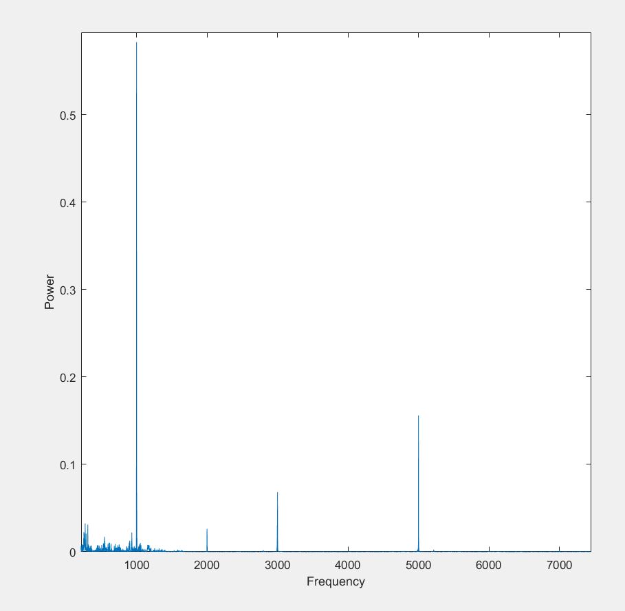
The data gathered at Eindhoven train station is analyzed using a matlab script. At first, the sound files are loaded into matlab. Then the fourier transform is taken of the signal and plotted to discover the frequencies of beeps that sound after someone checked in or out. The beeps seemed to be made of several frequencies, 1000, 3000 and 5000 Hz. | The data gathered at Eindhoven train station is analyzed using a matlab script. At first, the sound files are loaded into matlab. Then the fourier transform is taken of the signal and plotted to discover the frequencies of beeps that sound after someone checked in or out. The beeps seemed to be made of several frequencies, 1000, 3000 and 5000 Hz. | ||
Fourier incheck beep: | |||
[[File:freq.jpg|300 px|Fourier Frequency]] | |||
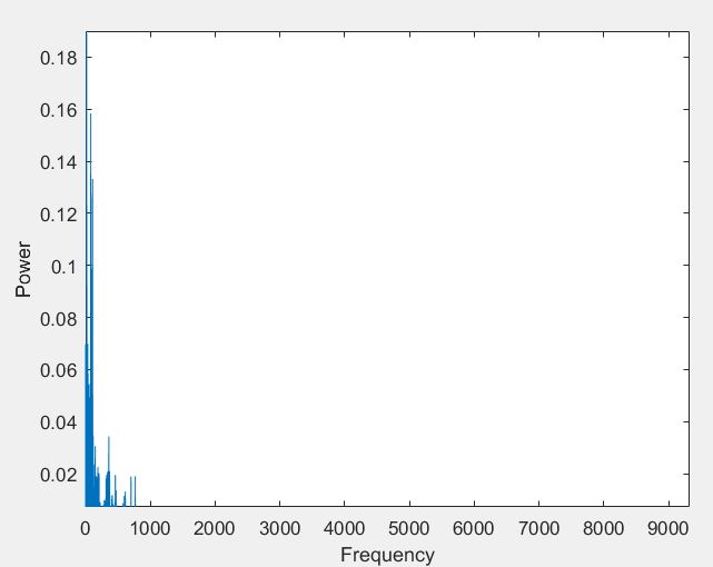
Fourier background noise: | |||
[[File:freq_ach.jpg|300 px|Fourier Background]] | [[File:freq_ach.jpg|300 px|Fourier Background]] | ||
| Line 382: | Line 385: | ||
For the rest of the analysis, we focused on the 5000 Hz part of the beep. This was done because after the background noise was analyzed in the same way, it was found that this consisted of low frequencies, mostly under the 1000 Hz. So, the 5000 Hz frequency stood out the most from the noise. | For the rest of the analysis, we focused on the 5000 Hz part of the beep. This was done because after the background noise was analyzed in the same way, it was found that this consisted of low frequencies, mostly under the 1000 Hz. So, the 5000 Hz frequency stood out the most from the noise. | ||
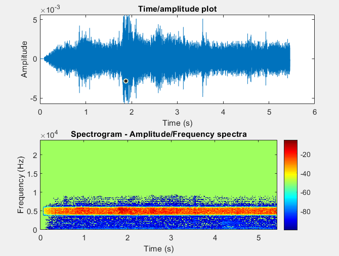
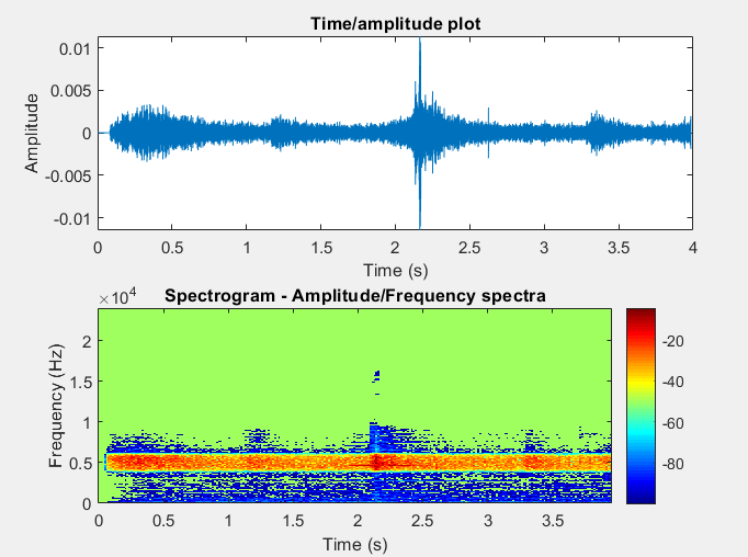
Then, the signal (not the fourier transform) was filtered with a bandpass filter. Only the frequencies between 4750 Hz and 5250 Hz could pass through. This modified signal was plotted. The first plot shows the amplitude vs the time and the second one the frequency vs the time. This showed clear results for the in or out check recording that were done nearby the incheck gate. The absolute amplitude for the beep peaks were around the 0.04-0.05. These amplitudes are connected to the decibel level of the sound but not in the right scale. | Then, the signal (not the fourier transform) was filtered with a bandpass filter. Only the frequencies between 4750 Hz and 5250 Hz could pass through. This modified signal was plotted. The first plot shows the amplitude vs the time and the second one the frequency vs the time. This showed clear results for the in or out check recording that were done nearby the incheck gate. The absolute amplitude for the beep peaks were around the 0.04-0.05. These amplitudes are connected to the decibel level of the sound but not in the right scale. | ||
For checking in, recorded near the incheck gate: | For checking in, recorded near the incheck gate: | ||
[[File:incheck_dichtbij.png|300 px|in check nearby with bandpass]]' | |||
For checking out, recorded near the incheck gate: | |||
[[File:uitcheck_dichtbij.png|300 px|out check nearby with bandpass]] | [[File:uitcheck_dichtbij.png|300 px|out check nearby with bandpass]] | ||
This analysis is also done for the background noise. The average absolute amplitude of the noise which has passed through the bandpass filter is 5*10^-3 which is much lower than of the incheck and outcheck beeps. So, the background noise should usually not be a problem for the device. | This analysis is also done for the background noise. The average absolute amplitude of the noise which has passed through the bandpass filter is 5*10^-3 which is much lower than of the incheck and outcheck beeps. So, the background noise should usually not be a problem for the device. | ||
For the background noise: | For the background noise: | ||
[[File:Achtergrond.png|300 px|Background with bandpass]] | [[File:Achtergrond.png|300 px|Background with bandpass]] | ||
| Line 404: | Line 408: | ||
For checking in, recorded 2 meters from the incheck gate: | For checking in, recorded 2 meters from the incheck gate: | ||
[[File:incheck_ver.png|300 px|in check far with bandpass]] | |||
For checking out, recorded 2 meters from the incheck gate: | |||
[[File:uitcheck_ver.png|300 px|out check far with bandpass]] | [[File:uitcheck_ver.png|300 px|out check far with bandpass]] | ||
Revision as of 09:10, 18 June 2019
Group 1
| Group members | Student number | Study | |
|---|---|---|---|
| Lotte van Gessel | 1237708 | Applied Physics | l.s.v.gessel@student.tue.nl |
| Piers da Camino Ancona Lopez Soligo | 1015467 | Biomedical Engineering | p.h.d.camino.ancona.lopez.soligo@student.tue.nl |
| Sander Poot | 1017804 | Biomedical Engineering | s.a.poot@student.tue.nl |
| Timon Heuwekemeijer | 1003212 | Software Science | t.m.heukemeijer@student.tue.nl |
| Jan van Leeuwen | 1261401 | Applied Physics | j.a.v.leeuwen@student.tue.nl |
Introduction
Problem statement
In modern society independency and mobility are of crucial value for ones everyday life. Everybody has the requirement to do whatever one wants and is able to do so. Independence and being mobile is important in everything you can depict, like having a good job, going to that job, walking to your next destination and choosing by yourself where to go next. To the majority of society mobility isn't a big issue. However, for a small part of the population this mobility and thereby independency is.
Visually impaired people have a huge disadvantage over people with visual capability. Almost all the concerns one can think of is not or slightly possible to people who can't see. But perhaps the most unpleasant concerns are the ones just described; they need more resources to achieve a similar level of independence and mobility as people with regular vision. Through the ages blind people has been assisted with the design of a walking stick, assisting lines provided on public space and through Braille.
Every day people travel with public transport, as well as the visually impaired. A very specific and recent concern for visually impaired is the state of independence in public transport. There are several problems in these public areas that needs to be solved and even more problems that aren't even thought of. Over the last view years these areas have been made a little more accessible by the visual impaired user, but not as much as is required. The authorities of the Netherlands have however recently started a new campaign where is it important to keep the tactile paving free[1]. This campaign was started for society to understand the constraints visually impaired have when obstacles are placed onto these tactile paving. They wanted to show that placing obstacles can even be of danger to the visually impaired, and drew attention by promoting the campaign on two different days in over 24 municipalities in The Netherlands, including Eindhoven. It was made possible by 7 companies, including Bartiméus and the Dutch national railway company NS. Next to that, a recent study of the Dutch National TV transmitter NOS[2] has shown that the visually impaired are far from home when they collide into their almost daily concerns in public transport.
Nowadays users ask for new input for improving the independence of people through a technological perspective. Our society is forever improving and becoming more and more reliable on technology. This project aims to design a technique, protocol, prototype or system in regard with technological robotics to aid the visually impaired in public transport. Firstly, we will come up with basic and non-concrete concerns that the visually impaired might experience in these public areas. Secondly, after an interview with these potential users and the specific existing technologies that are available, a specific part of these visualized technologies will be made concrete to aid the users in a specific way. This technology will be evaluated on its costs, efficiency and other aspects which influence the way in which the user will experience and interact with it.
Approach
At the end of the course and project, we want to deliver at least a design of the technology that will help visually impaired people travel with public transport. If there is enough time, we might make a (non-functional) prototype of the eventual design. We will start with looking at the user. To do this, we will approach several groups that have some sort of connection to visually impaired people for example a talk group. We will ask questions to our target audience and from the answers they will give us, we will design a system that will solve their problems. In the time that we wait for the user groups to answer our attempt at contact, we will look if we can identify certain problems ourselves. And if there is limited or no response, we will continue working on these problems. But we of course hope to involve real users as much as possible along the process of creating our final product. Then, the rest of the time will be spend on defining the concrete problem, designing a solution, making a prototype, (hopefully) doing user tests and revising.
Milestones
As our milestones we have the following:
- Must have features are researched, including ethical research where appropriate
- Should have features are researched, including ethical research where appropriate
- Can have features are researched, including ethical research where appropriate
- USE analysis completed
- Cost analysis completed
- All features combined in one product
- Product has a final (visual) design
- Discussion about this product completed
Following these milestones, we believe we have made an effective planning that will allow us to finish this project in a timely fashion.
Deliverables
The deliverables we will provide this wiki which documents our project. We will deliver a design of the device that will help visually impaired people keep track of their check-in status, that is, they can use the device to check whether or not they have checked in. We will also provide field data on the sound levels of Eindhoven Station that are relevant for this design. We will also back up our design and decisions with relevant literature.
NEW State of the Art research
If one is to design a technology for visually handicapped people, one has to take certain aspects into account. First of all, it would be wise to contact users in order to be able to discuss your thoughts and ideas with users who will use the product, rather than that you think of a problem from your engineer mindset, and provide a solution for that problem. This section discusses certain aspects of a possible technology for the visually impaired, and what the state of the art is on these aspects.
Companionship
The technology to be developed could serve as a supplement to the existing guidance tools for blind people. However, it could also be possible for the technology to replace the existing tools. One of the most used tools is the service dog. This dog is trained very well, and guides the blind user through their daily lives. It also serves, like any other dog, as a companion. If one where to design a robot that replaces these dogs, it should take into account that the robot will need to serve as a companion as well. The designer would need to take into account how the approach to the Human Robot Interaction (HRI) is performed. Several studies have looked into this. For instance [3] suggest a new approach to HRI, by looking at the uncanny valley hypothesis. On the other hand [4] uses the existing service dog as a model how HRI should be. [5] compares the use of robotic dogs to that of living dogs, and found that living dogs still have a higher likeliness than robot dogs. [6] looks into the way one could use a soft robot to improve the attachment of the user to the robot. [7] keeps it more globally, and looks into the role we give to a robot companion. Lastly, in [8] it is described what is important when one designs for HRI purposes.
Wayfinding
Another very important subject to be looked at is the wayfinding of blind people. They can either use a walker, or a service dog. There is already quite a lot of research that has investigated several technological improvements for the guidance of blind people. Since this is of a very high importance for their independence, mobility and safety, it is important research. In [9][10][11][12] there are several existing technologies that are helping the visually impaired in their everyday life. [13] on the other hand suggest using an ERobot to support blind people in structured indoor environments. They suggest that by using a robot, the user is less subjected to the load of the technologies themselves. [14] reports that current technologies concerning navigation target specific technological defects, but neglect social aspects and do not provide an integrated, multifunctional, transparent, and extensible solution that addresses the variety of challenges (such as independence) encountered in lives of blind people every day. In [15], there is a graph made which contains 31 actions that a user can take in a controlled indoor environment. This can then be used to guide a visually impaired user through a similar setting using auditory feedback. [16] proposes a robotic guide that the user can hold on to which will then guide the user. All of the above technologies are good examples of how the guidance of blind people could be improved.
Tools
As mentioned before, there are already certain tools that a blind user can help in their every day life. The most well known is the walker that helps them locate obstacles in their path. This is also a good aspect where technology can be used to improve the life of blind people. For instance, if one where to design a robotic dog, it will also need to take into account that this will need to be able to cope with unexpected events. [17] proposed a robot that is able to adapt to situations that the engineer did not foresee by storing knowledge in a behavior-performance space to make them able to react quicker. Another important aspect could be that one will want to make the robot walk, in a similar way that the user do. [18] looks into the advantages of making the robot have legs. In [19], a smart walker is proposed that helps the user take the smoothest path in order to make it comfortable for them. Research to the problems that users have with existing technologies is done in [20], and shows that users react better to physical rather than to auditory feedback. MELDOG[21] is an example of the design of a robotic guide dog that could serve as replacement for the regular service dogs. To make the robot affordable, it can be suggested that using LEGO Mindstorms NXT as a platform to implement the technology on could provide a low cost alternative[22]. HARUNOBU-6 [23] is an example of a robotic travel aid (RoTA) that can assist visually impaired users, and could potentially serve as a replacement for the service dogs. As mentioned above, there is already quite some research into robotic aid in the mobility of blind people. Finally, [24] provides an evaluation of these technologies, especially for elderly blind.
The users and their needs
Users are very important part of the design process. They are the ones who will use the product in the real world. They will find faults with the product. They will hopefully be helped by the product. To allow for a good design, it is very important to know the users.
Primary users and their needs
The primary users are (severely) visually impaired people. There are an estimated 302.000 people[25] who are visually impaired in the Netherlands . This might be only 1.8 % of the total population but these people experience great obstacles in their daily life that can be partially solved by better technology. What many see as easy tasks can be very hard for visually impaired people. Navigation, going from one place to another, can be impossible without proper planning. Even something as simple as a walk for fresh air can become impossible. To do this, they will require an aid which can be for example a white cane, a guide dog or a seeing companion. These aids chip away from their independence. An important part of transportation for blind people is public transport since they are not in control of the vehicle themselves which would be impossible. The only other option of traveling long distances for blind people is hitching rides from friends or taking 'care cabs'. So, to narrow our project a bit, we will focus on problems blind and visually impaired people have with public transport. We can take a look at the needs of blind people when using public transport. These needs can be broken down in several aspects:
- Navigation: Public transport is about moving from one place to another. This is no different for visually impaired people but they have greater difficulties travelling with other means than public transport and thus have to rely more on it.
- Safety: It has to be save for visually impaired people to use around several dangerous situations like train tracks and traffic.
- Reliability: The project will have to convey certain information to the visually impaired person using it. This information has to be reliable. If it gives the wrong information, it could lead the visually impaired person into dangerous situations. This is not the desired outcome.
- Clear communication: To help the visually impaired person, it is of highest importance that the communication is clear. For not visually impaired people, most communication is visible but this is of course impossible for people who can't see or whose sight is limited. To make the project communicate as smooth as possible, we have to do extensive research and talk with the users about how they perceive certain signals and how the noise in stations and around traffic affects them.
Secondary and tertiary users and their needs
The secondary users are the people working in or around public transport for example conductors. They will be the first to hear or to see when something goes wrong. They will have to know how the technology works and maybe how to fix it. Also, when a primary user (visually impaired people) doesn't fully understand some signal of the system, the people working in public transport will have to help them. Their needs are thus a simple system that is easy to explain and to fix. Also, it shouldn't make their job harder than it already is because then they will have negative feelings towards the system.
The tertiary users are the other people who travel with public transport. They have few needs. Mostly, the eventual design must not impede them in travelling. As few changes as possible should be made to their experience while using public transport.
Potential Problems
Before contacting users, we came up with some problems we thought are relevant. These are expanded upon below.
Finding the right bus
Information about which bus stops where is mainly provided through visual feedback. For instance, Eindhoven station has about 10 bus stops, each having a number of busses stopping there once every few minutes. For sighted people, this is no problem. It does proposes a big problem for visually handicapped people, since they cannot see which bus is where. A possible solution could be to develop a connection between the blind user and the different busses. A similar connection has been made in Vienna, where POPTIS helps the visually handicapped to know which vehicle is incoming at their stop. When they hear a vehicle approaching, they need to turn on their remote, which then emmits a signal. When the vehicle picks up this signal, it sends the information about which line it is and where it is heading to the remote, which then gives this information to the user through audio feedback. [26] POPTIS is a good example of the connection made between users and the vehicles. However, at a station like Eindhoven this could impose problems since there will be multiple busses incoming. Therefore, it is proposed to develop a system where the blind user can look up which vehicle they need to take to reach their destination. They can then fill in the line number in their device. Once this line number is at their station, or approaches it, the device will provide the user with auditorily instructions as to where this bus is. This solution would help visually handicapped users in finding where their correct line is, and improves their independance since they will no longer need to ask it every time they want to take a bus at a bigger station.
Train Door Position
One potential problem we expect visually impaired people to have is difficulty locating the position of train doors when a train arrives. There is often a relatively small time window to get on a train, and we suspect visually impaired people may have trouble finding a door in time. This might be solved by having the doors emit a disticnt sound, though this might become very overwhelming among the general noise of a trains station. It could also be possible to facilitate markers or signals, either on the ground or otherwise, ahead of time to indicate where the train doors are/are going to be. It might be possible do accurately determine where the train doors end up by finely regulating the arrival of a train. The markers could be set, although that would require a standardized train/wagon length, as well as a set distance between the doors. Since this currently is not the case, it is probably more interesting to look at a more flexible solution. It might be possible to set up virtual markers that can communicate with the phone of the visually impaired, to avoid overwhelming travellers with sound. This might be done by measuring the signal strength of the marker.
Checking in
On the station and in buses there are placed where you have to hold your OV-card and then you can check in or check out. This however is a lot more tricky for blind/visually impaired people. At this moment they need help from other people or from a dog to help them to find these check in places. Furthermore the check-in places make a sound when the check-in/out is registered, to let the user know he is checked in/out. However these sounds are not always very loud and very deceptive to noise from the environment. Thus it is also a problem for blind/visually impaired to know if they have checked in. So a suggestion to decrease this problem is to create a device which does not use sound but rather uses vibration/shocks to communicate with the user that he/she is checked in. This device could for example be a arm bracelet. It was researched that vibration/shocks are way more reliable when it comes to communication. People react way faster to these kinds of feedback in contrast with sound. Now the problem remains to find the check in places. One option could be to create an device which starts to vibrate/ give a shock when it is pointed towards one of these check-in places. It then could also increase it's vibration when the user is closer towards the check in place. This way the visually impaired user can be guided towards the check-in place. This device should be able to detect this check in place and maybe like within 3 meters of the check in place it could start vibrating. The problem with this is that when you go towards a train station there are most of the time multiple check in places next to each other. We therefore should make the device in such a way that it only approaches the closest one. So the device should be able to receive multiple signals and has to do some calculations to determine which of these signals is closest and then guide the user towards that place.
User Contact & aspect of interest
User Contact - part 1: Acquire contact
As said before, we made contact with visually impaired to ask them about their constraints regarding public transport in The Netherlands. Firstly we send a mail to three companies which are set up especially for blind and visually impaired people. We introduced ourselves, told them about the project and asked them if there would be a chance to arrange an interview, phone call or another method like the email to come in contact with these people. We contacted:
- Bartiméus, voor mensen die slechtziend of blind zijn[27]
- Koninklijke Visio, expertisecentrum voor slechtziende en blinde mensen[28]
- Zichtbaar! Veldhoven[29]
At first, only Bartiméus responsed and told us that through them it was not possible to contact specific visually impaired people. They did however give us a link to a Facebook page especially for blind users. We then decided to create a questionnaire [30] containing 15 questions about how they experience public transport in The Netherlands. This questionnaire was published on the Facebook page and send to the MuZIEum [31], a museum made to experience what it is like for the visually impaired. We asked the museum if they could cooperate with us by giving the visually impaired this questionnaire when they visited the museum. Next up, we called Zichtbaar! Veldhoven on May 9th. Through this we came in contact with the chairmen of this company. It showed out that you did not receive information about the email and when we told about our project again, he became extremely enthusiastic. He received the questionnaire on a personal email and we arranged a meeting for Thursday 16th, in where we could get more information about how the user experienced public transport.
User Contact - part 2: Meeting Zichtbaar Veldhoven, 16-05-2019
In week 4 (May 16th, 2019), Jan, Timon and Piers went to Zichtbaar Veldhoven, Veldhoven, The Netherlands, to meet the users to talk about their concerns regarding the public transport in The Netherlands. There were 14 users involved in the meeting, all about 60 years old and visually impaired. None of them was completely blind. They all had different visual problems, where glaucoma, macular degeneration and retinitis pigmentosa were the most common disorders within the group. We started by introducing ourselves and explained the project. They were very happy that they could be of help to us and where very kind. We talked for over 1,5 hours strait about several aspects. Firstly, we gave them the chance to blow off about all their constrains regarding public transport. Secondly, some positive aspects were mentioned as well. Next up, we talked specifically about the potential problems we gave up with and asked them about some potential alternatives that could improve these problems, on both a technical as well as a user-friendly view. Lastly, we asked them to give their general stand of the public transport in The Netherlands and asked them if they liked helping us and if it was useful for us as well as for them. In this section we will explain the main points discussed in this meeting.
During the beginning of the meeting we let the group talk freely about all their constrains and problems they experience every day. The main problems of public transport according to the user, mainly focused on the railway and bus station in Eindhoven, The Netherlands, are stated here:
- The numbering of the busses
- Information screens are difficult to read due to small letters
- There is no contrast in the busses. This one was said to be very unpleasant and a very big problem. Because there is no contrast between the chairs and the floor of the bus, it becomes dangerous for the visually impaired to find the right place to sit.
- The red pressing buttons are still difficult to find
- Checking in is very difficult due to a too small size of the pillar and the low volume of the tone heard when checking in
- Busses are too far from the platform. The visually impaired cannot see the gap between it very well, which makes it dangerous
- The tactile paving on most of the railway stations in the Netherlands is insufficient. Very often the lines suddenly stop in the middle of the path
- In the trains, the stairs are sometimes dangerous. One of the users with a guide dog had the problem that the guide dog didn’t want to climb the stairs because of this
- Above the busses at the bus station it is stated where that specific bus is headed, the text of this is too far and to vague and thus unreadable for the visually impaired. This is the same on the platforms at the railway station.
- The uniformity in public transport is insufficient.
- Overall, the railway and bus stations do not satisfy the Dutch national rules for visually impaired in public transport. Some of these users had checked this through the official laws. Mostly the help of the bus drivers, the tactile paving and the gaps between the busses and the platforms are insufficient.
There were however some positive points regarding the public transport as well. Some of these where:
- An escort cart, with which one could get personal assistance for the visually impaired in public transport
- The peeping sound which one hears when you check in or out. The distinguishing in this is a great improvement in this as well. 1 peep is heard when you check in, 2 when you check out, and 3 when an error occurs. This is very much appreciated.
- In overall, the personal assistance of the employees of the NS and the busses was rated sufficient enough
- Ongoing improvements for nowadays. They told us that Bartiméus and Visio were presently working on solving these problems regarding the public transport as well, which they found very helpful.
As one can see, there are many more negative than positive aspects regarding the public transport in the Netherlands. There were however some ethical aspects regarding the feeling and mood about public transport for the visually impaired users were discussed as well. These points tells us something about how they really think of the public transport as a human being, and how simple thinks may influence their daily life. One aspect of this was:
- ‘we as visually impaired are dependent of the public transport every day. However, as I can speak for all of us, we do not like it. If there would be another way to be mobile for us, we would take it without doubt’.
Jan Huybers, the chairman of Zichtbaar Veldhoven, said this many times during our meeting. The visually impaired have to travel with public transport, but it is important to mention that they told us that they didn’t like it. Every one of the fourteen members that we present said that overall, public transport was insufficient, and gave it a 4 or 5 out of 10. And as can see, more negative than positive aspects where discussed during the meeting proving that the public transport really is a concern. Another ethical constrain is about the participation in the design process and the future improvements regarding public transport for the visually impaired:
- For people who are not visually impaired, it is very difficult to precisely know how it is to be visually impaired. They will never experience what it is like to life with a handicap and bump into everyday problems, not only regarding the public transport.
Thereby, the visually impaired people in our meeting stated that because of this it is very important that they participate in the design process and get involved in every step that might aid the visually impaired in public transport. They want to be involved in companies who are responsible for these designs, such as ProRail and NS, the Dutch companies responsible for the railway network in the Netherlands. The last ethical concern they have it the need for others assistance than thereby their lack of independence. We asked them specifically about the potential problems we came up with; checking in, finding the bus and the train door position. The answer they gave us on how to find the door of the train properly, they said that they would always follow somebody else or the grout walking to a specific location, and thereby finding the door of the train. Thus the problems looks as being solved with this, but when one thinks about it, it is such a pity that these thoughts are there. It proves that society is far from finished and that the visually impaired are still very dependent in public transport even with the aspects that have already been addressed.
The main message of the meeting was public transport in the Netherlands, and mainly in Eindhoven, scored insufficient for the visually impaired. Uniformity, checking in, contrast and the lack of their involvement in design processes where some of the main aspects that came back during the whole meeting. There are however real improvements coming up and they were very glad we came to them. At the end of the meeting they thanked us, were prepared to fill in the questionnaire and asked us to send them the link of the wiki.
Questionnaire processing
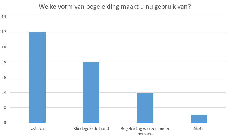
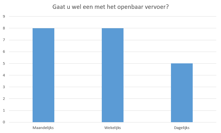
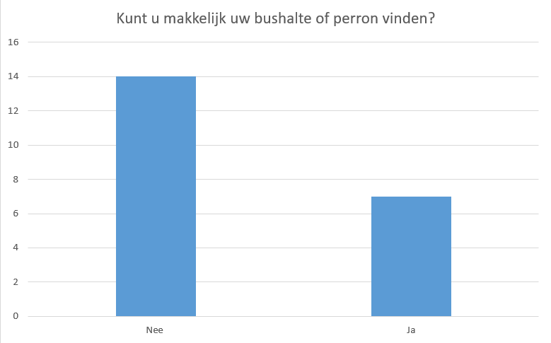
The questionnaire was online for several weeks, posted on a facebook site, given to the MuZIEum [31]. In that time, twenty-three people filled it in. But only twenty-two responses were valid. In this section, an visualization of the answers of the multiple choice questions are given, and a overview of the open questions. The first question was 'are you visually impaired'. This was used to make all the responses valid and to weed out which responses weren't from our target group. Two people answered no and thus their further answers weren't taken in account in the eventual processing of the questionnaire. The second question was 'which aid do you use on a daily basis?'. There was an other option for this question in which the users could enter answers we might have overlooked but there were some similar and misspelled answers which were put in the right category. There were also few people who used the other option to enter multiple answers. That's why in the chart there are more than twenty-one answers. The most answered question was the white cane which has several variants all used to feel one's way around. After that the guide dog. The following question was 'How often do you use public transport?' Monthly and weekly tied. But no one answered yearly which is an indication that visually impaired people often use public transport. The third question was an open question: 'What is in your opinion the greatest problem in public transport?' There were many different answers but there were two general trends. Visually impaired people have difficulty finding out which vehicle is the right one and they have difficulty checking in.
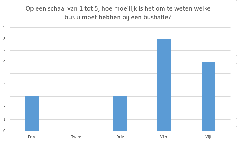
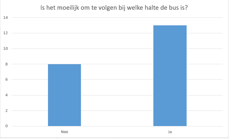
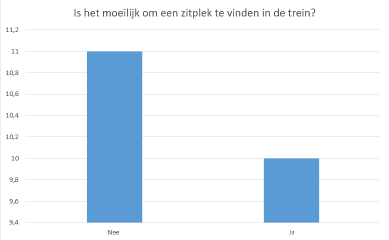
The fourth question was 'On a scale from one to five, how difficult is it to know which bus you have to take at the bus stop?' The most answered question is four which would be pretty hard and this would be a great problem for many visually impaired people. The following six questions are yes/no questions. The fifth question was 'Is it difficult to know at which stop the bus is?' The most answered answer is 'yes' with quite a big margin. So, this also is a problem for visually impaired people. The sixth question was 'Is it difficult to find a seat in the train?'. Most people answered 'No'. So, this wouldn't be a valid problem for the project since not many of our users struggle with it.
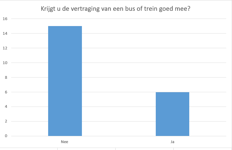
The seventh question was 'Do you find out about train or bus delays in a timely fashion?' No was the resounding answer.
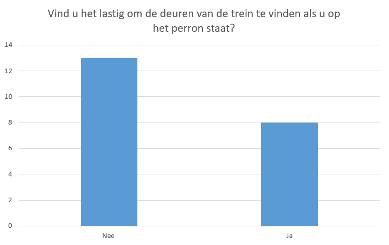
The eight question was 'Do you experience difficulties finding the door to the train?' The most frequent answer is no but the answers are a bit more divided than for the other questions which often have a clear and uniform answer.
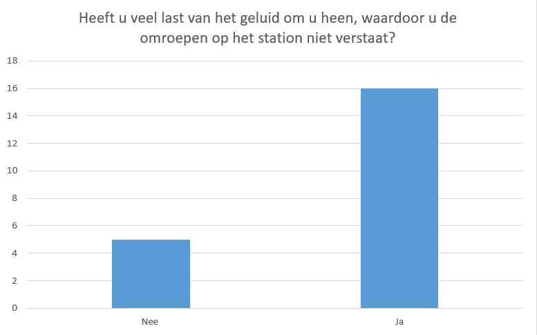
The ninth question was 'Does the noise at the platform/bus stop drown out the broadcaster?' This question had a very clear positive answer.
The tenth question was 'Can you easily find the right bus stop/platform?' The answers was mostly no.
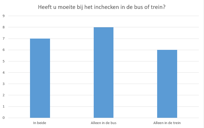
The eleventh question was 'Do you experience difficulties with checking in in the bus or train.' The three answers for this question were 'only in the bus' which was often filled in, 'in both' which people filled in almost as many times as 'only in the bus' and 'only in the train' which was the least filled in answer of them all.
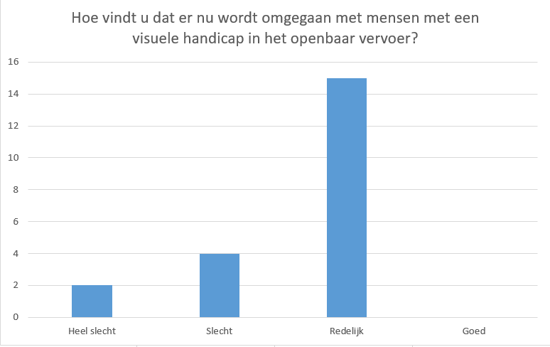
The twelfth question asked people to give a review about how visually impaired people are treated within public transport. Most people said reasonable well but none answered good while some did answer bad or very bad. So, while there is certainly room for improvement here, to change behavior is quite difficult because it is rooted in social norms.
The last two question are also open questions. The first is 'How do you handle a situation while using public transport in which you have to act fast?'Again there were many different answers but the main feeling was that having to act fast is quite stressful for visually impaired people and that they have to rely on other people, both strangers and friends.
The last question was 'In what area in public transport should be improved to make it better for visually impaired people?'.
From this question, some 'small' things arose (that could be fixed without technology and thus couldn't be subject of our project) like more braille in stations/ bus stops or more paths for visually impaired people (the white stones with ridges) and better trained personnel. But other mentioned problems could be solved by using technology like better indication of where the bus/train currently is and on which platform/bus stop they will arrive, help with checking in and better communication of delays and changes in the train/bus schedule.
Final aspect of improvement: Checking In
As one can see out of the meeting with Zichtbaar Veldhoven and the Questionnaire, is that there are many problems with using public transport in The Netherlands. Out of the meeting with Zichtbaar Veldhoven, there were eventually eleven negative problems assigned regarding public transport in overall. In the Questionnaire there were more than seven questions which stated a problem, and three open questions where one could fill in yet another constrain about public transport, which summed up to more than four, including finding the right bus and checking in, which we predicted before the processing of the questionnaire and the meeting at Veldhoven in the [#Potential Problems|potential problem statements]. Although some of these overlap, one can conclude that there are many problems to be solved. It is however very important in a robotic design process that we diminish our project as much as possible, to finally come up with a specific and very concrete design. All these problems are nonetheless very important to address, to further think about and to come up with a potential solution for that specific problem. The problems are however very different from each other, and all the problems have to be solved separately. Thereby we cannot make a concrete design which satisfies everything. It will thereby not be possible for us to solve all the problems visually impaired people experience in public transport and we will have to divergent in solving one specific constrain.
When verifying the meeting at Veldhoven, out of all the problems, we found three interesting constraints that were mentioned frequently; the problem with checking in, finding the right bus, and seeing more contrast in the bus and trains. Out of the results of the questionnaire, we found that noticing delay of the train and/or bus was a problem, along with again finding the right bus and checking in. In the questionnaire, there were however some questions not correctly stated, like question 11 regarding checking in. This was because the option that people did not receive problems with checking in was not provided. But because of question three were one could fill in 'the greatest problem' we can still conclude that checking in is still a valid problem. We decided that we would not choose working on a specific design for improving the contrast of the bus and train. We decided this because, firstly, we would have to redesign the whole outline of the design of the bus and train. Nonetheless we could improving the contrast in a specific part of lets say a bus, like the contrast between the chairs and the ground, as was also stated in the meeting at Veldhoven. But this would however make our design and work too easy, and we would be done to quickly. Secondly, we did not want to work on improving the contrast because we do not decide these designs of a bus or a train. We would have to cooperate with for instance NS to chance a design that affects more than just the visually impaired. Lastly, we chose not to work on this because checking in and finding the right bus are relatively bigger problems, since it was mentioned as a big problem in both the Questionnaire as well as the meeting with Zichtbaar Veldhoven.
Out of the meeting at Zichtbaar Veldhoven and the results from the Questionnaire we have decided to problem statement and design on improving checking in with an OV-card in public transport in The Netherlands. We thought that making a design for finding the right bus would be too hard in just for 4 weeks, and that it would take a lot more aspects into account than one would think. Improving checking in was for us the best option as well, because it would concern just the visually impaired people, where there would be a design that would help them and nobody else finds it troublesome. Moreover, finding the right bus may be a bigger concern, but when checking in would be improved in the bus as well as the train, the 'flow' of visually impaired people in public transport would immediately go up, which would thereby positively affect finding the right bus as well.
Requirements
From the meeting with Zichtbaar Veldhoven and the results of the questionnaire we gained a lot of insight on what visually impaired people would require from our product to improve checking in. It is important to mention that these requirements only show a general point of view on how to improve checking in. The more concrete and specific design will be described later in the design section. These general requirements for this product are as follows:
- The final design must be able to correctly distinguish the different check-in/check-out sounds. And respond to these sounds with a (computer generated) voice, telling what the current check in status is.
- The final design must remember the current check in status.
- The final design must only register a check-in sound when the user checks in themselves (it must not register the sounds of people adjacent to the user for example).
- Different parts of the product need to be differentiated through stark (color) contrast to improve the visibility for visually impaired people who are not fully blind.
- The final design needs to be able to play back the current check-in status through a (computer generated) voice.
- The final design should have a place where the OV chip cart can be put, as to make it an integrated piece of the design.
New innovative designs to improve Checking In
As mentioned above, there has been said that the feedback for checking in is now sometimes unclear for visually impaired users. At the moment, the feedback works as follows: Once the user checks in, there will be a single beep. When the user checks out, there will be two beeps. If something is wrong, three beeps will sound. However, the potential users have told us that because of the different sounds at bus and train stations, it is not always clear. Hence, we will look at another way how to check in. For this, two things are of importance. If we want the device to tell the user if it is checked in, then it should be able to detect the incheck status once the person checks in or out. The other is that this status needs to be linked back to the user, in a non-visual way. Lastly, there will also be different ideas how the device can be designed. This will be described in the last section.
Detection of the check in status
Visual
A manner to detect whether the person is checked in or not could be to equip the device with a camera, so it can use software to “read” the screen to see the incheck status. In [32] the idea is set that one could use deep learning to be able to train a neural network for it to be able to read text. One of the layers would segment the sentence, then it needs to find the separate words. Next up is the division into syllables, and then they groups these together into stems. However, this also poses for difficulties since the developer needs to spend a great deal of time to implement knowledge about language into the network. In [33], a convolutional neural network is described that is able, with a high accuracy, to read handwritten digits. It can then convert these into a digital number. Perhaps this is a network that could be altered so it can be able to read the text on the screen of the check in pole. However, this could prove to be very extensive and difficult, since a neural network requires a lot of training. It then also needs to be implemented into the portable device, which should have a processor that can make sure that the text is read accurately and quickly. The advantage of using the visual aspect of the check in pole is that you do not have the background noise that you would have if you were to use sound. However, to adjust the above mentioned neural network to understand the check-in status and to make it able to use this network in a small wearable device would be too expensive and difficult to achieve. For the user, visual feedback should not introduce a lot of problems since the camera can be installed in the device, and the software can be run automatically.
Sound detection
Another method to check whether the user has checked in successfully could be by using the beeps that the pole excites upon in-checking. These beeps have a certain frequency and volume, which can be measured. In this way, the distinct sound of the beeps to check whether the person has checked in or out, or in the case of an error message. To do this, it is important that the device will only record the beeps that are transmitted from the pole of the user itself. Since at, for instance Eindhoven station, there could me multiple poles next to each other, this is very important. The volume of the beep can be used to make sure that only the checking in of the user is recorded. Volume decreases quite rapidly. According to the inverse square law [34] , sound in a gas decreases inverse proportionally to the distance. Hence, it could be measured what the volume of the pole itself is, and what the volume of the pole next to is will have. These volumes can be used to set up a decibel band. Within this band, the device should be measuring the frequency of the beep. By using the method described above, the device should be able to measure the beeps that the check-in pole excites upon in-checking,.
Providing feedback to the user
Vibration
A way to improve the current way of feedback about the check-in status could be to make a device that is able to vibrate. This could have certain vibrations, similar to the beeps that are used now. So for instance, checking in would require one vibration, checking out two and an error message would lead to three vibrations. The improvement over the beeps is that the vibrations will not have to deal with the background noise that is present at busy bus or train stations. In [35] there is an analysis of how different vibration patterns and positions can be used to guide blind people. This research found that, using a tactile belt containing 8 tactors that is positioned around the waist, for instance that using single bursts of vibrations that participants would be better to indicate a direction that the user should move into. It also found that by using the anterior part of the belt for directions and the posterior for signals about the walking speed or stop signs, that it is more clear for the user. For the check in problem, it should similar to this research first be researched where the vibration has the highest efficiency to send through a signal. Another thing to look into is how hard it needs to vibrate in order to give the message through. It should not be too hard since the user will then experience the vibration as unpleasant. Vibrations could prove to be a lower cost alternative than to equip the device with a speaker/Bluetooth connection to make it able to give the user auditory feedback. It would only require a small vibration plate in the device to create the vibrations.
Speech
To give feedback to the user that he/she is check in/out can be solved by using speech. There could be a computer generated human like voice which tells the user that he/she is check-in/out or that the user has too low of a credit to check in. This should be a clear way for the user to know if he/she in check-in/out. A problem rising with this is that often in public places there is also a lot of background noise.
This could be solved to maybe make it so that the person has to manually press a button on the device which states if he/she is checked in. This way the person can hold the device near their ears or wait until there is less background noise to listen if he/she is checked in/out. They could than manually choose when to hear the status of checked in, and press the button multiple times. Another way to make it even more clear to know if the user is check in/out is to have two different voices for in checking and out checking.
To communicate this speech to the user our device does need a speaker. However we can not put a big speaker on our device as this would be very impractical. So we have to choose a small speaker which has just enough power to be to hear but is also practical and does not weigh a lot. A good example of this are the speakers in most phones, they are very small do not weigh a lot but do provide a good enough sound to be used in our product.
Alterations to the check in pole
At this point in time when someone checks in the pole gives one peep when you check-in, two peeps if you check out and three peeps if one does not have enough credit to check in. However in train stations is often a lot of noise coming from the background making it difficult for the visually impaired (which rely way more on sound) to know if they have checked in.
A way to solve this problem is to have the pole tell if you are checked-in or out. There could be a voice inside that comes out of the pole which tells you that. The problem however with this is that this also is susceptible to noise from the background. Nevertheless, it does help the visually impaired with knowing if they have signed in/out.
Another way to make the pole more visually impaired friendly is to increase the contrast. One of the problems with visually impaired people is that they do not notice small differences in color. To make it easier for them the poles could have more contrast. This was stated during the meeting in Zichtbaar Veldhoven as well.
Another problem with the poles is that it is hard for the visually impaired to find where they have to scan their OV-chipcard. It would be way more handy if they do not need to scan their card at a certain place but maybe create the pole in such a way that if one walks by it you are immediately check in or it could be that maybe a person stands in front in the pole and tells the pole that he/she wants to check in. Thus that the pole can understand speech and check the person in/out if he/she asks for it.
Shape of the product
For the shape of our product we need to find a balance between comfort, aesthetics and practicality. Some options we came up with include:
- a bracelet (possibly with a card holder)
- a ring
- a card holder for the OV chip card (that has our system built in)
- a glove (possibly with a card holder)
We expect that in order for our product to work it has to be very close to the pole at the moment of checking in or out. Therefore, our options are either on the wrist, the hand or around the card itself. In terms of aesthetics, we believe that the glove is the worst option. We want to make a product that would suit all potential users, and we expect that a lot of people would not want to wear a specialized glove just to check in for public transport. For the same reason we think the card holder for the card is a better option than the bracelet or the ring. The card holder allows the user to wear whatever they want, and it won't alter their appearance. It also offers more practicality, since it makes sure that our product is always together with the ov card, therefore preventing users from losing our product. With a wristband or ring it matters which hand is used for checking in, but not with the card holder. A downside of this design is that the user will need some extra room in their pockets or purse for this design, but since it is not wearable and might be too thick to fit in a wallet. However, we believe that the advantages in aesthetics and practicality together outweigh the slight disatvantage this design has in terms of comfort.
Conclusion: our further design
As to conclude, we want to design a card holder for the OV chip card which can measure the frequencies and the decibel levels to verify the check-in status. Here, we need to motivate why we exactly want to use this card holder and why we want to verify the check-in status through measuring the frequencies and decibel levels. We want to use frequencies and decibel levels because:
- One can measure the decibel level of only one pole. The next one will be too far away to measure a certain beep. This indicates that we can specifically measure the check-in status of only one person checking-in; the one with the card holder.
- Because with these data we would not need to data that the NS requires from the OV card. It makes the device totally independent and thus it could always easily be improved.
- With frequencies and decibel levels combined, it makes it easier for the device to differentiate between checked in and checked out. This is also because now, as stated before, one hears different deeps depending on the status.
- We can verify the data to a voice, as the potential users wanted.
- It is possible to give one a binary answer. You are checked in or not, and by measuring these aspects this is possible.
- You can measure the check-in status without noise. This is the case because the device will always measure the same beeps, and one will not have to make a picture (like stated in ‘visual’) which differs every time.
- Because we want to use frequency and decibel, the user does not have to do anything except holding the card with the holder next to the check in pole. The hardware and software then are together responsible for verifying the status.
- Implementing a microphone and the software to analyze sound is less expensive than a camera and the imaging techniques needed to read the text on the check in pole.
- By using a microphone, it does not matter which side is facing the check in pole. Using a camera would require consideration that the camera faces the check in pole.
We want to use a card holder for the OV chip card because:
- One directly uses the check-in pole. Thus the pole does not need to chance due to our design
- The design is independent of other companies or stakeholders. The design will therefore be credited to the designers only.
- We can place a battery in it, so that the user has to charge it sometimes, like a cell-phone. This makes the device useful in a way that one does not depend on the card holder when you just need it once a month or year. Because the device can be shift off and remain its battery charge.
- It is user friendly and not difficult to understand in terms of how many options there are. Just an on- and off-button and a button which states the status.
- It can be used by completely blind people as well, not only the visually impaired. A digital device for blind people would already worsen the usability for them.
- It is easy to place in your pocket and does not require much space.
- One does not need to constantly touch the device, what would have been the case with a bracelet. Several users did not prefer this.
- A lot of users which are visually impaired are elderly. Thereby the use of a card holder comes in handy because the card holder does not rapidly chance the design and protocol for checking in, which is not preferred by the elderly and the potential users.
- The way of checking-in is not changed. The OV is still used, but the feedback for the visually impaired is just improved. When the checking-in protocol would be changed tremendously, it would affect everybody (which also affects the independence of the design).
- By using a card holder, it is made sure that the device is always within close proximity to the OV card at checking in. With a bracelet or app, it would require an extra device that the user needs to hold close.
- No changes need to be done at stations or at the check in, so there will be no disturbances for other users.
- There is no need for the user to have a smartphone in order to use the device, and it can therefore be used by everyone.
- The card holder doesn't have any aesthetic downsides.
Objectives
The objectives will be divided in two parts, the card holder and the embedded system itself. They are equally important. Without the system, there was no function to the card holder. Nonetheless, without the card holder, the user would be unable to use the system.
The system:
| Primary Objectives: Must have | Secondary Objectives: Should have | Tertiary Objectives: Can have |
|---|---|---|
|
|
|
The card holder:
| Primary Objectives: Must have | Secondary Objectives: Should have | Tertiary Objectives: Can have |
|---|---|---|
|
|
|
Method
Measuring instruments
We decided to use an easy and inexpensive option for our research, and to use phone apps to measure the decibel levels and the frequency spectrum. There are many free options out there, After consoling different websites comparing these apps,[36][37][38][39] we chose the following apps:
- Decibel X for measuring the sound levels
- Spectrum Analyzer for measuring the frequency of the check-in pole.
We chose Decibel X because it was the only free app we found that also allowed us to export the measured data, which is very useful for our research. It also has an intuitive interface and measures the data we need: average loudness, maximum loudness and minimum loudness.
We chose Spectrum Analyzer because it keeps track of the maximum loudness of all frequencies. It also allows us to zoom in on those peaks and thus allow s us to read these frequencies very accurately. It also keeps track of these peaks until reset, which is not the case for some other apps we found.
Measurement protocol
- The first step is to inform the NS personnel that are working at that time of our plans and ask for permission.
- We measure the average background noise of the station. We do this on several places around the in-check area of the station because our eventual design will be used in this area. Make multiple (around five) measurements to increase the accuracy.
- Then, we'll choose an in-check gate/pole that is far from the general buzz of the station and where we won't annoy other travelers.
- For the next set of measurements, there should be no to very soft background noise. Make several measurements (five to ten) of the beeps when someone checks in from where the OV chip card is (which is around 5-10 cm from the check-in gate/pole). And then, do the same for when someone checks out from the same distance. (These beeps should have the same frequency and decibel. The only difference is the amount of beeps).
- Also for this set of measurements, there should be no to very soft background noise. Change the distance from where the measurement is done by one to two meters (the place where the other check-in gate/pole is). Then, make someone check in/out at the same check-in gate/pole as for the other measurements and measure the sound (around five to ten times).
- Again increase the distance between the measure devices and the person checking in to around 5 meters. And follow the same protocol as described above.
- Now, there should be people checking in/out around the place where we're measuring. We do multiple measurements for each distance (5-10 cm, 1-2 meters, 5 meters) while other people are moving, talking and most importantly checking in/out around the person checking in/out whose beeps we want to measure.
- These measurements will be processed, using Matlab. The exact frequency and decibel will be determined from the silent measurements. This data will be used to filter out the 'wrong' beeps in the loud measurements.
Fourier transform
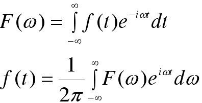
To analyse the sound measured at the train station fourier transforms are used. The Fourier transform is used to change a waveform(in our case a signal) into an other representation, which is characterized by sine and cosines. The principle where the fourier transform is based upon is that any waveform can be written as a sum of sinusoidal functions.
In the formula above f(t) is the function of the signal which is dependent on time. Using the formula above f(t) can be changed in F(w). A function which is dependent on frequency. It transforms a function which first is dependent on time to a function which is dependent on frequency. This is what is desired in our case. As it shows at which frequencies there are maxima. Thus we can use this to determine what the most prominent frequency is for the peep sound of the check in pole. Now if the frequency is found which is desired, it is also possible using the fourier transform to filter out the frequencies that are not relevant, thus meaning the background noice. This way only the relevant frequencies remain. In the case we are using Matlab has a build in function to calculate the fourier transform of a signal. Therefore we do not have to use the formula listed above, however this is theoratically what is done to the signal. So the formula above is applied to our signal formula f(t).
Data analysis
The data gathered at Eindhoven train station is analyzed using a matlab script. At first, the sound files are loaded into matlab. Then the fourier transform is taken of the signal and plotted to discover the frequencies of beeps that sound after someone checked in or out. The beeps seemed to be made of several frequencies, 1000, 3000 and 5000 Hz.
For the rest of the analysis, we focused on the 5000 Hz part of the beep. This was done because after the background noise was analyzed in the same way, it was found that this consisted of low frequencies, mostly under the 1000 Hz. So, the 5000 Hz frequency stood out the most from the noise.
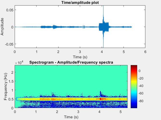
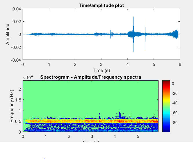
Then, the signal (not the fourier transform) was filtered with a bandpass filter. Only the frequencies between 4750 Hz and 5250 Hz could pass through. This modified signal was plotted. The first plot shows the amplitude vs the time and the second one the frequency vs the time. This showed clear results for the in or out check recording that were done nearby the incheck gate. The absolute amplitude for the beep peaks were around the 0.04-0.05. These amplitudes are connected to the decibel level of the sound but not in the right scale.
For checking in, recorded near the incheck gate:
 '
'
For checking out, recorded near the incheck gate:
This analysis is also done for the background noise. The average absolute amplitude of the noise which has passed through the bandpass filter is 5*10^-3 which is much lower than of the incheck and outcheck beeps. So, the background noise should usually not be a problem for the device.
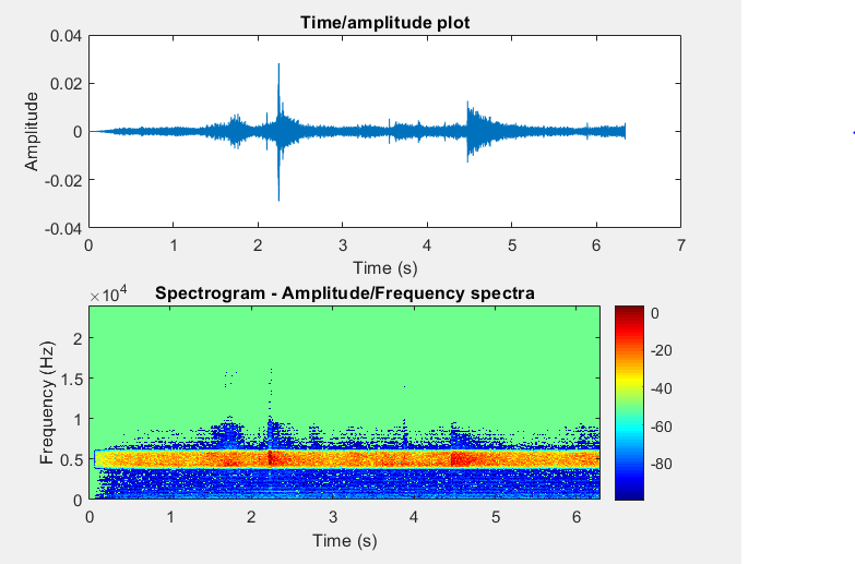
Also, recordings were made further from the incheck gate around 2 meters which is around the distance which is between the incheck gates.
The amplitude of these peaks are around 2/3 times lower than the ones of the nearby recordings. This means that a distinction can be made between the two which is exactly what we wanted.
For checking in, recorded 2 meters from the incheck gate:
For checking out, recorded 2 meters from the incheck gate:
Of course, to bring this design to the market more analysis has to be done on the beeps. The other frequency parts have to be identified. Several bandpass filters would be used and they would be smaller and more honed in on the right frequencies. This would diminish the influence of the background noise, because while the in or out check beeps will be consistent along the different frequencies, the back ground noise will not be. So, while the background noise might 'hold' a lot of one particular frequency used to identify the beeps, for others the background noise will not.
Design
Visual
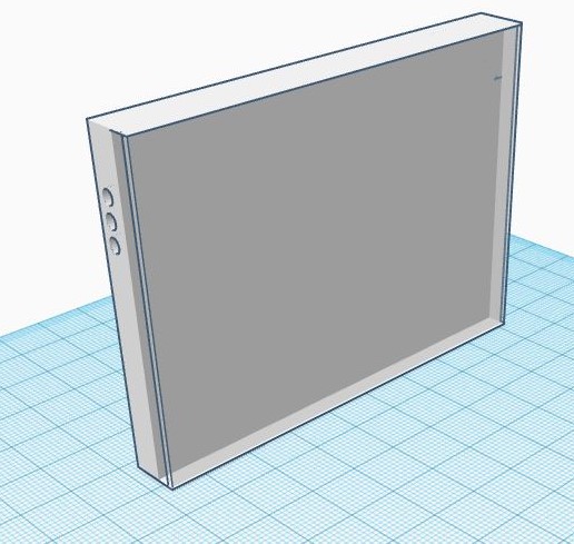
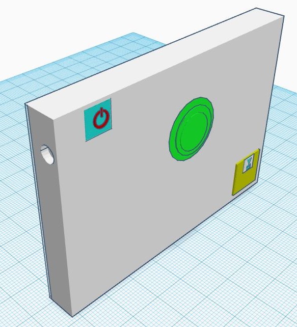
As mentioned there has been chosen for a card holder which can be put around the OV chipcard of the user. This way, the device is always in close proximity of the check in pole when the user checks in. There are certain aspects of importance for the card holder. Since visually impaired can see contrast, the different aspects of the card should have stark contrasts to one another in order for the user to be able to distinguish between them. It should also have a good contrast to the check-in pole, so the user can also distinguish between these to see where to check in. The card holder should also not be too thick and big, since it will need to be easy to carry for the user. The button that will be there to control the in-check status of the user will also have a ribbed surface so the user can feel where it is. The speaker and microphone will be put on the sides. For train personel to be able to check whether the card is still valid and is with the right person, one side will be made transparent.
In the left figure, one can see the transparant side of the case. On the side of the case, three holes can be seen that represent the speakers that will be used to give auditory feedback. On the right figure, the side with the buttons can be seen. In the left corner, there is a power button that can be used to turn the device on or off. The big green button in the middle is ribbed, and can be used to receive the current check in status of the user. In the right bottom corner, there is a cover for the battery. The case itself is white, since this causes that all the different buttons have a stark contrast to the case itself and are therefore for someone who is visually impaired distinguishable. The different features all have an edge so users will be able to feel where the buttons are. On the side there is again a hole, this time for the microphone.
As for the size of the design, it has to appropriately fit regarding the OV cards dimensions. An OV card on the moment is 54 mm X 85 mm (length X width) and the design therefore has to be in an specific range of this. We expect it to come out a bit larger, especially in the depth due to the hardware required. It will due not be as flat as the OV card currently is. As for the length and width, we wish an appropriate range wish can be a bit larger than the current lengths, but not that big so that the OV can fit inside the card holder.
Hardware
For the hardware necessary for our design, one requires:
- A speaker
- A microphone
- An on- and off-switch
- A battery plug-in
As a good indication of what good hardware would look like we decided to look at currently existing hardware. At it's core the device would have a small computer. A good indication for what this would look like would be a Raspberry Pi Zero. At the time of writing, this computer is sold in the Netherlands for €5,35 including tax by Kiwi Electronics B.V..[40]
For a speaker, something similar to the Dayton Audio CE20-14M-8 3/4" x 1/2" Micro Speaker[41] would be a good option due to the small size and relatively low price. At the time this speaker is sold for €2,45 on soundimports.eu.[42]
Regarding the on- and off-switch, we need a button which is flat and that the user can easily press for turn on or off. For this, the most likely battery system for us to work appropriately and that fits the design, is the system that is currently placed in cell phones. This hardware system already exists, it is well known by the users and most of all, the hardware is flat. This would benefit the design because in this way the system does not become uncomfortable for the user or too thick. A recentl system is that for the iPhone 7, which can be easily bought on Amazon[43]. The hardware is 4 x 2,7 x 1,4 inch, so a bit out of range for our design. However it shows that hardware exists and getting a smaller on- off-switch is is achievable. It costs $15,66.
Determining the power usage of this device is hard since the internal computer can probably be much simpler and less powerful, making it more efficient. But there exist batteries that are powerful and small enough to power even a Raspberry Pi Zero. Although this battery is probably rather expensive (it is not for sale for private individuals), but it is more a proof of concept. This battery is the Pin-type Lithium-ion Battery CG-425A from Panasonic.[44] It can provide enough current as seen in this data sheet from panasonic and this experiment by Jeff Geerling. If two of these batteries are connected in series, the batteries would also provide plenty of voltage. Given the time, research and enough demand it would be possible to develop this device using dedicated, cheap and simple hardware, because using these batteries is probably too expensive and unnecessary since the total power usage could most likely be brought down with a simpler pocessor and motherboard.
Software
Since this device will require very simple software, it would be efficient to make this a simple embedded system. This will mean that there is no operating system on this device, and only one executable program (which would be the one described below). This will ensure there is no unnecessary overhead in the program, thus enabling the use of cheaper hardware. The programming for this device would optimally be done in a low level programming language, such as C. This will give the programmer the most control over the optimalisation of the program and reduce overhead even more, making it run as efficiently as possible. And since the program will be rather simple, it should be relatively easy to program, even in a low level programming language.
The functionality of the code would resemble the following pseudocode:
When decibel level is higher than indicated threshold
  record for a short time
  analyze frequencies
  If the frequencies correspond to checking in
    set current status to checked in
  Else if the frequencies correspond to checking out
    set current status to checked out
  Else if the frequencies correspond to an error message
    set current status to checked out
  Else
    do nothing
Here the "short time" of recording depends on the time each type of beep takes. The recording would be as long as the longest beep, as any longer would be redundant and any shorter would cause a loss of valuable data. This might require some trial and error during development to optimize, but it should be possible to deduce the optimal recording time from our testing.
When the button is pressed a so-called exception (a piece of code that only runs when a certain trigger occurs, in this case a press of the button) will be thrown, and the following code will be executed:
retrieve current status from memory
retrieve corresponding audio file from memory
play the corresponding audio file
The only potentially difficult aspect is the analysis of the frequencies. Here a program would need to recognize the frequency patterns corresponding to each beep. This would return a variable that has the information on which beep (if any) was recorded. We first need to ensure that it is possible to recognize these frequency patterns in such a recording through our testing. However if it is possible, it should also be possible to make a program that can recognize these patterns with accuracy. This program will likely have linear complexity, meaning that its running time will only increase linearly in relation to the size of the input (the audio recording). Since the audio clips will be relatively short, we do not expect that this will become an issue.
User Contact - part 3: verifying the design
At week 7 of the project (12-06-2019), Sander and Piers went again to Zichtbaar Veldhoven to evaluate the design for checking in with the potential user group. They had a board meeting containing just 5 members instead of 14 this time, and they made free time exclusively for us. In this meeting we told them what we had done since the last meeting almost a month ago. We told them we has specified our project on designing a technological system that was focusing on just one of the many subjects that came along the last time. We started with explaining what the design was supposed to do. Thus, a very simplified version of all that has been discussed here, but mainly focused on the visual design and how it works for the user themselves. Thus that they had to start by switching it on, and to press the button to know there check in status. We told what the system contained; having a green, ribbed button, a battery and an on- and off-button. We told tell anything about the technical part of the design, like that system would measure frequencies and would need difficult software. We did this because these aspects of the design are not of concern of the users, at all. We did however told them we had an experiment at the NS train station to verify if it was possible for the design to work, and that the design was independent of NS cooperation and that we (mainly) therefore decided to use a card holder which would contain the OV chip card.
They were very, very enthusiastic about the design. They immediately stated that this would make travelling with public transport a lot easier, that it could work, and asked if we had already made the design so that one of them could experience with it. After we told them that our design was just a conceptual one, they immediately said to us that we had to contact Bartiméus[45] for this, so that they could further work this project out so that it would appear on the market. In overall, the design would give them more confidence to travel with public transport. For us it was directly clear that the design would be a success regarding the user.
Technically the liked our design as well. They liked the contrast between the white card holder and the green ribbed button. It was not a problem that because of this design the OV card would be a little thicker. This would for them only benefit the card holder and the containing OV card, because it would be a lot easier to find in for instance a bag because of the increased thickness. Using a voice was again very much appreciated, and the chairman immediately stated that the voice of ‘Claire’ should be used (a voice that is very much used for daily tasks for their target group). Because they were so enthusiastic, the chairmen immediately asked us how much the design is going to cost. We told them that this would be a point for the future, since the hardware part is not completed and we do not have a full cost-benefit analysis. We did however told them that this is every dependent of which companies is going to produce the design in the future, and what the hardware components are. We did however made a conk at around 40 euros. To make a long story short; they we still buy it for this price.
They also had some points of improvements. Firstly, finding the place to check in is still hard. They would prefer a card holder which can check in, in a bigger range. This so that they can easier check in. Secondly, another point of improvement is to expand the voice in which is can also say that the card holder has to be loaded up again, and that the card says when it is on and off. This is a very good point of improvement because we didn’t think of that before. With implementing a battery system and good software this might be possible in the future as well. Next up, as for the battery plug in, they would prefer a plug in which is the same as for an Apple of Android system, so that they would not need an extra charger. Ideally it would contain both the plug ins, the said. Lastly, to increase our target group, they stated that we could also add vibrations to the device, so that the deaf could benefit from our design as well.
At the end of the meeting we gave them some chocolate to thank them for their time and good advice. They stated again that they really liked our idea and that we have to mail them again on how the end of the project, including the presentation, had gone.
Conclusion
This project aimed to develop a product which would make life easier for visually impaired people in the public transport system of The Netherlands. in the meeting that was held with Zichtbaar! Veldhoven, the problem that visually impaired had with knowing whether they are checked in or not came forward. This problem has been tackled in this research. The proposed solution is a case for the OV chip card. This would have software that would be able, by using a microphone, to filter the frequencies from the beep using a Fourier analysis, and could therefore detect the status of checking in and made this heard to the user. In the end this project was mostly a proof of concept. We have shown that it is likely possible to discern the check-in beeps from a recording. We have shown that the beeps at least stand out at 5000HZ. We also made a visual design which we made to be as accessible and easy to use as possible. The product that has been described could potentially be a very good tool for visually impaired to be able to know at all time what their check-in status is. However, it still requires more research before it can be produced.
Discussion
We showed in multiple regards that our device would be feasible. We took a first step into discerning the frequencies of the check-in beeps, and thus showed that it would most likely be possible to isolate these accurately with dedicated software. This however shows that in order to have this product realised, there is much research that still needs to be done. The hardware should be designed, designing either specialized hardware (which would probably make the product more cost and energy efficient), or using existing components (with which we had trouble finding them in the short time we had). The software that controls this device would also need to be developed. The testing we did regarding the frequency recognition is also still rather limited, since we only measured once during a very calm moment at the station, and we did not measure at a bus or any other type of check-in station. All this would have to be done with low cost in mind, as we envision a product that would be accessible to all people with a visual impairment.
We spent a relatively long time deciding our specific goal and topic during this project, which cost us a lot of time we could have spent on gettin further with the project itself. The project itself went rather smoothly, and we have the idea that we researched something that could really help people some day.
While we did not yet start working on this project we did not waste the first weeks. We used this time to get in touch with our target group at Zichtbaar! Veldhoven. This ensured that the problem this product aims to solve is a problem that users actually struggle with, and this gave us useful insights on public transport for the visually impaired. We incorporated these in our product, and it made sure we focussed on the aspects that were important to the user. In our second meeting with Zichtbaar! Veldhoven we got some very useful feedback on the device. Most of it was very positive, and we got some good points of improvement for this product, such as the charging port and more forms of voice feedback. Also, one of the things that we first saw as a drawback, the increased thickness of your OV-card when using this device, was actually seen as an advantage by potential users.
Overall we feel that this design shows a lot of promise, and that it is worth it to further this research. However, a lot of research would need to be done in order to fully realise this design.
Logbook & planning
| Week | What to do/What was done | Person(s) |
|---|---|---|
| 3 (May 6-12, 2019) |
|
|
| 4 (May 13-19, 2019) |
|
|
| 5 (May 20-26, 2019) |
|
|
| 6 (May 27-June 2, 2019) |
|
|
| 7 (June 3-9, 2019) |
|
|
| 8 (June 10-16, 2019) |
|
|
References
- ↑ https://www.houddelijnvrij.nl/
- ↑ NOS. (z.d.). Een simpele treinreis is voor veel blinden een hindernisbaan. Geraadpleegd op 9 mei 2019, van https://nos.nl/artikel/2280245-een-simpele-treinreis-is-voor-veel-blinden-een-hindernisbaan.html
- ↑ Miklosi, A., Korondi, P., Matellan, V., & Gacsi, M. (2017, June 9). Ethorobotics: A New Approach to Human-Robot Relationship. Retrieved May 3, 2019, from https://www.ncbi.nlm.nih.gov/pmc/articles/PMC5465277/
- ↑ H. Nguyen, C. C. Kemp, Bio-inspired Assistive Robotics: Service Dogs as a Model for Human-Robot Interaction and Mobile Manipulation, https://smartech.gatech.edu/bitstream/handle/1853/37366/biorob08_canine.pdf
- ↑ Banks, M. R., Willoughby, L. M., & Banks, W. A. (2008). Animal-Assisted Therapy and Loneliness in Nursing Homes: Use of Robotic versus Living Dogs. Journal of the American Medical Directors Association, 9(3), 173–177. https://doi.org/10.1016/j.jamda.2007.11.007
- ↑ Winkle, M., Crowe, T. K., & Hendrix, I. (2011). Service Dogs and People with Physical Disabilities Partnerships: A Systematic Review. Occupational Therapy International, 19(1), 54–66. https://doi.org/10.1002/oti.323
- ↑ K. Dautenhahn, S. Woods, C. Kaouri. M. L. Walters, K. L. Koay, I. Werry What is a Robot Companion - Friend, Assitant or Butler, https://uhra.herts.ac.uk/bitstream/handle/2299/7119/901108.pdf?sequence=1&isAllowed=y
- ↑ Arnold, T., & Scheutz, M. (n.d.). The Tactile Ethics of Soft Robotics: Designing Wisely for Human-Robot Interaction. - PubMed - NCBI. Retrieved May 3, 2019, from https://www.ncbi.nlm.nih.gov/pubmed/29182090
- ↑ Ye, C., Hong, S., Qian, X., & Wu, W. (2016). Co-Robotic Cane: A New Robotic Navigation Aid for the Visually Impaired. IEEE Systems, Man, and Cybernetics Magazine, 2(2), 33–42. https://doi.org/10.1109/msmc.2015.2501167
- ↑ Bai, J., Lian, S., Liu, Z., Wang, K., & Liu, D. (2018). Virtual-Blind-Road Following-Based Wearable Navigation Device for Blind People. IEEE Transactions on Consumer Electronics, 64(1), 136–143. https://doi.org/10.1109/tce.2018.2812498
- ↑ Patil, K., Jawadwala, Q., & Shu, F. C. (2018). Design and Construction of Electronic Aid for Visually Impaired People. IEEE Transactions on Human-Machine Systems, 48(2), 172–182. https://doi.org/10.1109/thms.2018.2799588
- ↑ Shoval, S., Ulrich, I., & Borenstein, J. (2003). Robotics-based obstacle-avoidance systems for the blind and visually impaired - Navbelt and the guidecane. IEEE Robotics & Automation Magazine, 10(1), 9–20. https://doi.org/10.1109/mra.2003.1191706
- ↑ V. Kulyukin, C. Gharpure, J. Nicholson, G. Osborne, Robot-assisted wayfinding for the visually impaired in structured indoor environments, https://link.springer.com/content/pdf/10.1007/s10514-006-7223-8.pdf
- ↑ Bourbakis, N. (2008). Sensing Surrounding 3-D Space for Navigation of the Blind. IEEE Systems https://ieeexplore-ieee-org.dianus.libr.tue.nl/stamp/stamp.jsp?tp=&arnumber=4435653
- ↑ Dong, H., & Ganz, A. (n.d.). Automatic generation of indoor navigation instructions for blind users using a user-centric graph. - PubMed - NCBI. Retrieved May 3, 2019, from https://www.ncbi.nlm.nih.gov/pubmed/25570105
- ↑ Kulkarni, A., Wang, A., Urbina, L., Steinfeld, A., & Dias, B. (2016). Robotic assistance in indoor navigation for people who are blind. 2016 11th ACM/IEEE International Conference on Human-Robot Interaction (HRI), . https://doi.org/10.1109/hri.2016.7451806
- ↑ Cully, A., Clune, J., Tarapore, D., & Mouret, J. (2015, May 28). Robots that can adapt like animals. Retrieved May 3, 2019, from https://www.nature.com/articles/nature14422
- ↑ Liu, J., Tan, M., & Zhao, X. (2007). Legged robots — an overview. Transactions of the Institute of Measurement and Control, 29(2), 185–202. https://doi.org/10.1177/0142331207075610
- ↑ S. MacNamara, G.Lacey. A smart walker for the frail visually impaired https://ieeexplore.ieee.org/abstract/document/844786/authors#authors
- ↑ Iwan Ulrich and Johann Borenstein, Member, IEEE. The Guidecane - Applying Mobile Robot Technologies to Assist the Visually Impaired http://www-personal.umich.edu/~johannb/Papers/paper72.pdf
- ↑ Tachi, S., & Komoriya, K. (z.d.). Tachi_Lab - Guide Dog Robot (MELDOG)https://tachilab.org/projects/meldog.html
- ↑ Al-Halhouli, A. (n.d.). LEGO Mindstorms NXT for elderly and visually impaired people in need: A platform. - PubMed - NCBI. Retrieved May 3, 2019, from https://www.ncbi.nlm.nih.gov/pubmed/26835733
- ↑ Mori, H., & Kotani, S. (1998). Robotic travel aid for the blind: HARUNOBU-6. In European Conference on Disability, Virtual Reality, and Assistive Technology.
- ↑ Lacey, G., & Dawson-Howe, K. (1997, July). Evaluation of robot mobility aid for the elderly blind. In Proceedings of the Fifth International Symposium on Intelligent Robotic Systems (p. 25).
- ↑ Volksgezondheidenzorg https://www.volksgezondheidenzorg.info/onderwerp/gezichtsstoornissen/cijfers-context/prevalentie-incidentie#!node-aantal-mensen-met-gezichtsstoornissen
- ↑ Markiewicz, M., & Skomorowski, M. (2010). Public Transport Information System for Visually Impaired and Blind People. Communications in Computer and Information Science, 271–277. https://doi.org/10.1007/978-3-642-16472-9_30
- ↑ Bartiméus. (2019, 16 mei). Bartiméus, voor mensen die slechtziend of blind zijn.. Geraadpleegd op 9 mei 2019, van https://www.bartimeus.nl/
- ↑ Visio. (z.d.). Koninklijke Visio - Expertisecentrum voor slechtziende en blinde mensen - Blindeninstituut - Koninklijke Visio. Geraadpleegd op 9 mei 2019, van https://www.visio.org/home/
- ↑ Raaijmakers, A. (z.d.). Zichtbaar! Veldhoven. Geraadpleegd op 9 mei 2019, van https://www.zichtbaarveldhoven.nl/
- ↑ Enquête https://docs.google.com/forms/d/e/1FAIpQLSca3WMyHYoyTtGg35x1-Kff8mvmvuEprm3tU7IiqkofIPZsHA/viewform
- ↑ 31.0 31.1 MuZIEum. (z.d.-b). MuZIEum | Het ervaringsmuseum over zien en niet zien. Geraadpleegd op 9 mei 2019, van https://muzieum.nl/
- ↑ Textual analysis and deep learning. (n.d.). Retrieved May 22, 2019, from https://skymind.ai/wiki/text-analysis
- ↑ Lecun, Y., Bottou, L., Bengio, Y., & Haffner, P. (1998). Gradient-based learning applied to document recognition. Proceedings of the IEEE, 86(11), 2278–2324. https://doi.org/10.1109/5.726791
- ↑ Wikipedia contributors. (2019b, May 23). Inverse-square law. Retrieved May 24, 2019, from https://en.wikipedia.org/wiki/Inverse-square_law
- ↑ Durá-Gil, J. V., Bazuelo-Ruiz, B., Moro-Pérez, D., & Mollà-Domenech, F. (2017). Analysis of different vibration patterns to guide blind people. PeerJ, 5. https://doi.org/10.7717/peerj.3082
- ↑ https://www.hearingsol.com/articles/decibel-meter-app/
- ↑ https://www.healthyhearing.com/report/47805-The-best-phone-apps-to-measure-noise-levels
- ↑ http://hz-frequency-meter.allbestapps.net/
- ↑ https://www.channelpronetwork.com/slideshow/best-audio-spectrum-analysis-apps-ios-and-android?page=1
- ↑ https://www.kiwi-electronics.nl/raspberry-pi/raspberry-pi-zero/pi-zero-boards-packs/raspberry-pi-zero-versie-1-3
- ↑ https://www.daytonaudio.com/index.php/loudspeaker-components/loudspeaker-drivers-by-type/mini-micro-speakers/ce20-14m-8-3-4-x-1-2-micro-speaker-8-ohm.html
- ↑ https://www.soundimports.eu/nl/ce20-14m-8.html
- ↑ https://www.amazon.com/Switch-Button-Control-Bracket-Replacement/dp/B07MDYDPV5
- ↑ https://industrial.panasonic.com/ww/products/batteries/secondary-batteries/pin-li-ion
- ↑ Bartiméus. (2019, 16 mei). Bartiméus, voor mensen die slechtziend of blind zijn.. Geraadpleegd op 9 mei 2019, van https://www.bartimeus.nl/
